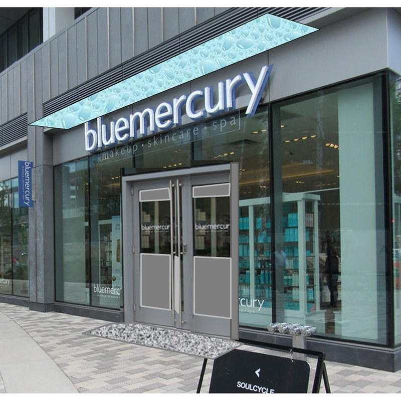
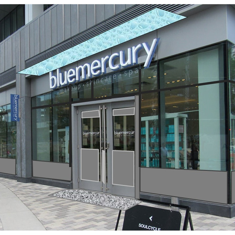
I don't think too many doors is really the problem here.
Something feels 'off' about this, and I can't put my finger on it. This doesnt look like an entrance to anything - the doors look too ... casual?.
Maybe its because there's no element projecting from the facade? Like either a 'doormat', or an awning, or something extending beyond the facade? Or is the 'weight' of the frame within the glass facade? Or the proportions of the door being inconsistent with the proportions of the facade 'bay' (ie if you had double doors of the same size, they'd form a rectangle of the same shape as the larger window area?)
Can someone with some proper architectural chops help me articulate why this facade and entrance looks / feels so off-key?
I recognize that this is a pretty common set-up on contemporary buildings ... but again, just looks wrong?