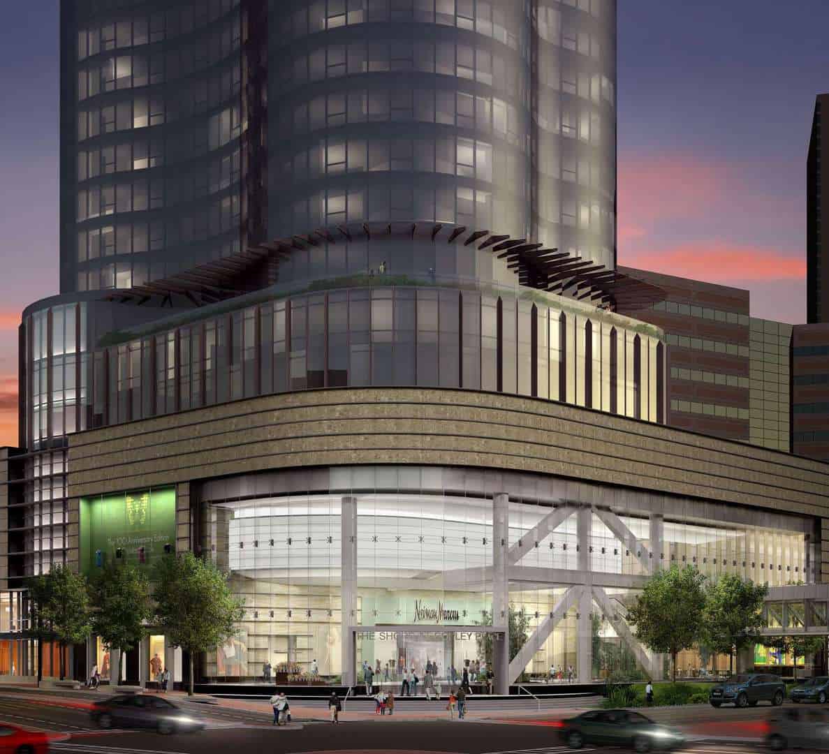
I personally think the ground floor of the current proposal is much better than the ground floor of the previous proposal and its a much more attractive overall building as well. Its unfortunate that theyre not maxing out the height here, but the tower itself is a quality proposal.
I know a lot of people on here liked the previous proposal but I always hated it… well the bottom half of it. I’m not a fan of buildings that hover over a podium the way it did, plus the way the tower got wider in the middle where it over-hanged over the thinner base looked weird. The color, curves, and general shape from about 50% of the way up to the roof looked really good, they just should have continued that down to ground level imo.
This looks incredible.
View attachment 45103
This looks awkward and like its going to fall over.
View attachment 45104
If the top image had continued to ground level getting rid of the weird over hangs and removing the podium this thing would have been an absolute home run.
It actually would have looked a lot like copley tower, which is one of the greatest towers never built in Boston.
View attachment 45105


