You are using an out of date browser. It may not display this or other websites correctly.
You should upgrade or use an alternative browser.
You should upgrade or use an alternative browser.
115 Federal St. (Winthrop Square)
- Thread starter castevens
- Start date
- Status
- Not open for further replies.


- Joined
- May 25, 2006
- Messages
- 7,064
- Reaction score
- 1,990
Haha, thats actually one Pei tower that would look good in Boston.
type001
Senior Member
- Joined
- Jun 29, 2006
- Messages
- 1,839
- Reaction score
- 395
Even after all of kz1000ps's hard work, I am still a fan of the original 115 rendering most.
Not to get too off-topic, but does anybody else have the same sneaky suspician as myself that the London Brigde tower will only look good in rendering form only?
Not to get too off-topic, but does anybody else have the same sneaky suspician as myself that the London Brigde tower will only look good in rendering form only?


briv
Senior Member
- Joined
- May 25, 2006
- Messages
- 2,083
- Reaction score
- 3
I think Piano's design is great, a perfect fit for Boston. It is quiet, subdued, and elegant--all common characteristics of the best parts of Boston. I just hope it succeeds at street level and activates Winthrop Sq.
As far as the wild designs Justin posted and other ones like them going up all over the world:
Architecture has entered a period in which Modern Rococo, lead by starchitects such as Gehry, Hadid, Mayne, and the like, is just hitting its stride, thanks to ascension digital design. As novel and sensational these designs may be, I highly doubt they will stand the test of time and Id bet that in the near future they will face a backlash not unlike the one which ended the Rococo period in the 18th century. And just as fashion rebelled against that style and its audacious decadence, supplanting it with the far more subdued Neoclassicism, I think we can expect a period of in the near future when architecture reacts against this Modern Rococo (Digital Expressionism?) with more reserved, austere forms. In this way, Piano's design can be seen as forward looking and maybe ahead of its time.
lexicon506
Active Member
- Joined
- May 25, 2006
- Messages
- 568
- Reaction score
- 308
here's a couple of Lexicon's request
Thanks KZ, I don't care what program you use to make them, but these are really helping me understand what types of skyscrapers could actually fit in Boston. In the end, those radical designs don't really work with the rest of Boston. The skyline isn't ready for them......yet. I think Piano probably realized this and proceeded to give us the tall box we have now. While it fits well, a small tweak could really work wonders or else Boston will never break out of its boxy mold. Something as simple as Merper's first sickle/ice cream scoop variation makes 115 much better. That improvement already elevates it to the level of iconic. I consider something iconic if someone can draw the general shape of a building and people with even a slight knowledge of skyscrapers can recognize it (ESB, TransAmerica, Twin Towers [simply because there were 2 of them], soon to be Fordham Spire). To my knowledge, there isn't a building in the US that has a sickle shape for its roof. Although not to the level of the ESB, the sickle roof could distinguish it as "that building in Boston" for many people, while its impossible to tell one box from another. I think that kind of recognition was what Menino was originally going for, and it would make me plenty happy. It's also interesting to note that many of the world's iconic buildings have a relatively simple design.
kz1000ps
Senior Member
- Joined
- May 28, 2006
- Messages
- 9,186
- Reaction score
- 13,716
briv said:As novel and sensational these designs may be, I highly doubt they will stand the test of time and Id bet that in the near future they will face a backlash not unlike the one which ended the Rococo period in the 18th century.
I'm completely of the same opinion. My first reaction to seeing the proposed St. Petersburgh tower was, "they're going to have a squiggly line on their skyline...?" While as an abstract sculptural object it's rather beautiful, I would NEVER want to see that blown up to skyscraper proportions. Call me a traditionalist, but I want a tower that at the least looks like it is firmly rooted in the ground. All this cantilevering and such just looks too cartoony to be taken seriously.
Perceptive and probably prescient.briv said:Id bet that in the near future they will face a backlash not unlike the one which ended the Rococo period in the 18th century. And just as fashion rebelled against that style and its audacious decadence, supplanting it with the far more subdued Neoclassicism, I think we can expect a period of in the near future when architecture reacts against this Modern Rococo (Digital Expressionism?) with more reserved, austere forms. In this way, Piano's design can be seen as forward looking and maybe ahead of its time.
After seeing a host of random skyscrapers plopped down at 115, I think that I do like the present design. Its taken me a while to reach this conclusion, but the design is growing on me. Its simple and elegant, though Merper's permutations make it better with an interesting top.
In order to preserve the roof top garden idea, and eliminate the flat appearance, perhaps the designers should approach Mass Hort. The winter garden idea for the green way seems to be dead. Wouldn't it be cool to move the winter garden to the top a 1,000' tower? that way, the designers could implement an enclosed Garden space with an interesting roof line. Could somebody with mad photoshop skills add some kind of glass bubble structure, or other enclosure a la Mass Hort's original proposal?
In order to preserve the roof top garden idea, and eliminate the flat appearance, perhaps the designers should approach Mass Hort. The winter garden idea for the green way seems to be dead. Wouldn't it be cool to move the winter garden to the top a 1,000' tower? that way, the designers could implement an enclosed Garden space with an interesting roof line. Could somebody with mad photoshop skills add some kind of glass bubble structure, or other enclosure a la Mass Hort's original proposal?
I agree with Briv; however, the Piano design is too subdued for its context, which isn't the Boston's elegant 19th century neighborhoods (though they're all rococo by comparison), but rather its collection of squat striped borwn boxes. Better proportions and nicer skin aren't enough to set it apart, much less to steer Boston in a more daring architectural direction, which by its prominence it's uniquely positioned to do.
The alternative, however, need not be the exhibitionism a la St. Petersnurg (which I dislike, by the way); we need something to steer a middle course, distinctive without being flamboyant. Piano may be the right person for it, but this design needs a twist. I think any of Foster's skyscrapers, or Rogers', would be great examples.
Speaking of twists, remember the iteration of the new WTC design (sorry, I can't bring myself to use its official name) with a torqued triangular grid? It needed work, but I felt it had more promise than anything before or after it. Some subtle torquing would give the Piano tower just enough interest while still working with its surroundings,
justin
hubcrawler
New member
- Joined
- Nov 28, 2006
- Messages
- 29
- Reaction score
- 37
How about something with a hint of Greek Revival as Boston's new tallest. After all Boston is the Athens of America. This would be a great way to pay tribute to this title. It has been a long time since the Custom House was constructed and it is still considered a landmark
lexicon506
Active Member
- Joined
- May 25, 2006
- Messages
- 568
- Reaction score
- 308
^ No one knows how to design buildings like that anymore, and if they tried to imitate the style, they would just mess it up. If you don't believe me, take a tour of UVA, look at the real Jeffersonian architecture and then look at the new stuff they're trying to pass as Jeffersonian. Fake historical hardly ever turns out well. I say go with modern, seeing that it's appropriate to our time period.
Incorporating a twisting element, as in Calatrava's Twisting Torso, culminating in a refined version of Merper's sickle (maybe even resembling the favorite Boston sail") ) could make a very cool yet not too out-of-place tower. LeTaureau's top of the world rainforest idea would be crazy in an amazing way, if that makes any sense :?
) could make a very cool yet not too out-of-place tower. LeTaureau's top of the world rainforest idea would be crazy in an amazing way, if that makes any sense :?
Incorporating a twisting element, as in Calatrava's Twisting Torso, culminating in a refined version of Merper's sickle (maybe even resembling the favorite Boston sail
) could make a very cool yet not too out-of-place tower. LeTaureau's top of the world rainforest idea would be crazy in an amazing way, if that makes any sense :?More fun with Microsoft Paint. The building's approximate appearance from north and south is not exactly a thing of beauty. From the south you get a plain box with a clumsy attachment bisecting the facade. It looks as if the tower is trying to hide behind this sleek needle in a futile attempt to diguise its own anything-but-sleek profile. From the north you get the Pru. Perhaps Piano's idea of a joke.


tmac9wr
Senior Member
- Joined
- Jun 14, 2006
- Messages
- 1,446
- Reaction score
- 68
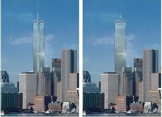
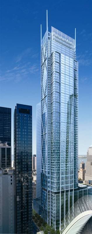
Hey kz, you've been doing such a great job fitting those other buildings into the place of the Winthrop Sq. Tower...think you could give this baby a try? (Obviously not the same rendering) I think the towers bear similarities and it's a gorgeous building. NYC is so lucky to be getting this thing...I don't think anyone would be complaining if this was the tower we were getting (even though I really really like WST).

B
BostonSkyGuy
Guest
briv said:I think Piano's design is great, a perfect fit for Boston. It is quiet, subdued, and elegant--all common characteristics of the best parts of Boston. I just hope it succeeds at street level and activates Winthrop Sq.
That's my main hope for this building. That it succeeds at street level and makes the Winthrop Square area "whole".
The more I see of this building the more I'm still on the fence. Originally I hated it, then I thought "this is pretty good" and now I'm right in the middle.
I think had this building just been a regular proposal where Belkin or some other developer had the stones to say "screw it, I'm gonna see if I can get this built" people would be falling over themselves over the prospect of this being developed. Instead the Mayor made a major mistake of going on and on about this project claming it to be a Boston landmark, something state of the art. Something that would be like the Empire State building is to NYC or the Sears Tower is to Chicago. I don't see it like that, maybe because the design doesn't jump out at you or maybe because I expected more. Probably both.
My point is when something is hyped up beyond belief (and we're all at as much at fault about hyping this project as the Mayor) most of the time it tends to let you down or not be what you expected.
Thankfully KZ has inserted different buildings to see how they'd mesh in the skyline and it's shown us that a singular rendering can look good by itself but the context with the surrounding buildings can make it look out of place. I don't think this building looks out of place, infact it does well to mesh in with what I'd concider a bland skyline.
It's not this building's fault that the surroundings around it really cut down on how innovative it could be. Hopefully this gets built and then another building (even at 500'-600') comes along and tries to go away from the norm even more and so on. That way eventually certain buildings won't be so out of place with the current skyline.
B
BostonSkyGuy
Guest
I really like the WTC3 design too. I would like to see the flat glass on sides of the top incorporated into Winthrop Sq. somehow.
- Status
- Not open for further replies.