115 Federal St. (Winthrop Square)

Status
Not open for further replies.
The Globe said:
Balkin' Belkin

By Steve Bailey, Globe Columnist | December 1, 2006

Welcome home, Steve Belkin.

Now I don't know the man at all, and the only thing I know about the 1,000-foot skyscraper he wants to build downtown is what I read in the newspaper. But I couldn't be happier.

One door closes, and another opens. We lose Frank McCourt to L.A., and Steve Belkin comes home.

My only question: Is a 1,000-foot tower really big enough to accommodate both Belkin and his new partner, Tom Menino? You know it has to get under Belkin's skin to be spending maybe $1 billion and have the thing called "Tommy's Tower." Isn't it always the way?

Belkin and his 1,000-foot tower could be good for years of columns, this being Boston. Consider the circus that has been going on in Atlanta between Belkin and his partners for the last 18 months, where our guy is derided as "Balkin' Belkin," or alternatively "Belkin of Boston."

To recap: Belkin spent more than two decades chasing the rich guy's ultimate dream of owning a pro sports team. He tried and failed to buy the Boston Celtics and the Charlotte Bobcats. And finally, three years ago, he and other investors landed the misfits known as the Atlanta Hawks basketball squad and the Atlanta Thrashers hockey team.

Mayor Menino take note. "Sharing power with the other investors could be a challenge for Belkin, who has been the unquestioned boss in previous ventures," a Boston Globe profile of Belkin noted then. "Another member of the investment group, Maryland publisher Bruce Levenson, said Belkin isn't like business leaders who scrap for control. 'Frankly, when I saw he had been a sole proprietor, that was a concern,' said Levenson. 'But in the year we've worked together it just hasn't proven out. We don't get defensive if we have a disagreement.' "

No, these guys just sue. The whole sorry Belkin v. Everyone Else saga has become a running soap opera in Atlanta.

The fun began in July 2005 when Belkin objected to the Hawks plans to acquire guard Joe Johnson, and said he would use his authority as the team's league governor to block the trade. In a 180-degree change of heart, Levenson called for an ownership vote to toss their Boston partner. Belkin rushed to a Boston court to block his removal. It's been a legal arms race since -- with Belkin out-litigating his partners at every turn.

Belkin agreed to sell out to his partners, but he was clever about it. The price for Belkin's 30 percent stake was to be set by a series of appraisals. Belkin picked the first appraiser, which valued his stake at $88 million. But within a minute of getting the appraisal, Belkin objected to his own appraisal, giving him the right to pick the second appraiser. The second valuation came in much higher at $140 million. More court maneuvering followed, and Belkin kept winning. Under the complicated arrangement, Belkin turned the tables on his partners, winning the right to buy them out -- for the cost of their original investment, a stunning bargain. Appeals are pending.

Writing about the owners has been more entertaining than writing about the mediocre Hawks.

"Here we pause to consider the havoc that Belkin as majority owner could wreak," wrote Atlanta Journal-Constitution columnist Mark Bradley. "He doesn't want to spend money. He doesn't come to games . . . He wants to own a team not because he wants to make it a winner but just so he can say he owns a team."

Echoed columnist Jeff Schultz: "Could he ever attend a home game? He would be less popular than a Hawks player, thought to be a scientific impossibility."

In Atlanta, they call Balkin' Belkin "this litigious man," "cheap and distant and arrogant." In Boston, we call that good copy. Welcome home, Steve Belkin, who through his lawyer, declined to comment.

Steve Bailey is a Globe columnist. He can be reached at bailey@globe.com or at 617-929-2902.
Link
 
Oh, I get it ...

So basically Steve Bailey gets paid to just read articles that other reporters and columnists have already written, and then compose a column from them?

Nice work if you can get it.

He's a complete tool.
 
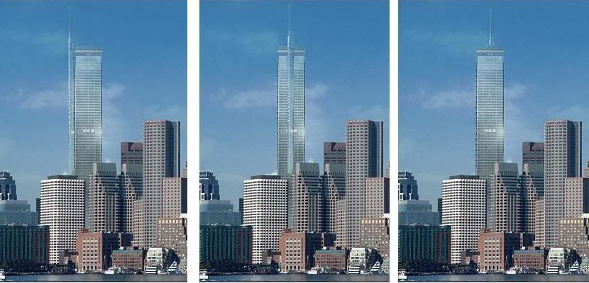
I had some time to kill, so here is xec's 115 Winthrop intervention. The renders left to right are looking at it from the east, south, north, and northeast. Lower right is a modification of kz's diagram to clarify the rends.
115W-rend-combi2xec.jpg


I'm biased, but I like it a lot more than this.
115W-rend-combi1.jpg
 
Id like to request that you put the Empire State Building in there. People said they wanted pointy so lets see how that will look.
 
For a real Boston feel, the design should be a 1000 foot stack of three-decker floors.
 
Great design xec, the best I've seen yet. I really think I could get onboard with something like that.
 
Personally, I think they all look out of place. They're too tall. Maybe seeing it with the addition of the new South Station Tower will convince me. But looking at the renderings I don't think the height compliments Boston's skyline. I'd like to see one or two more buildings close to that height built along with this one. so that the Winthrop Sq. building doesn't seem so misplaced. Just my opinion.
 
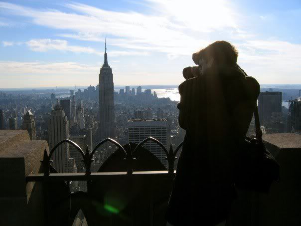
For the record, the Empire State Building looks pretty awkward even in Midtown Manhattan, where the average height of a skyscraper is probably taller than some of Boston's top 10.

proof?

n1812665_31834481_3758.jpg


That's me on saturday taking a picture of it from 30 Rock
 
I agree, the Empire State Building looks good in the skyline. An interesting top such as a ziggurat would be more interesting than the current flat-top roof design. The current design with some alterations here and there could really be improved.
 
callahan said:
Personally, I think they all look out of place. They're too tall. Maybe seeing it with the addition of the new South Station Tower will convince me. But looking at the renderings I don't think the height compliments Boston's skyline. I'd like to see one or two more buildings close to that height built along with this one. so that the Winthrop Sq. building doesn't seem so misplaced. Just my opinion.

Kinda like this?

m197806060397.jpg
 
If this building can be approved in a timely and sane manner and then built when the time is right other talls will follow. Boston's economic stagnation, expensive housing, paltry job production and bad architecture have a common thread. An abysmal NIMBY-based planning and design process that is so slow and expensive almost nothing gets built driving up costs and killing the competitve edge of the city. Along the way we get archtiecture watered down by committees more interested in low impact than aesthetics or utility. It's not the only contributing factor to all of these problems, but IMO a significant one
 
vanshnookenraggen said:
callahan said:
Personally, I think they all look out of place. They're too tall. Maybe seeing it with the addition of the new South Station Tower will convince me. But looking at the renderings I don't think the height compliments Boston's skyline. I'd like to see one or two more buildings close to that height built along with this one. so that the Winthrop Sq. building doesn't seem so misplaced. Just my opinion.

Kinda like this?

m197806060397.jpg
Yip, that's a beautiful skyline.
 
It's a shame that they don't build 'em like that anymore. Those skyscrapers look great from street-level all the way to the spire!
 
hubcrawler said:
It's a shame that they don't build 'em like that anymore. Those skyscrapers look great from street-level all the way to the spire!

i dont know why but when i read that i get some sort of gay innuendo
 
What makes that skyline so great is that there is a unity of style, material, and pallette, despite the individuality in its expression. It is the same thing that makes the Back Bay or Beacon Hill so great. The current Boston skyline it too much of a mish-mash of styles which disrupts the visual coherence.
 
Joe_Schmoe said:
What makes that skyline so great is that there is a unity of style, material, and pallette, despite the individuality in its expression. It is the same thing that makes the Back Bay or Beacon Hill so great. The current Boston skyline it too much of a mish-mash of styles which disrupts the visual coherence.
That's right; that skyline is comprised entirely of masonry buildings expressing the module of vertical windows; though they may vary in size, they all have the same scale.

One curtain wall building was all it took to wreck the harmony. That building arrived when Chase Manhattan put up the first flattop in the sixties.

One such monolith was interesting, but when the second arrived, chaos came hot on its heels.
 
I seem to remember numerous posts on this forum complaining about how Boston's skyline is too monolithic not only because of uniform height but also because of a lack of varied building material. There is finally a proposal for a 1000 foot glass tower and somehow its all wrong for Boston? What exactly do you want?
 
An interesting yet well-designed 1000' glass tower.

justin
 
Metropolis Magazine interview with Piano

An insight perhaps into the thinking of the architect of perhaps Boston's next tallest tower...


Urban Journal
Mixing the Sacred and the Profane
Renzo Piano talks about the New York Times building, future projects, and his procured inspirations.
By Martin C. Pedersen
Posted December 5, 2006
To the consternation of some critics like Nicolai Ouroussoff, Renzo Piano has become the go-to architect for American cultural institutions?the default choice when more ?adventurous? designers flame out, bust the budget, or spook timid museum boards. And while he did indeed inherit faltering projects once attached to other big names (most notably, The Whitney Museum and LACMA, with Rem Koolhaas), Piano?s credentials are indisputable: thirty-plus years designing some of the world?s most important buildings, a precise and rigorous (and construction-friendly) aesthetic, an urbane and utterly charming personality likely to put even the most skittish directors and donors at ease.

Recently executive editor Martin C. Pedersen spoke to the Genoa, Italy and Paris-based architect in New York about visiting nearly complete buildings, 21st century campus planning, and his voracious method of inspiration. (The interview occurred before the Whitney Museum announced they were canceling plans for their Madison Avenue expansion and exploring sites downtown, including the High Line.)

**

You just came back from touring the New York Times building, which will be completed next year. At this stage, what kind of things are you looking at?
It?s very emotional because you spend years designing a piece and you simulate everything. You make models, prototypes, but one thing you will never simulate is truth, reality. This is only possible when the building is up, because buildings are about scale and presence. It?s one of the reasons why architecture is a cultural pursuit but not the same as art or sculpture. There is a sculptural quality about architecture, but it?s not sculpture because architecture takes place in cities where presence is crucial. In some way, this is a special moment when your dreams become reality and you begin to discover the atmosphere that is impossible to design. So now it?s more about space, scale and feeling than physical beings.

Because of the fa?ade, the building has really changed character during construction. Do you think the ceramic rods will make the structure appear lighter than a typical 52-story tower?
I think so. When the ceramic goes above the roofline, it will become more readable. The other important thing is the way the building touches the ground. Here we?re trying to do it a completely different way. From 40th Street, you can see 43rd Street. From 8th Avenue, you see it through the entire depth of the building, and from the depths of it you can see the traffic on 8th Avenue. This sense of transparency is part of the story. It?s about the art of telling the story by using form. And the idea that the Times is a building and institution where the relationship with the city is more open, more permeable.

One of your New York projects involves Columbia University?s expansion in Harlem. So you?ve been exposed to our famously contentious public process. What has your experience been?
Our site office is on Martin Luther King Boulevard and Broadway. It?s an old factory where they used to pasteurize milk at the beginning of last century. When I visit there and go out for lunch, I talk Italian to the Spanish lady. I know the neighborhood reverend. So, generally speaking, the level of understanding of the scheme is quite good. Everybody?s very keen about making it a good one. We are concerned about making a new complex where the university is not separated from the community. It?s not the same kind of campus they designed a hundred and fifty years ago. It?s a different story today.

You can?t have a campus on a hill?the way the existing campus, as beautiful as it is, is closed off from the community.
Today it is more about dialogue, more about reciprocal enjoyment. So we?re making a scheme where there is a kind of public layer on the first and second floors. It is more about those functions. None are purely academic. They are about cultural activity, shops, clinics, new little companies. So it?s a scheme of light and the edge between architecture, human design and social being. Especially because Harlem is a place with a very strong DNA, a strong character, and we love that of course. But in this process it is never so easy because sometimes the common interest must be understood in association with local and specific interests.

Let?s talk about museums. You?ve been doing them for about thirty years now. How has the brief for architects changed since you and Richard Rogers designed the Pompidou?
When we designed Beauborg a long time ago, the museum was a place of dust and antiquity. They were not places of success. I?m not saying that Beauborg changed that, but it was the engine. So in some way, the brief there was to create a place of success.

And by success you mean vibrancy?
Life. The mixing of the sacred and profane. It may sound absurd, but the real risk today is that you do too much of that, losing the intimacy and needs for silence and introspection. I?m not suggesting you reduce the success of museums, I?m saying that when you design them you have to be careful to provide both dimensions. One is more social. It?s about civic life, street life. It?s about the profane. But you also need to preserve the silence and more introverted moments of enjoyment. Enjoying art is a personal matter. It?s made up by contemplation, silence, abstraction. So you should try to combine those things.

You have a few projects that were once major commissions for other architects, and then they became yours. Obviously there?s a comfort level between museum boards and you. What do they see in you that makes them so comfortable?
That?s a good question, but it?s one you should better ask them. As an architect, you have to provide a shelter to enjoy art. And you have to love art. It?s like when you make a concert hall. You must love music. This is the reason why you make the space, to enjoy music?making a space for art is the same thing. You make the shelter, the envelope, in which art may be seen beautifully. It is not true that to make a good space for art, you make it neutral. Neutral is a dirty, dirty word?it is a terrible thing. Museums are always different. Some are about the collection, some are not. It?s a complex thing, but maybe the constant element is to love art and to put it first. But I don?t want to say too much on that because it may sound a bit moralistic.

When you visit buildings by other architects, what do you look for?
Haha! First, I enjoy them very much. Second, I steal everything. Stealing is maybe too hard a word. There?s an Italian word, you say ?rubarro,? which means a nice robber, without a mask.

What did T.S. Elliot say, ?Good poets borrow, great poets steal??
It?s really about that. But art is about that. Music is about taking and giving back. In a way I spend my entire life stealing from everything?from the past, from cities I love, from where I grew up?grabbing things, taking not only from architecture but from Italy, art, writing, poetry, music. And you know what, I put all my robberies in a little piece of paper that I have with me and fill almost a whole sketch pad. Even when I don?t like a building, I still find something to take. This is probably because I was never a good school boy, so I grew up with the idea that I was not the first in class and I was a problem all the time. When you grow up with that idea, you spend your life taking from others.
 
Status
Not open for further replies.

Back
Top