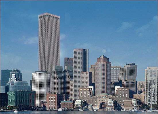
115 Federal St. (Winthrop Square)

Status
Not open for further replies.
Joe_Schmoe said:
I have to echo the criticism that this design fails to do what it was intended to do, that is, be an iconic emblem of Boston the way the Empire State is for New York. I can't imagine anyone seeing this building and feeling inspired or impressed with Boston, or really reacting in an aesthetic way at all to this building. When you ask what makes this building great, you get a list of engineering feats or public amenities. What you don't get is any aesthetic virtues, because it has none.
Quite a bit of truth to that.

But haven't we grown accustomed to it?

After all, this is Boston.
 
ablarc said:
statler said:
Which one is Koolhaas?
oma1.jpg


oma2.jpg

Cool. This one echoes Russia's history with ice buildings. Hope it doesn't melt.
 
Well if we keep talking the way we are (not just as archBOSTON, but as residents and such), we may be able to inspire change in the design. I always imagine how "dull" 111 Huntington would be without the crown. The city/architects have the ability to change designs even after construction. You make a wonderful argument about how it does not do what Menino set out to do, and that's the best argument that may inspire change in the design
 
I like the Herzog design for Gazprom. Maybe we can use that instead here if it loses :)
 
Joe_Schmoe said:
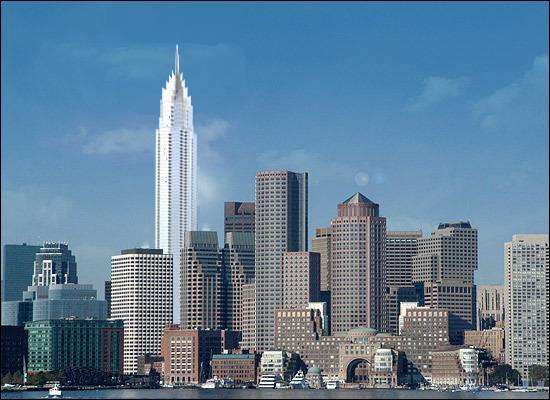
Way back on the old board, when this project was announced, I joked that the tower would liik like this:

>picture<

Sadly, I came closer to the truth than I would have liked.

:?:


hehe!
 
HAHA - Nice work, KZ.

Does anyone know if the top of 115 is going to be lit up some how? Hopefully it'll be something better than the boring, dim yellowish lights we see on the Pru or even International Place...
 
The original south station tower design built at the same height as the current proposal would have been more aesthetically pleasing design on this site.
 
I don't know if this was born of ambition or a severe lack thereof..


Trump Tower Chicago


art deco throwback: Nashville's Signature Tower


cutting edge "organic:" Paris' proposed new tallest, by Thom Mayne of Morphosis


To put in my two cents, I don't like the Paris tower (see the whole thing here http://forum.skyscraperpage.com/showthread.php?t=120901 ), nor much of anything from this whole "organic" trend, aesthetically speaking. We may detest boxes to no end, but some of the stuff going on in Europe and Asia is downright bizarre.

And if there's another tower you really want to see put in, say so and I'll do my Paintbrush magic.
 
Nice Work KZ, flawless photoshop. To be honest, after looking at all of those i have to say our proposal looks the best. I like it. the more and more i look at it, the more and more i like it.

To be honest, I see a little bit of Chicago's Hancock Building in there... I don't know what it is. I like Chicago's Hancock Building, and i feel that this building will grow on me (and hopefully everyone else) in the same way.

They're both basic, they're both relatively bland, yet they're both Iconic in their own way (well, Chicago's Hancock anyway).

Most buildings that are iconic and have a long lasting impact (that aren't world's tallest, or previous world's tallest) really aren't all that intricate. Boston's City Hall was iconic when built, and now anyone who doesn't like brutalism (the majority) doesn't like it. Art Deco is an exception as it seems ageless, but most people move past styles or "trends" of certain eras. this proposal looks like it could have been built in the 60's, 70's, 80's, 90's or the new millennium. It will grow on people and it will be iconic despite it's relatively bland look.

I think it's perfect, especially when i look at KZ's photoshops of all those different buildings in its place.
 
Hmmm...it might be interesting to see the New York Times Tower and the London Bridge Tower in a rendering to compare how Renzo's other work might look in the Boston skyline to 115. And just for kicks, the Fordham Spire, Bank of China, or Burj Dubai in Boston would be an interesting sight to see.

NOTE: For some reason I can't see the Sig Tower or Trump Tower photoshops. They load for a long time and then appear as question marks or broken image icons according to which browser I'm using (usually Camino or Firefox). Strange because I can see the other three renderings posted above.
 
OK lexicon, assuming I can find renderings that are at a suitable angle for all those towers I'll do them tomorrow or Friday.

And I re-hosted the two you had problems with.. hopefully that fixes things.
 
Lrfox said:
Nice Work KZ, flawless PHOTOSHOP.

Haha I don't even own a copy of Photoshop. These were all done in the lowly program Paint.. You know, that bitmap program that has come standard with every version of Windows since 1.0. Funny how even in 2006 it can still do a bang-up convincing job.
 
You rock kz1000ps!

And I couldn't agree with Lrfox more.
 
The more I look at it, the tower portion itself isn't too horrible. It looks to have a fairly interesting, high-quality skin. It is the completely flat top, in combination with an essentially square tower, that really drags it down for me. A much more dynamic and original top/crown would do wonders for this building. The top of 111 Huntington certainly transformed that building from a somewhat squat cylinder to a quite successful design. I think/hope that a similarly successful crown could potentially transform the design from mediocre to superior. Otherwise, every time I look at it, I can't help but thinking this is what an 21st century update of the Pru's design would look like.
 
I saw renderings of Sig. Tower before and i liked it, but it looks god awful in the boston skyline. And that French thing... it's terrible.
 
The Trump Tower looks really neat there. How long 'till we get a real one in Boston? :?:
 
...

eh... in my opinion, the tower isn't terrible, especially if the mast does include a scenic elevator to the top, but it isn't 'good enough'. For me, the flat top was probably the most dissapointing part. I like the idea of a rooftop garden (if thats even possible) but does the roof need to be flat for it? A little decoration for decoration's sake would be welcome here.

Just for an idea, i made these, that though rudimentary and simple I think enhance the current design, at least slightly....


winthrop2.jpg


winthrop3.jpg


winthrop4.jpg


winthrop5.jpg


My point is that ANY decorative top would enhance this building's appearance and make it more memorable.
 
Merper, I actually really like the bottom one! How does the bat tower sound?
 
.

...ha!

my favorite would be the first one, but i would hope real architects could come up with something better.
 
Status
Not open for further replies.

Back
Top