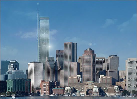
115 Federal St. (Winthrop Square)

Status
Not open for further replies.
There was only one proposal because any realistic proposal for a 1000-footer on the Winthrop Square Garage site requires the use of the adjacent property on Federal Street owned by Steve Belkin. If that parcel was also owned by the City and part of the RFP you would have seen additional proposals.

From the Boston Business Journal website http://www.bizjournals.com/boston/stories/2006/11/13/daily15.html?jst=b_ln_hl:

One bidder for Mayor's tower
Boston Business Journal - 2:56 PM EST Monday
by Michelle Hillman
Journal staff


Mayor Thomas Menino's dream for a tower is in the hands of one businessman -- Steven Belkin -- and his very famous architect Renzo Piano.

Responses to the Boston Redevelopment Authority's requests for proposals were due today, Monday, Nov. 13th. Belkin's team was reportedly the only respondent.


The mayor's office issued a statement on Monday in regard to Belkin's proposal.

"I called for world-class architects to come up with a building that reflects all the greatness and potential of Boston," Menino said. "Today's proposal, a 1,000 foot tower from Trans National Properties, promises everything we asked for. I look forward to a working with the developer and to review in detail their plans for this historic project."
 
theres a rendering at boston.com. id put it up but i have no idea how to post images!
 
Here it is!!!

WinthropSquare.jpg


It looks very simple but I like it...I'd like to see the opposite side of the tower too, it looks like there's more to it on the other side. I hope we'll be getting some 360-degree renderings soon.
 
^ An artist's rendering of how Boston's skyline might look if the city accepts Steven Belkin's proposal.

boston.com
 
Wait so does that mean that that's not the rendering?
 
It stinks.

It looks like a slightly taller flat top brown box.
 
^^ Shows how short DT is. The skyline really needs a few taller buildings to look great. I agree that getting only one proposal is probably due to Belkin's ownership of the adjactent lot more than anything else. IMO it could get built given the strengthening office market, letting up on the height limit by government, and Belkin's big wallet and ego.
 
Looks a lot like Piano's New York Times tower. It's roughly the same height too, although this tower looks slimmer, at least from this angle.
 
I have to say that after all the hype I'm a little disappointed with the rendering. I don't dislike the tower, and I think it looks great in Boston's skyline, but I was expecting something along the lines of the London Bridge Tower, something really unheard of in Boston. The fact that it is 1,000 ft tall is already unheard of and a step in the right direction. Hopefully, if this goes through rather smoothly, it will open the door to more spectacular projects.

I'm kind of surprised that Renzo opted for the NYT look rather than a LBT look. Does he realize how prominent this site is? We're not talking the mess of skyscrapers in Manhattan, where anything below 1,000 ft gets drowned in a sea of towers. This thing will stick out like a sore thumb (in a good way). A masterpiece here could have easily become his most well known building.
 
Maybe we will be treated to more pictures soon if Piano's website updates its Boston section in the coming days, though I find it odd that it isn't up yet.
 
Is it just me or does the propose tower looks taller than 1000ft even without it's spire. I mean the First National Bank of Boston looks about half the height of the tower and it is 591ft and is pretty much across the street from the proposed tower. I'm guessing a 1000ft-1100ft tower and 1200-1300ft tower with the spire.
 
Sexy. Very contemporary, reminds me of the new World Trade Center designs. It may look like just another glass tower but I think it will work very well given all the high modernist designs around it.
 
I was hoping for something with a spire and not a flat roof, maybe even something creative. I really want to see more renderings though especially from the ground.
 
I don't think its ugly by any means, maybe somewhat generic and not as creative as I had hoped, for some reason it reminds me somewhat of the four seasons in miami. I think it would be nice if they had a creative lighting scheme for the tower at night....not exactly like BOA Tower in Miami but something that is as creative and unique to give the building some pizazz
 
Mike said:
^ An artist's rendering of how Boston's skyline might look if the city accepts Steven Belkin's proposal.

boston.com
tmac9wr said:
Wait so does that mean that that's not the rendering?
I think so. My guess is that the 'artist' in question works for the Globe or the BRA.
 
The Herald said:
Belkin unveils 1,000-foot Boston tower plan
By Scott Van Voorhis
Boston Herald Business Reporter
Monday, November 13, 2006 - Updated: 03:36 PM EST

Boston business magnate Steve Belkin today unveiled a stunning plan for a 1,000 foot office tower that would become the new centerpiece of Boston?s skyline.
Belkin, who heads a credit card and travel empire and owns a pair of pro sports teams, wants the Hub?s tallest tower at the site of a city-owned Financial District parking garage.
Mayor Thomas M. Menino put the Winthrop Square parking garage on the sales block earlier this year, calling for proposals for a 1,000-foot tower that would be taller than even the 60-story Hancock tower.
The Weston businessman is the only bidder for the Winthrop Square garage site. He?s hired top international architect Renzo Piano to put his stamp on the high-rise.
Belkin, who has been quietly pushing tower plans for years, is expected to incorporate a mid-rise he owns next door on Federal Street into his development plan.
Link
The Herald said:
Garden in the sky: Plan for Tommy?s Tower features greenery
By Scott Van Voorhis
Boston Herald Business Reporter
Tuesday, November 14, 2006 - Updated: 06:15 AM EST

Bostonians would get a new garden - 1,000 feet in the sky above the Financial District - as part of a stunning plan unveiled yesterday for the Hub?s tallest tower.
Boston business magnate Steve Belkin yesterday pulled the wraps off Trans National Place, a 75-story office and retail tower that would become the new centerpiece of Boston?s skyline.
At 1.6 million square feet, the new tower would hold roughly the same amount of space as the Hancock Tower, while also looking down 15 stories at what is now New England?s tallest building.
But the new tower, designed by internationally renowned architect Renzo Piano, may stand out even more for its unusual design, including garden areas on both the roof and the ground floor.
Belkin heads the Trans National credit card and travel empire and holds stakes in two pro sports teams. His tower would take shape on a downtown site bounded by a city-owned parking garage and a mid-rise Federal Street office building he now owns.
Mayor Thomas M. Menino earlier this year put that Winthrop Square garage out to bid, calling upon developers to submit bold plans for the city?s tallest tower.
?We commend (Menino) for his forward-thinking vision, and have answered his call,? Belkin said in a statement.
Protected by windscreens, the rooftop Lookout Garden - named after an historic Natick farm Belkin recently bought - offers a bucolic setting high above downtown Boston.
Meanwhile, the ground floor of the tower itself would feature a park called the Town Green. The park would be built underneath the skyscraper?s main lobby, which will be raised up three stories to make room for the greenery below.
Nor do the surprises end there. The tower?s first few floors would feature a mix of retail and restaurants, including a grocery store.
No other developers submitted proposals, leaving Belkin the sole contender and stifling City Hall?s hopes for a bidding war.
Link
 
If this is really what the tower will look like, I say don't build it at all. Not only is it far from iconic, but as the tallest tower in Boston it flat out stinks. It might work in Chicago or somewhere else where it can blend in, but Boston deserves better, especially with all that built up anticipation. Also, what is the deal with that side spire? It looks like a pole just running up the side of the building for no reason. Compared to the Hancock this is an eyesore.
 
Actually, I could see some promise with a few tweaks of this design. Mainly, that spire has to go. It's beyond hideous and I almost put my fist through the computer monitor when I saw it. Also, a setback somewhere would do this building wonders.
 
Honestly, the first time I looked at this tower, I was a bit disappointed. But the more and more I look at it the more I like it. It's very simple but sleek, and it's the type of design that grows on you. It does look very similar to the NY Times Tower, but I think it's better. When you look at how NYTT is turning out, many people are disappointed because the facade is darker than people were expecting but it doesn't look like this building has those horizontal rods that NYTT has so it'll help this building glow a bit more.

For those of you who don't like the design, sleep on it and then come back and look...you may like it a lot more.
 
Status
Not open for further replies.

Back
Top