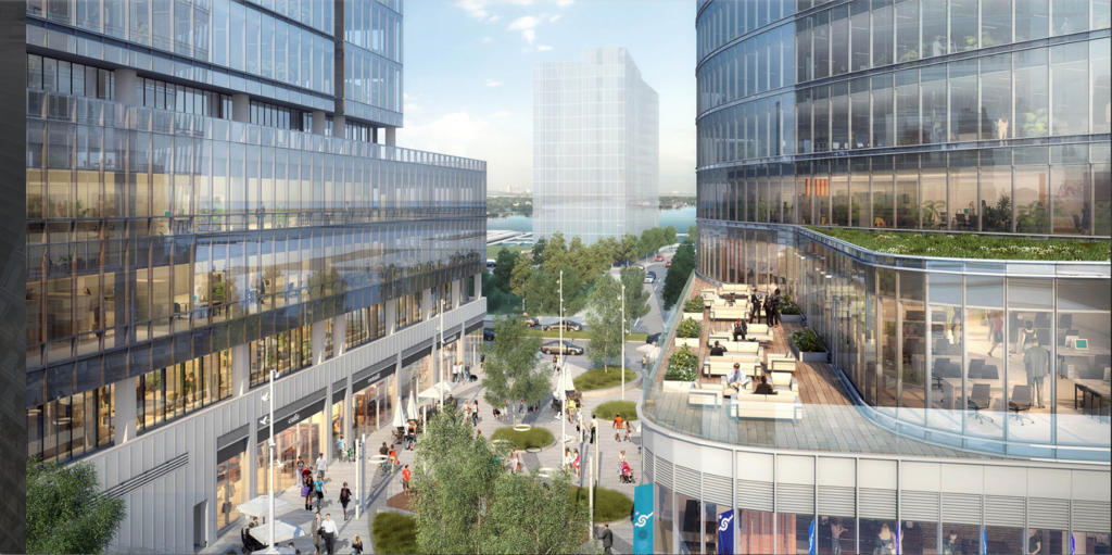
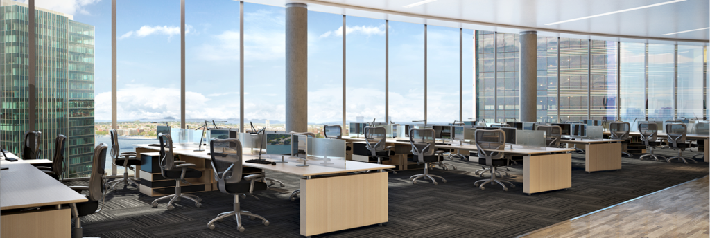
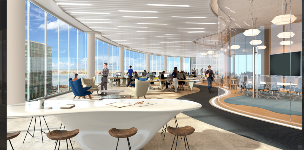
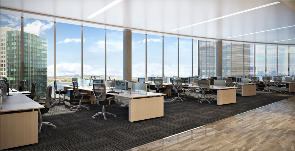
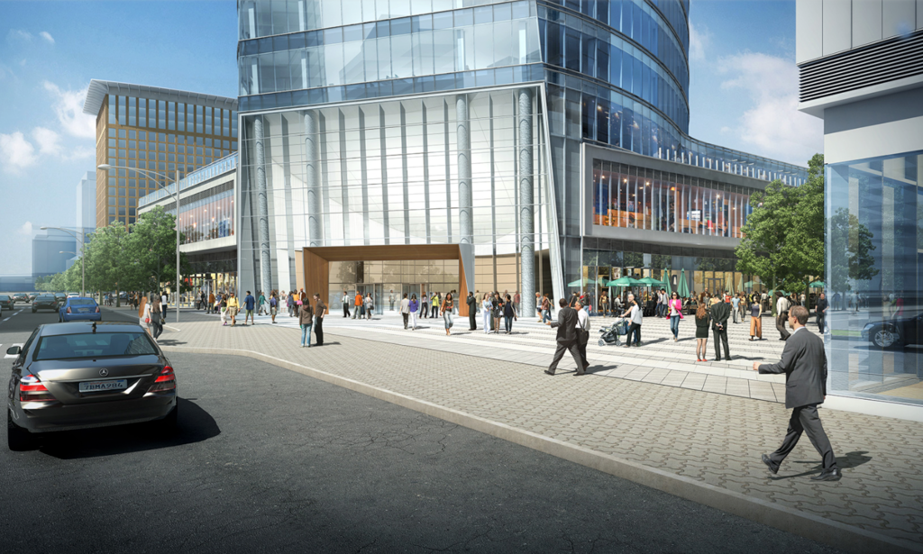
121 Seaport Boulevard | Parcel L2 | Seaport Square

Anyone have any insight as to why they'd choose top down (very expensive) here?
In my experience it's usually limited to really dense, compact sites.
 
This should be the point where it starts speeding up a lot and before you know it there will be multiple floors in the sky. I cant wait to see how the angled lobby changed the dynamic of the streetscape.
 
From Sunday.

28563772326_d6cee733c5_c.jpg


28563753436_25a8c47dbd_h.jpg


28596295755_c9ec0cff05_h.jpg


28489244472_29c55488c7_h.jpg
 
Nice, and in the next two years or so, the Seaport will see this building, One Seaport Square, 50 Liberty, the office and condo at Pier 4, the church, the small office building next to the church, and the Yodel Hotel completed or nearly so! I'm loving all this!
 
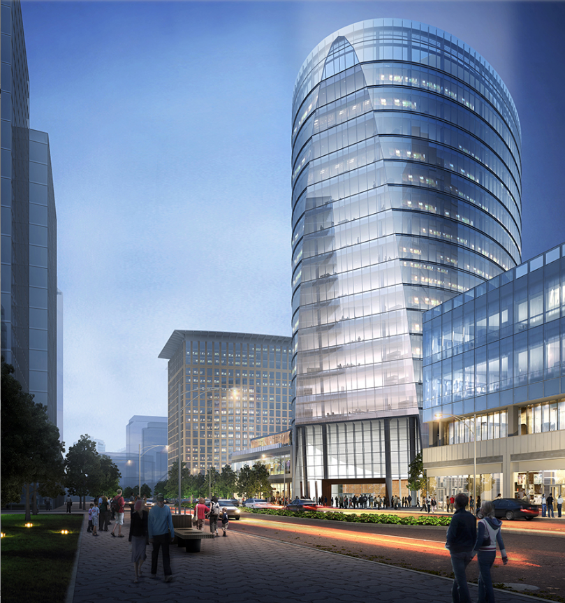
At night its one of the most visually interesting neighborhoods in Boston.
 
Last edited:
Via 121seaport.com. Some are old but I just ripped em all. This along with 1 Seaport Square are the next phase of development here. It started with brick buildings with minimal retail. Moved to precast with retail, then moved to glass boxes, and now its moving toward all different shapes, and then will move into stone/glass combinations at the M parcel and pier 4. I like where its all headed. I was in the Seaport again tonight showing my mom all of the new pieces they added and she was blown away. Its really coming into its own. I honestly am starting to like this almost as much as anywhere in the city- in its own way. Sometimes you just want to be on flat roads that aren't a mess and easy to navigate with lots of shiny new retail and this is the spot to go when it comes to Boston.


A cool thing that stands out when you are in the area (and even in the pictures of this thread) is that the core of L2 is rotated 45 degrees from the rest of the buildings. Its very noticeable.
 
Its because the building is rotated. Look what angle the lobby meets the street.
 

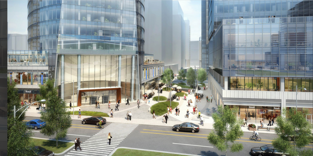
I'm a little skeptical of the treatment of the pedestrian 'shopping street' here. My thinking has always been 'make the street walls interesting, and let the street be the background'. What's happening here is a bunch of ellipsoid green stuff, which might work as a demi-park, or it might just get in the way. And the street walls are super-boring because we're working with full-block monoliths.

Why not just build a street? But for pedestrians instead of cars? The got it right between the envoy and the crab. Not sure they will get it right here.

It might work. But I'm skeptical.
 
...What's happening here is a bunch of ellipsoid green stuff...

Yeah, because developers now know they are on-the-hook for accuracy of facade design and the shape of structures (e.g., Hotel Commonwealth mandated re-do 10+ yrs ago), but they are essentially unaccountable for how the green stuff ultimately ends up looking. So they pepper their renders with beautiful, lush, aesthetically pleasing green stuff as an easy way out to sell the design. I am NOT saying landscape design isn't important - it absolutely is. But when a developer makes a half-assed effort to plant some trees or gardens, then then they die a year later, there's nothing much the city can do. Whereas there's no hiding behind the shape of your building.

I agree with you that a monolithically-lined street with nice trees in the middle does not count as activating the street for humans. That said, I generally really like 121 seaport but wish they did more with that corridor.
 

Back
Top