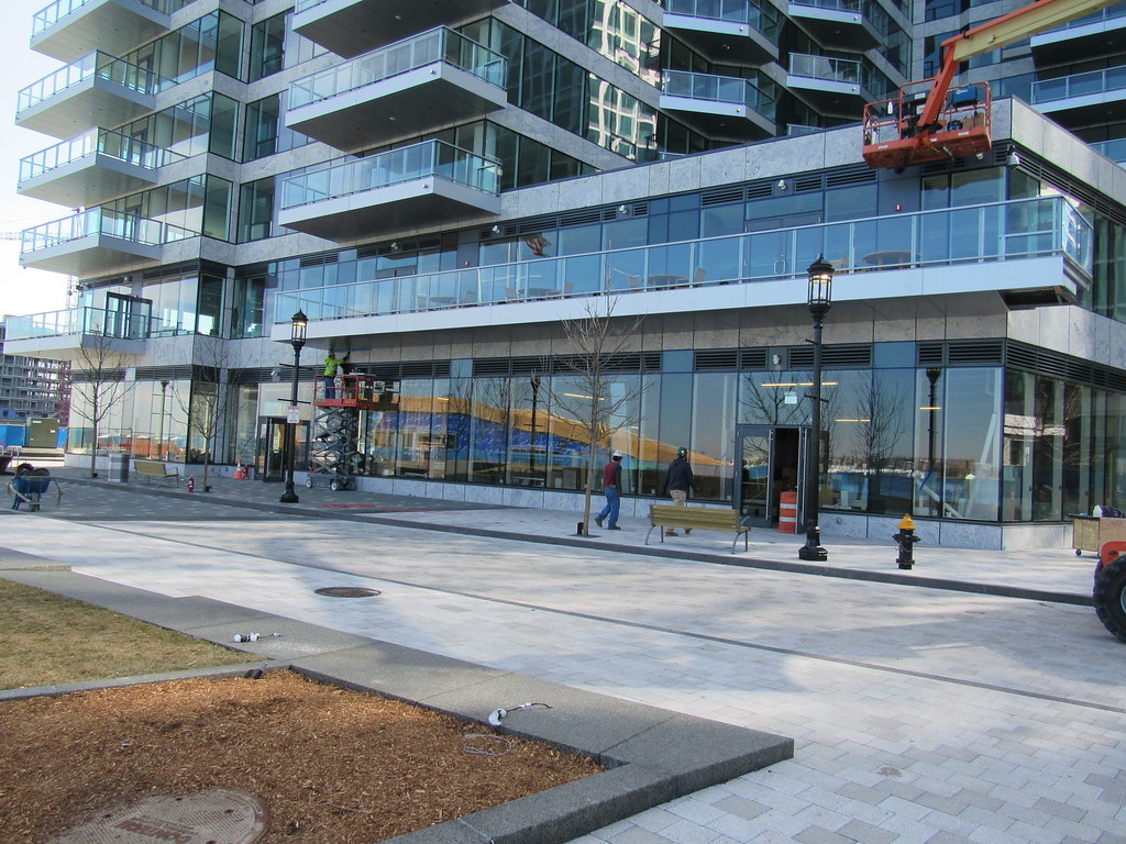
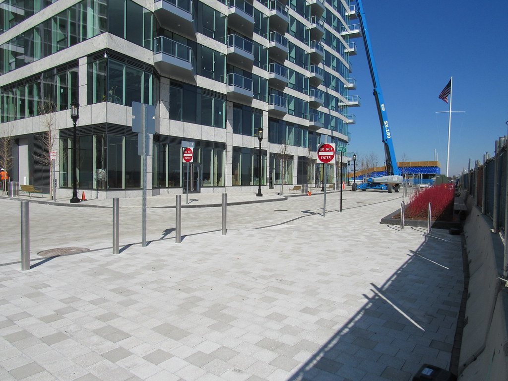
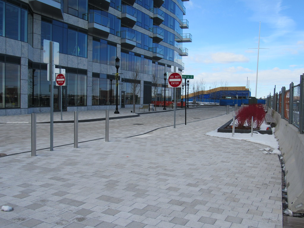
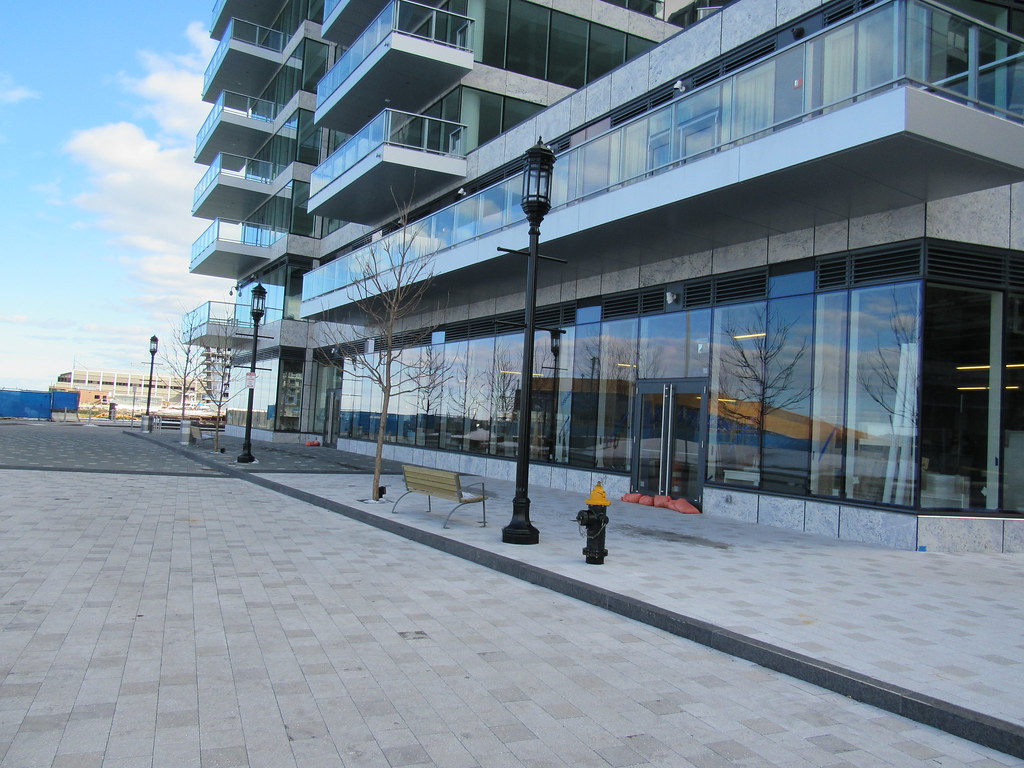
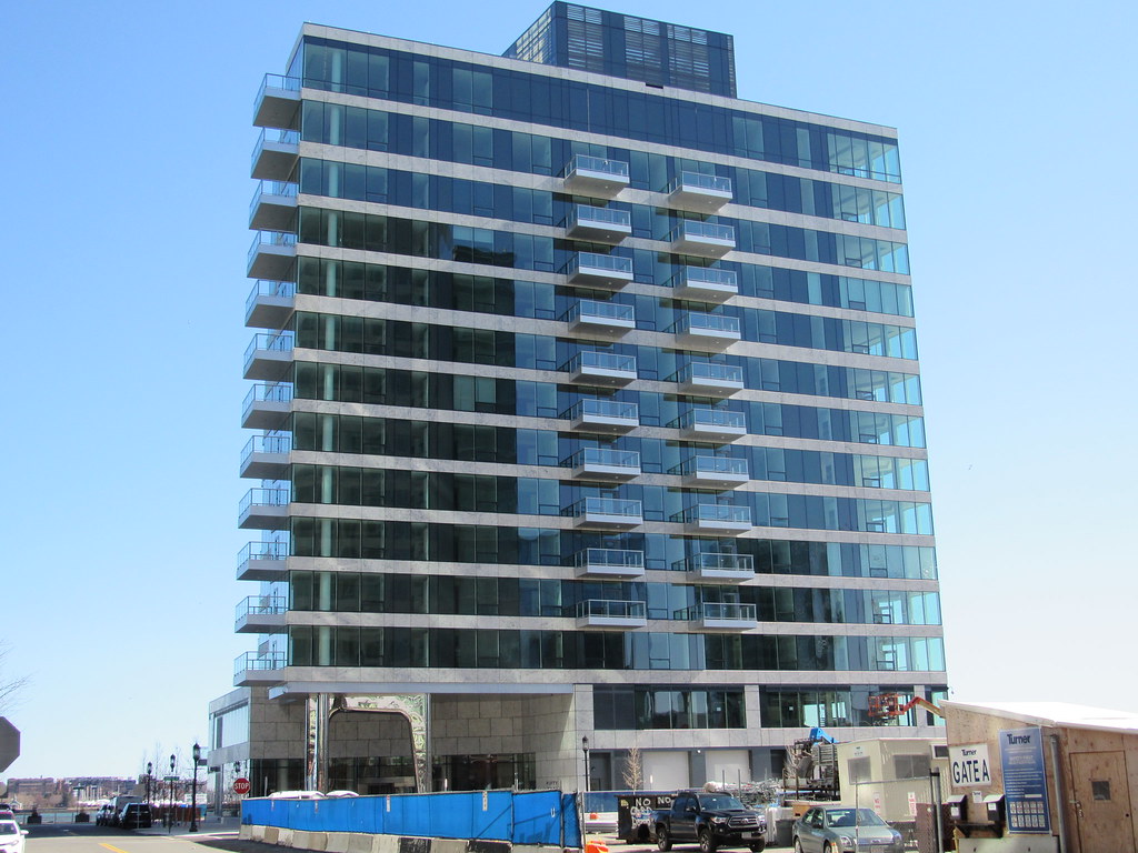
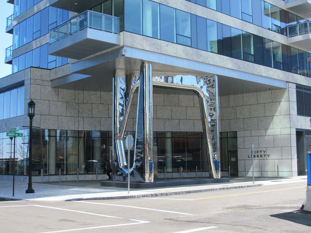
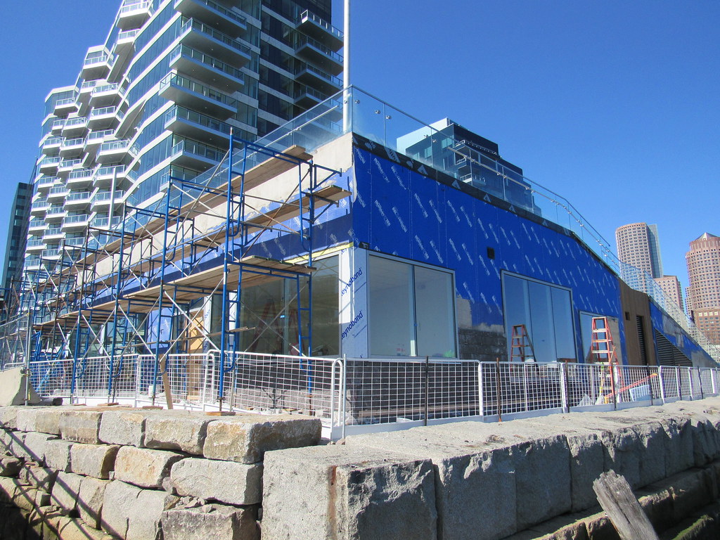
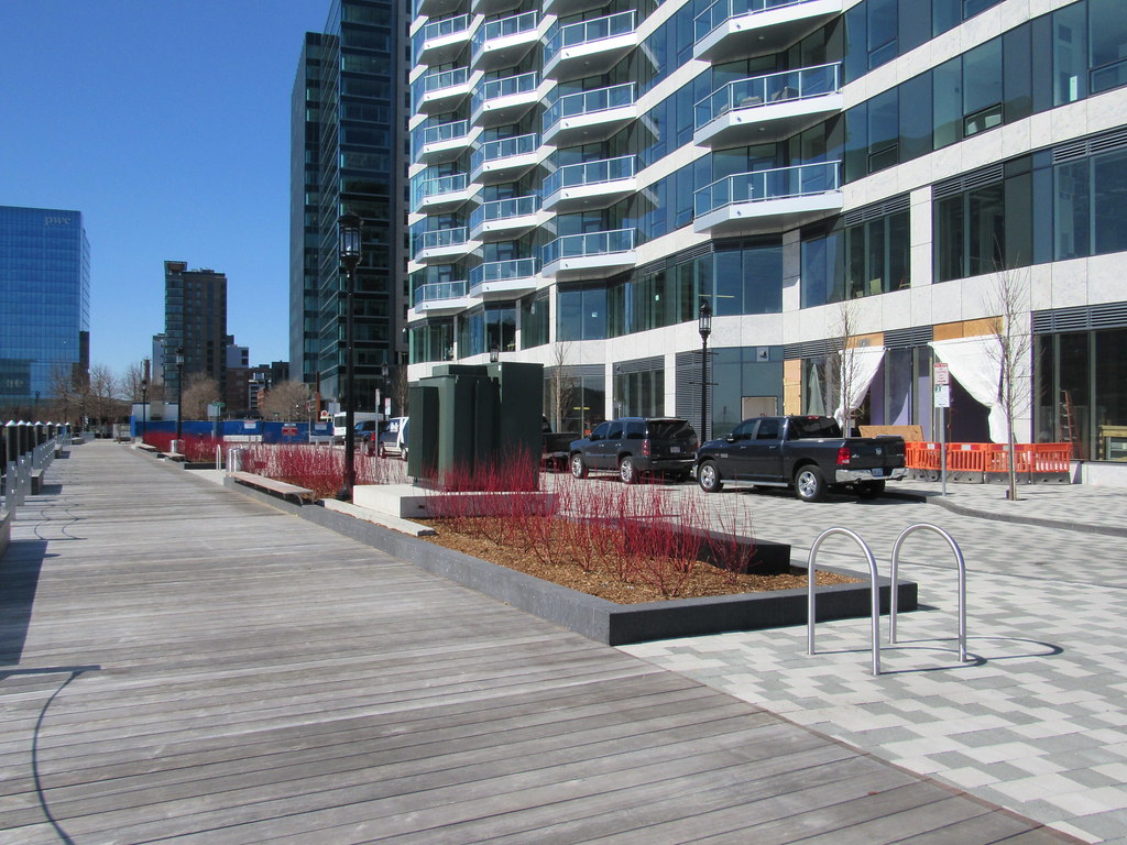
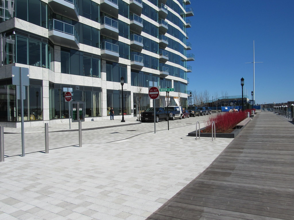
I've said this before: this building is cheap garbage masquerading as fancy. In the second photo from 3/3, look at how the balconies don't course with the stone veneer in the same place at each level. The first balcony floats somewhere in the middle, while the second one, above it, is bottom aligned. They don't even align on the same level! The right-hand second balcony goes back to hitting somewhere in the center of the stone course. I don't know who made the mistake but it's just so lazy and sloppy.
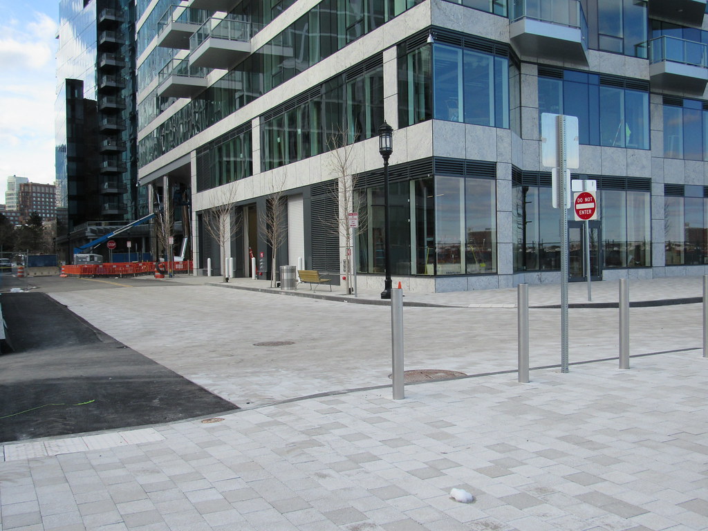
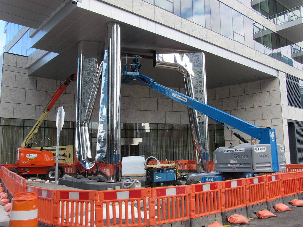
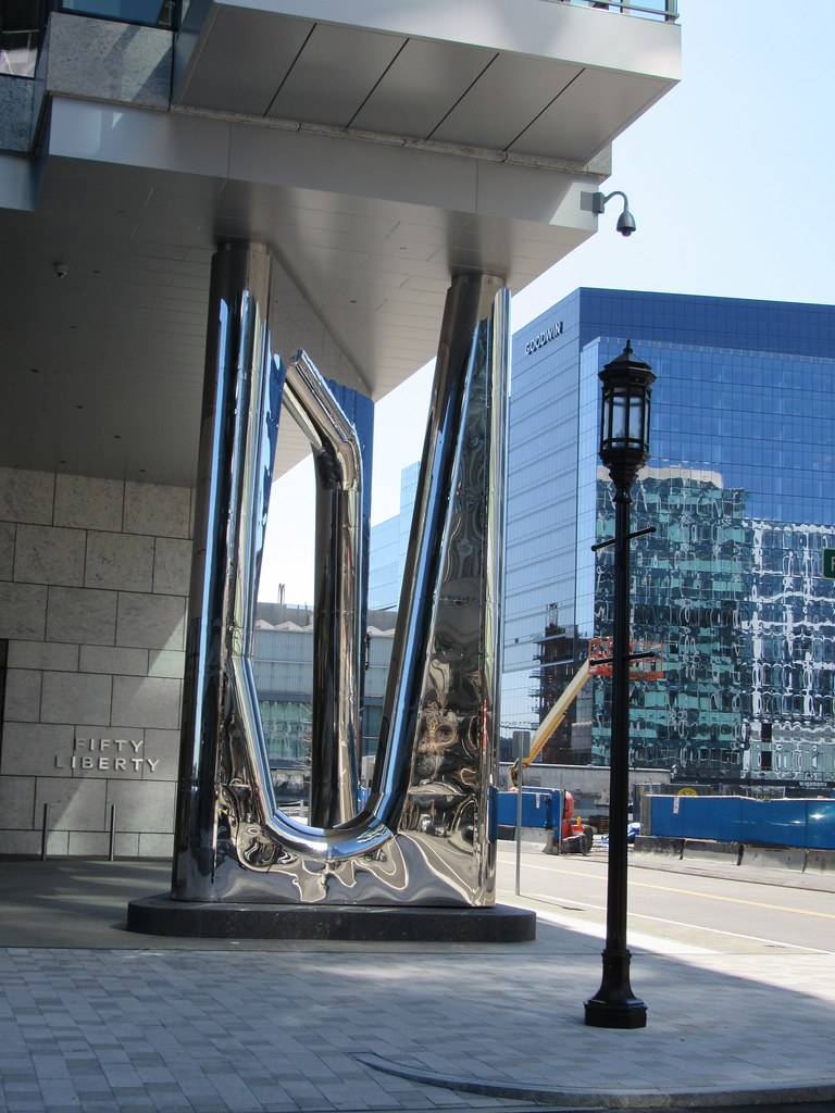
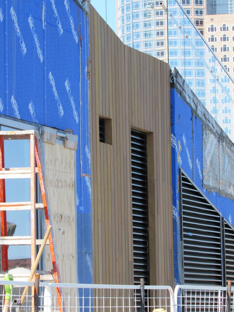
Further, look at how the low volume meets the overhang of the tall volume. You have a top course of "stone", then a course of mechanical grilles over the windows. But when it turns the corner under the overhang, this second stone course collides with the metal cladding of the underside and those are misaligned too!
Anyone who's worked in architecture knows there's just too much to keep track of and too little time, and things fall through the cracks. But these contribute to a general feeling of disharmony and a sense of cheapness that's endemic to so much of the new stuff going up all over town. Would it really be the end of the world for everyone to slow down and just get the details right?
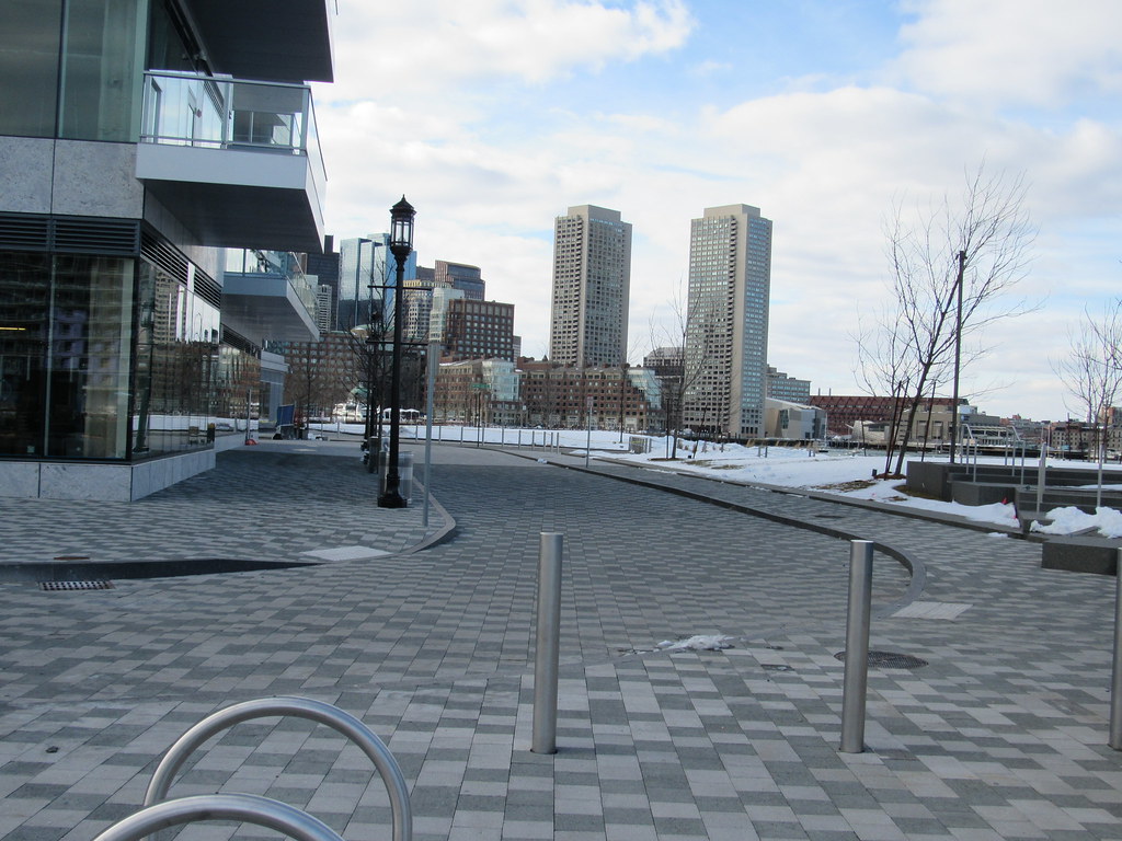
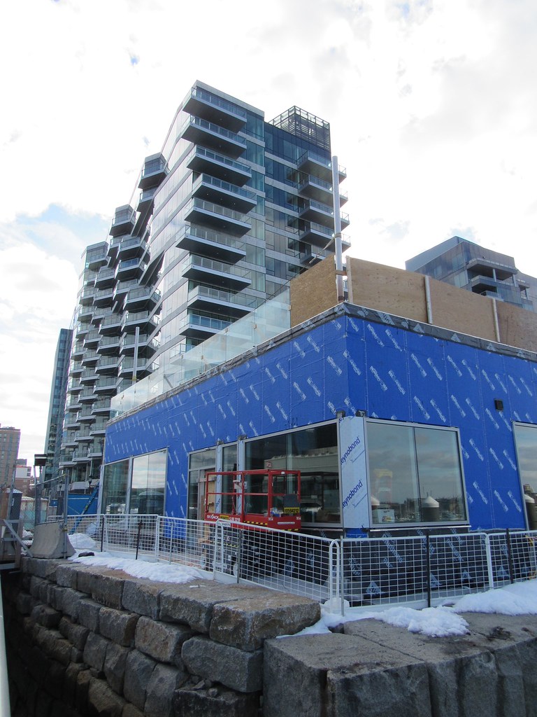
By contrast, the building on the left in the first shot from 3/3 is much more handsome. Restraint never hurt anybody.

