Academic Building @ Suffolk U | 20 Somerset Street | Beacon Hill

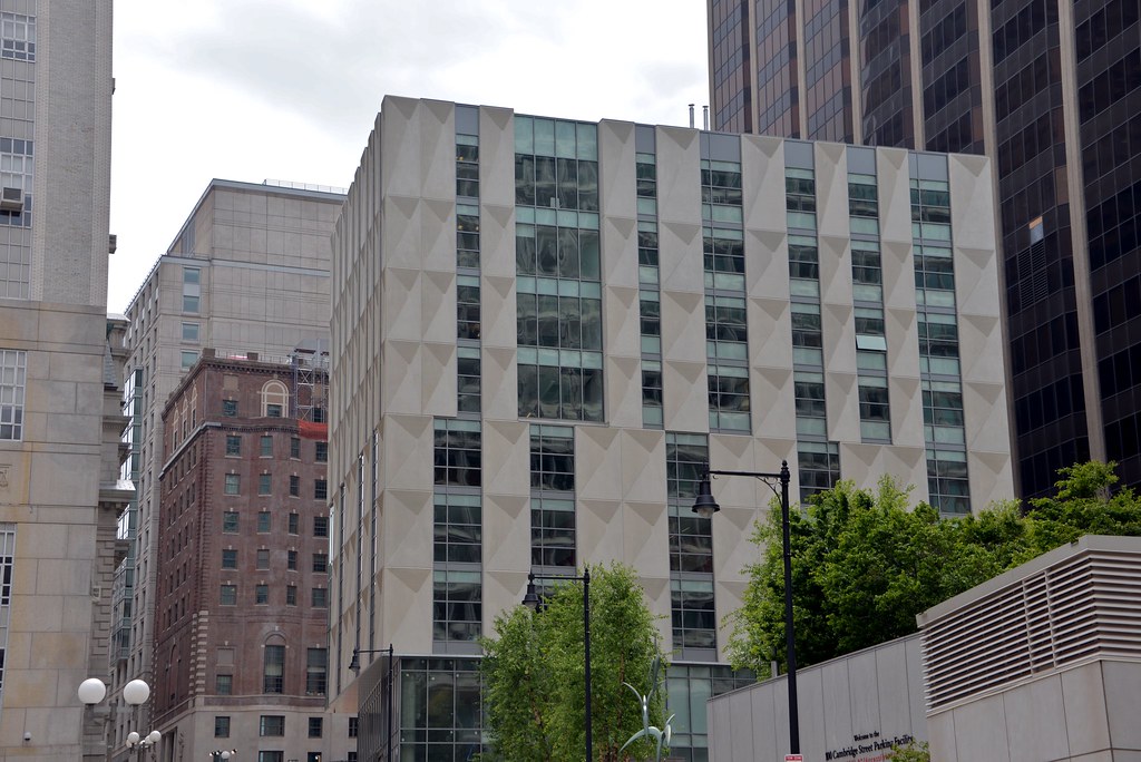
More of a rhetorical than literal statement. As a result of lurking around here, I have gathered Brad Plaid loves simplicity and modernism and I respect the difference in opinions. Although my personal preference is for the historic, I do appreciate the powerful brutalism of City Hall as well as more clean modern look of recent buildings, e.g., the Envoy Hotel under construction on Fort Point. My point being is that I have a very high degree of confidence that if you were to show a before and after pic of this particular project to the vast vast majority of people, they would prefer a rehabbed MDC building. The end result of this project is a another incremental loss for Boston.

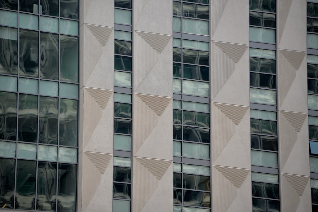
The old MDC building was riddled with aesbestos and had unworkable floor plates and column grid for today's modern tenants. Rehabbing would have been a complete charity project and a poor real estate decision by any owner. Get over it.
 
The irony is that Suffolk was willing to remove the asbestos and work with the "unworkable floor plates" as the initial plan was to retrofit the MDC building for student residential use. Although they constructed a new dorm from the ground up a block away, they were proposing a gut rehab here. The neighborhood of Beacon Hill opposed bringing more students into area so Suffolk went back to drawing board. What is being built now is the second proposal.
 
I'm not really interested in sharing everyone's negativity and disdain on this project DZH22. The overwhelming vitriol is misplaced in my opinion. Its as if the designer and university personally offended some of you. Really?!
The building has some flaws, but I think it does well with the constraints it was given - cost, height, existing conditions. I think time will prove it to be a vast improvement over an unfeasible restoration project of the former MDC.
The panels by the way are 3D. You can see in the photos attached there is a subtle indent that reveals itself in certain light conditions. Sort of unique and engaging. A risk that paid off in my opinion.

https://www.flickr.com/photos/31692143@N04/

17222368728

16787636424

17223940349
 
The issue is not negativity or disdain, IMO. The issue is that so much could have been done with this important site on Beacon Hill that would have added to the otherwise bleak landscape in part caused by the disregard for the site by previous mega-projects going back decades. I guess I would have been more pleased had the architect shied away from gimmicky facade treatments and delivered a simple, functional building that brought the site into the 21st c. rather than reaching into the 1960's for inspiration and then throwing in a mish-mash of window placement...why? Just to be different?
 
The issue is not negativity or disdain, IMO. The issue is that so much could have been done with this important site on Beacon Hill that would have added to the otherwise bleak landscape in part caused by the disregard for the site by previous mega-projects going back decades. I guess I would have been more pleased had the architect shied away from gimmicky facade treatments and delivered a simple, functional building that brought the site into the 21st c. rather than reaching into the 1960's for inspiration and then throwing in a mish-mash of window placement...why? Just to be different?
Offset windows are NBBJ's obsession right now.
 
I'm not really interested in sharing everyone's negativity and disdain on this project DZH22. The overwhelming vitriol is misplaced in my opinion. Its as if the designer and university personally offended some of you. Really?!
The building has some flaws, but I think it does well with the constraints it was given - cost, height, existing conditions. I think time will prove it to be a vast improvement over an unfeasible restoration project of the former MDC.
The panels by the way are 3D. You can see in the photos attached there is a subtle indent that reveals itself in certain light conditions. Sort of unique and engaging. A risk that paid off in my opinion.

https://www.flickr.com/photos/31692143@N04/

17222368728

16787636424

17223940349

Did you design the building? It's hideous, but I guess even the world's ugliest kid has some mother than loves him or her.

I watched this building go up in person and those 3D panels that you're fawning over are not going to age well. They don't look good today and they're not going to look good a few decades from now. That whole street is a mess though; the park behind 100 Cambridge is basically a dead zone, and the street presence behind the courthouse and next to 1 Ashburton is awful. I don't know if this one plot could have salvaged the area, I sincerely doubt it, but this particular building certainly didn't. At least it's on a relatively unseen and ignored street. But seriously, I don't know how you defend this one--it went out of its way to be ugly.
 
Offset windows are NBBJ's obsession right now.

Why does architecture need to be subservient to windows that line up? I imagine the windows are located where they need to be to serve the spaces behind them. Everyone forgets these buildings have interior logics that can't be dismissed in the name of antiquated notions of facade composition.
 
Everyone forgets these buildings have interior logics that can't be dismissed in the name of antiquated notions of facade composition.

By that logic the facade composition would be much simpler and aligned to facilitate consistent interior floorplates.

Either way, I don't think that people here have as much of an issue with the window placement as much as a problem with the strange 3D panels that aren't aligned properly.
 
By that logic the facade composition would be much simpler and aligned to facilitate consistent interior floorplates.

You cannot assume the floor plates are consistent, especially in a school building. I can almost guarantee you they are not in this building. The only place where you see consistent floor plates now are apartment buildings, hotels, & spec office buildings. Schools are designed classroom by classroom nowadays. Each one is different than the other in shape, size, AV requirements, etc.

And yes, the panels are the main problem.

Data -- that process seems to evolve in the direction of the amorphous almost organic building

Don't need no stinkin uniform floor spacing -- just put a floor where you need it in 3D space and if you need a window well you can just pop one in
 
I don't have the hate for this building that everyone else seems to have. I need to go check it out in person.

It's not like it's the GrandMarc (which I loathe!) or something that bad.
 
Okay, I'll admit it's not as awful as I thought before the glass went in. The windows look vaguely industrial-chic and, while not making things wonderful, at least balance off the facade treatment.
 
It has a strange art-deco look to it which I didn't see before. I actually really like this building, from this angle anyway. Nice pic!
 
I like those textured panels. It's something different.
 

Back
Top