Boston College Master Plan

I think the new plans/renders roughly follow the 2009 imp site plan. But it appears to be a new design for the athletic center to go where Edmunds is now.

As far as the rec center, yes, they're following the 2009 IMP. Perhaps the render you posted yesterday at 9:17 is a new render: I don't recall ever seeing a render for that new rec center. But per the site map you posted, the new rec center is in the same place it was proposed to be in the IMP.

The new field house is a pretty significant departure from the IMP, especially if it squeezes out some of the new dorms proposed in the IMP. The IMP had no field house anywhere. They propose it to the East of Alumni Stadium, which on the site plan you posted, is down from Alumni (the site is rotated 90 degrees with North to the right). The IMP had some open fields there and three new structures for undergraduate housing. I have not seen a new site plan so I don't know if they're going to try to re-configure that area to keep some housing while inserting a field house, or if the dorms go elsewhere.

The field house will have a full-size football field inside it with some spare around the perimeter, but no stands (or very nominal stands). So just from looking at Alumni on the site plan one can get a general idea of that field house size. As the IMP site plan is now, they'd maybe be able to wedge it in at a 90 angle to Alumni's field.

At the time of the IMP, they hadn't yet acquired the apartment building over on Comm Ave, so that has been something since the IMP that boosted the housing capacity over the IMP; might be enough there to trade away those dorms on Shea Field, the area where the new field house goes. Still need lots of details here.
 
Yes, it would be good to see a new site plan. I wasn't a big fan of the dorms at Shea Field in the 2009 site plan. Far better to finally kill off the mods and make some equally cool (yet actually nice) housing around some quads there. Mods to Quads.
 

Having observed BC's campus development for 15 years now, I am convinced that this is exactly the reaction they're hoping for. I do not claim to know why. My only theory: the one time they really stepped outside of their schtick, on O'Neill Library, everyone was so appalled with the results that they went into full retreat to their safe place. Which is what you see below, and which is what they build again and again.

There's worse things in life, there's better things in life. Oh, wait, you already said it: ehhhhhhh.

ETA: There is some other dreck on campus, too, like the soon to be removed Edmunds Hall, but the other dreck is a lot duller and more utilitarian looking at a glance. It's hard to care enough about Edmunds to work up an opinion. O'Neill is more aggressively jolting, most people form an opinion real quick, and usually negative.
 
Last edited:
One alum's opinion, but I have always found O'Neil to be lovely given its geography. It hangs off a cliff and serves as a perfect means of navigating from middle to lower campus.

The fact is that lower campus has always been an "ehhhh" ghetto"—it's student housing! And the mediocrity coming in on Campanella Way replaces outright criminality going out (Edmonds, Walsh, the Plex). When it counts, with academic buildings, they actually do a fine job. Maloney Hall, Stokes, and the renovations to Higgins and Fulton, for example.
 
One alum's opinion, but I have always found O'Neil to be lovely given its geography. It hangs off a cliff and serves as a perfect means of navigating from middle to lower campus.

I see your point except it was more true before Maloney was built, now it's mostly obscured from lower campus (but in winter people do cut through from the back of O'Neil across the little bridge into the fourth floor of Maloney, so your navigational point stands). Your opinion more generally (which I respect) is not shared by many.

The fact is that lower campus has always been an "ehhhh" ghetto"—it's student housing! And the mediocrity coming in on Campanella Way replaces outright criminality going out (Edmonds, Walsh, the Plex). When it counts, with academic buildings, they actually do a fine job. Maloney Hall, Stokes, and the renovations to Higgins and Fulton, for example.

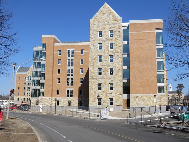
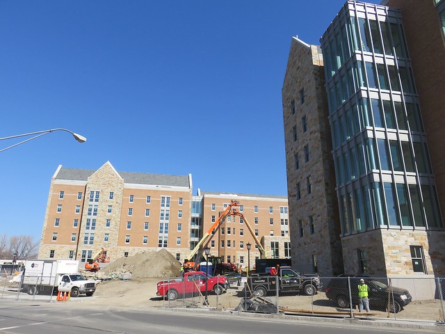
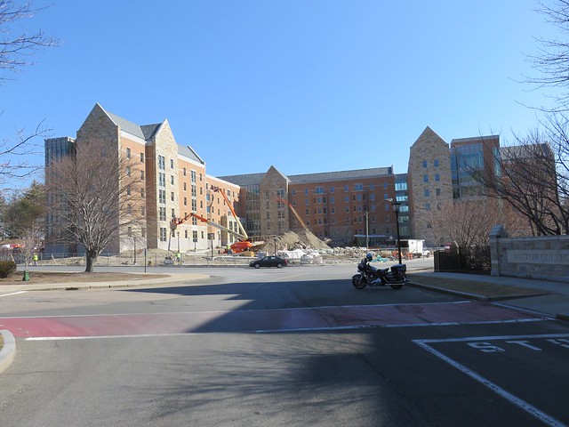
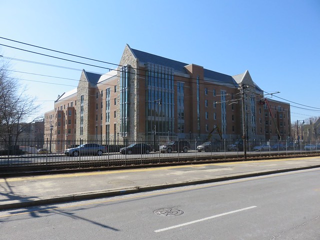
these are fair points. They really do a great job on their renovations. Maloney and Stokes and the new dorm pictured a few posts back, though fine looking, all strike me as too safe and too conformist. The daring is gone. Whether it's really because of O'Neil or not, I don't know. I'd like to see them push the envelope a bit. But if they don't, and end up with lots of "ehhhh", well, that will not be a tragedy.

[/Damnation with faint praise.]
 
I think it is great that they are trying to create some overall conformity to their original collegiate gothic style. It works. It is a good architectural style for a University.

Dorms shouldn't stand out architecturally. You want the iconic buildings to be the visually important structures on campus. The tower of Gasson Hall, the libraries and classroom buildings, the chapel/church.

In terms of O'Neill Library I think now that O'Neill plaza doesn't look like a mini version of Government Center Plaza that it really does also work. Mostly because it makes an otherwise very large building less obtrusive and now it doesn't have a sea of red brick making a stark contrast with the facade.

In terms of lower campus I would like to see a bit less brick and more stone. A stone facade can make any building look like it has been there for a thousand years.

The mods are one of the next big undertaking...financially and psychologically considering how many seniors have fond (if fuzzy) memories of them. If you could replace the mods with smaller scale senior housing that was arranged around grassy quads in the tradition of some place like Oxford (or an Irish Village style to pay homage to the University's immigrant roots) then I think you would get a similar intimate effect like that which made the mods popular:

oxford646.jpg
 
too safe and too conformist. The daring is gone. Whether it's really because of O'Neil or not, I don't know. I'd like to see them push the envelope a bit. But if they don't, and end up with lots of "ehhhh", well, that will not be a tragedy.

Yes, yes, of course. I'll give up my apologia but I do have to note that, for what it's worth, BC architecture has been grounded in nostolgia from the beginning. Gasson Hall was completed in 1913, the same year as NYC's Woolworth Building. So it's fake gothic from the get-go. It's even late for gothic revival! The Disney comment is fair. :) The buildings are intended to evoke another place and time—to "feel" old.

I do believe this move toward doing facsimiles of the original architecture is being driven in part by the students and alumni who grew up with all the reactionary modernist architecture from the 60s-80s and see how badly it has aged. If you're going to build something new, they say, just make it blend in so we aren't distracted from the marquis buildings. Case-in-point, the new addition to Harvard's Winthrop House backing down from a modernish first draft: http://news.harvard.edu/gazette/story/2015/11/an-update-for-winthrop-house-renewal/
 
Even with "vines" you need good architecture underneath. Vines are the 'garnish', if you will, but architecture is the 'meal'!

To those who would denigrate BC for adopting a 'Disney-like', neo-gothic theme, you would have to include many, many other colleges and universities guilty of that -- some, in fact some of our most esteemed, have even modeled their signature tower buildings after Gasson Hall.

This is an entirely true observation. And, as one who is disappointed by BC's recent architectural timidity, I admit that within the context of what they seem to be aiming for, they nail it pretty well. I don't think they're being incompetent at all with some of these new dorms. They are very competently creating just what they want. It's just that what they want is, for my humble opinion, overly timid and "meh". Gasson is not at all meh, even if it was itself, as noted above by kjdonovan, an act of nostalgia in its day.

So I'm not aiming to denigrate BC, I'm more in the range of mildly disappointed. I'll get over it.
 
Nice pics, BeeLine

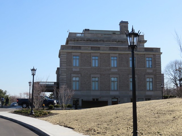
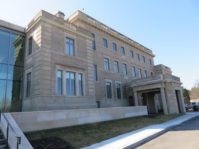
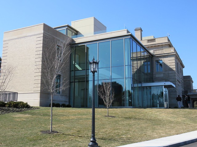
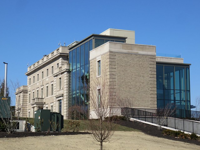
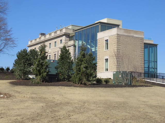
In the discussion on BC's architectural tendencies, I had completely forgotten this addition / rehab of the former archdiocesan residence. This one DID break the mold, using modern materials for the addition. I had forgotten all about it before, as I am almost always approaching campus from the other side.


We had heard for a long time that the McMullen Museum was being relocated to this building, but I see nothing on the McMullen's web site to indicate that's still true.
 
Cardinal Law's former residence? Seems to be surrounded by lots of open space. Room for building future dorms perhaps?
 
Cardinal Law's former residence? Seems to be surrounded by lots of open space. Room for building future dorms perhaps?

It is a bit out of date in terms of what exactly has gotten built, but the master planning had called for about 500 students to live on the Brighton Campus:

2008-06-23-map.jpg
 
West - I am disappointed, too, in the details of how they are building students residences -- and also in the massive scaling! -- which is really the antithesis of the humanist ideal. And, for a college that promotes and identifies itself with the 'humanities' (let's hear it for Stokes Hall!) it is not only disappointing but baffling as well.

I just wonder how far the monies spent on the new residence hall would have gone had BC used a more 'human-friendly' design...
 
Even with "vines" you need good architecture underneath. Vines are the 'garnish', if you will, but architecture is the 'meal'!

To those who would denigrate BC for adopting a 'Disney-like', neo-gothic theme, you would have to include many, many other colleges and universities guilty of that -- some, in fact some of our most esteemed, have even modeled their signature tower buildings after Gasson Hall.

Doing something that even comes a little close to true Collegiate Gothic is impossibly expensive to do. Look at Higgens Hall renovations. It is a terribly expensive facade just to look a little bit like Collegiate Gothic.

These schools are simply expressing their values through this work. They cannot spend the kind of money it takes for a museum quality replica of true Gothic. To do so would undercut their true mission - make money buy providing a educational experience. The architecture is part of that, but it is less valued by their "customers" than in the past. Their customers (parents and teachers) are more interested these days in modest architecture that performs well, is comfortable and does not suck resources away from other more valued program on the campus.

BC should not be blamed for expressing their values through their architecture.

cca
 

Back
Top