You are using an out of date browser. It may not display this or other websites correctly.
You should upgrade or use an alternative browser.
You should upgrade or use an alternative browser.
Brigham Building for the Future | LMA | Fenway
- Thread starter jambergenbos
- Start date
- Joined
- Jan 7, 2012
- Messages
- 14,072
- Reaction score
- 22,813
- Joined
- Jan 7, 2012
- Messages
- 14,072
- Reaction score
- 22,813
- Joined
- Jan 7, 2012
- Messages
- 14,072
- Reaction score
- 22,813
cca
Senior Member
- Joined
- Aug 19, 2008
- Messages
- 1,408
- Reaction score
- 12
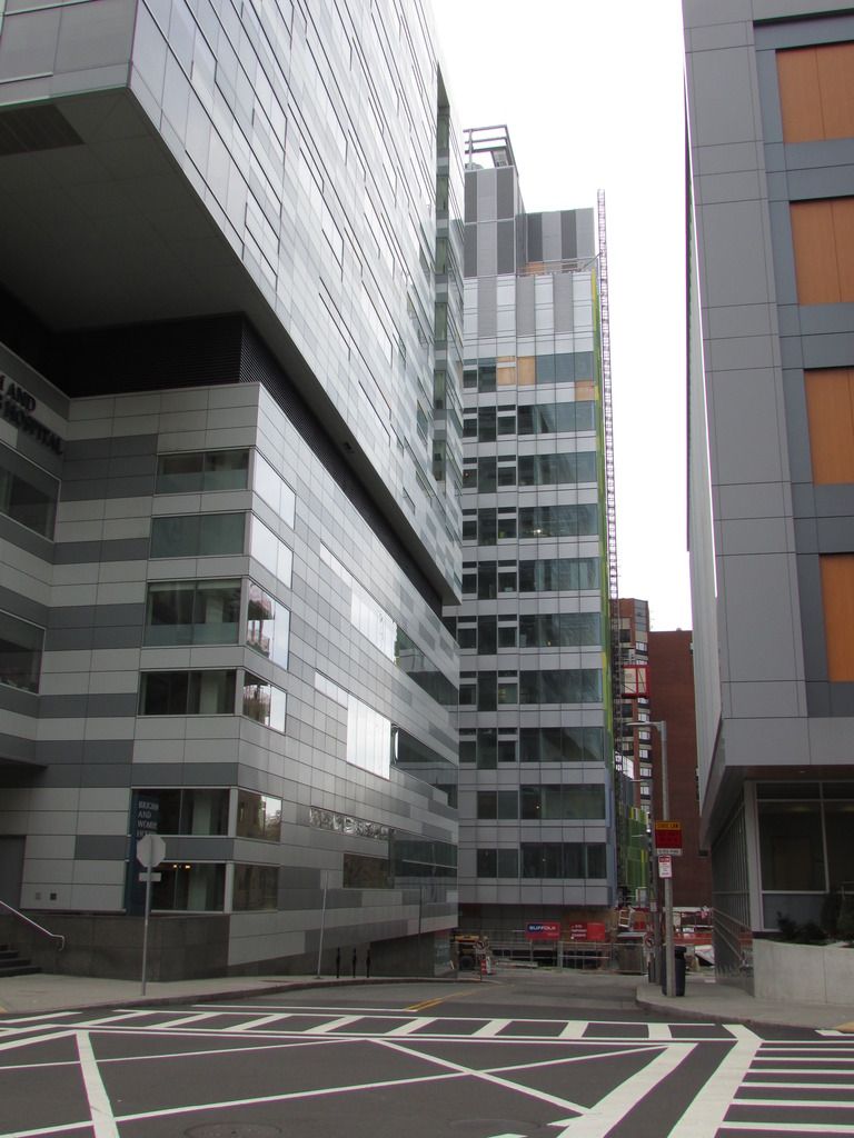
I will go out on a limb and say that this has turned out to be an awkward mess. There are a whole host of micro design solutions pasted next to each other and in no way speaks either to the context nor to itself in any meaningful way.
Other opinions?
cca
Other opinions?
cca
citylover94
Senior Member
- Joined
- Oct 27, 2012
- Messages
- 1,140
- Reaction score
- 58
I would agree overall. The main issue is the differing fins on each face. I think if they had chosen one style and maybe not used it on the whole building instead of having so any different styles of fins.
My solution would be to leave the colored fins and remove the other ones and have that random clear glass box section at the base match the glass in the connector that it is attached to.
My solution would be to leave the colored fins and remove the other ones and have that random clear glass box section at the base match the glass in the connector that it is attached to.
DigitalSciGuy
Active Member
- Joined
- Apr 14, 2013
- Messages
- 670
- Reaction score
- 421
I'd agree. I don't know how to articulate my design critique beyond: it looks like an attempt at designed chaos; like lipstick on a generic office design pig.
It's a very uncomfortable building to look at and I honestly don't know how you arrive at a design like this and say 'yeah, let's spend millions building that.'
It's a very uncomfortable building to look at and I honestly don't know how you arrive at a design like this and say 'yeah, let's spend millions building that.'
cca
Senior Member
- Joined
- Aug 19, 2008
- Messages
- 1,408
- Reaction score
- 12
I'd agree. I don't know how to articulate my design critique beyond: it looks like an attempt at designed chaos; like lipstick on a generic office design pig.
It's a very uncomfortable building to look at and I honestly don't know how you arrive at a design like this and say 'yeah, let's spend millions building that.'
Its probably based on good problem solving. But without architectural rigor it tends to look like a building designed by spreadsheet.
cca
I will go out on a limb and say that this has turned out to be an awkward mess. There are a whole host of micro design solutions pasted next to each other and in no way speaks either to the context nor to itself in any meaningful way.
Other opinions?
"Looming behemoth" is how I'd describe it. Remains to be seen how the street level will work out.
- Joined
- Jan 7, 2012
- Messages
- 14,072
- Reaction score
- 22,813
 https://flic.kr/p/JDBULd
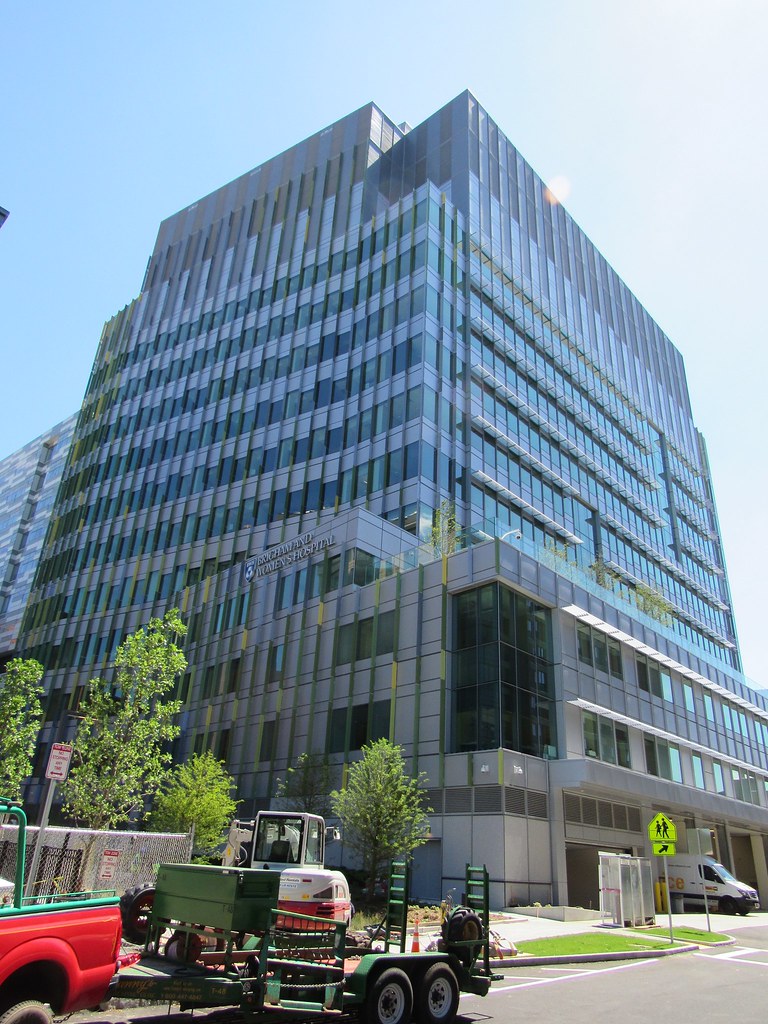
Talked to one of the medical people during their smoke break and he said the official move in / open date will be September, but as you can see furniture a other stuff can be seen through the windows. Landscaping is almost done.
 https://flic.kr/p/JXyuHn
 https://flic.kr/p/JXypUe
 https://flic.kr/p/JDCF9G
- Joined
- Jan 7, 2012
- Messages
- 14,072
- Reaction score
- 22,813
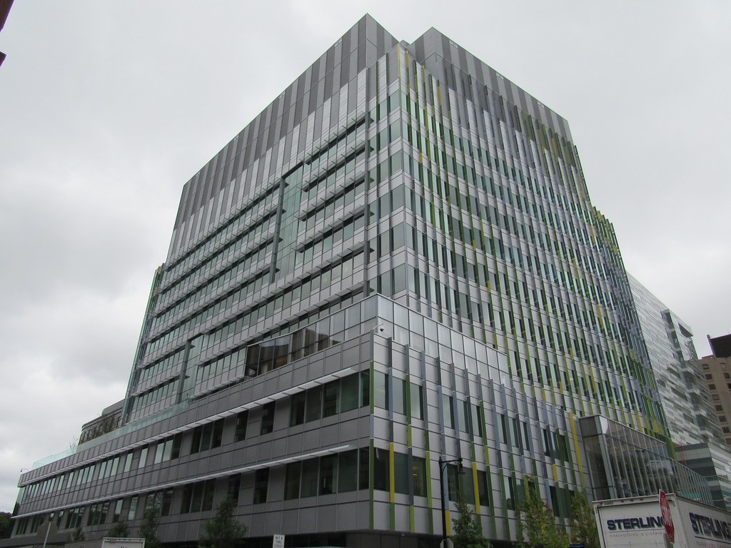
A lot of people have already moved into this building. According to todays BBJ the official opening will be Monday the 3rd.
 https://flic.kr/p/MyaZcN
 https://flic.kr/p/MARmRt
 https://flic.kr/p/LLRdpZ
 https://flic.kr/p/LLR9FX
 https://flic.kr/p/MyaLLW
Mod, I think we ca call this one completed.
 https://flic.kr/p/MyaZcN
 https://flic.kr/p/MARmRt
 https://flic.kr/p/LLRdpZ
 https://flic.kr/p/LLR9FX
 https://flic.kr/p/MyaLLW
Mod, I think we ca call this one completed.
Last edited:
- Joined
- Jan 7, 2012
- Messages
- 14,072
- Reaction score
- 22,813
Mod, this project is officially open per the local news papers. Construction Completed.
 https://flic.kr/p/NFRusx
 https://flic.kr/p/MRvEQB
 https://flic.kr/p/Nn6oMQ
 https://flic.kr/p/NFRusx
 https://flic.kr/p/MRvEQB
 https://flic.kr/p/Nn6oMQ
They did an excellent job with this building - very handsome. I wasn't a fan of the new Shapiro building but this one complements Shapiro and they look good together. Street level is typical sterile medical institution, but overall, nice work here.

