Brookline Infill and Small Developments

That first one looks like crap but the second is very nice.

when you see them in person the reverse is true.

anything but a staples would have been better in the second bldg. there is one at fenway and one at harvard/comm ave, why one here?
 
That building at Beacon and Charles looks MUCH better than the gas station that was there before!
 
The building that replaced the gas station is actually not so bad in person. And it's going to have a funky gym in it, so the design (once finished and dressed up) is a nice change for that part of town.

The other little annex to the Trader Joe's building is really innocuous, you'd walk by it and never know it wasn't part of the original design. I'm curious what people think about the angled store-front though... I know we have people here with very strong opinions about street walls.

The worst part of that whole block is that there is an abortion clinic, and on Sundays it fills with anti-abortion crazies, and pro-abortion crazies and they work together to make that block "uninviting".
 
Last edited:
I too like the larger (Staples) building, as it gets along well with its elder neighbors without reverting to any sort of historicism. Plus, I think it looks real sharp, be it in photos or in person.

As for the little angled store front, it's of such a small scale that any adverse effects that design might have are pretty much null and void, and not to mention that the sidewalk there isn't terribly wide to begin with. Plus, to have built it out to the lot line would've required them to rebuild the entrance to the upstairs offices (the "1309" seen to the right of the addition).
 
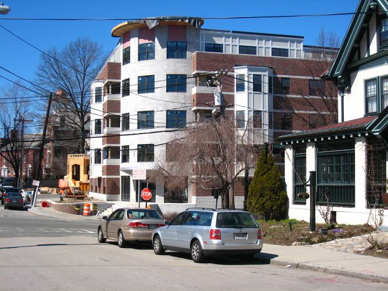
This little project is at the northwest corner of Sewall and Saint Paul streets. And although the scrim is blocking it, most of the brick exterior is done (and it looks good).

img1020yy6.jpg


img1019pt0.jpg


img1033jc2.jpg
 
2/08.. Saint Paul Arms.. the scrim came down

img1214bd9.jpg


img1215hr8.jpg


..and the Staples building

img1216mn0.jpg
 
It might have been too expensive, given the curve and the grade. Traditional buildings would have an entrance here with steps, but that would have made it more difficult to comply with ADA nowadays.
 
The new CVS and Boston Sports Club in Davis Square manage to put their entrances at the street corners.
 
It's the slope that makes it hard to accommodate wheelchairs (all that space given over to ramp).
 
You also have to consider the location. The focus in Coolidge Corner is the intersection of Beacon and Harvard. That corner of the building is furthest away from that intersection, and that intersection is where the bulk of the foot traffic will come from.
 
You also have to consider the location. The focus in Coolidge Corner is the intersection of Beacon and Harvard. That corner of the building is furthest away from that intersection, and that intersection is where the bulk of the foot traffic will come from.

you are exactly right. that corner is facing the outskirts of coolidge corner. The entrance is located closer to the Coolidge Corner T stop.
 
Saint Paul Arms, at the corner of Saint Paul and Sewall Streets, 3/15

img2450qp0.jpg
 
Both classic and sleek. Not bad at all.
 
I like it too, but the bays and "penthouse" look kinda cheap. Copper, zinc, or even clapboard cladding would have looked better.
 
Here's another pic from yesterday. It's nice, but the brick/stone scheme is weird: the stone looks like it belongs on the Harvard Med campus, while the brick (red/black) reminds me of an early-1980s Amtrak station. It's a strange matchup.

img2926db1.jpg
 

Back
Top