- Joined
- Jan 7, 2012
- Messages
- 14,172
- Reaction score
- 23,677
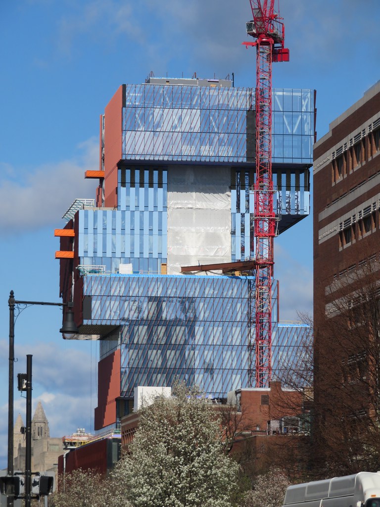
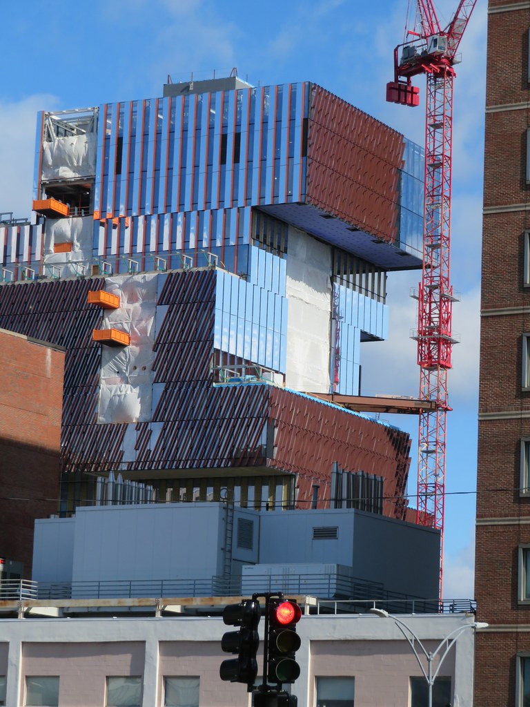
 IMG_5828 by Bos Beeline, on Flickr
 IMG_5826 by Bos Beeline, on Flickr
 IMG_5833 by Bos Beeline, on Flickr
 IMG_5849 by Bos Beeline, on Flickr
 IMG_5828 by Bos Beeline, on Flickr
 IMG_5826 by Bos Beeline, on Flickr
 IMG_5833 by Bos Beeline, on Flickr
 IMG_5849 by Bos Beeline, on Flickr
Finally someone wrote what I was thinking, only I couldn't articulate it as well as Beantropolis. I was beginning to cheer the building on as the stacks grew, until the facades went on. I thought, okay, maybe this is limited to a story or two....but no.In my opinion, the designers of this building committed huge blunders by 1.) incorporating so many different exterior finishes onto this facade and 2.) treating the building's exterior as a collection of two-dimensional planes rather than three-dimensional volumes. The whole precariously-stacked-boxes effect is ruined because each side of each box has a different finish, so it no longer even reads as a cohesive 3D object. What we're left with, visually, is a busy mess of a building.
Deliberate ugliness would seem to be what the architects of this building were striving for, and they certainly succeeded. Not to wax too philosophical here, but this trend of deliberate ugliness, IMO, comes from a loss of hope and a despair over the decline of civilization. At least that's the statement this awful building conveys.In my opinion, the designers of this building committed huge blunders by 1.) incorporating so many different exterior finishes onto this facade and 2.) treating the building's exterior as a collection of two-dimensional planes rather than three-dimensional volumes. The whole precariously-stacked-boxes effect is ruined because each side of each box has a different finish, so it no longer even reads as a cohesive 3D object. What we're left with, visually, is a busy mess of a building.
I like this building.
