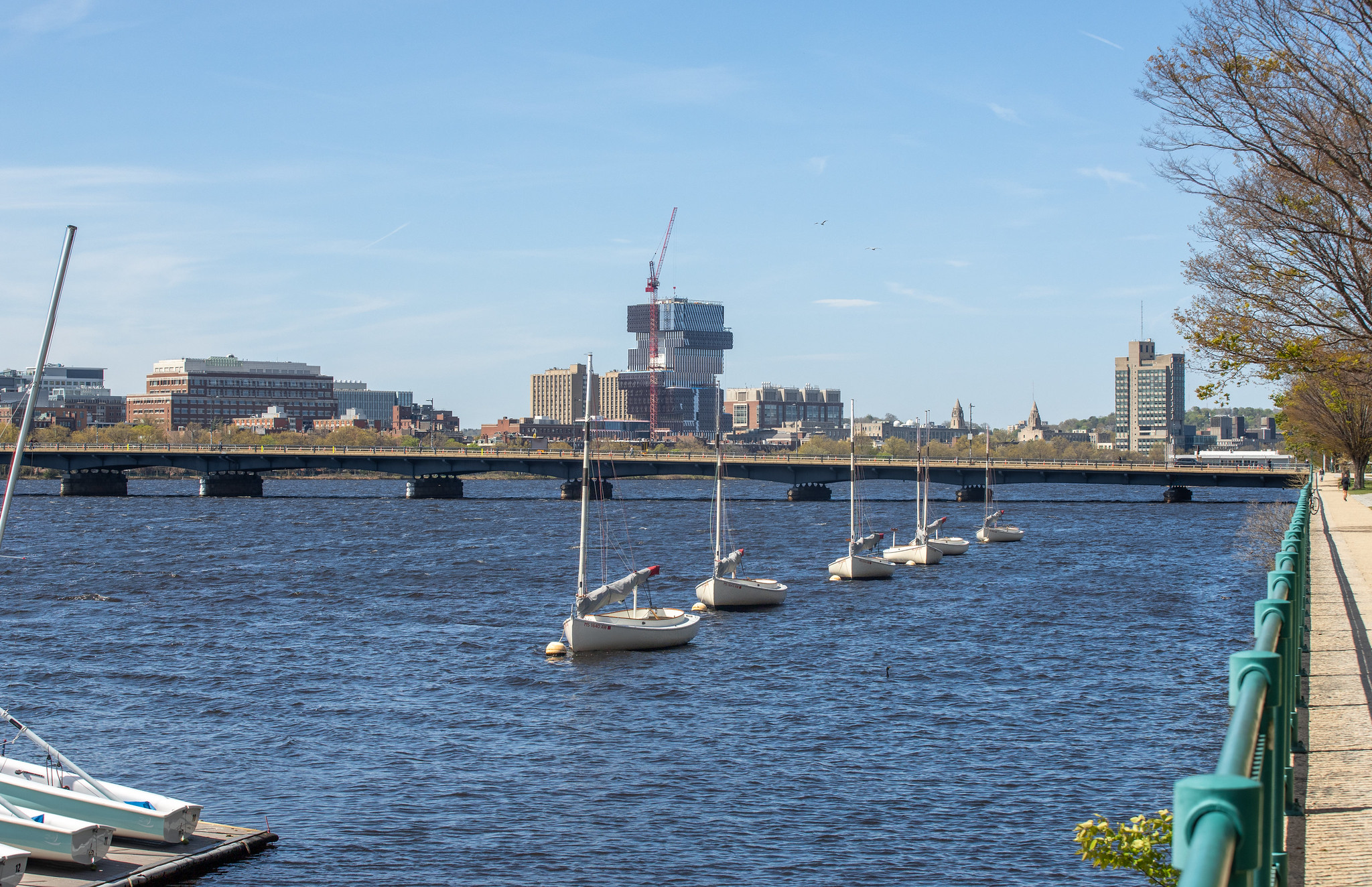
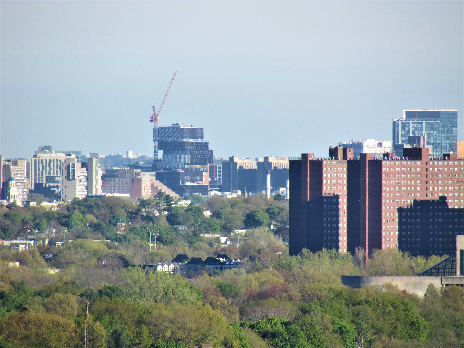
I like this building.
Deliberate ugliness is a long-standing BU tradition: the cement Gothic block, the Sert complex, Warren Towers etc. It is rare to see such a continuity of (bad) design in one area.Deliberate ugliness would seem to be what the architects of this building were striving for, and they certainly succeeded. Not to wax too philosophical here, but this trend of deliberate ugliness, IMO, comes from a loss of hope and a despair over the decline of civilization. At least that's the statement this awful building conveys.
This building walks a fine line between being ugly or being exciting, eliciting either strong love or strong hate, or maybe even both feelings simultaneously. I can see the exciting and innovative piece of this, the admiration for something different and bold. I get that. I just think it goes a bit too far that way.
Boston City Hall was daring when constructed. It was loved then and now it is maligned.more than half the city hated JHT when it went up. while i wouldn't put this on par with that development in terms of design excellence, i think the haters will come around in similar fashion. it's a weird thing to observe here on aB -- much of the board bitches about boston's conservative, staid, take-no-chances architecture, but whenever some proposal (or, more rarely, actual construction) actually does take chances, then it's time to clutch the 'ol pearls and take shots at anything that dares to be more than anonymous and unassuming.
I think we can all agree that we wouldn't want a city-defining building on par with the Hancock or Pru to look like this. At 700'+ it would be the most hated structure in New England. At ~300' (about 80th tallest) it can be both appreciated while simultaneously mostly ignored. It's a cool oddity for its location and has a couple strong angles in the skyline, but is otherwise "off to the side" so to speak.
Honestly, I think it's the perfect height and type of location (secondary/tertiary neighborhood skylines) where I'd like to see more bold out-of-the-box designs. I'd rather go safer and classier at the top level, but go down a few rungs and let's get weird with it! This is a good addition and would go really well with that Kenmore "drippy" hotel if that one ever gets built.
Love it or hate it — it’s here to stay.
Exactly!This would have been my hands down favorite building in the Seaport.
Here? Ehhhhhh.....