Bulfinch Crossing | Congress Street Garage | West End

Re: Congress St Garage is being sold.

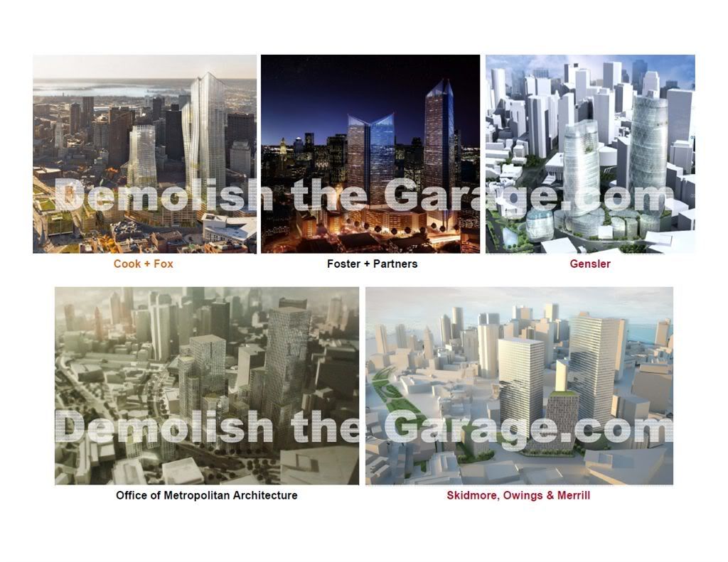
Are all these towers the same 52 and 42 stories or whatever it was?

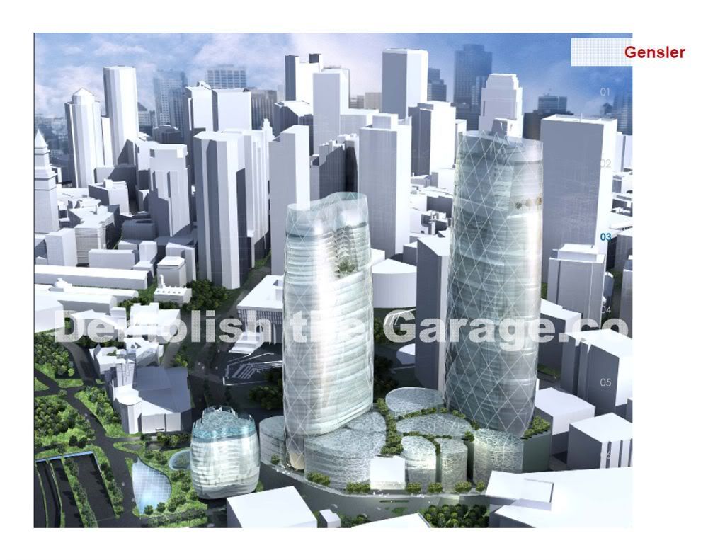
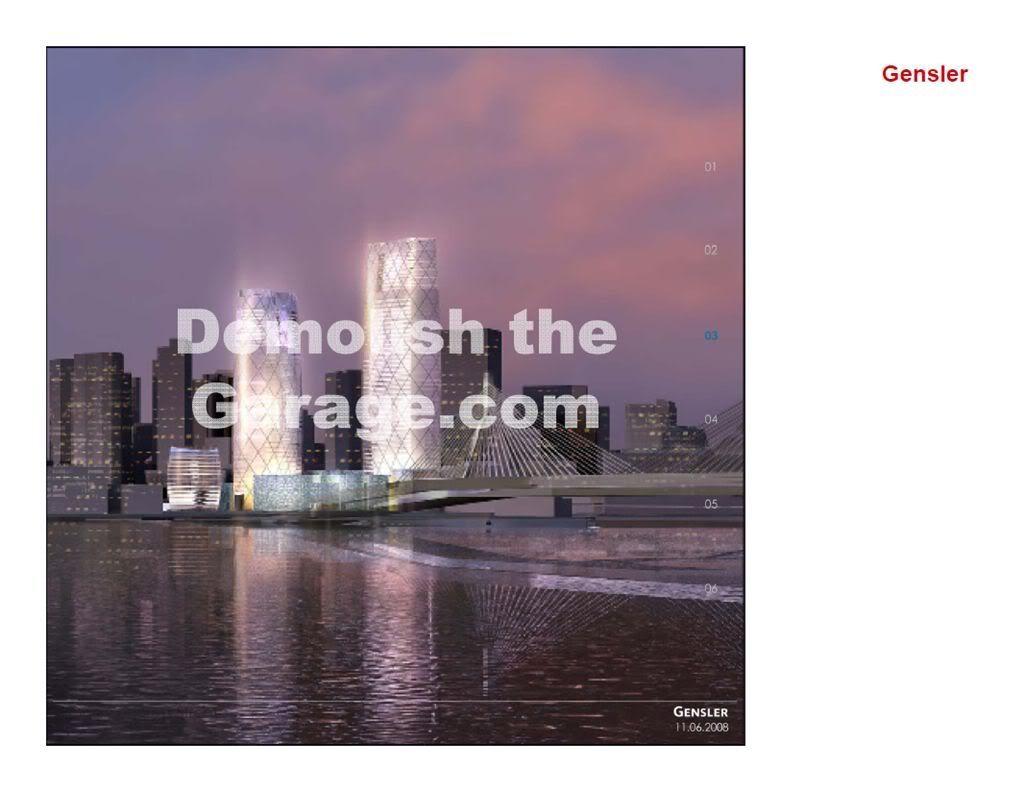
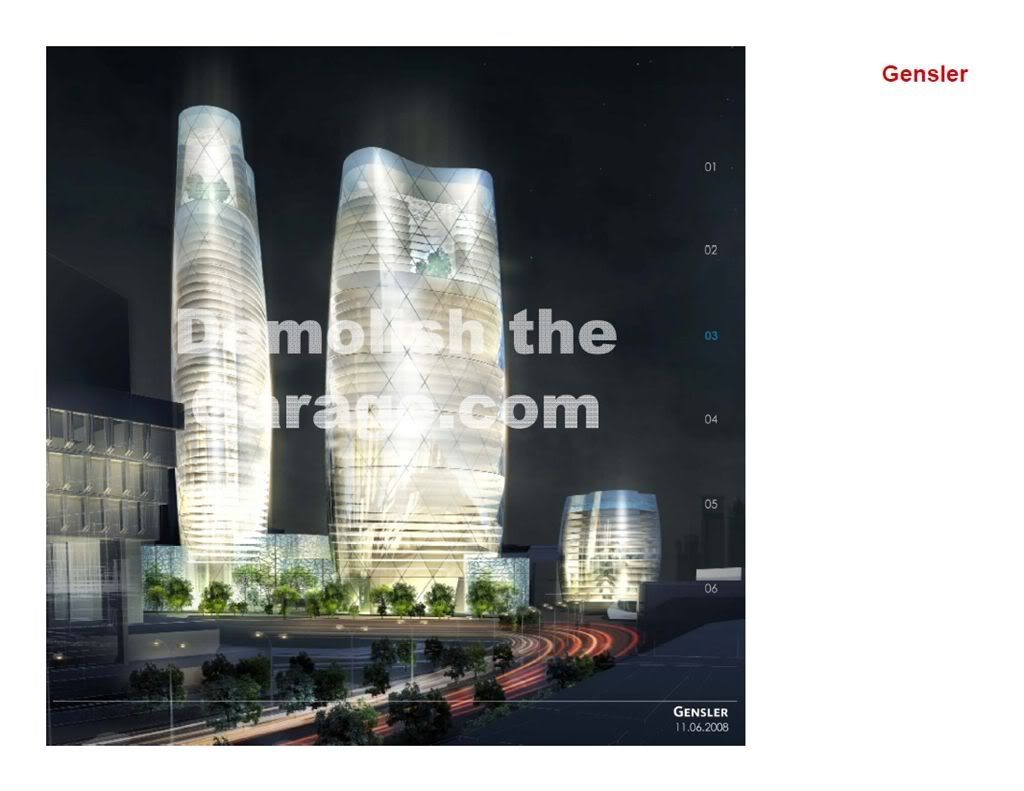
or do the different proposals vary in height. The gensler one looks really short compared to some of the others.
 
Re: Congress St Garage is being sold.

This thread needs a name change.
 
Re: Congress St Garage is being sold.

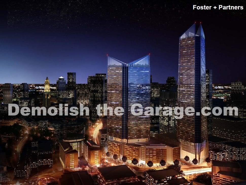
Beton, was the shorter of the Foster towers fat all around? Or was it thinner when viewed from other angles.

Both towers have the same basic footprint, offset by 90 degrees.

I would love to see some visuals. Does anyone have handouts from the meetings they can post?

The project team didn't seem interested in presenting the plans and renderings to the public via the web. I found this odd, because they do seem very interested in hearing the thought and ideas from groups just like the active posters on this board.

I did not see any hand-outs at the meeting, other than prints of the .pdfs available at the project's website.

Could someone (other than myself -- they've actually met me) email the project and ask that they post a proper set of renderings and site-plans.
 
Re: Congress St Garage is being sold.

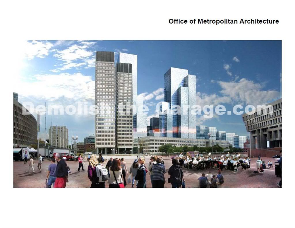
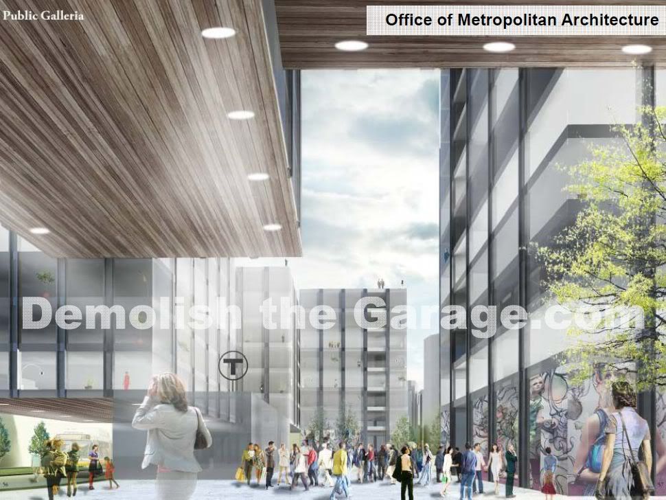
Congratulations, ablarc! You got me to go back and look at the OMA/Koolhaas scheme again. I agree that there are some interesting ideas in it (he's an idea guy, really, more than a craftsman like Piano), but the feel is not humane. It's cold, like a piece of the Borg cube. The details, materials, and grammar will make or break this design, and I didn't see any specifics in the presentation materials.


I did make passing mention of this here. I chose to leave it out of my initial post because I wanted pure reactions to the five schemes as is.

So what do people think? Could any of these be combined in a way that would work urbanistically, and as a "complete" design?

Since Beton Brut posed the question, I was thinking that the taller Koolhaas tower would look good incorporated with the two smaller Foster buildings. I like the traditional base of the Foster tower and think it would fuse nicely with the Koolhaas design, sort of a blend/battle between traditional and modern.
 
Re: Gov't Center Garage Redevelopment

I don't think it worked...

...my bad, I just never refreshed the page.
 
Re: Gov't Center Garage Redevelopment

53 State/ exchange place is integrated new and old very well. You only notice the new building if you walk further down congress or kilby.

The lobby is currently undergoing renovations, seems to look a little better now.
 
Re: Gov't Center Garage Redevelopment

I think I change my mind, I think the unofficial first renderings are the best proposal.
 
Re: Gov't Center Garage Redevelopment

^^^ I'm with you brother! Although we all jugde the Boston skyline so critically (because we love it, and we love this city more than anything), it's exactly what this city needs.
 
Re: Gov't Center Garage Redevelopment

I may be parroting parts of other posts behind me.

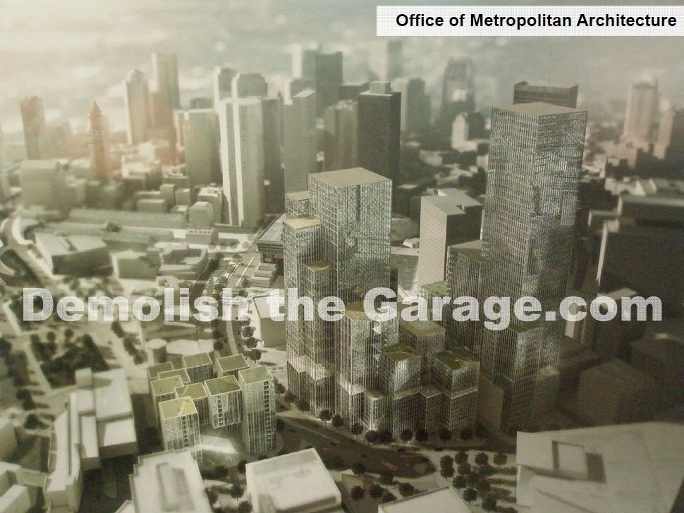
Personally, I don't care if they build 'too tall' here--30, 50, 70 stories makes little difference. I don't even want a unified design--essentially, that's what all these proposals do. However, (biiiig however), I most want to see a smaller street grid returned. OMA and Gensler seem to be the only two heading in that direction.

I want a combination of Foster's and Gensler's towers with OMA's seemingly tighter and smaller street grid, overall footprint and density, although Gensler's footprint and density looks good, too. (Huh??!! I know what I mean.) I think multiple architects, and breaking the site into three distinct parts for each of them is a good idea and would alleviate the 'planned, gargantuan complex' feel that all of these are. (Well, it IS a planned, gargantuan complex.)

Then, I want to take Cook's towers and use them, modified for the location(s), in Winthrop Square. In doing this, I don't want to see the BCBS/Rudolph Building demolished! (Look at Cook's again and think about this.)

Oh, also, the form of the tower portion of 53 State Street--a great building. The lobby, sadly, is not. That's what makes this facadectomy so jarring. Basically, the connection between the two buildings could have been handled better, but the grand lobby accentuates the 'mistakes.'
 
Last edited:
Re: Gov't Center Garage Redevelopment

I still think the Cook & Fox is the best but now I like the Foster one more.
 
Re: Gov't Center Garage Redevelopment

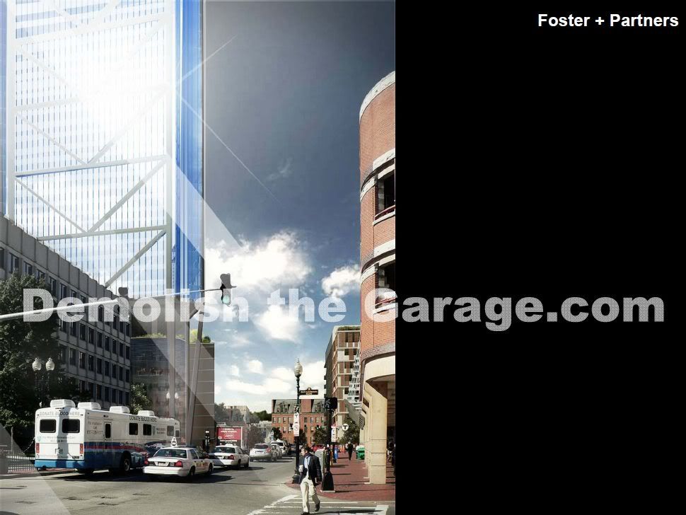
Cook & Fox is appealing more to me, but I just don't like the larger tower (too derivative). The triangular approach of the larger tower in Foster certainly is new, but the base's interaction with the street is just ... eww. I really don't like Foster's left most building either (cook's split design is better).

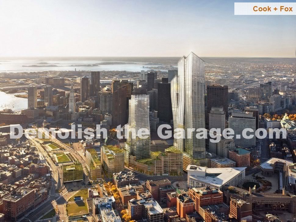
Does anyone know the the building over the greenway in Cook's is supposed to be?
 
Re: Gov't Center Garage Redevelopment

The cook base of the tall tower looks like a parking garage

The presentation definitely started off strong and then turned to ew...
 
Re: Gov't Center Garage Redevelopment

Spent a while cropping screenshots...here are the results! :D

Overview of all designs:

overview.jpg


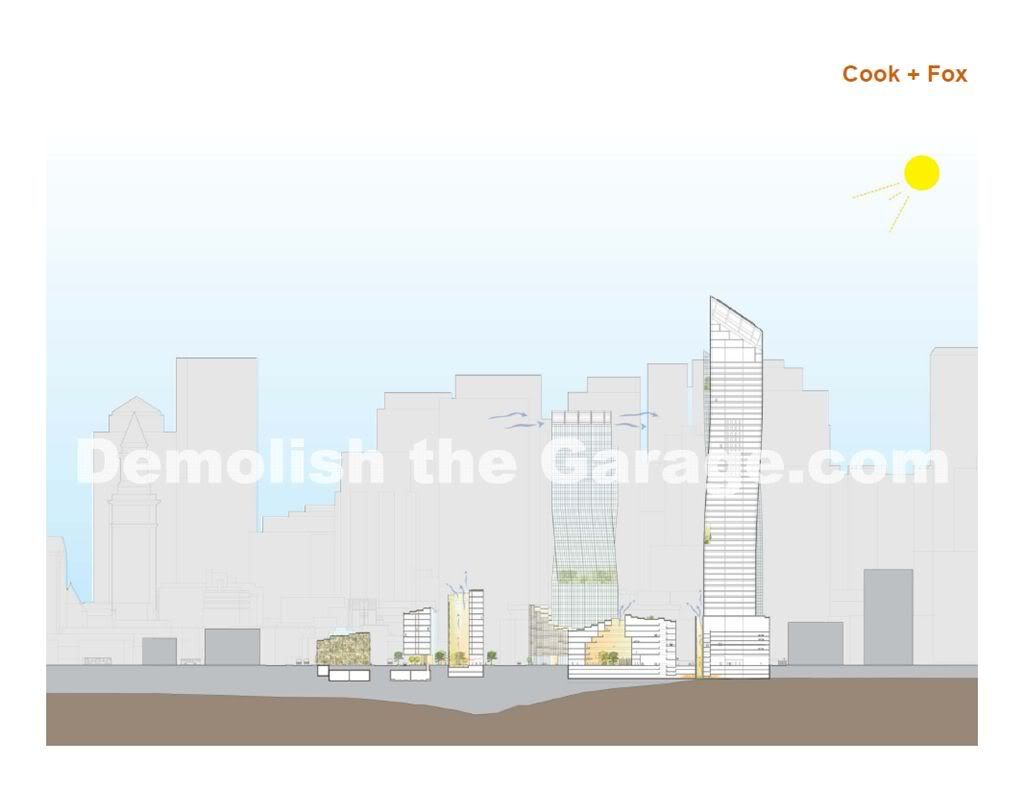
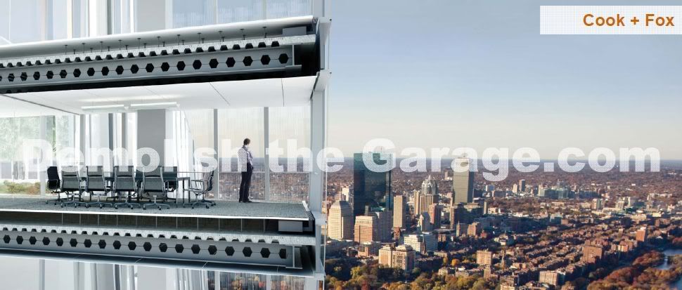
Cook + Fox:

cookandfox.jpg


cookandfox2.jpg


cookandfox3.jpg


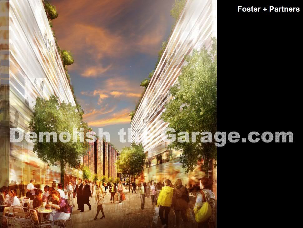
Foster + Partners:

foster.jpg


foster2.jpg


foster3.jpg


Gensler:

gensler.jpg


gensler2.jpg


gensler3.jpg


Office of Metropolitan Architecture:

oma.jpg


oma2.jpg


oma3.jpg


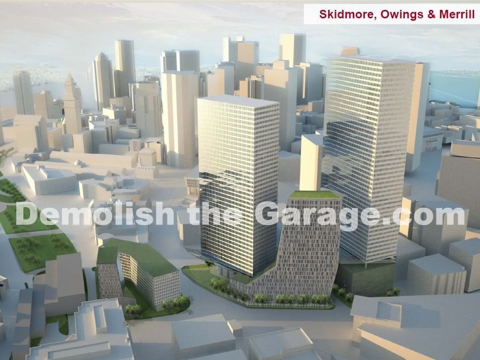
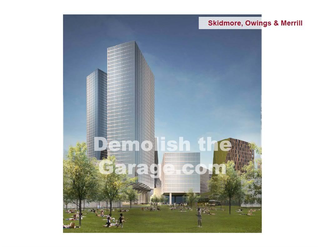
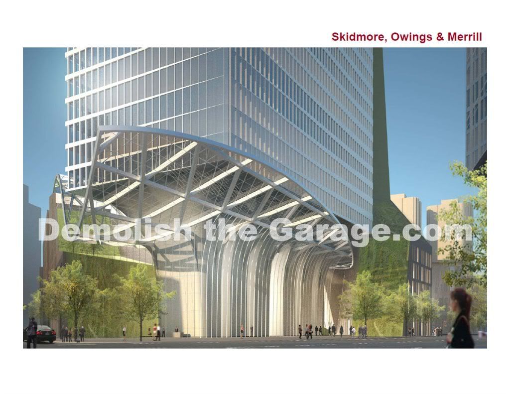
Skidmore, Owings & Merrill:

som.jpg


som2.jpg


som3.jpg
 
Re: Gov't Center Garage Redevelopment

It's nice to see SOM completely ignore the street level.
 
Re: Gov't Center Garage Redevelopment

The SOM kinda reminds me of the Empire State Plaza. Do we really need a second Government Center? Did we need the first one? No.
 
Re: Gov't Center Garage Redevelopment

The new renderings made me hate SOM and OMA even more. The bottom of SOM has an interesting design I admit but it kills the street level. For OMA, there are so many cubes that I can't even count them all.
 
Re: Gov't Center Garage Redevelopment

It's still tough to get a read on Cook + Fox's proposal...

I still like Foster's but not as much as I once did....the buildings might be too harsh for the location.

If Gensler's design incorporates some sort of lighting or color motif for the building's envelope like the Agbar or the Swiss Re using lit and or colored panels....I think it would run away with the best design of the 3 in terms of fitting into the location...counter balancing Government Center and also providing the best vista view out of all the designs, night or day.

It seems it would also be the easiest building to cut floors from if that became necessary in the City approval process.


SMO and OMA are still blech....both firms obviously made the error in coming up with a design that would act as an extension of Government Center.
 

Back
Top