Bulfinch Triangle Infill & Small Projects

KentXie

Senior Member
Joined
May 25, 2006
Messages
4,189
Reaction score
750
Turnpike Authority picks developer for Bulfinch site

May 31, 2006


The Massachusetts Turnpike Authority said it has designated Boston Development Group to develop a 34,900- square-foot site in Bulfinch Triangle near North Station. Boston Development is proposing to build 63 units of housing, 136,000 square feet of office space, and 22,000 square feet of ground-floor retail near Causeway Street and Valenti Way . The site was one of four included in a request for proposals issued by the Turnpike Authority last year and is the third to have a designated developer. (Chris Reidy)
 
WOHOO!! 63 Units! The housing shortage is over boys and girls, we can all celebrate.
 
vanshnookenraggen said:
WOHOO!! 63 Units! The housing shortage is over boys and girls, we can all celebrate.
You sound like my normally cynical self. But note that this is but one parcel of three going out to bid. And combine this with the residential planned for the North Station towers, and North Point across the river, and there will soon be thousands of new residences in that general vicinity. Now, it may be that all those projects taken together won't make a real dent in the housing shortage, but it's a legitimate start, no?
 
They are all luxury. That isn't a dent, thats a polish.

I know I'm being cynical but this is good news.
 
They're all luxury because the city's bracing for an invasion of retiring baby boomers, who, without these units, would either be driving up housing prices elsewhere around town or taking their selves and their tax dollars to Florida or something, or just staying in the burbs. Also, these things fluctuate. The South End was posh until Back Bay was built, and now it's posh again. Maybe Bulfinch will be working class someday too. But the better it sells, the easier it will be to get places like the Mission Flats area I'm working on built up. There's a real opportunity for affordable housing, in a good location, though not as good as Bulfinch. And I agree with chumbolly on the "death by a thousand cuts" approach to the housing shortage.
 
Avenir means future in French, so I guess the same is somewhat appropriate.
 
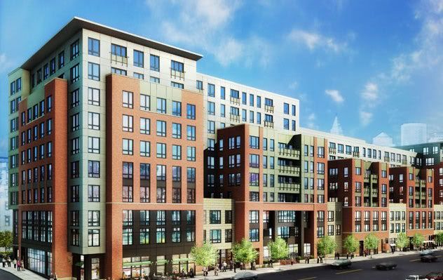
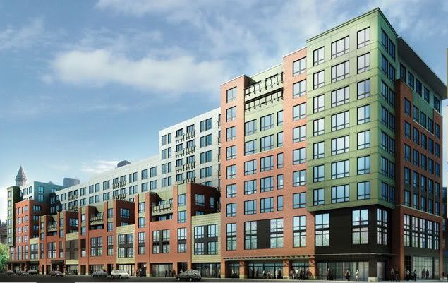
Its another big, bad, boring landscraper. Why did these parcels need to be so ridiculously big again?

bt2.jpg


bt1.jpg
 
Hmmm.....the structures look rather Soviet and monolithic.
 
Terrible massing. Bet the architect is proud as punch, though. Shows you how out of touch they can be.
 
Maybe I don't fully understand the concept of 'massing' but isn't the massing here very similar to the massing of the Mandarin Oriental, which everybody seems to love?

Granted, the materials and details of the M.O. are much nicer but the size and scale seem very similar to me. They both appear to be mega-block buildings.

06.jpg


bt2.jpg
 
I was thinking the same way. I think it looks really good if the rendering and the actual thing would look like that but I really hope they can do a mid-rise tower on top of it
 
When I saw the rendering, the first thing I thought was that it looked like the MO (size/shape wise.)

And its the Bulfinch Triangle, a tower wouldn't look right there. This is the right-sized development for there.
 
Also, I think there's some desire to preserve views of the Zakim Bridge from other parts of the city, and a tower here would block that.
 
It looks like the architects realize how superior a streetscape is when it is composed of many smaller facades, as it is in the existing BT, North End, Beacon Hill, Back Bay. So they tried to break up the structure into multiple sections. However, they only go halfway in this and still tried to provide some unity to the building. The result fails at both tasks in that it doesn't provide an interesting and variagated streetscape, but is too disjointed to hold together as an individual structure. From the look of it, I'd guess this was designed by ICON architecture. Am I right? They have risen to the top of my list of least-favorite architects. The stuff they did in East Boston is total crap when it had every chance of being terrific.
 
They did the Maverick Landing Hope VI redevelopment of the Maverick housing projects, and the related Carlton Wharf residential development across the street. Not a huge fan of Carlton, but I think Maverick Landing succeeds on a number of fronts--its without question a major improvement over what it replaced, it returns the historic street grid through what was previously a super block (and they've actually broken the block up even more with a new cross street), and the inclusion of park space is (for once) appropriate. The majority of the new structures are pastel colored row houses that are consistent with the surrounding neighborhood in that they are attached and by alternating colors they have varying facades. Not a huge fan of the pastels, but I think this project is my favorite housing project redevelopment (better than Orchard Gardens and the area behind Wentworth, in my opinion).
 
THe rendering isn't too too awful. It reminds me of some mill turned loft renovation.. kennedy biscuit comes to mind. As for the height, it could be 1-2 stories taller but it would look out of place if much more. This development is reminiscent of triology.
 

Back
Top