Cambridge Infill and Small Developments

I wonder what happened to these guys:

an incident last June when nine prisoners smashed and ripped apart the fire suppression system, causing massive flooding and forcing the evacuation of the jail

Maybe the state could award them (after an appropriate public bidding process) the demolition contract.
 
rt 2 Alewife
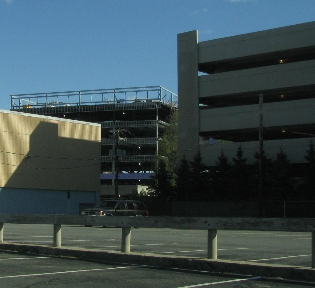
085.jpg
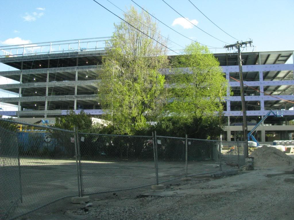
086.jpg
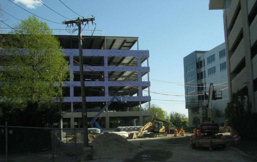
087.jpg
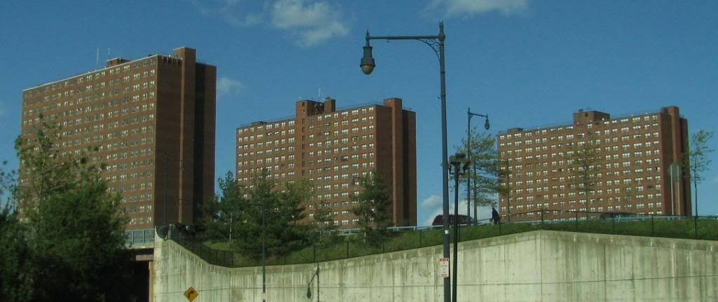
088.jpg
089.jpg
090.jpg
093.jpg
 
Updates:

1. The new hotel southeast of Harvard Square is nearly complete and hideous, painted an awful shade of grey and largely as unappealing as the triple decker it replaced. Unless the thing was rotting from termites, I don't even know why they bothered. Oh, there's a monstrous transformer box sitting out front like an after thought, too.

2. Down the street, at the intersection of Mass Ave. and Mt. Auburn, the remaining one story taxpayer is set to be replaced by a four story mixed use building. Crossing my fingers on that one...
 
Here's a rendering from the website of the Broadway and Columbia project:

pic-home.jpg


http://abodezonbroadway.com

I'm indifferent to it, though like the large street-level windows. I'm hoping there will be retail, though the rendering shows none. It's better than an abandoned gas station, and certainly one of the most modern-looking buildings in that vicinity.

Not sure if this has been reported, but while walking along Cambridge St. in Inman Square last night, I saw that the building with the old antiques store at the corner of Cambridge and Elm was demolished.
 
Updates:

1. The new hotel southeast of Harvard Square is nearly complete and hideous, painted an awful shade of grey and largely as unappealing as the triple decker it replaced. Unless the thing was rotting from termites, I don't even know why they bothered. Oh, there's a monstrous transformer box sitting out front like an after thought, too.

I second that. What were they thinking with that color?!?! When they were painting it, I was sure it was some kind of undercoat...because no one in their right mind would paint an entire building (at least in this particular spot, of that particular style) that color. But there you have it.
 
^^ Looks like a pocket amphitheatre. Maybe Vertex will hire a clown to make DNA strands out of balloons...
 
Hmm, lets use the same color for "Available" and "Under Construction". Dumb as graphic designer.
 
Leisure station?

Somehow the Hotel Veritas manages to look much worse in person than in this photo:

30700_421576349413_125522794413_5395528_6501492_n.jpg
 
Really? I think it looks pretty cool in that photo. That cornice is weak as hell but overall I think it fits in well.
 
Looks cheap. The addition looks like an addition. Try harder.
 
That's an ongoing debate. Should an addition to a historic building look like it was always there, or should it look distinctly different and modern? I can see both sides of this.
 
Isn't this a replica of the depressing green building that was there before? Walking by it, I always thought it was paltry. Now they've reproduced ir, paltriness and all.

Aside from the clean new surfaces, where's the progress?


(Oh, I know ... it's not an auto repair shop any more.}
 
That's an ongoing debate. Should an addition to a historic building look like it was always there, or should it look distinctly different and modern? I can see both sides of this.

The problem is, this addition fails either test.
 

Back
Top