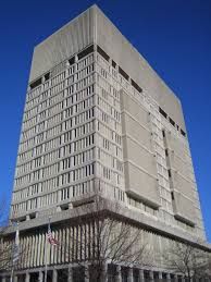
^My favorite project happening right now, there's so much potential for this area to develop and personally I love when buildings are close to bridges/highways like its neighbor, the EF building... makes it feel more dramatic or something
You are using an out of date browser. It may not display this or other websites correctly.
You should upgrade or use an alternative browser.
You should upgrade or use an alternative browser.
Cambridge Infill and Small Developments
- Thread starter kz1000ps
- Start date
bobthebuilder
Active Member
- Joined
- Oct 17, 2013
- Messages
- 434
- Reaction score
- 159
Some choice quotes in this one...
Cambridge courthouse project under fire, By Brock Parker, March 13, 2014
Full article at the link provided previously.
The opposition to this project is driving me nuts. It's not a building out in north Cambridge in the middle of a residential neighborhood. It's a prime location, that already has height. It is just blocks from lechemere (soon to be a few more blocks) ~6 blocks from kendall square, almost across the street from the galleria. It is not that far from other buildings of similar height in north point and Kendall. I think it's an area that could use a little density, and could support it fairly well. I just wish this project could be more residential than office, but I get that the floor plate doesn't really allow for that.
underground
Senior Member
- Joined
- Jun 20, 2007
- Messages
- 2,390
- Reaction score
- 3
Many worry about no longer being able to afford to live in the neighborhood.
Limiting supply in the face of skyrocketing demand will surely help.
fattony
Senior Member
- Joined
- Jan 28, 2013
- Messages
- 2,099
- Reaction score
- 482
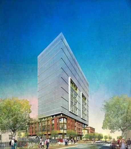
^ Why do architectural renderings always have "inverted" perspective? In real life, further away things (like the tops of buildings) look narrower, not wider. If they didn't make the top of the building bulge unrealistically it would look significantly less imposing. The photo above compared to the rendering make a stark contrast. The old concrete hulk looks svelt compared to the bizarre, fat, top-heavy inverted pyramid in the rendering.
Padre Mike
Active Member
- Joined
- Jan 27, 2007
- Messages
- 681
- Reaction score
- 1
^ Excellent point Fattony. I was born in E Cambridge and though the hulk seemed to intrude, it did so no more than the elderly housing up Cambridge St. near Warren St. built in a brutalist style. That end of the street is perfectly suitable for taller buildings since it had been an industrial zone mostly for decades.
There are two issues. The photograph appears to have a bit of barrel distortion (notice how the sides curve near where the base and tower meet).
The other issue is the way I believe it was rendered. It's a two point perspective, where the sides have a vanishing point but the vertical lines are parallel. This is what you would see in an interior, or views from very far away (look at a skyline shot of boston, the vertical lines are all parallel) Basically the difference is whether you are looking roughly straight ahead or craning your neck/lens up to see the full building. It took me for ever to replicate this, but here is what it appears they did.
The model was rendered from a point of view really far away in 2-point perspective:

Then, they cropped it to appear like you were standing very close, which makes it appear to bow out.

For comparison, here is a rendering from approx the same location in 3 point perspective, what you would usually use for an exterior.

(This looks a bit wonky because I didn't play around with the field of view, but you get the point)
Now why they did this, I have no idea. If it was being physically drawn it would make sense, since 2 points are easier to keep track of. But to do it digitally took me for ever.
The other issue is the way I believe it was rendered. It's a two point perspective, where the sides have a vanishing point but the vertical lines are parallel. This is what you would see in an interior, or views from very far away (look at a skyline shot of boston, the vertical lines are all parallel) Basically the difference is whether you are looking roughly straight ahead or craning your neck/lens up to see the full building. It took me for ever to replicate this, but here is what it appears they did.
The model was rendered from a point of view really far away in 2-point perspective:
Then, they cropped it to appear like you were standing very close, which makes it appear to bow out.
For comparison, here is a rendering from approx the same location in 3 point perspective, what you would usually use for an exterior.
(This looks a bit wonky because I didn't play around with the field of view, but you get the point)
Now why they did this, I have no idea. If it was being physically drawn it would make sense, since 2 points are easier to keep track of. But to do it digitally took me for ever.
- Joined
- Sep 15, 2010
- Messages
- 8,894
- Reaction score
- 274
Darn, you beat me to illustrating the explanation and you did a damn good job at it too! Well done!
Darn, you beat me to illustrating the explanation and you did a damn good job at it too! Well done!
Hah, thanks. Any idea WHY they did this?
- Joined
- Sep 15, 2010
- Messages
- 8,894
- Reaction score
- 274
Hah, thanks. Any idea WHY they did this?
In architecture school you're taught that renderings that look the least realistic as they possibly can be are acceptable forms of "architectural representation." I'm guessing the render was done by someone fresh out of school... you know a "Photoshop ninja."
citylover94
Senior Member
- Joined
- Oct 27, 2012
- Messages
- 1,140
- Reaction score
- 58
It also has the effect of making the building appear much shorter than it is because the mind sees that the top is as large or larger than the base so your brain decides it must be shorter than it truly is. Maybe it is an attempt to prevent people from having a negative reaction based on height.
fattony
Senior Member
- Joined
- Jan 28, 2013
- Messages
- 2,099
- Reaction score
- 482
Thanks for the explanation, I see this odd look in many architectural renderings.
The thing that bugs me is there is no place you can create that view of the building IRL. It literally can never look like that.
You have to be far away, but still at ground level. Unless you are in a cornfield (which opponents would like you to think East Cambridge is) you can't be far away at ground level and have nothing blocking your view. If you elevate the perspective the vertical lines stay parallel, but the near corner of the building loses that bizarre tricorn hat look and it looks like a normal, flat (as in "no depth"), long distance perspective.

stellarfun
Senior Member
- Joined
- Dec 28, 2006
- Messages
- 5,726
- Reaction score
- 1,586
Haven't seen a [Bovis] Lend Lease construction sign in Boston in a while.
Maybe Suffolk has its hands full. A Suffolk project in San Francisco.
https://www.youtube.com/watch?v=yKs-xbIQuE8
https://www.youtube.com/watch?v=qYMtEaKwjoE
Maybe Suffolk has its hands full. A Suffolk project in San Francisco.
https://www.youtube.com/watch?v=yKs-xbIQuE8
https://www.youtube.com/watch?v=qYMtEaKwjoE
pixelsand8
Active Member
- Joined
- Mar 16, 2013
- Messages
- 467
- Reaction score
- 2
But Hawley said the building is “grossly outsized” for its location, and neighbors say converting the facade to glass will create problems with solar glare during the day and light pollution at night.
This has to be a joke. Solar glare? Light pollution? East Cambridge is less than a mile from downtown of the sixth biggest city in the country (going by metro population), it's not like a new building is going to spoil your view of the milky way. I feel like this has nothing to do with making the neighborhood a better place but just opposing something for the sake of opposing something, to send developers a message.
Sure, in a perfect world it would be better for the neighborhood to tear down the courthouse and put in a smaller 8 story mixed use residential building. The reality is that it's going to cost 45 million to clean the building out and tear it down, and that's money that can be spent in MUCH better ways than to benefit a few property owners.
- Joined
- Jan 7, 2012
- Messages
- 14,173
- Reaction score
- 23,688


- Joined
- Jan 7, 2012
- Messages
- 14,173
- Reaction score
- 23,688


