You are using an out of date browser. It may not display this or other websites correctly.
You should upgrade or use an alternative browser.
You should upgrade or use an alternative browser.
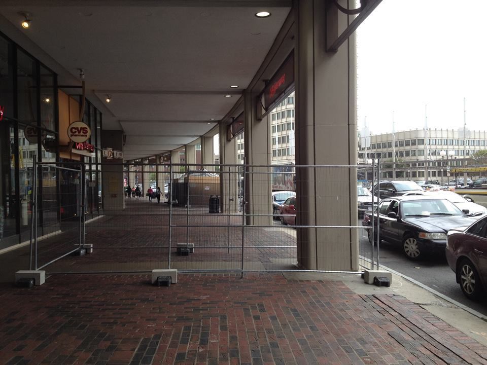
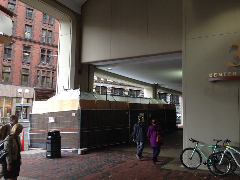
Center Plaza Renovation | Center Plaza | Government Center
- Thread starter statler
- Start date
Funny thing is that the hotel named The Colonnade (near the Pru) should probably be renamed "The Parking Garage".
It's a giant pile of carp.

briv
Senior Member
- Joined
- May 25, 2006
- Messages
- 2,083
- Reaction score
- 3
^Lol!
Center Plaza's worst sin isn't it's colonnade. That would be the fact the building walls in the beautiful Adams Courthouse a la The Cask of Amontallado. These proposed improvements to it's street level are welcome but they're mere bandaids. This building is just too long, too boring, too monotonous, and too..blah. And the fact that it visually defines much of City Hall Plaza is one of the reasons City Hall Plaza is so reviled.
Center Plaza's worst sin isn't it's colonnade. That would be the fact the building walls in the beautiful Adams Courthouse a la The Cask of Amontallado. These proposed improvements to it's street level are welcome but they're mere bandaids. This building is just too long, too boring, too monotonous, and too..blah. And the fact that it visually defines much of City Hall Plaza is one of the reasons City Hall Plaza is so reviled.
Yep. I didnt even know about the old Courthouse until only a few years ago. A hillside park could replace Ctr Plaza with a tradeoff of a streetside development on the other side of Cambridge St. That would be ideal in my mind.
tobyjug
Senior Member
- Joined
- Jul 21, 2007
- Messages
- 3,408
- Reaction score
- 473
The colonnade at the Doge's palace doesn't contribute much to the action in the square. But that's probably because you just walk under it...no shops or restaurants.
Speaking of squares, the courthouse was always somewhat walled off, even by the townhouses that once occupied the eastern side of Pemberton Square, and then later by the commercial buildings that preceded Center Plaza. https://en.wikipedia.org/wiki/Pemberton_Square#/media/File:PembertonSq_ca1920_Boston.png
Restoring the short street that ran up to Pemberton from Scollay would do a lot.
- Joined
- Sep 15, 2010
- Messages
- 8,894
- Reaction score
- 271
Public meeting tonight:
Tonight! Public meeting re: Center Plaza upgrades. 6:30-8:30pm at City Hall.
https://twitter.com/BostonRedevelop/status/648882446176423936
Tonight! Public meeting re: Center Plaza upgrades. 6:30-8:30pm at City Hall.
https://twitter.com/BostonRedevelop/status/648882446176423936
bigpicture7
Senior Member
- Joined
- May 5, 2016
- Messages
- 3,896
- Reaction score
- 9,518
^ I hope it's a heck of a lot more than what looks like an IKEA carpet and some new fluorescent light tubes in that render. This thing needs to be leveled.
More realistically, I was at least looking forward to that jewel box rooftop addition in the renders from a couple of years ago.
More realistically, I was at least looking forward to that jewel box rooftop addition in the renders from a couple of years ago.
odurandina
Senior Member
- Joined
- Dec 1, 2015
- Messages
- 5,328
- Reaction score
- 265
needs to get cut and a section to go tall.
odurandina
Senior Member
- Joined
- Dec 1, 2015
- Messages
- 5,328
- Reaction score
- 265
Btw does this mark the pinnacle of White's gone-full-retard BRA?
Padre Mike
Active Member
- Joined
- Jan 27, 2007
- Messages
- 681
- Reaction score
- 1
I agree that the building should be partially demolished, Court Street restored, Pemberton Square restored as a park, and judicious additions to height and scale added. The sidewalk area of this building has been redone at least 3 or 4 times in my memory...adding lights, subtracting lights, adding kiosks, taking them away, changing glass facades, etc. None of it works in part because there is no sense of place, no central destination, no clear theme for the entire strip. It would be great if most of the stores were places to eat and drink with venues for entertainment and music. And that all fast food outlets and chains would be banned.
Thanks, Matthew. Those are good examples, and they all seem to have a levity that is missing from Church Park and Center Plaza. For those buildings the problems seem two-fold: excessively wide sidewalks and streets, and heavy, overbearing design.
I guess the next challenge is to find a modernist colonnade of a similar style as Church Park and Center Plaza that works well (a quick search yielded no results in an urban context).
I think one of the other things working against Center Plaza is the curve, you are constantly looking past building as you walk by it. A straight line or a convex arc would draw the eye more to the building and retail with in it. Hopefully the renovations are addressing this.
odurandina
Senior Member
- Joined
- Dec 1, 2015
- Messages
- 5,328
- Reaction score
- 265
Center Plaza redo | Downtown
https://www.tangram3ds.com/center-plaza/.
How about a discussion about the redo of Center Plaza?
The new curtain wall seems like an incredible improvement. But the current plan seems way too small, given the office and residential market, and transit access.... Center Plaza seems an especially fine location for some quantity of residential to be added on top w/ no additional parking.
A pair of modest, slender mid-rises a la 171 Tremont would be great. Maybe they looked at doing this. i Hope this does not become a lost opportunity in the Downtown Zone without a careful study....


Last edited:
Equilibria
Senior Member
- Joined
- May 6, 2007
- Messages
- 7,080
- Reaction score
- 8,304
Re: Center Plaza redo | Downtown
1) We have a thread on Center Plaza already: http://www.archboston.org/community/showthread.php?t=5051&page=2&highlight=Center+Plaza
2) That Tangram3D thing isn't the real proposal. It's just an idea. The real proposal is the retail concourse that AFAIK is now complete.
1) We have a thread on Center Plaza already: http://www.archboston.org/community/showthread.php?t=5051&page=2&highlight=Center+Plaza
2) That Tangram3D thing isn't the real proposal. It's just an idea. The real proposal is the retail concourse that AFAIK is now complete.
Charlie_mta
Senior Member
- Joined
- Jul 15, 2006
- Messages
- 4,554
- Reaction score
- 6,472
Re: Center Plaza redo | Downtown
The above renderings portray something hideous and suitable for Las Vegas in my opinion.
Instead, at a minimum, the portion of the building needs to be removed that blocks the street level view of the Courthouse from Cambridge Street. Also preferably a couple of high rises in the remaining footprint would be cool.
stick n move
Superstar
- Joined
- Oct 14, 2009
- Messages
- 12,066
- Reaction score
- 18,807
Re: Center Plaza redo | Downtown
Its gonna look like this. They're building on the roof, adding pass throughs to the structure, and ground level retail.

/cdn.vox-cdn.com/uploads/chorus_asset/file/4398785/centerplazacompos_20_1_.0.jpg)

Its gonna look like this. They're building on the roof, adding pass throughs to the structure, and ground level retail.
/cdn.vox-cdn.com/uploads/chorus_asset/file/4398785/centerplazacompos_20_1_.0.jpg)

RandomWalk
Senior Member
- Joined
- Feb 2, 2014
- Messages
- 3,315
- Reaction score
- 5,182
Re: Center Plaza redo | Downtown
Sadly, they’re not breaking up the mass to visually link the courthouse to the plaza.
Sadly, they’re not breaking up the mass to visually link the courthouse to the plaza.


