- Joined
- May 25, 2006
- Messages
- 7,033
- Reaction score
- 1,865
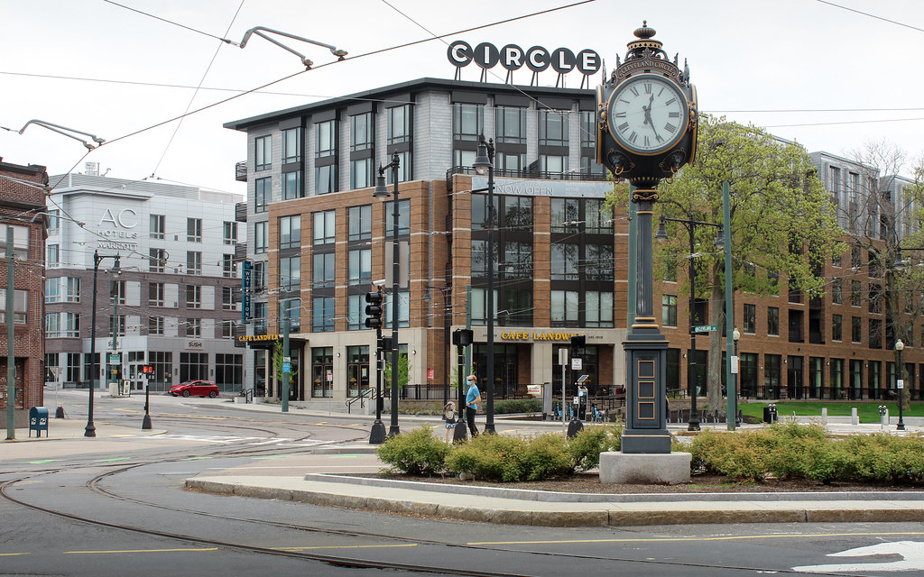
That looks great!
Wow, that turned out really well.Sitting at a red light

I agree it looks nice but I find it funny because it is just a dressed up 5 over 1 format that everyone loves to bash otherwise!
The dressing it up is the key part.
That’s almost iconicSitting at a red light

Almost iconic? HA!That’s almost iconic
Laugh now but just you waitAlmost iconic? HA!
there's another one not far from cleveland circle, right outside the brighton police dept. my aunt is on a few community organizations in brighton and was instrumental in getting both of those installed.For the record, the company that manufactures these vintage, Victorian-timey clocks is based in our very own Medfield.
Pompous pretentious pedants will look at their website and sneer, "look, they're contributing to the literal Disneyfication of America by designing all of the Disney world theme park clocks!" But that's what makes them pompous pretentious pedants; screw 'em, these clocks are fabulous, I think.
Other than this one in Cleveland Circle, I've seen (many times) the one in Downtown Crossing adjacent to the Jewelers Building--which is optimally cited for a variety of reasons--along with one situated at the approach to the Newton Corner rotary. Which strikes me as a far more puzzling location, but, eh, whatevs.
Hear hear! ^^^ I thought the theater, itself, was a pretty cool building. While I'd stop short of calling what's now there "iconic," I think it clearly demonstrates that *any* effort to distinguish one pre-fab panel, cookie-cutter building from another goes a loooooooong way. Also -- and related -- Boston has long been pretty weak in the "cool signage" department. More creative and "fun" lighting and signs would be great IMHO. Not everywhere (not suggesting a giant 3-D neon pig-shaped sign above a BBQ joint on Newbury, for example), but we're definitely on the lower-end in that department.
Bi-annual kz check in on this one...
