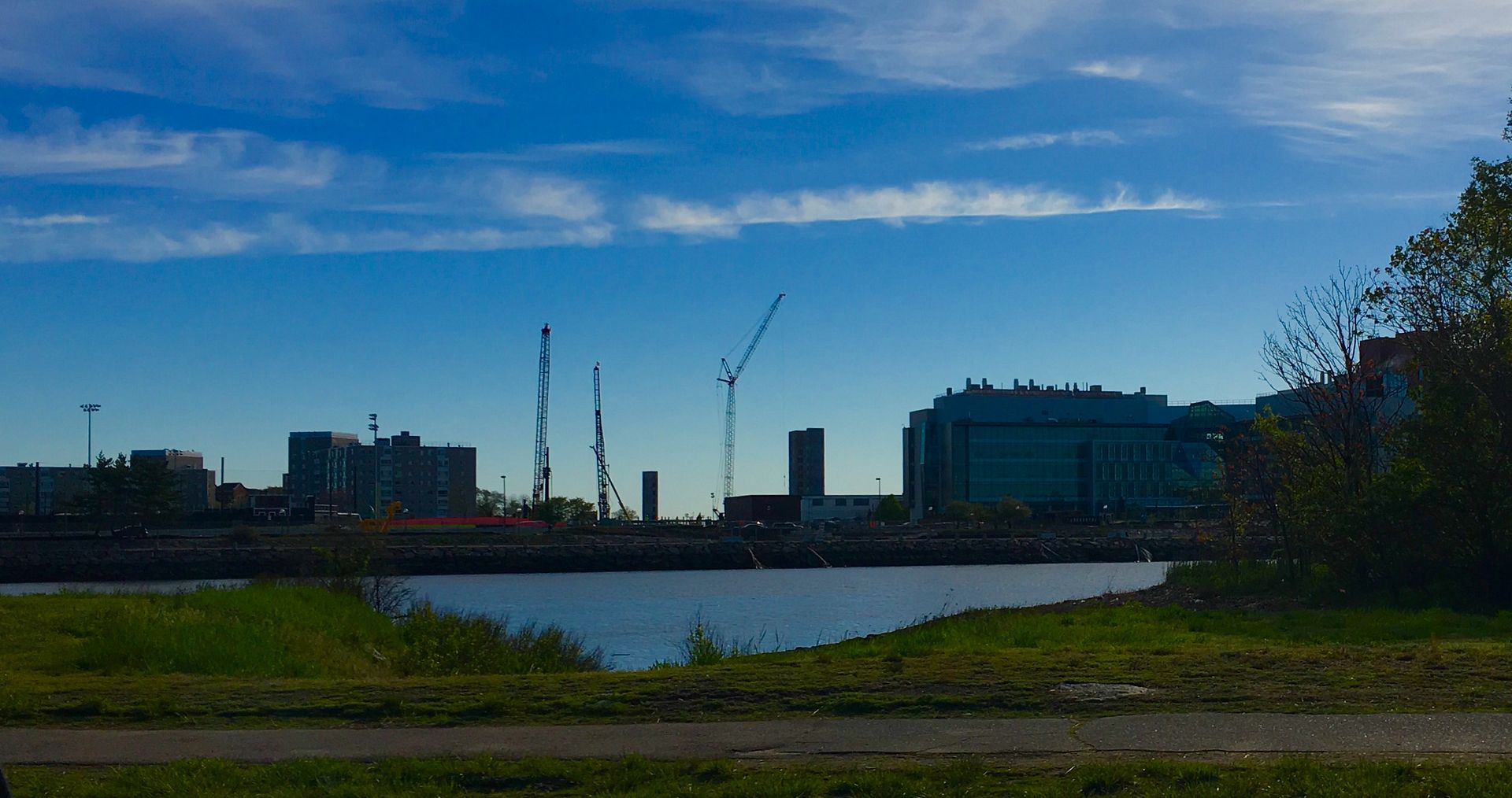
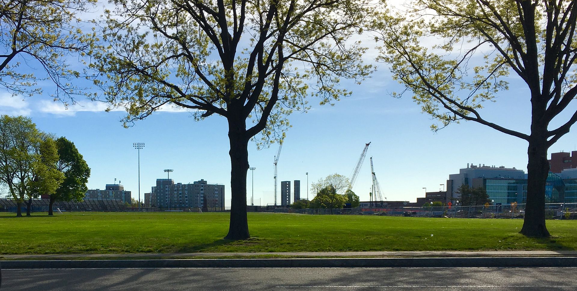
Columbia Point (JFK/UMass) Infill and Small Developments

I dont understand why Umass doesnt build higher and preserve the open land they have. They're boxed in on all sides with a finite amount of land why they wouldn't save every scrap of land they could for future expansion makes little sense to me

Suffolk -- a lot of U buildings that are used for teaching are low so that they can use escalators and stairs rather than elevators -- as you need to move masses of people in a short time around the "bell" at the end of a class period

Another teaching need is to have large footprints for big lecture halls

recreational and intercollegiate athletics functions need big footprints for arenas, gyms and specialized training facilities

On the other other hand U buildings used for research are often low and long to provide extended floor plates for labs and short to accommodate lots of vents

That pretty much leaves only dorms and profs and admin offices for taller buildings
 
Nice shots, BeeLine.

I had a chance to see the inside of University Hall. This is not the kind of spectacular building that will make AB forumers tingle. But it is a very practical and positive space that suits the campus.

Like the 2003 Campus Center, the building responds to the awful elements of the original megastructure. The exterior brings additional architectural variety to the campus. The classrooms and interior hallways are full of natural light. The floor plans are fairly intuitive and organized around common social spaces. The auditorium is located just off a grand atrium, which seems right for performances and events.

This is a good addition to a campus in need of positive and functional spaces.
 
Great pics. If it ages well, it will be one of very few Boston buildings put up this decade that people will still like.
 
Great pics. If it ages well, it will be one of very few Boston buildings put up this decade that people will still like.

There are many buildings that have gone up recently that I do like, but I, for one, really dislike this one. Its weird amalgamation of materials and angles comes together to produce something that is, altogether, really very bland. It's less a building and more a bunch of disparate parts of other buildings that have been cut and pasted together. But I guess all of my opinions will change in a decade?
 
There are many buildings that have gone up recently that I do like, but I, for one, really dislike this one. Its weird amalgamation of materials and angles comes together to produce something that is, altogether, really very bland. It's less a building and more a bunch of disparate parts of other buildings that have been cut and pasted together. But I guess all of my opinions will change in a decade?

For me it mostly works, but then they put a giant curvy surfboard looking thing that sticks out too much on the top. I think this building is going to age about as well as a mullet.
 

Back
Top