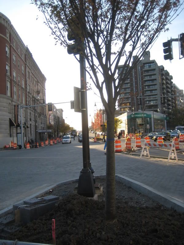
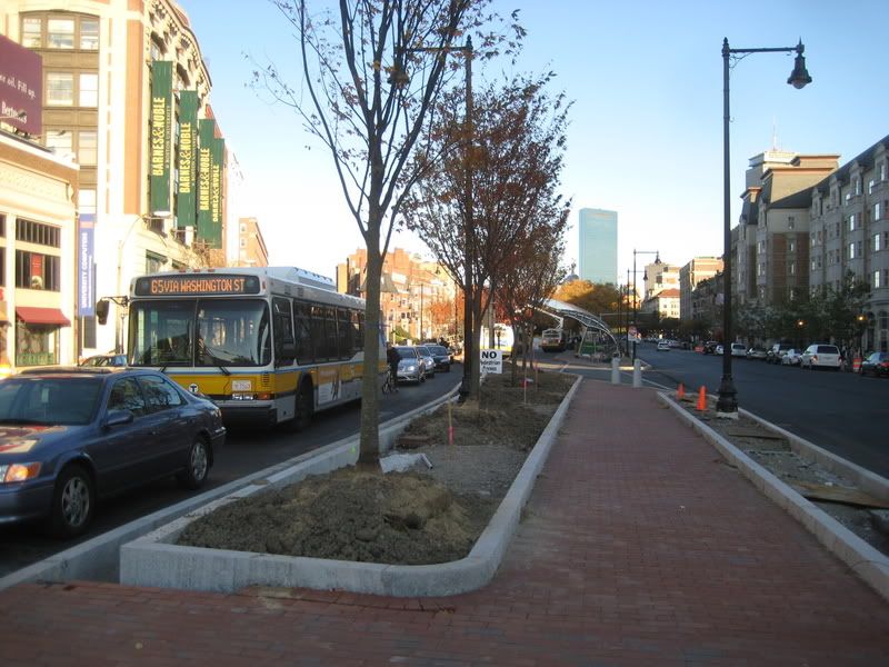
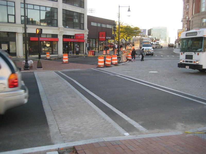
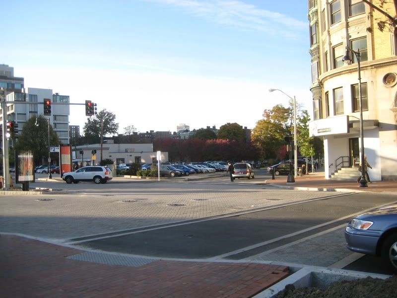
Commonwealth Avenue Improvement Project

I can live with the Back Bay-ification of Kenmore, but the ugly horizontal armed traffic lights don't really complement that image. Imagine the Commonwealth Avenue mall or Newbury Street blemished with that blunt crap. Back Bay's streets are called Parisian for a reason; the boulevards there don't need overhead signals, even where five intersect.
BTD came through and "updated" lights on part of Centre Street here in JP years ago with those hideous overhead arms. Complete overkill on our two-lane street and a huge waste of tax dollars. On Boylston I can see a rationale for overhead lights. Maybe they could even put proper street signs on them so people from out of town can determine the names of cross streets!

I attribute the lack of overheads in Back Bay to the historic district protection. Same reason you don't see them on Charles St on Beacon Hill.

I'm also surprised to see brick sidewalks going in -- I thought the disability advocates had managed to stop the use of brick outside of historic districts.
 
Maybe they could even put proper street signs on them so people from out of town can determine the names of cross streets!

Please no; the landscape would belong completely to the car at that point. I couldn't believe when this ridiculous LA-born idea made it to Manhattan.

I'm also surprised to see brick sidewalks going in -- I thought the disability advocates had managed to stop the use of brick outside of historic districts.

More overkill. You can't stop brick in Boston.
 
Right, but he doesn't mean a normal street sign, he means big signs on the crossbar of the traffic light, like this:

326392018_c0b3936778_o.jpg
 
I can live with the Back Bay-ification of Kenmore, but the ugly horizontal armed traffic lights don't really complement that image. Imagine the Commonwealth Avenue mall or Newbury Street blemished with that blunt crap. Back Bay's streets are called Parisian for a reason; the boulevards there don't need overhead signals, even where five intersect.

I thought they were temporary (as they replaced the non-overhead kind), but they recently activated a new one (terrible idea) so I guess not.

The new one is a red right turn arrow from sherborn street to comm ave outbound. Not only do all the cars ignore it and turn anyway, but it has cut the pedestrian light time by more than half.


As for street signs, Im shocked that nyone would be against better ones. The current boston standard seems to be
1) No signage
2) Signage on one street, but not the other
3) Signs that are too high, or too hidden, or block each other

This is a good sign:
IMG_7134.jpg

Note how both are easilly readable.

The only thing that would make this better is having them both face into the street, instead of away.


This is a decent, but not great example of how to set it up. The picture is about the incorrect spelling, so ignore that
sign_web.jpg


You can see both names, but not at all angles.

Ironically, I cant find an image online of what most boston street names look like. Im sure most of you know that the two are placed at the same height, so its impossible to see them both.


It wont work in Boston, but Im a fan of giant illuminated street signs.
Linked due to size.
http://lh5.ggpht.com/_iGyotZutnnQ/SA6MKvs0-nI/AAAAAAAAA-E/GRxbBnJepes/IMG_2078.JPG
 
Agreed about the horizontal traffic light poles. I also noticed that the new ones are metallic unlike the old ones which are black and match the other street furniture, making them stick out even more I wonder what prompted the change.

I'm guessing it's federal safety standards that require the overhead poles. It's interesting comparing US standard to other countries. In Europe, you rarely see horizontal poles, and instead you have really nice sight lines of buildings! Also, in Europe they commonly place the signals at the near side of the intersection instead of the far side, which reduces quite dramatically the number of motorists who stop past the stop line (if they do stop past it, they can't see the light!).
 
That is the biggest problem with all the work on Cambridge Street. The overhead lights, the sheer number of them, just ruin it.

There needs to be solid lighting on all main streets. Boston has terrible street lighting compared to other cities. At least the new street lights don't look generic or old.

I thought they were temporary (as they replaced the non-overhead kind), but they recently activated a new one (terrible idea) so I guess not.

The new one is a red right turn arrow from sherborn street to comm ave outbound. Not only do all the cars ignore it and turn anyway, but it has cut the pedestrian light time by more than half.


As for street signs, Im shocked that nyone would be against better ones. The current boston standard seems to be
1) No signage
2) Signage on one street, but not the other
3) Signs that are too high, or too hidden, or block each other

This is a good sign:
IMG_7134.jpg

Note how both are easilly readable.

The only thing that would make this better is having them both face into the street, instead of away.


This is a decent, but not great example of how to set it up. The picture is about the incorrect spelling, so ignore that
sign_web.jpg


You can see both names, but not at all angles.

Ironically, I cant find an image online of what most boston street names look like. Im sure most of you know that the two are placed at the same height, so its impossible to see them both.


It wont work in Boston, but Im a fan of giant illuminated street signs.
Linked due to size.
http://lh5.ggpht.com/_iGyotZutnnQ/SA6MKvs0-nI/AAAAAAAAA-E/GRxbBnJepes/IMG_2078.JPG

I think some street signs that light up could do well in boston. That and the signs on the highways need to have lighting. One of the biggest complaints from people I know that come to visit the area is that you can read an exit sign on the highway until you are right under it and that you can't see the street sign in Boston.
 
Also, in Europe they commonly place the signals at the near side of the intersection instead of the far side, which reduces quite dramatically the number of motorists who stop past the stop line (if they do stop past it, they can't see the light!).

Even worse - the overhead signal forces the driver's eyes up, and so he/she is less likely to see a straggling pedestrian crossing the intersection before hitting the gas once the light turns green.
 
Even worse - the overhead signal forces the driver's eyes up, and so he/she is less likely to see a straggling pedestrian crossing the intersection before hitting the gas once the light turns green.

In Kenmroe square, i see cars stopped all the time in the intersection of beacon and ? (tiny street) on the northeast side because the cars stop at the light.
 
The trees have been planetd, just in time for winter

IMG_6516.jpg

IMG_6517.jpg

IMG_6518.jpg

IMG_6519.jpg
 
I could be wrong on this but I belive this is the best time for planting trees and shrubs.
 
My 'wish list' has been for BU to sell it's theater on Huntington Ave and the other buildings to New England Conservatory and then build an Arts and Performance Center on this parking lot, add the HoJo's to that site.
 
Why BU doesn't replace the citizens bank and Sorganne Housing Project looking building with a grand Flatiron style building with a giant video screen similar to Times Square is beyond me. That would make a bloody fortune in advertising to all the RedSox crowds. Couple that with something replacing that decrepit parking lot and the former commie block hotel behind it, and maybe Kenmore Square could become a destination again?

/Is Sibler listening?

or

/Samuels you know you want to... it could compliment the planned Boylston, Park Drive, Brookline Ave triangle building.
 
My 'wish list' has been for BU to sell it's theater on Huntington Ave and the other buildings to New England Conservatory and then build an Arts and Performance Center on this parking lot, add the HoJo's to that site.

I think Northeastern University is interested in the BU Theater property too. It would make good geographic sense.

Also, the greatest eyesore remaining in Kenmore Square is the half block between the square and the BU Management Building: a parking lot, a one story commercial building and what is arguably the ugliest building built in Boston in the 60's: the old HoJo.
 
Oh, HoJo's OK. It's crisp and a little sculptural --like much Sixties modernism. Ditto the building behind Citizens Bank. Quite handsome and sculptural, like a good Sert building, though I think it's by Steffian/Bradley.

The rest is not OK, I agree.
 
they should surround those trees with low shrubs or groundcover but they won't...they will put down sod which will be overgrown and choked with weeds by June.
 
Oh, HoJo's OK. It's crisp and a little sculptural --like much Sixties modernism.

Surprised you like this one, ablarc. About eight years ago, the top floor bar was the best scene in town. Pandora's Box, every Sunday night: Mods & Rockers, British Invasion, Freak Beat, 60's Garage Rock. I'd get sloshed (Tom Collins a'hoy) and then stumble over to Deli Haus.

Remember when Kenmore Square was cool?

Ditto the building behind Citizens Bank. Quite handsome and sculptural, like a good Sert building, though I think it's by Steffian/Bradley.

No foolin'? Always thought this was Sert (at his best).
 

Back
Top