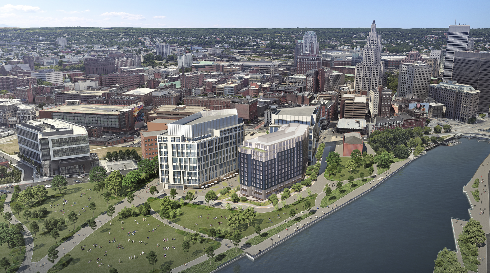
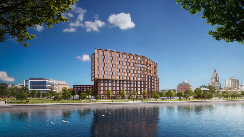
Dyer Wharf | I-195 District | Providence

Can we stick to the convention shared by mods when posting and consolidate project info discussed over threads? I think more organized over time and offers fairness to folks presenting thoughts.
 
The cladding looks very promising, but the building itself is way too fat. Imagine the same cladding on 2 somewhat taller towers (either twins or staggered) with some permeability between them.

These are the type of overbearing proportions that should be discouraged.

1716443271059.png


1716443294272.png


The less fat sides, except still pretty fat from the corner:

1716443409149.png


1716443473120.png


Cladding looks pretty cool though.

1716443535649.png


Not great in the scheme of the city.....

1716443634285.png


"Well, at least it isn't tall." - Providence in a nutshell
 
I wouldn't hate the proportions if there was some variation in the height rather than a roofline that's basically flat all the way across. When you look at the site plans, it's actually not a hulking building. But the flat roof combined with the width and lack of height/variation makes it look more hulking than it is.

That said, I do like the cladding. It's different than a lot of what's being built. I think it's a shame that it's only one ground level retail space, but that's not surprising considering the location. I do appreciate that future phases keep the center of the block open/accessible to minimize the megablock effect.
 
Will Morgan's critiques of this building are fair and accurate. I don't hate this proposal, but I do think the site would benefit from something a bit more inspired since it'll be so visible from so many locations. Something like this can be buried deeper within the district with no ill effect, but as-is, it's a bit disappointing. I would rather see it built in its current form rather than nothing at all, but it's hard to be impressed with what we've been presented.

Where Morgan loses me, is when he argues that the similarly scaled Benificient House, "brilliantly demonstrates how a great architect can create a building of visual interest that still looks dignified 55 years later." That's not what I think Beneficient House demonstrates. To me, it's a shining example of anti-urbanism in the heart of the city. It has an underutilized "front yard" and a surface parking lot that covers a larger footprint than the building itself. Even if you want to argue that it has more architectural merit than Dyer Wharf (I'm not convinced, but that's not a hill I'll die on), it's impossible to argue that it's better urbanism. And I'll take mediocre architecture and good urbanism over passably decent architecture (at best) and terrible urbanism.
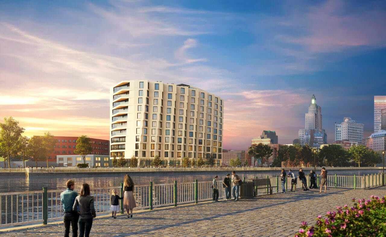
 
Yea. I think it wasn’t financially viable so they scaled back. It was always meant to be two phases with the two other buildings being lab space+ in partnership with Brown.

Agree with Irfox mostly in that if it were not in that location and hidden amongst other buildings they’d probably get away with it. As it is, total garbage. In the first meeting it was clear the developer and architect knew it was desperate.
 
Theyre both 11 stories so what was the scale back? Spending less on the facade?
 
You really can’t tell?

It’s not just the facade but rather the entire footprint and form of the building.
 
You really can’t tell?

It’s not just the facade but rather the entire footprint and form of the building.

Where?

The massing is about the same. The new building doesnt have the curve anymore, but besides that the overall size is damn close.
C1-scaled.jpg

P14_Updated.png
 
Where?

The massing is about the same. The new building doesnt have the curve anymore, but besides that the overall size is damn close.
C1-scaled.jpg

P14_Updated.png

The massing with the “twist” and bump outs in the original proposal is far more complex from a cost standpoint. The imitation stone precast was likely also more expensive. I would have thought that would be obvious.
 

Back
Top