Educate everyone on a good website...

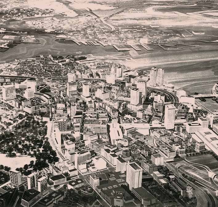
Amazing. I can see some art deco and early 20th century survivors, but everything else was supposed to become a Brutalist concrete cube except the North End?

According to this site, even the Blackstone Block would have been replaced by an I.M. Pei building. And there would have been a big stadium at the rear end of the South Station approach (with South Station itself having been replaced by a new complex designed by...Sert):

http://utile.posterous.com/the-bras-1967-plan
 
This site is pretty awesome. I'm not always interested in what they put up, but more often or not they have really valuable stuff:

http://thecityfix.com/
 
1967 BRA Plan:
1967_BRA_plantifscaled1000.jpg

I live in the upper right-had corner. Looks the same today...
 
Well, then..start the bulldozers! BB is all set!

;)
 
statler -- While you've got those bulldozers, maybe you could do something about this. East Boston's answer to the Hotel Commonwealth.
 
Wow. I don't think any new building has made me actually LOL until now. Impressive.
 
Shepard -- this is just for you. About a mile away, as East Boston becomes the Beachmont neighborhood of Revere.

The secret formula: Parking structure + vinyl siding + surplus replacement windows = FAIL
 
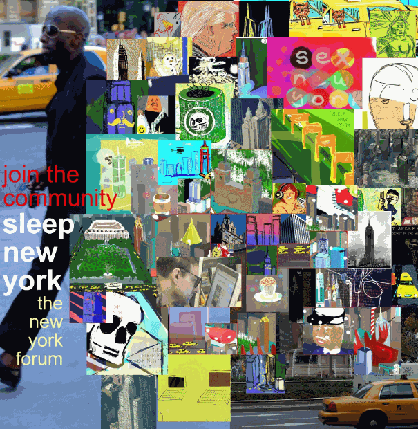
text is too hard to read and the picture looks way to cluttered and busy IMO.
 
Ok Thanks, all noted. Tell me Palindrome, what size/type monitor/notebook are you viewing it on? And what do you think of the new homepage, link is my sig. You can send a pm if thats ok.

Another great website for those using public transport walking in New York or Boston: www.hopstop.com
 
Ok Thanks, all noted. Tell me Palindrome, what size/type monitor/notebook are you viewing it on? And what do you think of the new homepage, link is my sig. You can send a pm if thats ok.

Another great website for those using public transport walking in New York or Boston: www.hopstop.com

I'm using an old (work provided) ibook g3 14" screen. I'll check it out, along with the website later tonight when i get home (dell 14" - forget model number but got it last year so pretty new.)
 
The text blends into the images. You need to work on heightening that contrast.

It's also not going to work at all scaled down from anything less than that size. You need something smaller and simpler.
 
The text blends into the images. You need to work on heightening that contrast.

It's also not going to work at all scaled down from anything less than that size. You need something smaller and simpler.

Thanks for the feedback. On the iPhone or Android phones double tap zoom/pinching works fine, but your fine points are all duly noted Sir.
 

Back
Top