You are using an out of date browser. It may not display this or other websites correctly.
You should upgrade or use an alternative browser.
You should upgrade or use an alternative browser.
Educate everyone on a good website...
- Thread starter Suffolk 83
- Start date


czsz
Senior Member
- Joined
- Jan 12, 2007
- Messages
- 6,043
- Reaction score
- 8
^ I actually don't think it's that different. Let's see, commie blocks (Fort Lee, NJ), hypermarkets (Paramus, NJ), cute villagey towns for wealthier people (Westchester), tract housing (Long Island)...yup, got it all.
The difference is that most of the cheap commie blocks in Paris (and their violent crime, immigrant angst, poverty) are in the burbs, whereas NYC keeps it in the city limits.
The difference is that most of the cheap commie blocks in Paris (and their violent crime, immigrant angst, poverty) are in the burbs, whereas NYC keeps it in the city limits.
tobyjug
Senior Member
- Joined
- Jul 21, 2007
- Messages
- 3,408
- Reaction score
- 475
Sometimes I visit WW1 battlefields if any are nearby. The drama and importance of the battle and the (often) banality of the locale can be so at odds.
I posted the suburban link because it is a pretty good su...(sorry, Nelly Carreno just came on the NECN weather)...
As I was saying, the link is a pretty good pictorial summary of the Marne valley suburbs. Probably not a big tourist draw, unless you are a EuroDisney fan.
Haven't spent time in the other suburban areas, so I defer to those who have done time there.
The visual aesthetic of NYC inner suburbs seems inferior to the areas I've been to. I leave the discourse on social conditions to the sociologists!
czsz
Senior Member
- Joined
- Jan 12, 2007
- Messages
- 6,043
- Reaction score
- 8
^^ Got to disagree w/ that. Yonkers has crime and grit, as does plenty of spots in Jersey and to the suprise of some Long Isalnd has some tough spots.
Yes, but there's not a relatively consistent pattern of wealth in the city, crime and poverty outside in New York as there is in Paris.
Ron Newman
Senior Member
- Joined
- May 30, 2006
- Messages
- 8,395
- Reaction score
- 14
That picture above of suburban Paris doesn't look much like 'crime and poverty' to me.
TikiNYC
Active Member
- Joined
- Jun 29, 2009
- Messages
- 147
- Reaction score
- 0
Gents, (and ladies). What do you think of our new type of design? Designed for those with a super widescreen frame of mind (and monitor...)
New design

New design

statler
Senior Member
- Joined
- May 25, 2006
- Messages
- 7,944
- Reaction score
- 562
http://nerdtownusa.tumblr.com/
This recent post is cool:
This recent post is cool:
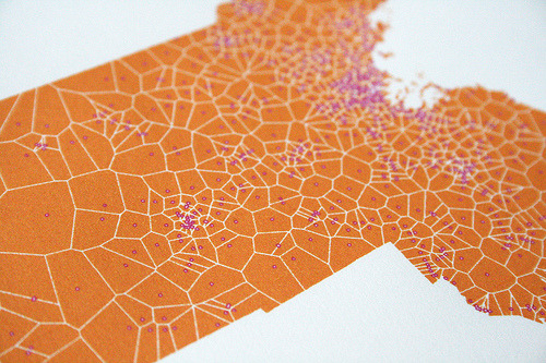
Voronoi diagram of Massachusetts, around Dunkin Donuts locations. The polygons delineate the points for which each Dunkin Donuts outlet is the closest place to get your fix.
- Joined
- Sep 15, 2010
- Messages
- 8,894
- Reaction score
- 274
Gents, (and ladies). What do you think of our new type of design? Designed for those with a super widescreen frame of mind (and monitor...)
New design
Not very impressive and confusing to navigate. Also, you bragged about the biggest flaw the site has: the extremely widescreen layout that requires almost all users to use scrollbars (which are so Web 1.0). The index has no clear navigation structure or even searchable text, which then effects the site's accessibility for those who have vision impairments and use screen readers. When I visited the site, I was unsure of what it was about, what the content meant, and if I could click on buildings that interested me. I clicked on WTC 1 and 2 because I love Minoru Yamasaki and it led me to a nice thread with some pictures and videos which I appreciated.
Overall, I can appreciate the desired feel of the website and the want to have featured buildings or projects on the homepage for quick-access, but they're presented in too haphazard of a manner for it to be comprehensible. Our younger generation would probably figure out and navigate the site fine, but someone older might have difficulty understanding how the site works.
</web design bitch>
statler
Senior Member
- Joined
- May 25, 2006
- Messages
- 7,944
- Reaction score
- 562
- Joined
- Sep 15, 2010
- Messages
- 8,894
- Reaction score
- 274
1880s architecture porn: http://www.fastcompany.com/1660684/is-this-hidden-architectural-gem-new-yorks-bradbury-building
statler
Senior Member
- Joined
- May 25, 2006
- Messages
- 7,944
- Reaction score
- 562
BostonUrbEx
Senior Member
- Joined
- Mar 13, 2010
- Messages
- 4,346
- Reaction score
- 140
This speaks volumes about Houston. What a terrible city.
JohnAKeith
Senior Member
- Joined
- Dec 24, 2008
- Messages
- 4,366
- Reaction score
- 115
If you love Boston, if you love Massachusetts, then you should read Commonwealth magazine, every quarter. Get a subscription, even, to support their work.
Not just about government, it's about transportation, development, and all things urban.
http://www.commonwealthmagazine.org/
Not just about government, it's about transportation, development, and all things urban.
http://www.commonwealthmagazine.org/
Lurker
Senior Member
- Joined
- Jun 13, 2006
- Messages
- 2,362
- Reaction score
- 1
statler
Senior Member
- Joined
- May 25, 2006
- Messages
- 7,944
- Reaction score
- 562
This is probably old news to most and may even have been posted here already, but it just popped up on my radar screen, so in case anyone else out there has yet to find it:
http://openbuildings.com/
I love the smart phone app. It generates a list of interesting buildings nearby based on your location.
http://openbuildings.com/
I love the smart phone app. It generates a list of interesting buildings nearby based on your location.
Lurker
Senior Member
- Joined
- Jun 13, 2006
- Messages
- 2,362
- Reaction score
- 1
JohnAKeith
Senior Member
- Joined
- Dec 24, 2008
- Messages
- 4,366
- Reaction score
- 115
Hell. Yes.
They seem to have bitten off a lot to chew from the very beginning, but they have the staff to back it up, I think. I wonder if they pay for entries?
http://www.theatlanticcities.com/
They seem to have bitten off a lot to chew from the very beginning, but they have the staff to back it up, I think. I wonder if they pay for entries?
http://www.theatlanticcities.com/