Eli Lilly IGM | 15 Necco Street | Fort Point

I see that Alexandria's response to the neighbors was "would you like it better if we VE'd it a bunch?" Given that the building is still the same size, I'm guessing the answer is "no".
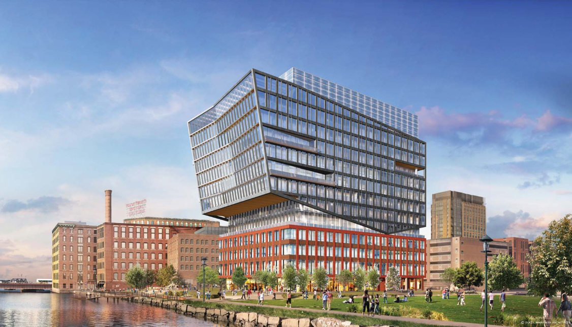

1582204076704.png
 
Now this just looks dumb. If the bottom section was an old building being saved, such as Atlantic Wharf, this would be a good proposal. However, to design it from scratch to have those 2 distinct sections is asinine.
 
Now this just looks dumb. If the bottom section was an old building being saved, such as Atlantic Wharf, this would be a good proposal. However, to design it from scratch to have those 2 distinct sections is asinine.

That's a response to the neighbors, who wanted it to fit in with the factory buildings. If you don't have a real factory to use as a podium, I guess you fake one.
 
Actually, I really, really like this. Granted, the base is not original to the neighborhood, but so what? The base reflects the surrounding Fort Point buildings well, in both design and in materials. And the top portion, with the glass within the dark metal frames, angled towards the channel and city, well, it's a show-stopper! I hope this get's built!
 
This is what happens when you let the neighborhood design your building. That said, I like it, could be better, but it's not bad.
 
That's a response to the neighbors, who wanted it to fit in with the factory buildings. If you don't have a real factory to use as a podium, I guess you fake one.
I'd be fine with this redesign if the podium used actual, textured, hand-laid brick. But you know it's gonna be flat sorta-brick-colored panels.
 
Ah yes, civic space like a police or fire station, neither of which the city wants or needs there. Maybe let the experts place civic functions where they should be?
 
I'd be fine with this redesign if the podium used actual, textured, hand-laid brick. But you know it's gonna be flat sorta-brick-colored panels.
I know you can’t always go by the renderings, but the brick base seems to have some real nice design/texture to it. Might not be hand-laid but it looks very good.
B8EE4D5B-1AC8-47A0-B5F2-A289D5D9D045.jpeg
657002AD-B803-4EA3-B6C2-21F90C35C7BE.png
 
I'd be a fan if the dark metal frame portion was 'sheathed' over the brick massing, rather than sitting on a separate glass box on top of the brick base. They look really detached as is, and it wouldn't hurt to introduce some modern design styles to the base. The upper section definitely looks cleaned up and refined, which I'm a fan of, but the mechanical screen is screaming that it was an afterthought.
 
...but the mechanical screen is screaming that it was an afterthought.
A plain, corrugated screen that doesn't draw attention to itself (and doesn't clash with the facade) would work much better. Otherwise this is a good redesign that has scraped off all the unnecessary clutter and barnacles for a much simpler look. Would rather the base materials and color were the same as the upper section though, red brick is so over-used in this town.
 
Looks about like what I expect for lab space in Boston: shit.
 
From world's fair pavillion to contextual Boston. It fits in better, but I do enjoy the imaginative creations more that come out of world's fairs.
 
After so much weak, uninspired design becoming the norm for so many years no one has a sense of quality anymore so this is the type of hopelessly imbalanced, Terribly ugly building that everyone expects even in a prime waterfront location.
 
Now this just looks dumb. If the bottom section was an old building being saved, such as Atlantic Wharf, this would be a good proposal. However, to design it from scratch to have those 2 distinct sections is asinine.

A poor mans Elbphilharmonie? A long lost step-cousin from Rotterdam? The transition is a bit jarring, but it is still intriguing.
 
Top of the building is much, much better. A lot less crazy going on. Would be better if this thing had a better color scheme throughout of course.
 
I like this better then anything that's gone up in the Seaport to date.
Van -- I agree it has a certain almost aire of multigenerational hybridization

The real question is this going to be a style emulated by the rest of the remaking of the Fort Point Channel soon to begin with:

The adjacent 6 acres of parking to get 3 or 4 buildings -- placed as permitted by the underground I-90 tunnel box as the Fort Point Channel crossing tunnel comes ashore in Southie

and then later when P&G / Gillette figures how best to capitalize on the 20+ acres of World Shaving HQ
 
A poor mans Elbphilharmonie? A long lost step-cousin from Rotterdam? The transition is a bit jarring, but it is still intriguing.
I like your comparison, it does have that vibe. The Elbphilharmonie ran waaaay over schedule and budget, so let's hope the similarities stop at aesthetics.
 

Back
Top