You are using an out of date browser. It may not display this or other websites correctly.
You should upgrade or use an alternative browser.
You should upgrade or use an alternative browser.
Four Seasons Tower @ CSC | 1 Dalton Street | Back Bay
- Thread starter statler
- Start date
stick n move
Superstar
- Joined
- Oct 14, 2009
- Messages
- 13,361
- Reaction score
- 23,944
phenomenal pix. thanks much beeline.
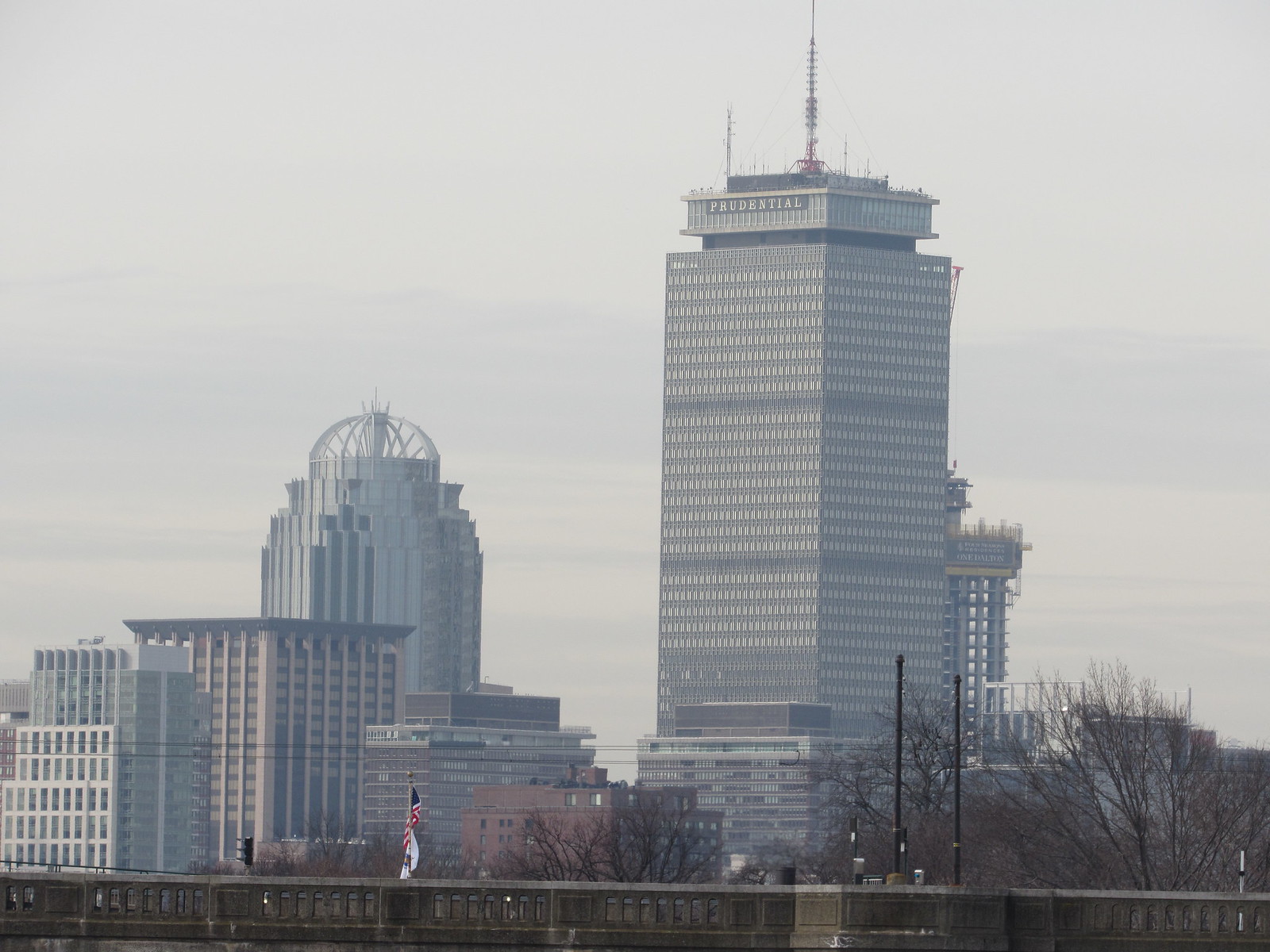
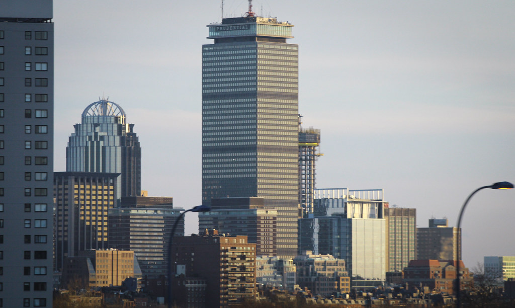
the ridges look amazing. this thing is going to wind up as possibly the finest skyscraper in town. i do love certain angles of JHT, but the "fat" views are nasty. this one is going to be flawless -- the only downside being that the fugly sheraton mess will cut off so much of it from across the river.
This is very true. The Hancock is "aaaaalmost" flawless. The fat side is mega fat though and looks horrible, but without it the other angles wouldn't be possible. I think if it wasn't angled it could have been built thinner and that would have helped that one side but being thin and at the angle it is it wouldnt have had all of the other flawless angles. This building your right it wont have a fat side and will definitely be up there as one of our finest examples of modern architecture. Cant wait to see 115 winthrop and the congress st. office tower and see which building comes out on top. Hell maybe even the redesigned SST will surprise. Going to be a nice problem to have when having to decide which of your very nice new towers is the best. MT is even up there for sure Im so happy with that building its insane. It really set the tone for the "new" era in Boston architecture history where we can build tall and with good design. Having that new peak over downtown really was a game changer that tied everything together and the impact it had on the downtown skyline cant be overstated. Downtown had been in need of something like MT for decades and we got it done.
odurandina
Senior Member
- Joined
- Dec 1, 2015
- Messages
- 5,328
- Reaction score
- 266
Look at the scale of the workers vs. the floor heights. They look like they'll be some nice high ceilings there, even after considering the eventual pipework, etc. I want one!
Since buildings like this don't pop up everywhere like they do in NYC, I think this will be THE address to have in Boston for a while.
Yes, notice the top 2 hotel floors are quite a bit taller than the rest of the hotel section.... followed by the mechanical floor.
Then those residential floors with w/ very high ceilings continue on.
- Joined
- Jan 7, 2012
- Messages
- 14,172
- Reaction score
- 23,677
kz1000ps
Senior Member
- Joined
- May 28, 2006
- Messages
- 9,140
- Reaction score
- 13,320
stick n move
Superstar
- Joined
- Oct 14, 2009
- Messages
- 13,361
- Reaction score
- 23,944
BosDevelop
Senior Member
- Joined
- Jul 25, 2006
- Messages
- 1,533
- Reaction score
- 396
That first pic is sick kz1000ps!
johnboy008
New member
- Joined
- Oct 11, 2014
- Messages
- 31
- Reaction score
- 23
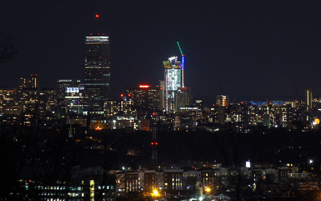
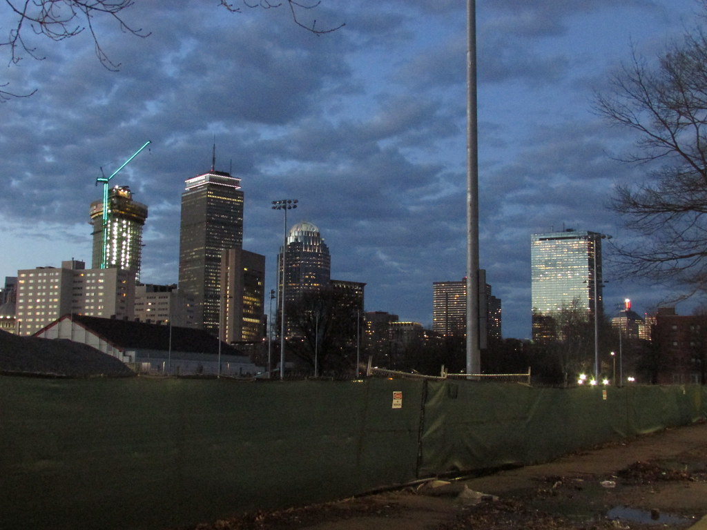
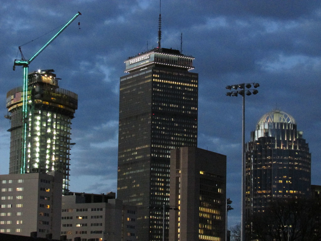
Can we keep the crane and all its nighttime bravado?
stick n move
Superstar
- Joined
- Oct 14, 2009
- Messages
- 13,361
- Reaction score
- 23,944
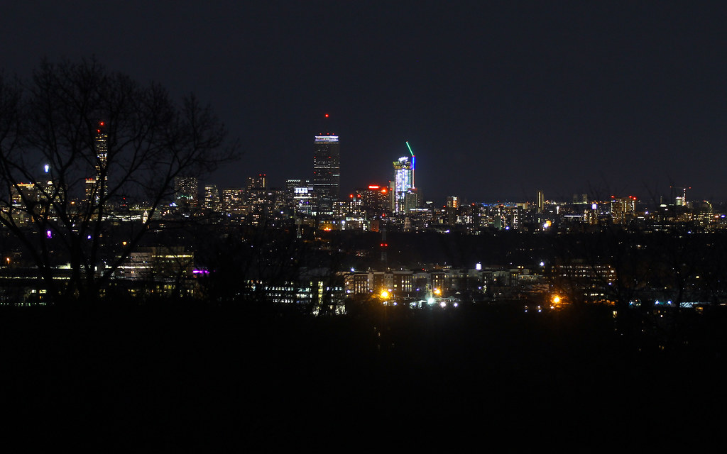
I like how the night time/lights lets you see through the trees.
stick n move
Superstar
- Joined
- Oct 14, 2009
- Messages
- 13,361
- Reaction score
- 23,944
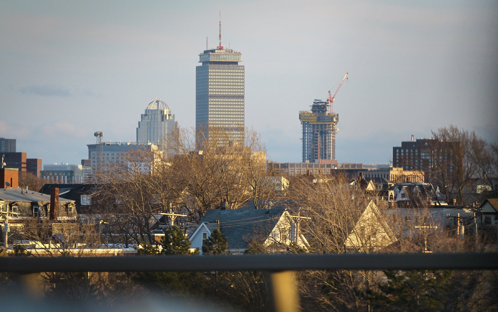
I was worried at first about the separation, whether it was going to seem too close to the Pru, but I think its turning out to have pretty good separation which adds to the high spine vs cluttering the area around the pru. It adds a 3rd peak to the high spine vs a neighbor for the Pru which I think is great. Also going down mass ave over the weekend I was able to see how much of an impact it has on the area. Whereas before the brownstones blocked almost all of the buildings from sight, now this looms over mass ave and still has a lot to go. Now other areas feel more connected now that you can see the building looming in the background vs before when you were just surrounded by brownstones only until you got extremely close to the Christian Science plaza. The new Huntington ave tower and the pike parcels are going to make this even more pronounced and its going to be awesome. The Huntington ave tower will be on the left of you also while coming down mass ave so it will feel as if you are driving into the back bay skyline vs slipping by behind it.
Subdivisions
Active Member
- Joined
- May 29, 2013
- Messages
- 251
- Reaction score
- 623
poking through cambridgeport


mdd
Active Member
- Joined
- Mar 14, 2008
- Messages
- 805
- Reaction score
- 171
Just a thought. Could you ever redo the spire on the Pru? Make it more substantial and add presence to it's height?
It's pretty utilitarian. It doesn't make much sense to re-do it just for aesthetic reasons.
bigpicture7
Senior Member
- Joined
- May 5, 2016
- Messages
- 4,043
- Reaction score
- 10,369
It's pretty utilitarian. It doesn't make much sense to re-do it just for aesthetic reasons.
Well...unless they decide to do a re-skinning/facade modernization a la One Post Office Sq...in which case it may be part of that overall architectural effort.
If such a thing happens, I really hope they sustain the period-representative "international style" and don't kill the Pru's history with a redo.
But I do remember reading somewhere that the Pru's facade is old and even just for practical/maintenance purposes may need to be re-skinned. Occupancy of the building may be good today, but that changes over time...the landlord, such as with OnePost Office, may perceive the aesthetic updates will help leasing prospects.

