Four Seasons Tower @ CSC | 1 Dalton Street | Back Bay

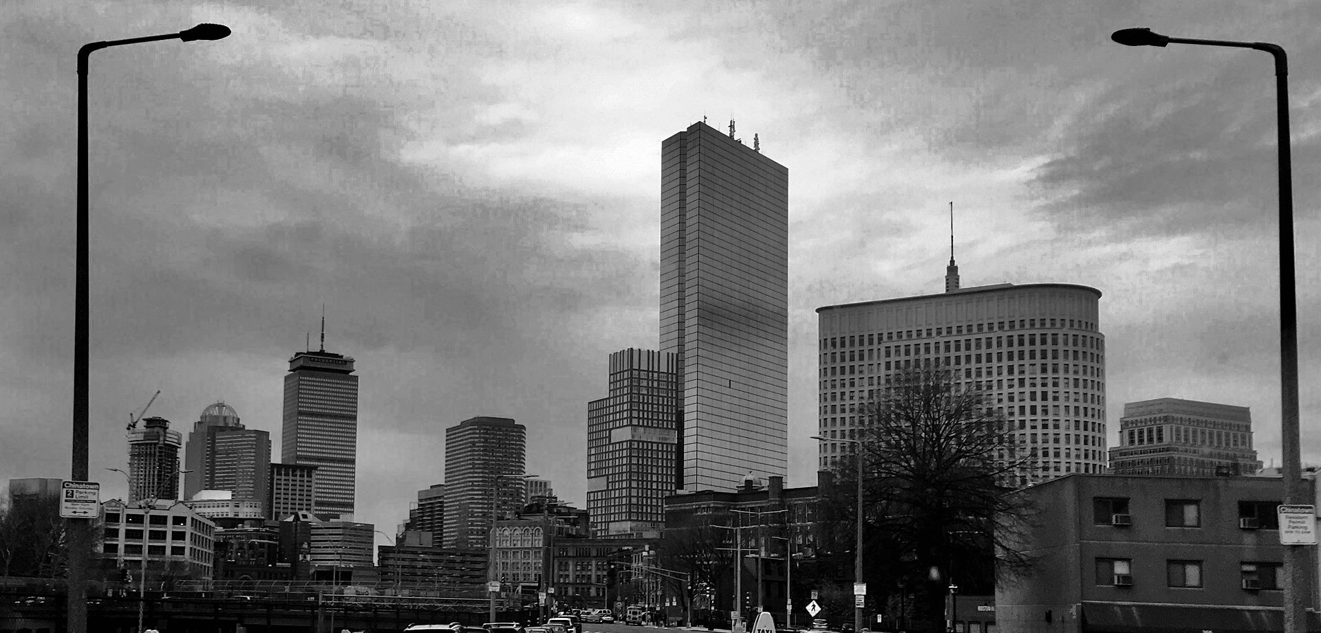
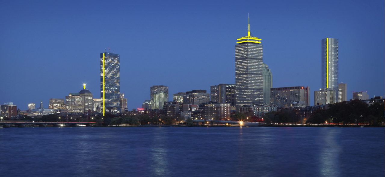
I think the Handcock might look good with some white/yellow lighting on that crease. But personally I don't think that the colored lighting looks good.

Anyway Stick, no offence but this has little to do with the Four Seasons and should probably be on the Boston Architecture and Urbanism thread.
 
imagine if we got 40 Trinity, Copley Tower, Parcel 15 & the Back Bay Station manure?

And maybe, they can squeeze 1 more >600' between the Pru and 1 Dalton.

Better yet, imagine thirty 200-350' residential buildings with quality ground floor retail and restaurant tenants scattered throughout Back Bay, South End and Kenmore.

Remember that only tourists look up.
 
Better yet, imagine thirty 200-350' residential buildings with quality ground floor retail and restaurant tenants scattered throughout Back Bay, South End and Kenmore.

Remember that only tourists look up.

Call John Henry. Let's start w/ Lansdowne St and 2 Charlesgate W, and the parcels from 154~160 Ipswich St.
 
From yesterday:

r7Qj5Sw.jpg
 
Remember that only tourists look up.

Right, because it's not like there's any sumptuous French 2nd Empire, Gothic Revival, Art Deco, or Beaux Arts masterpieces to be found anywhere in our benighted burg, replete with dozens of rich ornamental motifs.

Don't look up, if you're uninterested in catching a glimpse of (in Downtown Crossing alone):

Dozens of gargoyles on 1 Winter St. (Corner Mall)
Heraldic shields on crown of 453 Washington St.
The gorgeous Art Deco layer cake roof of 160 Federal
The 30 Rockefeller-style Art Deco bronze mural encircling 75 Federal
The spiral staircase on 100 Franklin St.
The Art Deco bronze mural embedded in 411 Washington St. (GAP Outlet bldg.)
The Gothic Revival clocktower on 99 Bedford St.
Lions on the crown of 130 Tremont St.

I can't think of a more sadly pathetically dismissive statement than that "only tourists look up."

Gee, what's the point of having architects then? Let's just build everything out of a prefabricated mold from here on, in that case...
 
I can't think of a more sadly pathetically dismissive statement than that "only tourists look up."

Gee, what's the point of having architects then? Let's just build everything out of a prefabricated mold from here on, in that case...

Well said, DBM. I've been living in the Boston area for 15 years, and my neck is craned upwards half the time when I'm downtown (I live on the Red Line, a few stops away, so it's not an annual event or anything).

Frankly, street-level activation is absolutely key, but when so many store fronts are CVS, Walgreens, a Fast-Food Chain restaurant, I'd rather be "looking up" instead of down on most days, though a balance of 'both' is ideal.
 
Right, because it's not like there's any sumptuous French 2nd Empire, Gothic Revival, Art Deco, or Beaux Arts masterpieces to be found anywhere in our benighted burg, replete with dozens of rich ornamental motifs.

Don't look up, if you're uninterested in catching a glimpse of (in Downtown Crossing alone):

Dozens of gargoyles on 1 Winter St. (Corner Mall)
Heraldic shields on crown of 453 Washington St.
The gorgeous Art Deco layer cake roof of 160 Federal
The 30 Rockefeller-style Art Deco bronze mural encircling 75 Federal
The spiral staircase on 100 Franklin St.
The Art Deco bronze mural embedded in 411 Washington St. (GAP Outlet bldg.)
The Gothic Revival clocktower on 99 Bedford St.
Lions on the crown of 130 Tremont St.

I can't think of a more sadly pathetically dismissive statement than that "only tourists look up."

Gee, what's the point of having architects then? Let's just build everything out of a prefabricated mold from here on, in that case...

It was more of a sarcastic remark on the hayseeds who walk around New York and Chicago gawking at the late 20th century soulless skyscrapers ...

"I ain't never seen somethin' like dat in Cedar Rapids"
 
It was more of a sarcastic remark on the hayseeds who walk around New York and Chicago gawking at the late 20th century soulless skyscrapers ...

"I ain't never seen somethin' like dat in Cedar Rapids"

I hear you.

And as a self-serving aside: I moved to Boston in 2005 after living in Chicago for 7 years.

I then proceeded to walk the streets of Boston's financial district gawking at the late 20th century soulless quasi-skyscrapers remarking, "I sure do miss the late 20th century soulless skyscrapers of Chicago."

I'm grateful, then, for the burst of development that has defined the last few years here, even if there are some less-than-ideal projects and major missed opportunities.
 
I think the Handcock might look good with some white/yellow lighting on that crease. But personally I don't think that the colored lighting looks good.

Anyway Stick, no offence but this has little to do with the Four Seasons and should probably be on the Boston Architecture and Urbanism thread.


True.

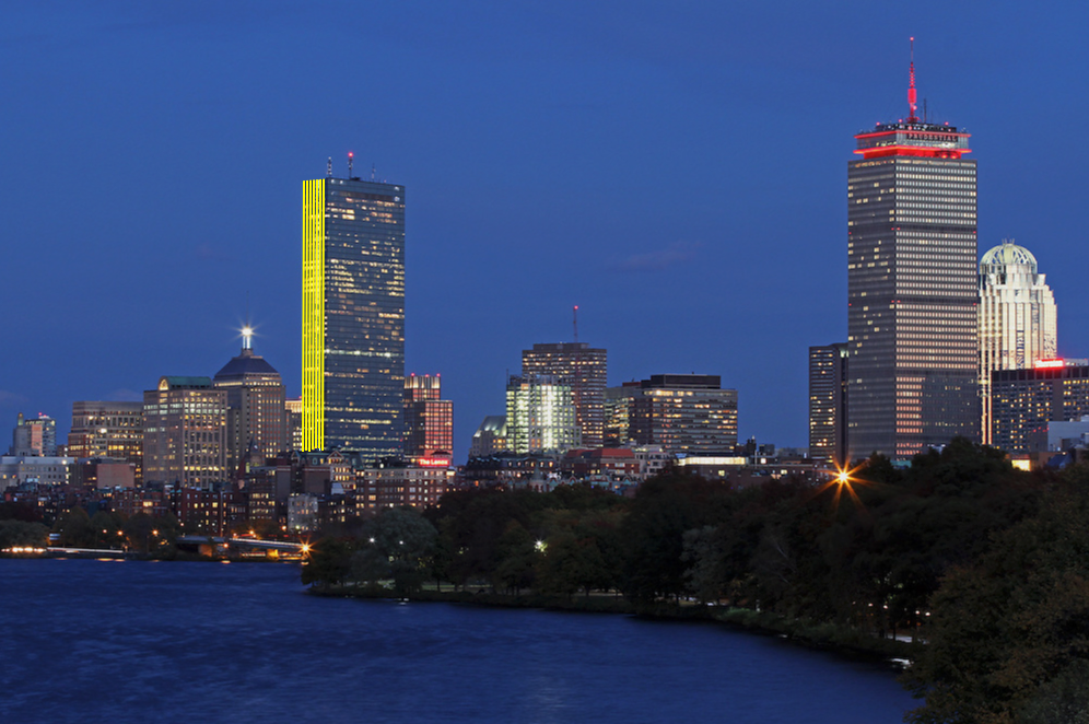
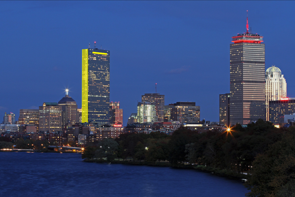
One more for the Hancock, I like this a lot. To me this looks better than the line. If these were LED bands you can write words, have multiple colors, flashing dots like the Eiffel tower, a huge array of colors to choose from, lots of stuff you could do. It could say Go Bruins! accurately and without having to do it with the windows like the Pru. You could really do a lot with this, plus it just looks badass and brings the Hancock to the 21st century without hardly doing anything because the design already holds up. Maybe do this and some ground floor retail and call it a day.

OKC style:


You could cover that black rectangle too:
https://postimages.org/

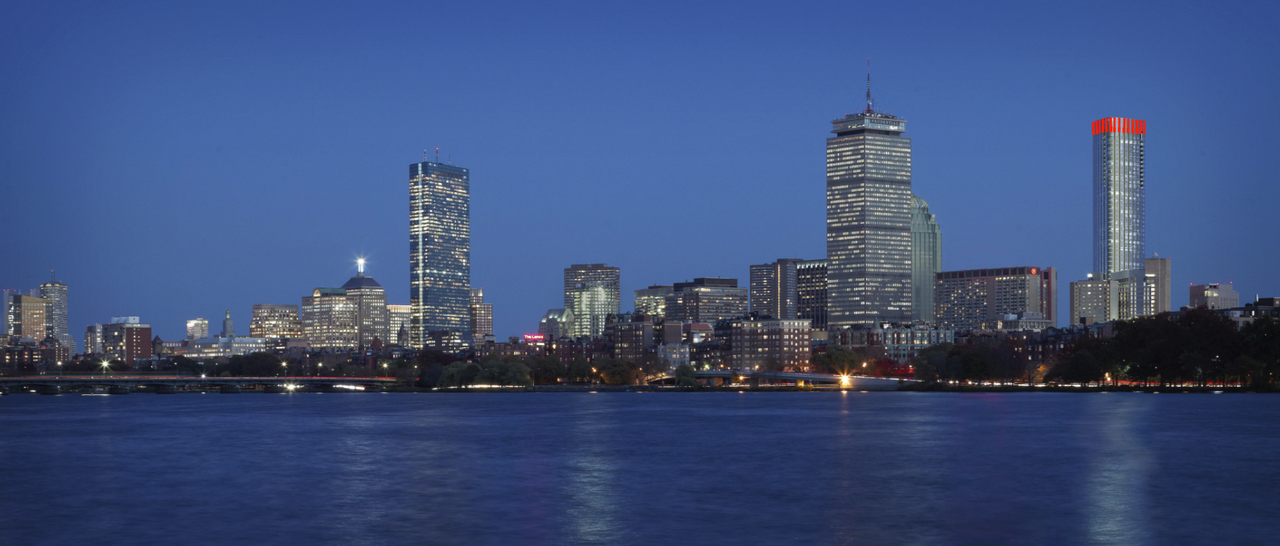
Heres some 1 Dalton:


Houston style:


The possibilities on both buildings with LED lighting are endless.
devontower1.jpg

BIb9cJtCEAAPI39.jpg
 
Last edited:
It was more of a sarcastic remark on the hayseeds who walk around New York and Chicago gawking at the late 20th century soulless skyscrapers ...

"I ain't never seen somethin' like dat in Cedar Rapids"

Ah, thanks for the clarification & I retract my criticism. Yes, sadly, our rich abundance of grand architectural motifs from ca. 1873 (explosion of development post-Great Boston Fire) to 1926 or so is deadened by the tedious sterile monotony of the skyscraper boom of the Mayor Kevin White* era (ca. 1968-84).

*Not that White should be held culpable, in any sense; it was just the lamentable architectural fashion of the time...
 
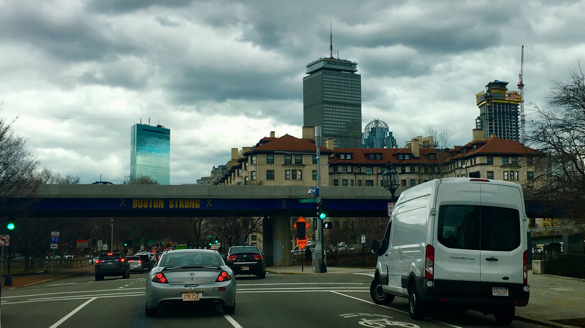
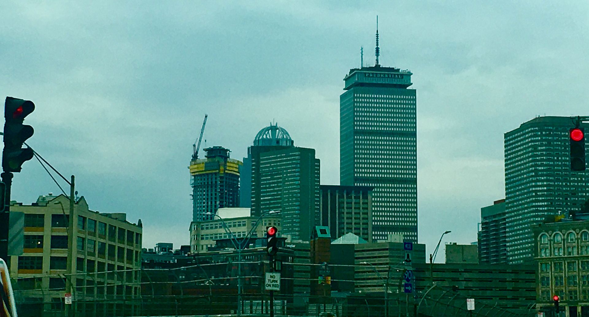
great pix. the taller this gets, the more pronounced its "skinny-ness" becomes. there's really nothing at all like this, proportionally, in boston.

very fun to watch this progress. and i still get to be there for the topping-off ceremony! promise i'll take pix.
 
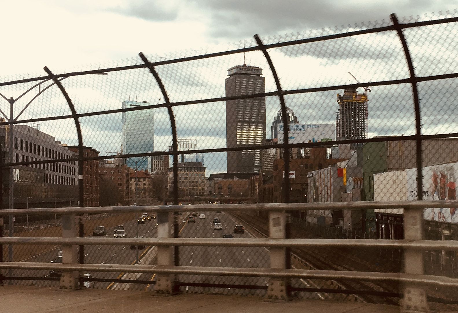
Definitely way past r2d2 now coming into the city on 93 from Dot. I think the top the crane will probably be where it tops out.
 
Definitely way past r2d2 now coming into the city on 93 from Dot. I think the top the crane will probably be where it tops out.

It won't be long now before this surges into 4th tallest. Also I figured out with a better render that it looks like it's 59 windows up (including mech screen), not the 58 I originally thought. So probably about 16 to go.
 
Thats roughly the size of the chunk we can see in the last pic added on top. I think from that angle it will appear a good amount bigger than the Pru.
 
Top climber was moved in position today just under the slewing unit; expect the crane to rise over the weekend.
 

Back
Top