Gardner Museum Expansion | Fenway

Re: Gardner Museum to undertake $60 million expansion

The one thing I did not like about the addition was a 3 story exibit room on the second floor. Seemed to be a wast of display space to me. It was a media presentaion the times I visited.

Is that space intended for temporary, rotating exhibits?
 
Re: Gardner Museum to undertake $60 million expansion

Is that space intended for temporary, rotating exhibits?
It and the adjacent, small single level room, are for rotating exhibits. It looks like the 3 story space will be primarily use as a media space. Seems like a waste and a lost opportunity. Oh well, 2 steps forward 1 step back.
 
Re: Gardner Museum to undertake $60 million expansion

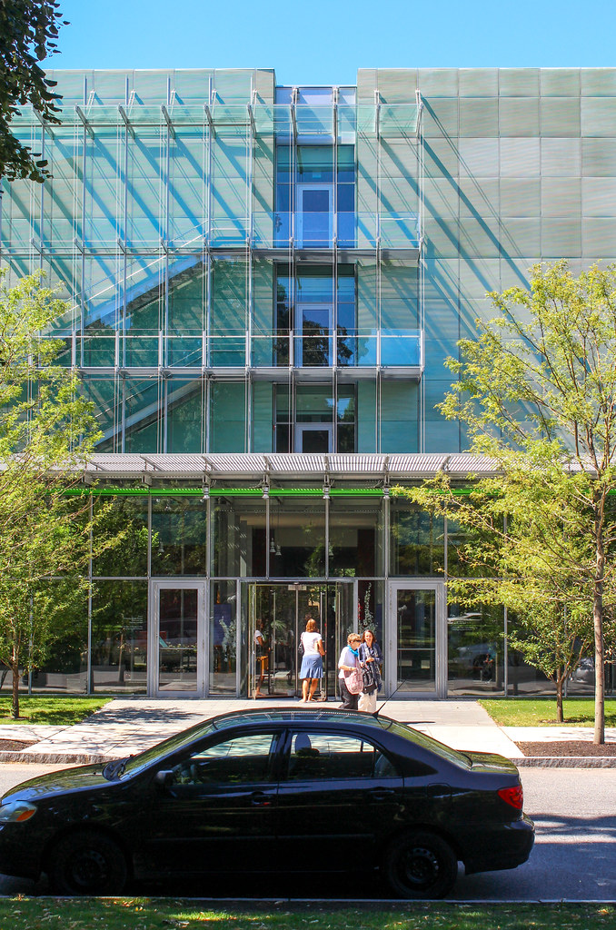
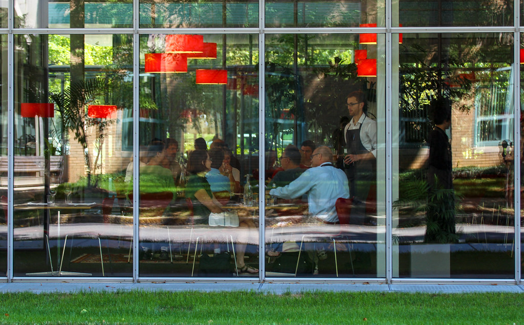
Upon entering the new structure I was impressed by the simplicity and lightness of the design. This proved to enhance the sensation of stepping back in time when entering the original building from the new entrance. The performance hall is striking in the intimacy of it. The new restaurant appears spartan. I thought the new gift shop to be smaller than I expected it to be. I did however enjoy the experience enough to renew my membership. I'm still struck by the empty frames of the stolen masterpieces.
 
Re: Gardner Museum to undertake $60 million expansion

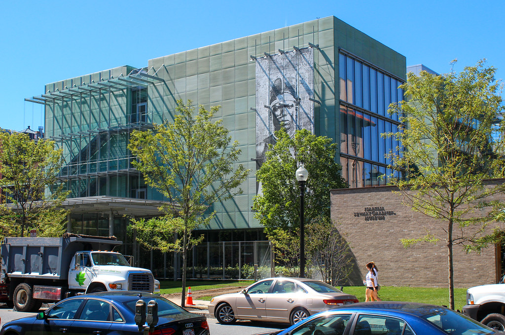
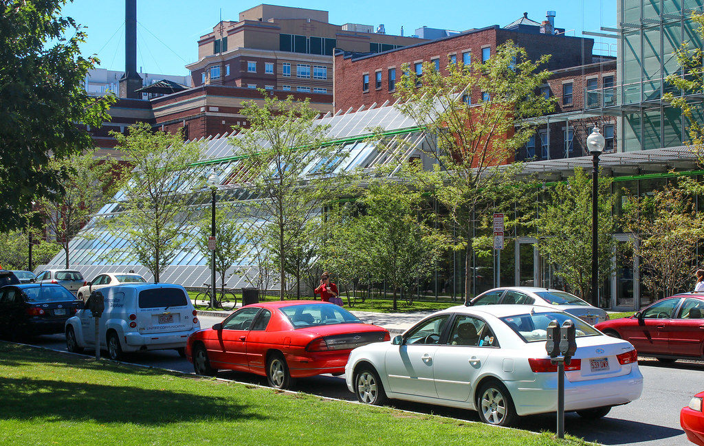
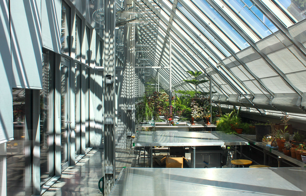
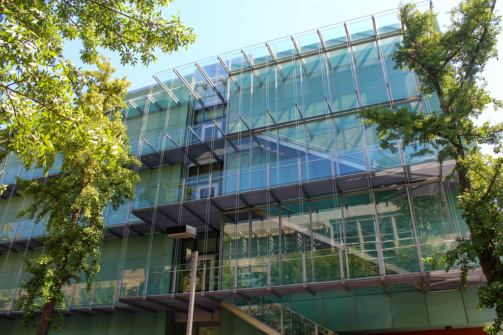
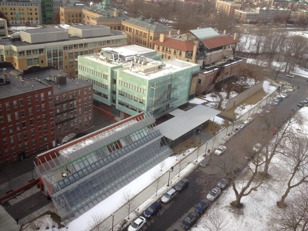
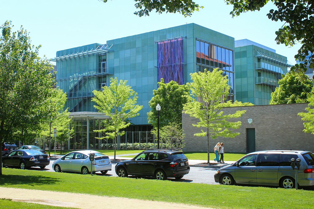
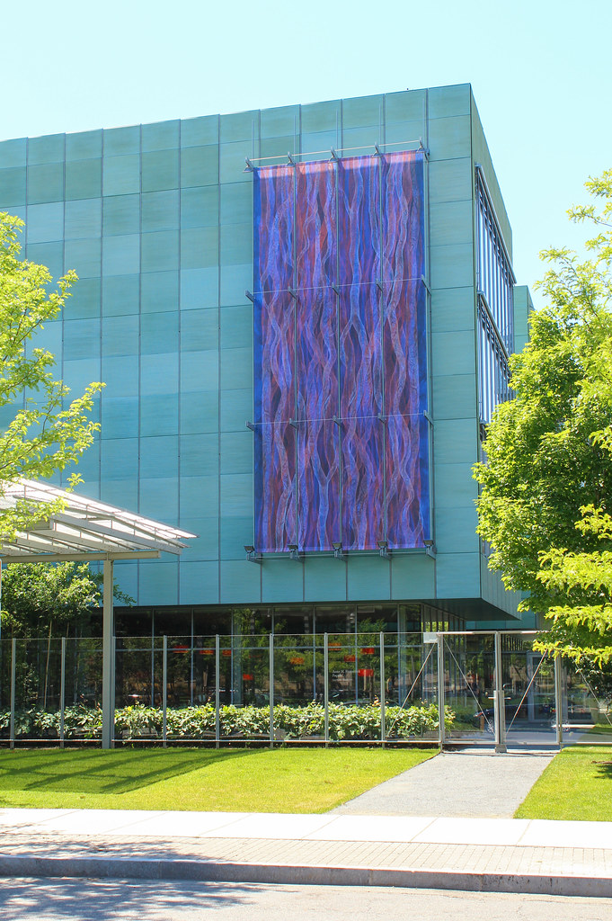
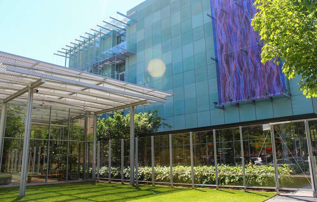
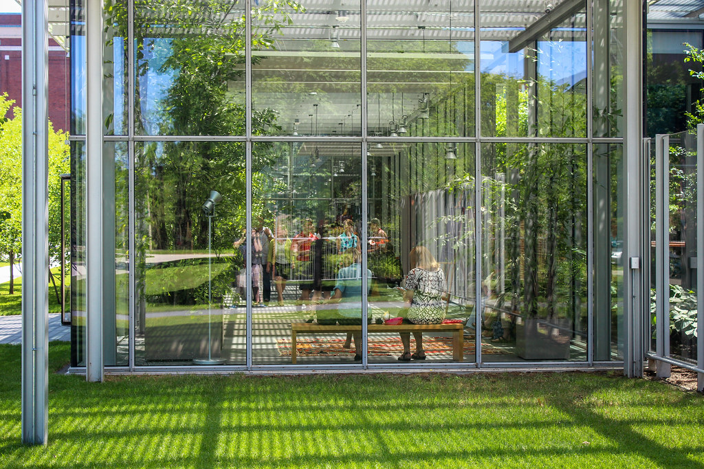
A year's worth of growth on the foliage has done wonders...

9674688225_ec0402b690_b.jpg


9674686625_3a001cc1df_b.jpg


9674683669_10caa7dab1_b.jpg


9674681565_f4f5f8dc26_b.jpg


9677909616_243978093c_b.jpg
 
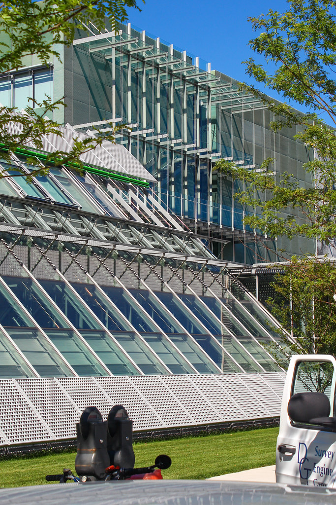
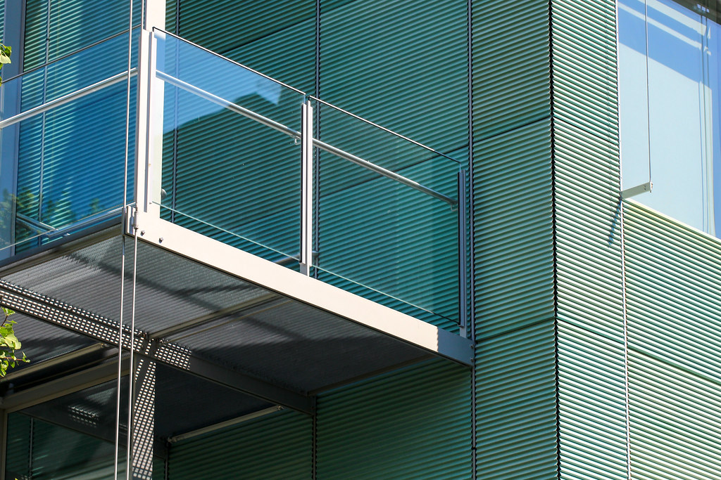
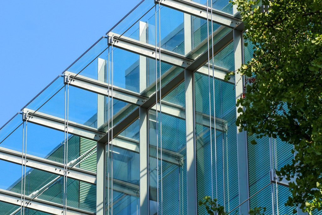
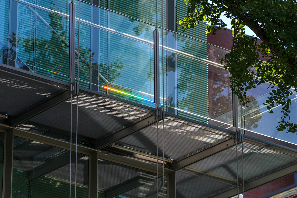
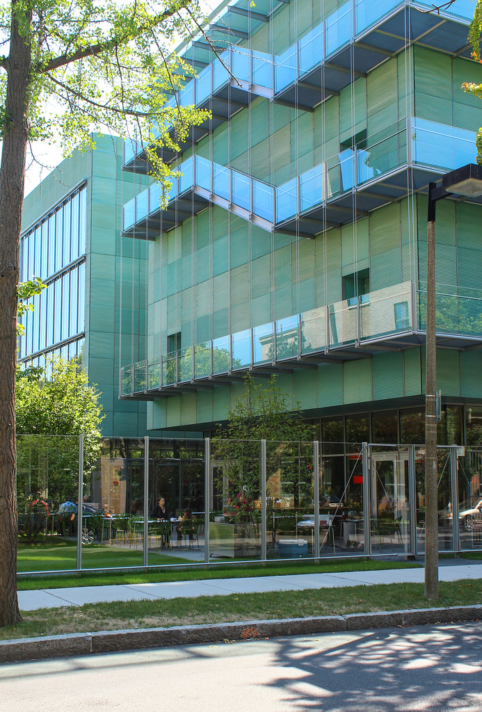
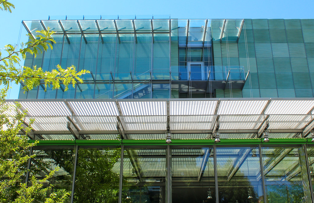
The tectonics of the facade are an architect's freaking wet dream. So awesome. Renzo Piano does it like no other.
 
Why I like this project:

Mr. Piano was hired here not to duplicate the original, but to build a building that exudes the kind of architectural attention to detail and craft. In this way it is having a dialog with the past. His solution succeeds in this dialog in my opinion.

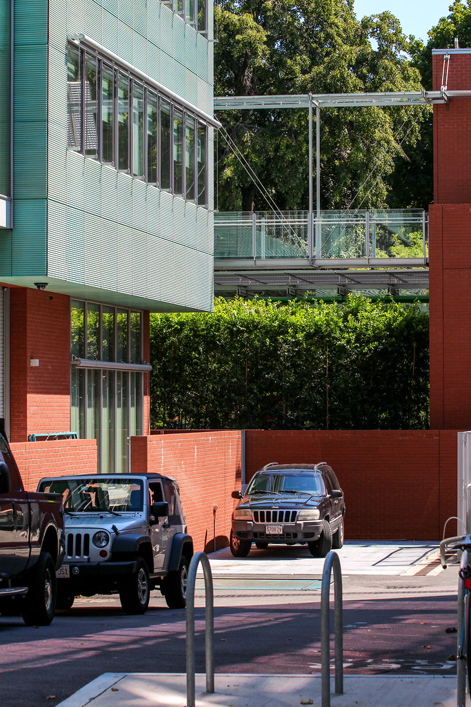
Much criticism has been made that the building has no relationship in its materials or structure to the urban context. I say it has as much relationship to the context as a Venetian palace ever did in the first place.

This is a finely crafted piece of architecture that cannot be fully appreciated from afar (or simply from pictures), it is a building in which you must walk though/touch/experience. I don't think there are many buildings around where that kind of experience can be had. Trinity Church, BPL, Boston Anatheaum.

How is that for archi-babble.

cca
 
Perfect. Thanks. Now maybe we can be drag Beyonce put of semi-retirement.
 
This is a finely crafted piece of architecture that cannot be fully appreciated from afar (or simply from pictures), it is a building in which you must walk though/touch/experience. I don't think there are many buildings around where that kind of experience can be had. Trinity Church, BPL, Boston Anatheaum.

While those three examples you cited do offer that type of experience, it is not necessary to appreciate them. "Timeless" and "beautiful" are terms that could be unconditionally applied to them, even without experiencing the interiors. They are unquestionably supreme examples of their craft.

Good architecture should be able to be appreciated from photographs and from afar in addition to a positive interactive experience for the user. Having to do that to just appreciate it is a design flaw of the highest magnitude. It's akin to a plaque talking about "what the architect was thinking when they designed so and so feature". You shouldn't need a plaque, or a walk through to experience a great building. It should just happen.
 
Why I like this project:

How is that for archi-babble.

cca

Great!!!
I for one appreciate the babble. Please feel free to archi-babble anytime you want.
 
While those three examples you cited do offer that type of experience, it is not necessary to appreciate them. "Timeless" and "beautiful" are terms that could be unconditionally applied to them, even without experiencing the interiors. They are unquestionably supreme examples of their craft.

Good architecture should be able to be appreciated from photographs and from afar in addition to a positive interactive experience for the user. Having to do that to just appreciate it is a design flaw of the highest magnitude. It's akin to a plaque talking about "what the architect was thinking when they designed so and so feature". You shouldn't need a plaque, or a walk through to experience a great building. It should just happen.

I do not disagree. The greatest of great buildings to it all. That is not being debated. I am simply saying why this is a good and worthwhile piece of design work that should be looked upon favorably. Not every design looks to or even tries to do everything you say it should or can. It is often trying to solve a concise problem with elegant solutions.

Once again .. .I think this buildings does that. At its programmatic core, its a big windowless box. In the hands of a lesser architect (me) it could be simply that and be dreadful. To a different architect (maybe Zaha Hadid) they might abandon the programmatic function to make a statement about something other than making the best possible performance space.

Mr. Piano does neither, he looks to balance design and function through craft. He took a great deal of care to break that box by using programmatic elements (like fire stairs and circulation spaces) and use them to add texture and visual interest. When you see that external stair up close you understand it is crafted like a fine jewel, elevating it beyond its simple function.

cca

Ps. Having to experience buildings at varies scales depending on how it address its context is never a design flaw, it is a choice, and sometimes a wonderful choice in the hands of master designers.

Pps. Boston Athenaeum has a rather weak exterior expression for its style. It is a very flat and rather uninteresting version of a Renaissance era roman pallazo. The only way to experience that it is one of Bostons great pieces of design work is to wander the reading room and be amazed.
 
I do not disagree. The greatest of great buildings to it all. That is not being debated. I am simply saying why this is a good and worthwhile piece of design work that should be looked upon favorably. Not every design looks to or even tries to do everything you say it should or can. It is often trying to solve a concise problem with elegant solutions.

....

cca

Ps. Having to experience buildings at varies scales depending on how it address its context is never a design flaw, it is a choice, and sometimes a wonderful choice in the hands of master designers.

Pps. Boston Athenaeum has a rather weak exterior expression for its style. It is a very flat and rather uninteresting version of a Renaissance era roman pallazo. The only way to experience that it is one of Bostons great pieces of design work is to wander the reading room and be amazed.

CCA -- sometimes the ins& outs are intimately connected as in [my top ten list]:
1) the BPL interior & exterior
2s) MFA Huntington entrance & grand staircase up to the Sargent Murals and the Rotund
2b) Grand Colonnade Fenway entrances with the Peristyle steps and galleries on to the Koch Gallery [albeit in the center of the MFA]
2* of course all were done by the same gifted architect albeit a decade + apart
3) Trinity in & out
4a) New Statehouse old parts in & out
4b) some of the new parts of the new statehouse
5) South Station out & mostly in
6a) MIT main entrance out & in
6b) MIT Killian Court Collonade & Great Dome out & Barket Library reading room under the dome inside
7) New Old South out & in
8) Rowe's Wharf out & in
9) Old North out & in
10) tie
Fairmont Copley Plaza
Langham Boston [aka the old Fed]

Other times there is just one knock-your-socks off such as the interior courtyard of the Gardner

Others:
1) you mentioned the reading room at the Atheneum
2) outside of the Customshouse
3) Inside of King's Chapel -- the outside is missing a real steeple
4) Outside of Hancock Tower
5) View from the Pru -- definitely not the view of the Pru
6) Outside of Chadwick Leadworks -- never been inside
7) Outside of the Old Middlesex County Building [Bulfinch] especially from an angle omitting the monstrosity behind it
8) Church of the Holly Bean Blowers --aka First Baptist on Commonwealth & Clarendon
9) 3 way tie
1st Harrison Gray Otis Mansion -- outside never been inside
2nd Harrison Gray Otis Mansion -- outside and the inside of the publicly accessible one
3rd Harrison Gray Otis Mansion -- mostly the outside and the foyer of the Beacon St one [AMS Hq.]
10) tie
10a) Burnham on the outside especially the Summer St. facade above the ground floor as in its last stages the inside was not up to the original standards
10b) Franklin St. as a grand outdoor gallery with numerous exteriors
 

Back
Top