You are using an out of date browser. It may not display this or other websites correctly.
You should upgrade or use an alternative browser.
You should upgrade or use an alternative browser.
GrandMarc Residence Hall (YMCA) @ Northeastern U | 291 St. Botolph Street | Fenway
- Thread starter KentXie
- Start date
- Joined
- Jan 7, 2012
- Messages
- 14,072
- Reaction score
- 22,823

http://www.flickr.com/photos/beelinebos/13025143813/

http://www.flickr.com/photos/beelinebos/13024962145/

http://www.flickr.com/photos/beelinebos/13025105183/

http://www.flickr.com/photos/beelinebos/13025084403/

http://www.flickr.com/photos/beelinebos/13024309845/

http://www.flickr.com/photos/beelinebos/13025066743/
Tombstoner
Active Member
- Joined
- Mar 5, 2010
- Messages
- 707
- Reaction score
- 2
A) It's under-f*ck*ng construction! Why people on this site condemn a building so prematurely always baffles me.
Can we hate it yet?
Shepard
Senior Member
- Joined
- Mar 20, 2009
- Messages
- 3,518
- Reaction score
- 68
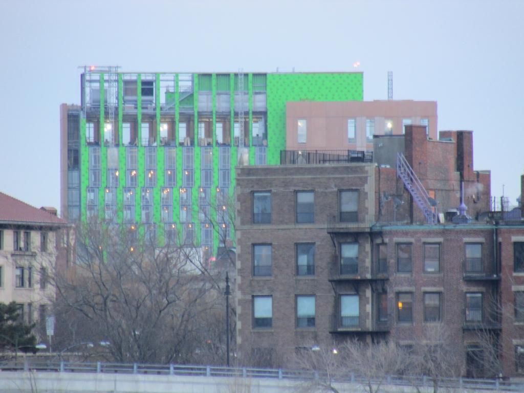
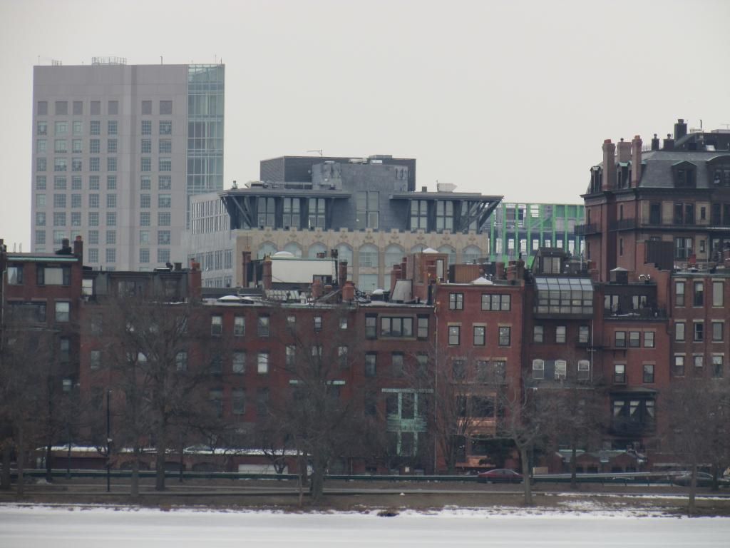
I don't think any of the pictures adequately capture how much like cardboard the panels actually appear in real life.
Also, I'm the last one to ever complain about height and density etc. BUT - the massing on this beast is severely offensive. It looms over all its neighbors like a huge ugly wall, separating Huntington from Northeastern. The choice of cheapo materials, bizzaro massing, and just everything about it is extremely out of place.
Also, I'm the last one to ever complain about height and density etc. BUT - the massing on this beast is severely offensive. It looms over all its neighbors like a huge ugly wall, separating Huntington from Northeastern. The choice of cheapo materials, bizzaro massing, and just everything about it is extremely out of place.
I don't think any of the pictures adequately capture how much like cardboard the panels actually appear in real life.
Also, I'm the last one to ever complain about height and density etc. BUT - the massing on this beast is severely offensive. It looms over all its neighbors like a huge ugly wall, separating Huntington from Northeastern. The choice of cheapo materials, bizzaro massing, and just everything about it is extremely out of place.
Can it actually look worse than it does in the photos above? Is that possible?
I agree about the massing but said that early on in this thread (and was flamed for it).
Last edited:
So I guess I will be the first one to say that I find this building completely unoffensive... close up pictures just don't work. I think it looks fine - not every building has to be some grand architectural statement. Also, it looks better in person.
pixelsand8
Active Member
- Joined
- Mar 16, 2013
- Messages
- 467
- Reaction score
- 2
This is all part of the AB acceptance curve. One that starts is excitement, then disappointment, then hate, then acceptance.
Happens every time.
cca
I haven't seen enough of GrandMarc to make an opinion, and I realize the massing is less than ideal but I want to wait till it's finished (or closer to that point) to form an opinion. That said, have we officially "accepted" Kensington or Waterside Place? Is that day imminent? In my mind the only way those buildings can be tolerated is when they are covered up by lots of better stuff, in which case their functionality can justify their existence. Still, tolerance is not the same as acceptance and even in terms of functionality they are treading thin ice by being "luxury" housing as opposed to just plain old "housing". Luxury housing should at least try to reflect what they are externally rather than rely on "newness" or location.
Considering it's purpose as a student dorm (albeit an overpriced one) my expectations for GrandMarc are much lower. It doesn't have to be pretty, it just has to warehouse lots of students and keep them out of the local apartment market.
Considering it's purpose as a student dorm (albeit an overpriced one) my expectations for GrandMarc are much lower. It doesn't have to be pretty, it just has to warehouse lots of students and keep them out of the local apartment market.
Uhm, wow.
I don't expect every building to be groundbreaking. I do think we can expect more out of architecture, especially with a building of this size and presence in this neighborhood.
Last edited:
That said, have we officially "accepted" Kensington or Waterside Place?
Waterside Place looks surprisingly OK from across the water. (where it's already partially hidden, and also is the glassier side) From the back (from BCEC) it looks terrible and will hopefully be covered up by new construction.
The Kensington is really just bad from almost every angle, except it's (barely) passable from the common.
I do not have high hopes for the final product of GrandMarc, but it should at least look a little better than it does now. Sure, the proportions aren't amazing, but there is a lot of buildup going on along Huntington and this just adds to that. So far, I find the randomly placed lighter colored panels to be the most concerning/disconcerting/offensive part of this building.
bobthebuilder
Active Member
- Joined
- Oct 17, 2013
- Messages
- 434
- Reaction score
- 159
Waterside Place looks surprisingly OK from across the water. (where it's already partially hidden, and also is the glassier side) From the back (from BCEC) it looks terrible and will hopefully be covered up by new construction.
The Kensington is really just bad from almost every angle, except it's (barely) passable from the common.
I do not have high hopes for the final product of GrandMarc, but it should at least look a little better than it does now. Sure, the proportions aren't amazing, but there is a lot of buildup going on along Huntington and this just adds to that. So far, I find the randomly placed lighter colored panels to be the most concerning/disconcerting/offensive part of this building.
The overall state of architecture (especially around here) is extremely disappointing. In my opinion one of the main reasons that we're not seeing anything architecturally significant, is that we're not allowing developers to go tall, so there isn't as much money to spend on things like an interesting shape/facade. That is also why we see these projects go through the "bait & switch", where a project starts out in some kind of grand scale and may look nice, until the NIMBY's get their hands on it and strip it down to a boring box just because they don't like the size or the shade or the wind or traffic or whatever they want to whine about.
Either that, or we need to start attracting developers with deeper pockets, which will never happen with the current state of the BRA.
bobthebuilder
Active Member
- Joined
- Oct 17, 2013
- Messages
- 434
- Reaction score
- 159
Was this building's height limited by neighborhood opposition? I recall there was a group that didn't want the addition to the YMCA torn down, but I don't remember if anyone had an issue with a proposed height.
Not that I know of, I was just speaking in generalities. My theory is that if there was more height, the developers would be getting more bang for their buck, and have more money to spend on nice facades and interesting shapes.
commuter guy
Active Member
- Joined
- Feb 1, 2007
- Messages
- 895
- Reaction score
- 130
Height is not the issue, it's the utter lack of meaningful city planning or design review in the Boston in recent past. I grew up in the midwest and even crappy parking garages built in the downtown area were required to have retail frontage on the first floor along with canopies. As a result there were multiple storefronts and the pedestrian on the sidewalk would have no idea they were walking next to a parking garage. Simple changes to the ground level and general massing of many of these new buildings could go a long way in making them more tolerable. Top notch materials certainly helps, but a lot could be done without a ton of additional money.


