You are using an out of date browser. It may not display this or other websites correctly.
You should upgrade or use an alternative browser.
You should upgrade or use an alternative browser.
GrandMarc Residence Hall (YMCA) @ Northeastern U | 291 St. Botolph Street | Fenway
- Thread starter KentXie
- Start date
Czervik.Construction
Senior Member
- Joined
- Apr 15, 2013
- Messages
- 1,932
- Reaction score
- 1,163
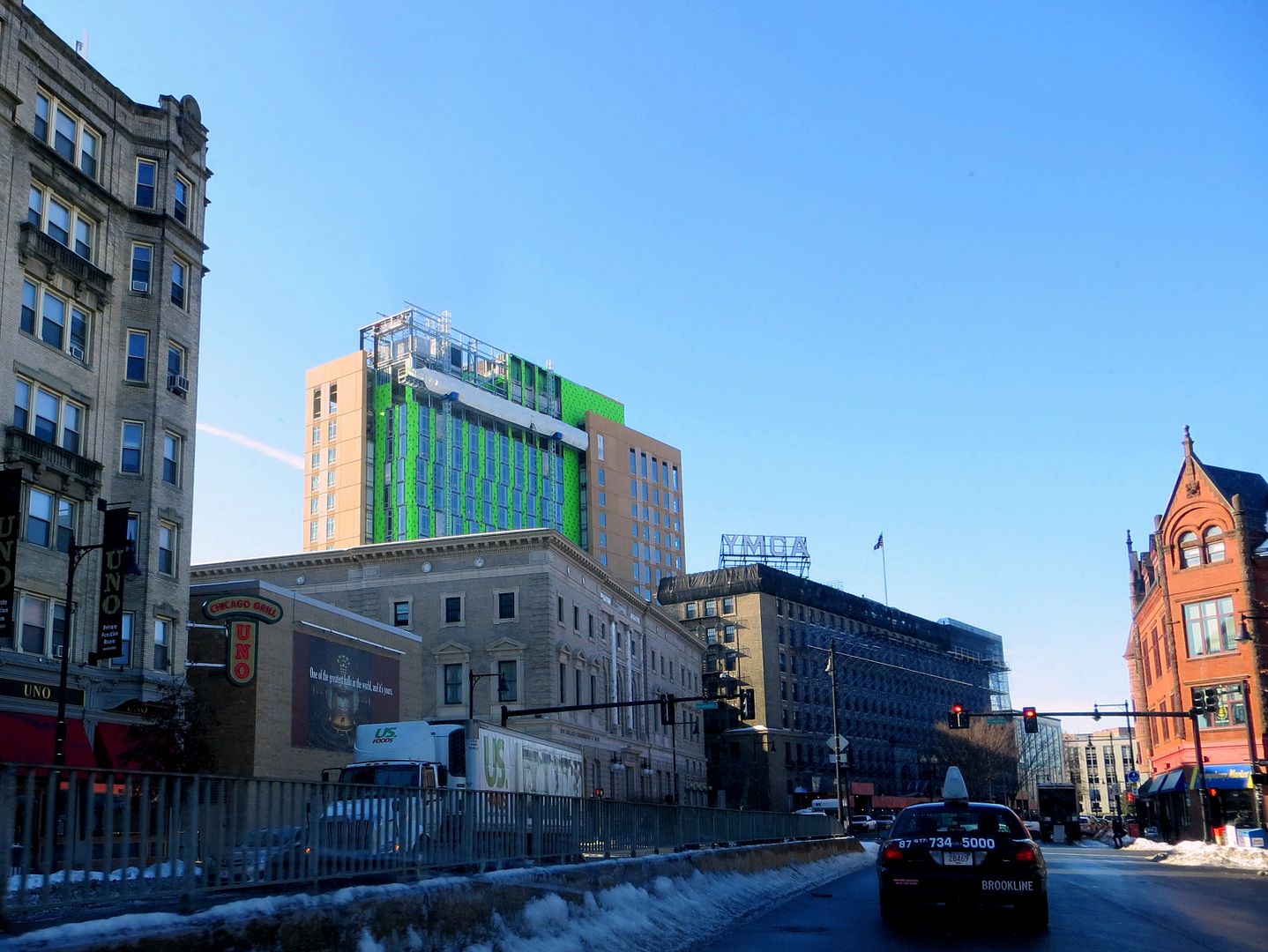
Ummm, it looks like Grand Marc is "having it's way" with the old YMCA building.
Boston02124
Senior Member
- Joined
- Sep 6, 2007
- Messages
- 6,893
- Reaction score
- 6,639
Downburst
Senior Member
- Joined
- Jul 20, 2012
- Messages
- 1,452
- Reaction score
- 347
I'm going to go out on a limb and say yes. From inside.
(I personally find it most impressive/appealing from ground level on the St. Botolph side. Within, say, 50 feet in most directions. I think it's because it sticks out a bit less when it's the only thing you see. I'll try and get a picture illustrating my point in the next few days.)
(I personally find it most impressive/appealing from ground level on the St. Botolph side. Within, say, 50 feet in most directions. I think it's because it sticks out a bit less when it's the only thing you see. I'll try and get a picture illustrating my point in the next few days.)
dshoost88
Senior Member
- Joined
- Apr 14, 2008
- Messages
- 2,168
- Reaction score
- 2,589
I'm going to go out on a limb and say yes. From inside.
(I personally find it most impressive/appealing from ground level on the St. Botolph side. Within, say, 50 feet in most directions. I think it's because it sticks out a bit less when it's the only thing you see. I'll try and get a picture illustrating my point in the next few days.)
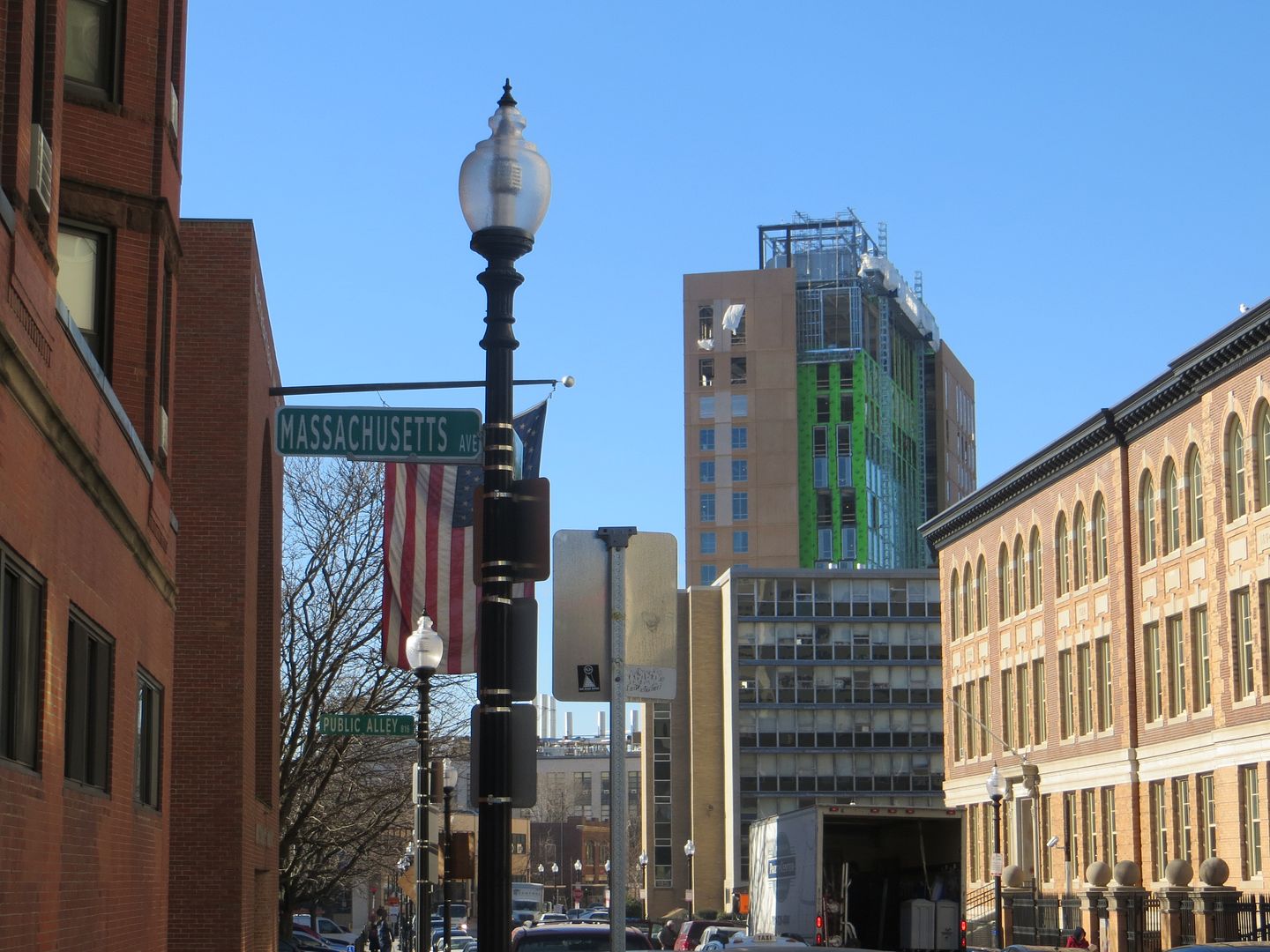
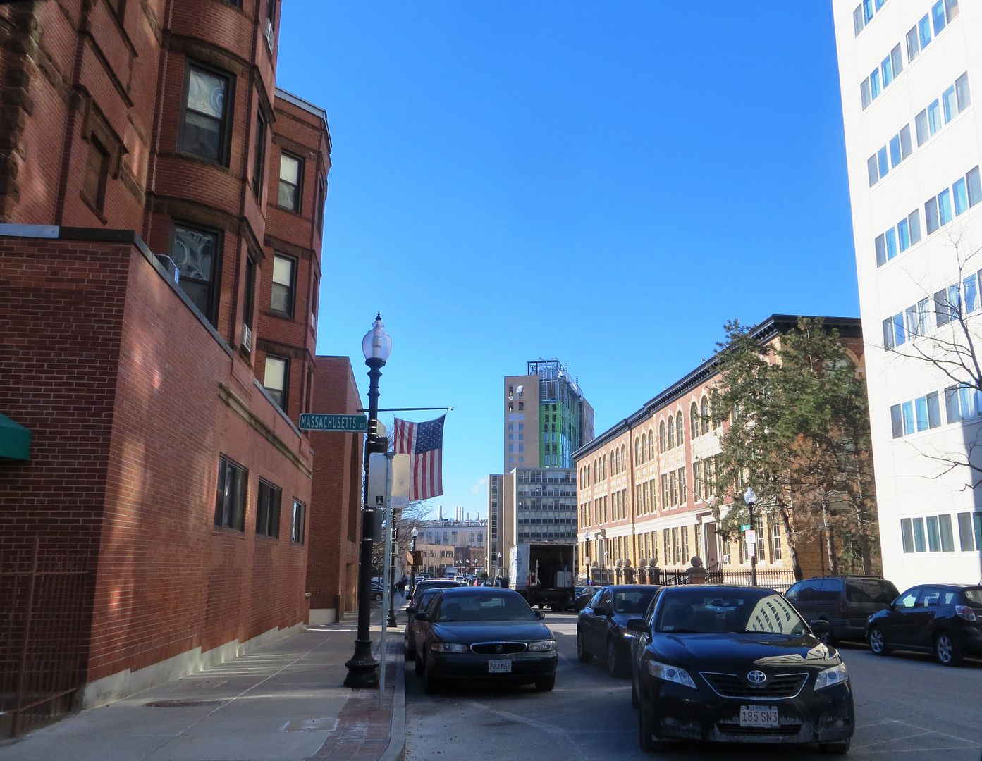
I think these photos somewhat illustrate your point, Downburst, and I agree. I also think the different glass scheme on the opposite corners of the building will have a positive impact on how people perceive this from near and far.
Czervik.Construction
Senior Member
- Joined
- Apr 15, 2013
- Messages
- 1,932
- Reaction score
- 1,163
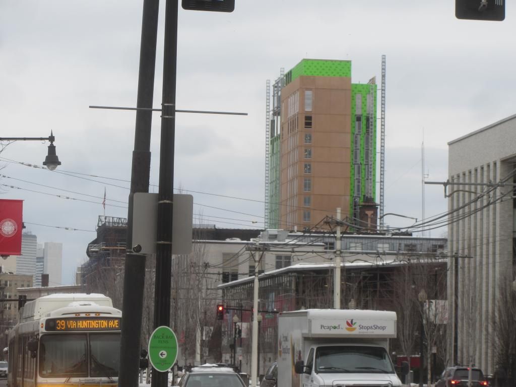
It looks tall and somewhat thin from the back and short and stubby from the front. Is that because the old YMCA building is blocking half of the building?
RandomWalk
Senior Member
- Joined
- Feb 2, 2014
- Messages
- 3,332
- Reaction score
- 5,265
It's the George Hamilton of precast buildings. Instantly recognizable in any crowd with the garish orange tan.
Tombstoner
Active Member
- Joined
- Mar 5, 2010
- Messages
- 707
- Reaction score
- 2
It's the George Hamilton of precast buildings. Instantly recognizable in any crowd with the garish orange tan.
John Boehner came more immediately to mind, but the point is well made.
TomOfBoston
Senior Member
- Joined
- Mar 29, 2007
- Messages
- 1,241
- Reaction score
- 465
I assume that they are cleaning and repairing the façade of the YMCA?
Boston02124
Senior Member
- Joined
- Sep 6, 2007
- Messages
- 6,893
- Reaction score
- 6,639


