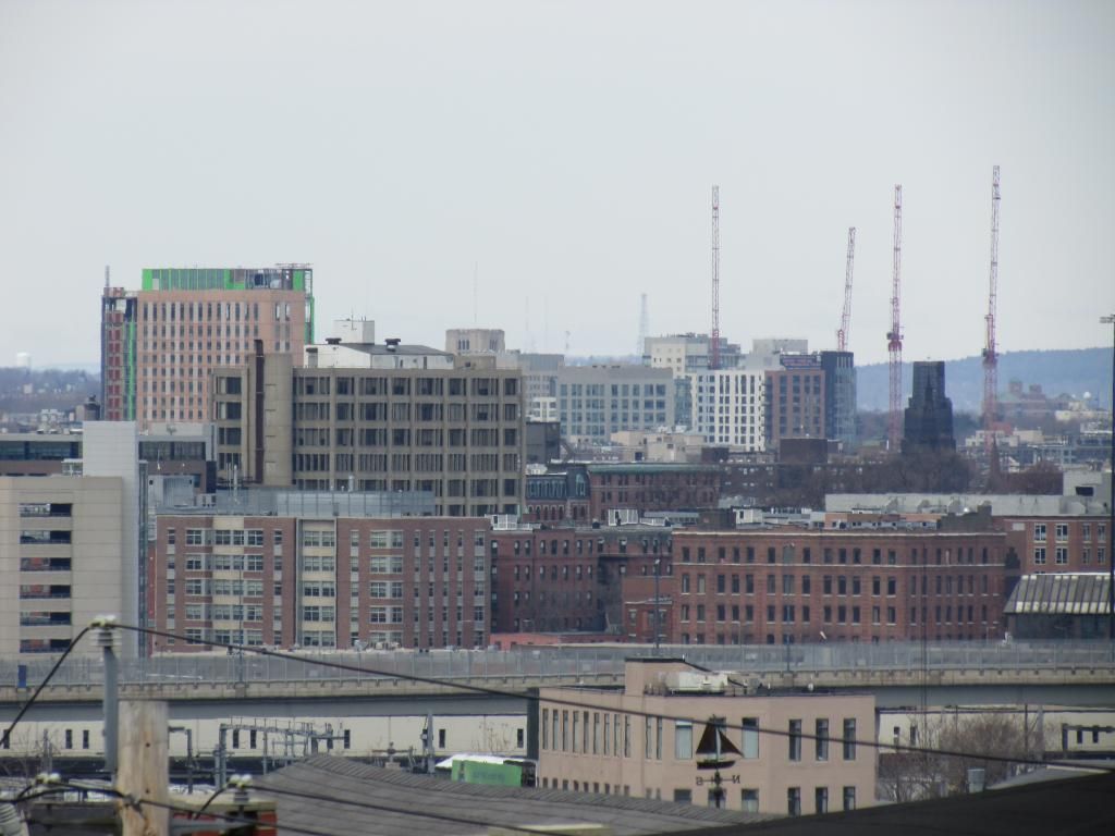
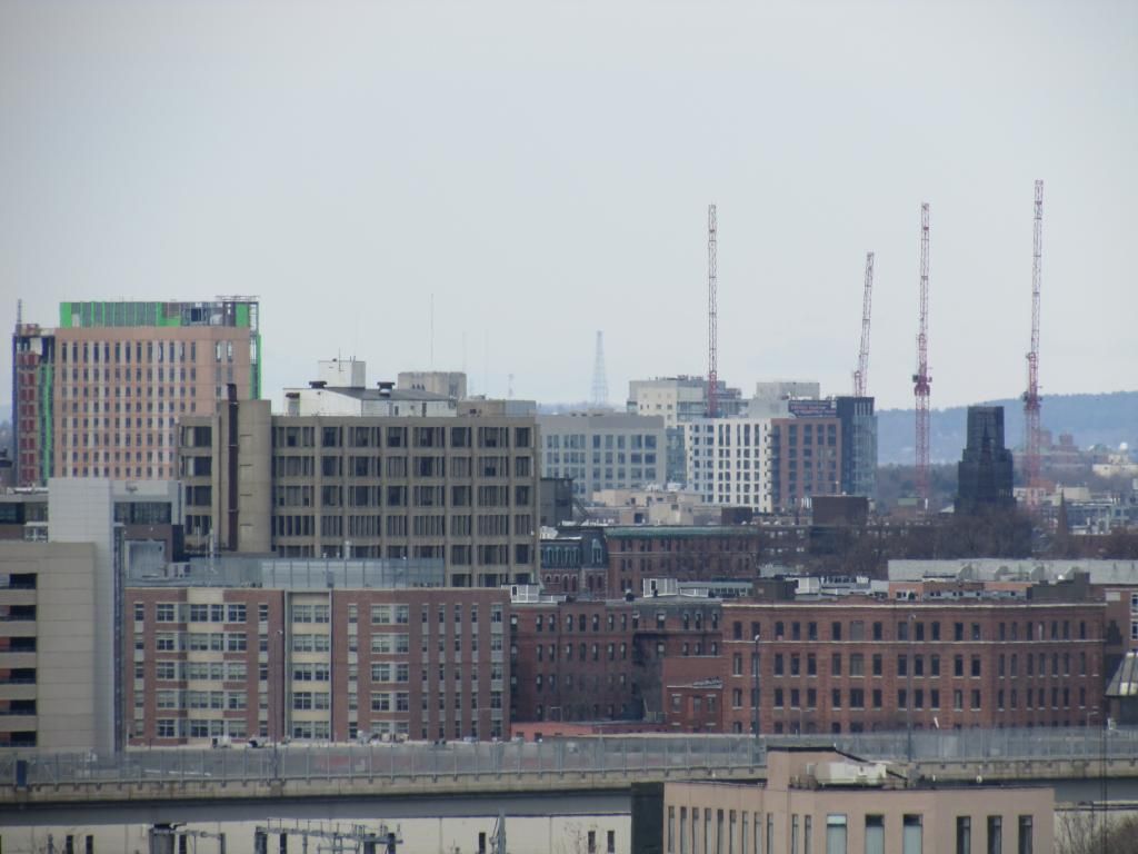
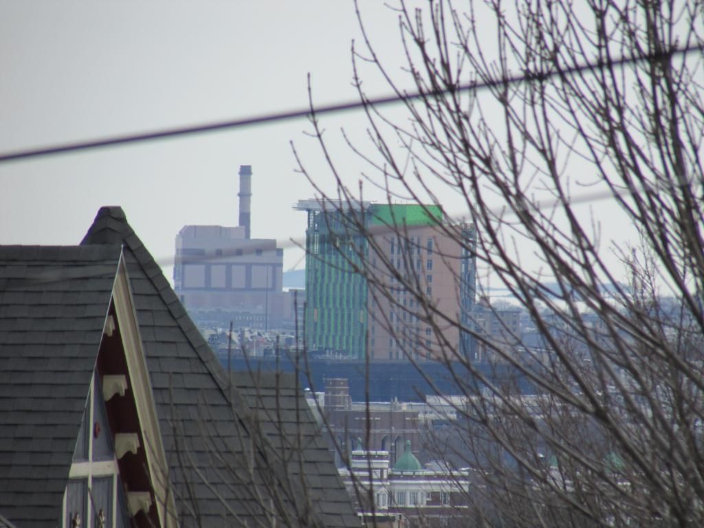
GrandMarc Residence Hall (YMCA) @ Northeastern U | 291 St. Botolph Street | Fenway

Can someone with knowledge of this explain to me what the theory is behind randomly placed panels of ever-so-slight color variations? It looks horrible to me in every instance. I get the theory behind going lighter as you go higher, but the random application turns into a sloppy looking mess. What am I missing?

Looking at this image:
13455172205_b50ceab764_b.jpg


It looks to me like the lighter colored panels are meant to form somewhat thick diagonal lines along the facade, but at the same time, it's not quite that way near the top, so yea I guess probably random.

Either way, looks dumb
 
Large glass panels are being installed at the top levels on the Huntington-facing side. (Pardon the quality; I took this from my phone yesterday)


I do believe that the Y is getting a good scrubbing. It could certainly use it, either way.
 
Grids are out. There is an assumption that a grid is thoughtless and proves that you are not being thoughtful about a buildings design. Thus we have lots and lots of instances where there is a true underlying need for a rigorous grid (in the case of a residence hall, or a laboratory tower) buy the people dealing with the last few inches of the exterior of the building do not want to seem out of touch to their Archdaily reading peers, and thus "plan-fully randomize" the facade by swapping out materials or adjusting colors to try to wash away the grid.

By the tone of this, you can guess that I am not a fan. I do enjoy a project that finds artful ways of making texture happen efficiently (MassArt) ... but projects like this one show me that the designer was not self confident enough to allow the organization of the building itself show on the exterior.

cca
 
I don't want to get in trouble here for straying off topic, but I think the Grand Marc looks better than International Place -Northeastern's last big dormitory tower project - but that's not saying much. With International Place, I just don't get why they chose different colored panels on different sides of the building. Northeastern had a chance to redeem themselves on this project and I think they missed the mark.
 
I don't want to get in trouble here for straying off topic, but I think the Grand Marc looks better than International Village -Northeastern's last big dormitory tower project - but that's not saying much. With International Village, I just don't get why they chose different colored panels on different sides of the building. Northeastern had a chance to redeem themselves on this project and I think they missed the mark.

Fixed
 
Thanks guys for the correction... I'm interested to see what this project will look like when its done...
 
kz, are these from today? I might have just missed you if that was the case.
 
What the heck is going on on the top floor in this dorm? That ceiling height is insane! Looks like a ballroom! The view from those giant windows has to be wicked awesome.
 
The western portion is definitely mechanical, but I do hope that some of those windows will present an accessible view for students.

Unlike other recent Northeastern residence halls, there's no obvious space for common rooms based on this building's exterior. Perhaps the common room will be up top?

That is how West H is, isn't it?
 
I should have said top publicly accessible floor. Obviously the actual top is an MEP penthouse.
 
I can't find the reference now but I remember that at least part of the top floor will be a large student lounge.
 
It was suggested the top floor would be the NEU President's sort of private exhibition space, to take big donors to. And the view from up top is amazing.
 
Click here and scroll to page 11 for floor plans. Floors 2 through 12 are going to have Jack & Jill double bedrooms (so doubles connecting with a semi-private bathroom, like the honors freshmen dorms on floors 2-9 of International Village) and will include common rooms on each level. Floors 13-16 are going to be suite style like most of West Village residences, and since the suites have living rooms there will be no common space on these floors.

The entire 17th floor will allegedly be open to the Northeastern community... logistically, I'm not sure how this would work, but that's what was inferred at task force meetings 3 years ago (GEEZE, 3 whole years ago). Page 15 shows the layout for the top floor: multi-use and lounge space.
 

Back
Top