Dr. Rosen Rosen
Senior Member
- Joined
- Jul 19, 2021
- Messages
- 1,164
- Reaction score
- 6,722
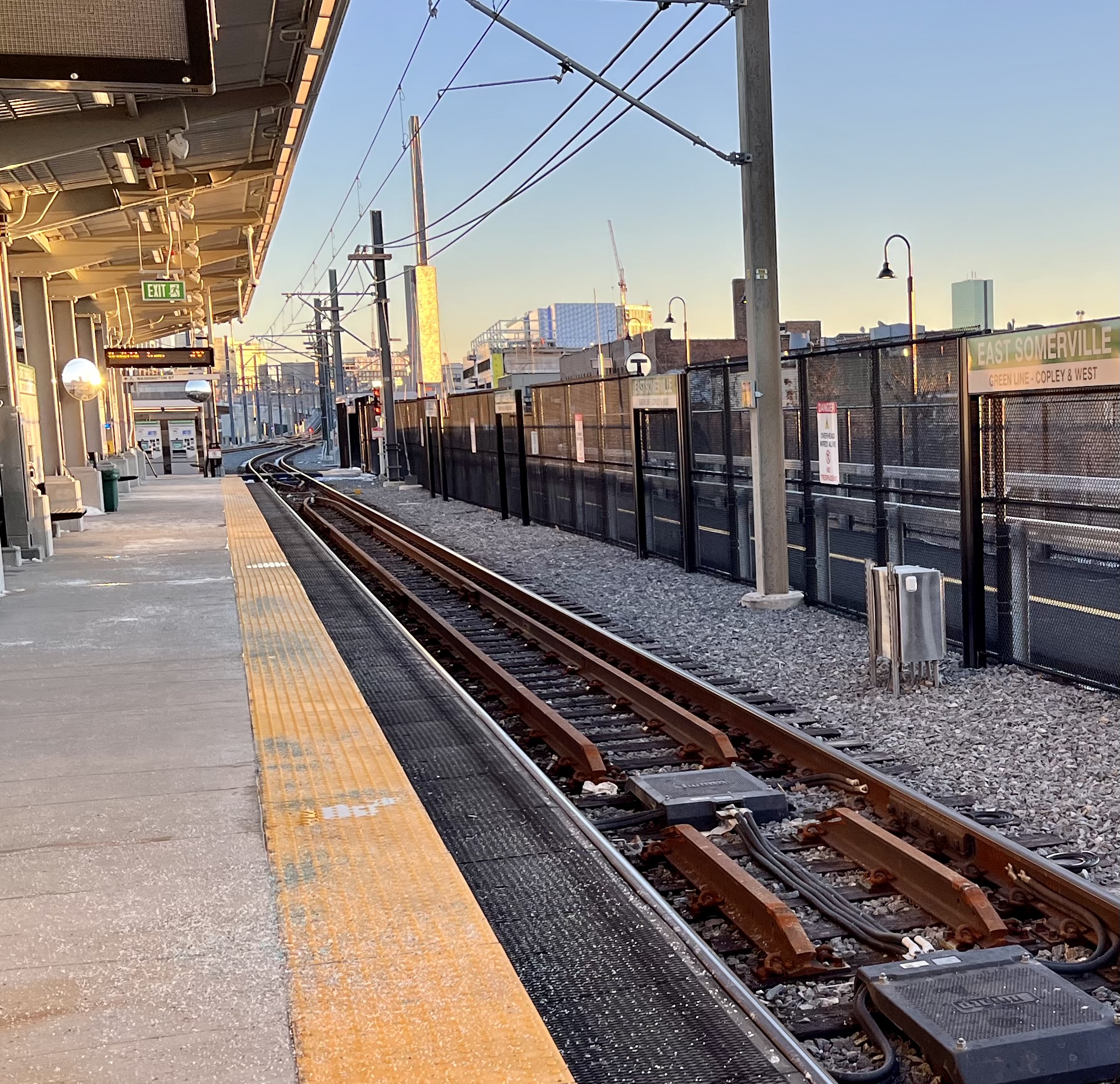
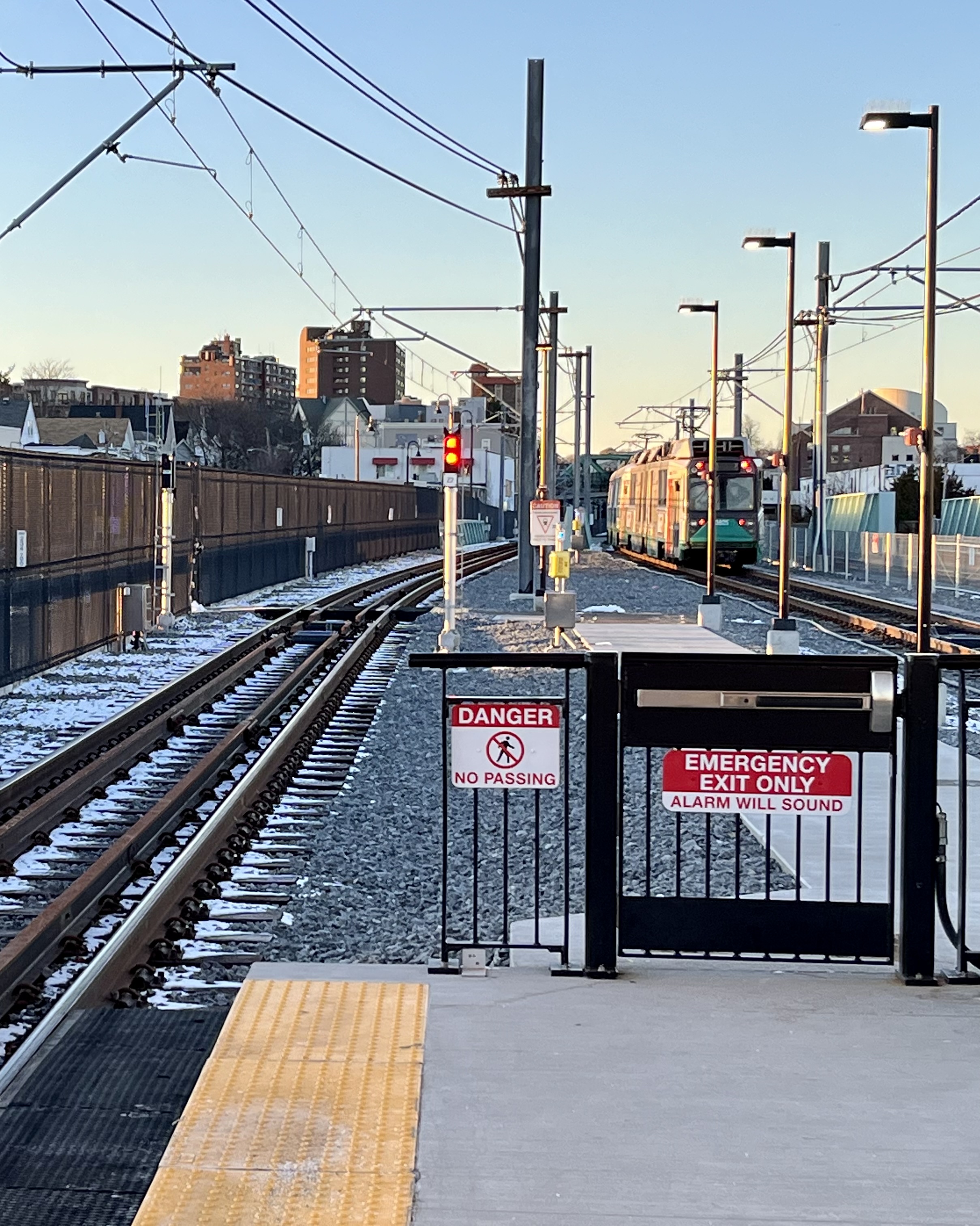
East Somerville represent!
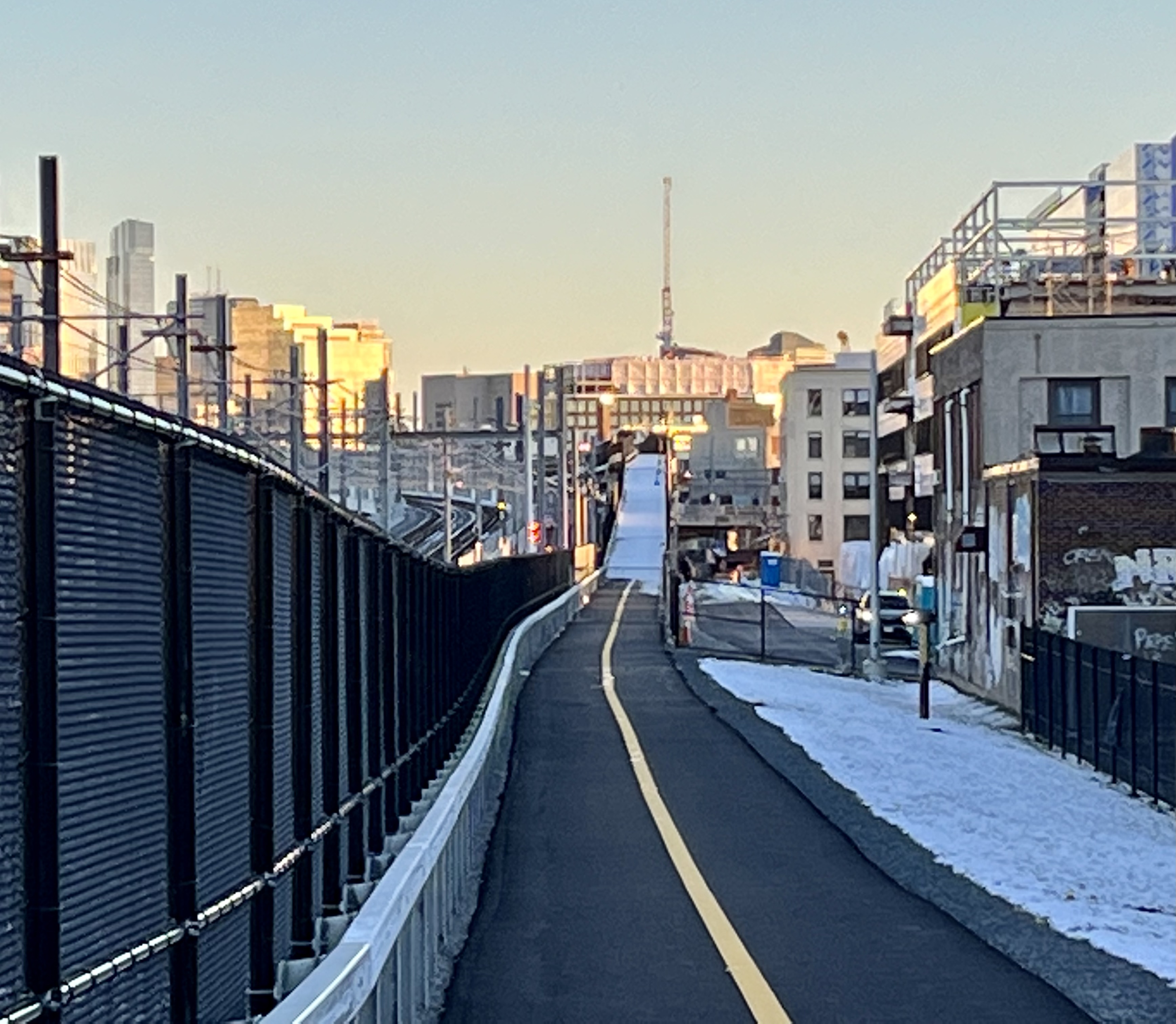
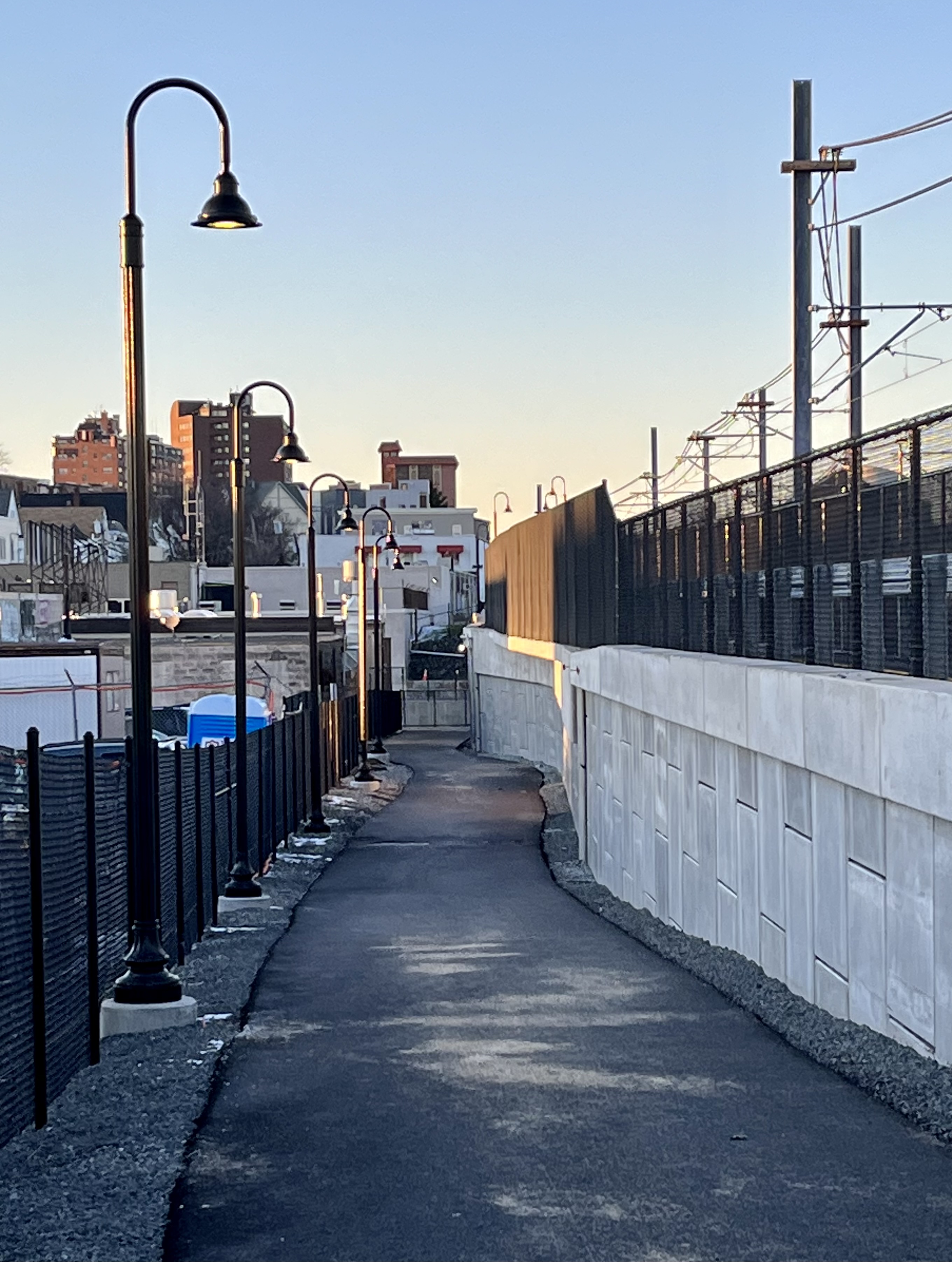
Is the community path now open?
This seems like the cheapest way to provide a temporary fix, aside from just having free rides. Adding a button/function to fare vending machines that were gonna be placed at stations anyway. But let's ask this: will there be more lost from fares evaded than the cost of fare gates? Is this the right equation? I am not in the industry, only a fan, and someone must have calculated this...The fare validation was really awkward (and badly explained).
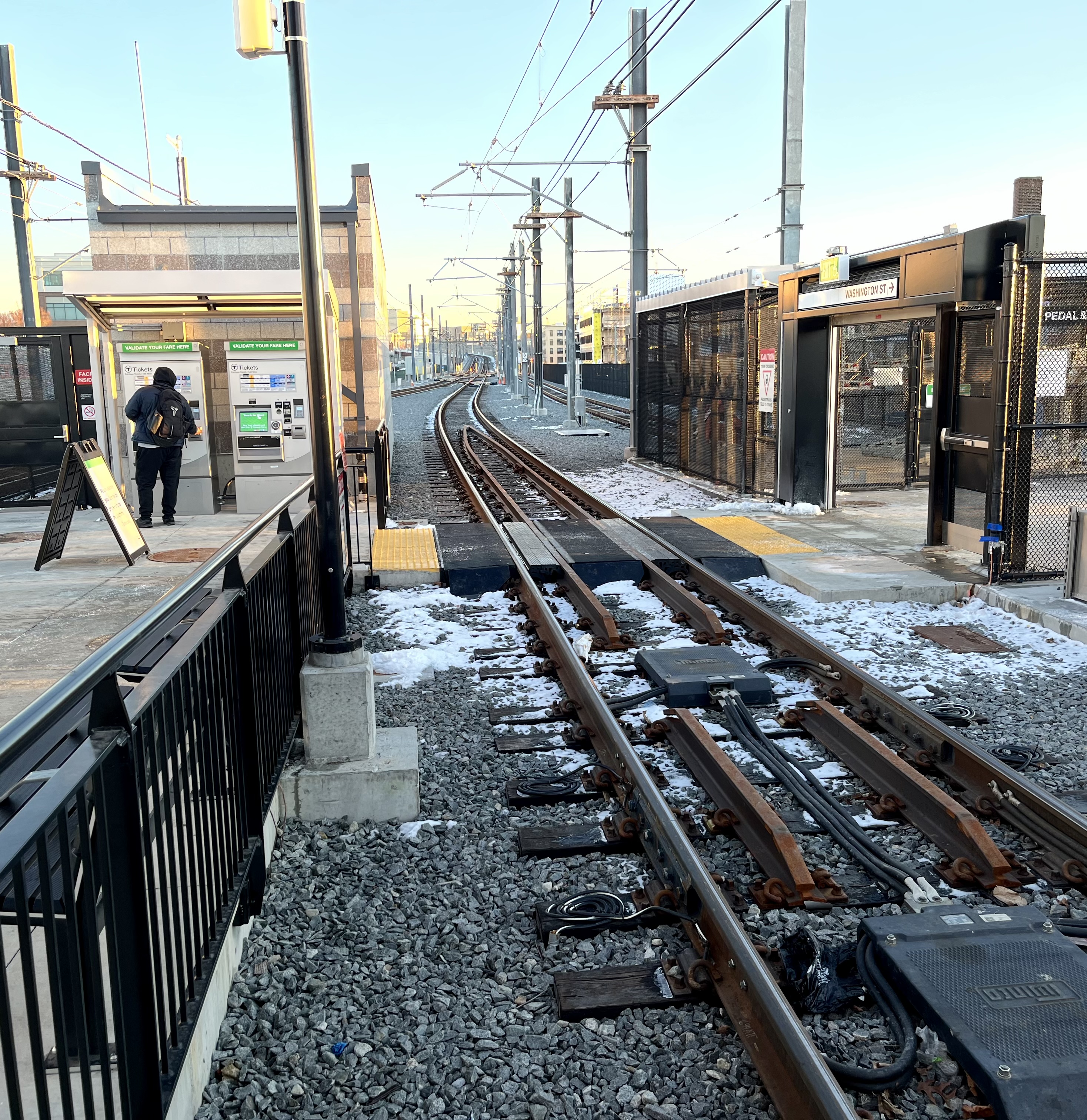
1) Go to fare "Vending" machine (it turns out it is also a fare-subtracting machine, but that isn't how any of us think of it)
2) Tap your card
3) At the lower left corner of a grid of all the usual "add value buttons" but the same size and color, there's a "validate fare" button. Very much hidden in plain sight, undifferentiated from the other buttons. Because I was transferring from the 80, I was offered a strange button where a $0.70 amount stood out, even if the text that said "Validate" didn't stand out.
4) poke that button
5) Did I tap again? I don't remember.
6) Then if you "miss" tapping at the FVMs, you're supposed to enter the front door of the cars and tap the farebox
As a result, nobody 'cept me was seen to pay a fare. I'd say 80% never even tried...expecting to be "asked" and 20% who seemed to hesitate/seek mostly went unhelped by environmental and UI cues (the FVMs don't have a big "Validate Here" look. I'd say I paid only because was determined to figure out how it worked, half from honesty, half as a student of UI/UX.
I judge the system is stupid-bad in all kinds of ways:
1) Why isn't there a big, brightly labelled tap target on either doorpost as you enter the station? Cheap, no screen, just a target, with a ping and maybe an LED (to be ADA )
2) Same for inside the trolley. Are/Arent there supposed to be tap targets at every door?
3) button on the Fare Vending Machine should look very different from the others. Its crazy to "hide" the Validate button among identical "buy" buttons having the same size, color ('cept validate has a smaller font)
4) FVM button should match the look of the physical tap targets Whatever logo / image / color / shape is used. Maybe a bright orange circle. Isn't the FVM just code? Can't you get me a circular Validate button among the rectangle-buy buttons?
I'm not advocating for fare gates. I love Proof of Payment systems, but can't ask people to do it (and we'll never get the social compliance) if validating fares is as obscure and difficult as they've made it here, particularly when there were lots of low-tech, no-tech, free-tech ways of explaining it and making validation more fluid/natural/obvious.This seems like the cheapest way to provide a temporary fix, aside from just having free rides. Adding a button/function to fare vending machines that were gonna be placed at stations anyway. But let's ask this: will there be more lost from fares evaded than the cost of fare gates? Is this the right equation? I am not in the industry, only a fan, and someone must have calculated this...

This seems like the cheapest way to provide a temporary fix, aside from just having free rides. Adding a button/function to fare vending machines that were gonna be placed at stations anyway. But let's ask this: will there be more lost from fares evaded than the cost of fare gates? Is this the right equation? I am not in the industry, only a fan, and someone must have calculated this...
I'm not advocating for fare gates. I love Proof of Payment systems, but can't ask people to do it (and we'll never get the social compliance) if validating fares is as obscure and difficult as they've made it here, particularly when there were lots of low-tech, no-tech, free-tech ways of explaining it and making validation more fluid/natural/obvious.
I always admired French railways and their virtual cordon just a bunch of posts with yellow validators in the middle of traffic flow at any platform access
FYI, the second Medford train (mostly people who couldn't board the first train) has about as many people as the first Union Square train. And December has worse weather than March.As a city we havent built a new transit line in… I dont even know how long. That being the case a lot of people havent seen first hand the massive improvements that comes with a new line. Hopefully the glx is a huge success and leads to more of the projects on the board getting off the ground with much more support, after thousands of people see first hand just how transformative it is. On top of that we now have contractors/workers with experience building a transit line so we should take advantage of that now to lower prices vs having to retrain a bunch of people in 10 years.
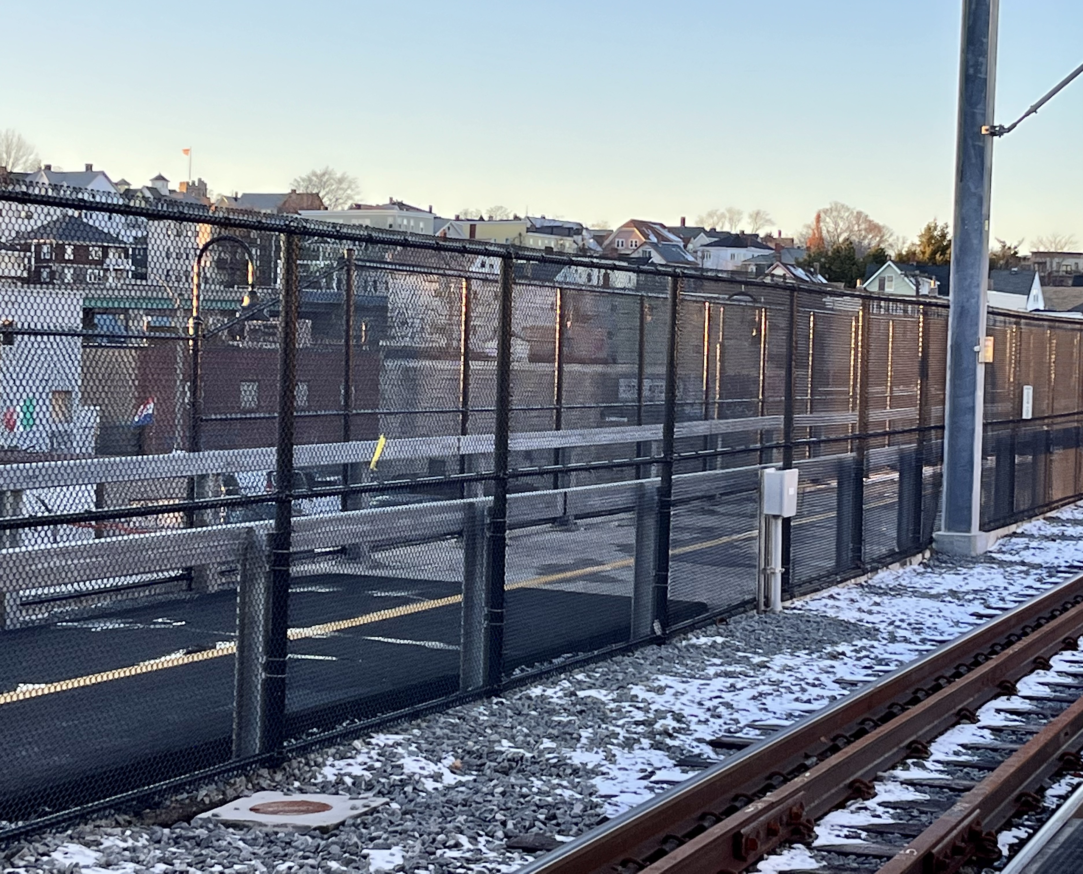
It seemed partially open - heading west from the East Somerville stop had no fencing; the inbound direction had minimal/easily moved fencing.
Only 6 years late!
as always, thanks for all the local documenting Dr.Approaching East Somerville from Lechmere.
View attachment 31789View attachment 31790View attachment 31791
Holy crap, is this real?
Its totally stupid. Its a new line that's completely separated, Just stop at every stop.I don't think it's an unreasonable policy, just needs to be better communicated to people who might be new Green Line branch riders. Several Highland stops (Newton Highlands, Chestnut Hill, Eliot, etc.) aren't really "at street level" either, but how many GLX riders have been there?
Its totally stupid. Its a new line that's completely separated, Just stop at every stop.
I'm not sure I've ever been on a light rail line with it's own tracks not running on a street where I've had to request a stop.
If someone wants to take the new line they have to go through the ticket validation mess and then request their stop on a new line that they're not familiar with.
I mean I hate to be a downer and I love that the thing is opened but come on...
yea but the GLX feels different. 6 new dedicated stations. Just stop at them for a sec so that people have one less step to think about as they get used to a new system, they've already been made to do some basic computer programing to get their ticket. It's all about usability and the T don't seem to be any good at it.This is how the D has worked for years, especially off-peak. Lower ridership stops (Woodland, Eliot, Beaconsfield, etc.) are routinely skipped at times of low ridership.
