Green Line Extension to Medford & Union Sq

Lol one way or another…

Guerrilla mapmakers step up on the T
handmademap.jpg


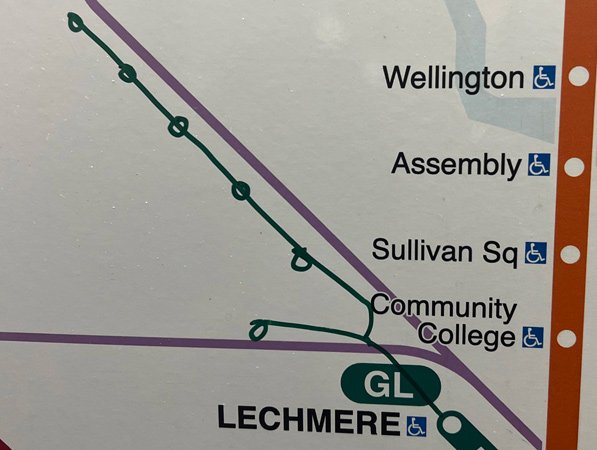
Neal spotted this hand-drawn Green Line Extension on a system map at Haymarket the other day.

Jessica Dello Russo, meanwhile, shows that Haymarket could stand some guerrilla leak sealers and mold-remediation experts, too:

https://www.universalhub.com/2023/guerilla-mapmakers-step-t
 
Yea, tweeted the T about this (just the out of date maps not the cool public updating), got a bit of traction and a response from them.
Went along the lines of "yeah yeah yeah, we're doing it..."
It blows my mind that Union and Lechmere have been open almost a year and the maps on the D and E lines haven't been updated.
It's the kind of small thing that just wouldn't fly anywhere else I've live but is totally accepted here.
There's a total acceptance of public transit incompetence.
If it takes a year to update maps on an actual newly extended line, how are they ever going to manage the big stuff?

Like, I can sort of get why it might take a bit to replace things like that Green Line map if it's not a sticker (it almost looks as though there was a sticker over it that got removed/vandalized, but it's a little hard to tell), especially if they don't want to constantly use stickers to update their maps. (Aesthetically, it's not a good look, but on the other hand they're so slow it would be more useful if they would.) The system map not being updated is completely inexcusable, though. It looks like one of those framed ones that were designed to be easier to replace, but more to the point it already has a sticker on it for the SL3, demonstrating their clear ability to make quick fixes. (It's also amusing that literally every east/north end point on that schematic map is wrong.)
 
When I rode GLX in late December, this was how one map at Park St (!) looked:

1677611039898.png


It's literally a sticker label. On top of an otherwise totally updated and ready-to-go map. Like. I don't know how it could be an easier "win" than that, and yet.

North Station also had some assistance from multiple guerrilla mapmakers (it's a bit hard to make out, but someone wrote Union in black, and then there's Medford/Tufts in blue):

1677611283279.png
 
It seems so easy to fix. Just get one guy, maybe a couple guys, and give them new maps and a screw driver and tell them to ride the glx and get off at every stop and fix the map. It shouldnt be this hard. It really is a reflection of the bigger picture, if you cant get the small things right how could you ever expect to get the big things right? You cant.
 
When I rode GLX in late December, this was how one map at Park St (!) looked:

View attachment 34801

It's literally a sticker label. On top of an otherwise totally updated and ready-to-go map. Like. I don't know how it could be an easier "win" than that, and yet.

North Station also had some assistance from multiple guerrilla mapmakers (it's a bit hard to make out, but someone wrote Union in black, and then there's Medford/Tufts in blue):

View attachment 34802
They do too many map iterations to keep up. The system map from Park St. in your post is Version 34. They're already on Version 37. It's quite likely that there are indeed two-dozen plus map versions still out there in the wild. The system hasn't changed that much over the years, but the constant fussing with small things puts them way behind the eight-ball when it comes to fixing big things on the maps systemwide. They need way better versioning control, and definitely a database of every single version currently occupying every single map on the system.
 
It seems so easy to fix. Just get one guy, maybe a couple guys, and give them new maps and a screw driver and tell them to ride the glx and get off at every stop and fix the map. It shouldnt be this hard. It really is a reflection of the bigger picture, if you cant get the small things right how could you ever expect to get the big things right? You cant.
On the GL is a bare minimum, but all system maps throughout the system need the update. People trip plan from their starting point entering the system; no updated map, no clue how to get to Medford or Somerville.
 
They do too many map iterations to keep up. The system map from Park St. in your post is Version 34. They're already on Version 37. It's quite likely that there are indeed two-dozen plus map versions still out there in the wild. The system hasn't changed that much over the years, but the constant fussing with small things puts them way behind the eight-ball when it comes to fixing big things on the maps systemwide. They need way better versioning control, and definitely a database of every single version currently occupying every single map on the system.
Agree. I'm just saying, though: all they had to do was take a ride through the subway looking for stickers and removing them/flagging them for removal.
 
Like, I can sort of get why it might take a bit to replace things like that Green Line map if it's not a sticker (it almost looks as though there was a sticker over it that got removed/vandalized, but it's a little hard to tell), especially if they don't want to constantly use stickers to update their maps. (Aesthetically, it's not a good look, but on the other hand they're so slow it would be more useful if they would.) The system map not being updated is completely inexcusable, though. It looks like one of those framed ones that were designed to be easier to replace, but more to the point it already has a sticker on it for the SL3, demonstrating their clear ability to make quick fixes. (It's also amusing that literally every east/north end point on that schematic map is wrong
I cant get why it takes time. I really cant.
They planned this extension for 20 or 30 years or something. They've been actually constructing it for 5 years and it'll take over a year to update the maps on the actual line(s).
They have the graphics. The newly opened stations have up to date maps.
How hard can it be to print 40 or what ever and over a weekend send a crew out to update every map.
The whole thing should take a week but instead it's pushing a year.
 
They do too many map iterations to keep up. The system map from Park St. in your post is Version 34. They're already on Version 37. It's quite likely that there are indeed two-dozen plus map versions still out there in the wild. The system hasn't changed that much over the years, but the constant fussing with small things puts them way behind the eight-ball when it comes to fixing big things on the maps systemwide. They need way better versioning control, and definitely a database of every single version currently occupying every single map on the system.
take the maps at Medford Tufts, print a load more, go to every station over a week and replace them. Do this every 6 months or when ever there's a change.
It's simple.
 
They do too many map iterations to keep up. The system map from Park St. in your post is Version 34. They're already on Version 37. It's quite likely that there are indeed two-dozen plus map versions still out there in the wild. The system hasn't changed that much over the years, but the constant fussing with small things puts them way behind the eight-ball when it comes to fixing big things on the maps systemwide. They need way better versioning control, and definitely a database of every single version currently occupying every single map on the system.

The map in Hynes on the Westbound side at least has the entire E branch to Arborway with the portion beyond Heath St. listed as “suspended service” and indicates the route 39 bus “temporarily” replaces the service. I’d say they’ve had more than enough time to update that map at least once. But I’m glad to see there’s still hope of service resumption to Arborway
 
The map in Hynes on the Westbound side at least has the entire E branch to Arborway with the portion beyond Heath St. listed as “suspended service” and indicates the route 39 bus “temporarily” replaces the service. I’d say they’ve had more than enough time to update that map at least once. But I’m glad to see there’s still hope of service resumption to Arborway

Until its renovation within the past few years, there was at least one sign at Oak Grove indicating that Chinatown would become accessible "later in 1990/91". They seem to have a particularly bad habit of leaving maps and signs untouched in stations that haven't been renovated. Hynes doesn't surprise me given how it's languished.
 
When I rode GLX in late December, this was how one map at Park St (!) looked:

View attachment 34801
For the Green Line map on the right, why is the D Line's Union Station synced with the E Line's East Somerville Station? The D should branch off to the left, just as the lines separate on the other end. Did someone totally shit up the GL map, too? Because currently that map would suggest Union and East Somerville are the same station.
 
The map in Hynes on the Westbound side at least has the entire E branch to Arborway with the portion beyond Heath St. listed as “suspended service” and indicates the route 39 bus “temporarily” replaces the service. I’d say they’ve had more than enough time to update that map at least once. But I’m glad to see there’s still hope of service resumption to Arborway
Those were the normal map in the GL stations up until not long ago, maybe 10-15 years (as in, decades after service was suspended). Im glad to know there's still one of those maps up somewhere.
 
When I rode GLX in late December, this was how one map at Park St (!) looked:

View attachment 34801

It's literally a sticker label. On top of an otherwise totally updated and ready-to-go map. Like. I don't know how it could be an easier "win" than that, and yet.
Unless that particular one is different, that orange "Open Spring/Summer 2022" sticker isn't actually a sticker - its actually printed as part of the map. See the corners where stains / marks indicate someone (or multiple someones) has clearly not realized this and tried to peel it off.

Edit: reddit photo from a couple of weeks ago showing what I mean:
1677636954274.png
 
Last edited:
Unless that particular one is different, that orange "Open Spring/Summer 2022" sticker isn't actually a sticker - its actually printed on the map - see the corners where stains / marks indicate someone (or multiple someones) has clearly not realized this and tried to peel it off.

Well then, that must have been a bad idea to not have a way to remove the label without reprinting a new map and replacing the whole map. I mean, I guess, if someone were to prematurely remove the sticker.

Technically, that Union Sq. bug being on the same branch does need to be fixed, so a new map would be needed for the design change of representing Union Sq. correctly.
 
Unless that particular one is different, that orange "Open Spring/Summer 2022" sticker isn't actually a sticker - its actually printed as part of the map. See the corners where stains / marks indicate someone (or multiple someones) has clearly not realized this and tried to peel it off.

Edit: reddit photo from a couple of weeks ago showing what I mean:
View attachment 34816
Wow. Well, that explains that. Honestly that feels somehow worse than if they had just been negligent in removing it.
For the Green Line map on the right, why is the D Line's Union Station synced with the E Line's East Somerville Station? The D should branch off to the left, just as the lines separate on the other end. Did someone totally shit up the GL map, too? Because currently that map would suggest Union and East Somerville are the same station.
Unfortunately that appears to be the official design. See for example the maps below on display at Lechmere and Union Square:
1677640104467.png

1677640142192.png
 
Unless that particular one is different, that orange "Open Spring/Summer 2022" sticker isn't actually a sticker - its actually printed as part of the map. See the corners where stains / marks indicate someone (or multiple someones) has clearly not realized this and tried to peel it off.

Edit: reddit photo from a couple of weeks ago showing what I mean:
Well then, that must have been a bad idea to not have a way to remove the label without reprinting a new map and replacing the whole map. I mean, I guess, if someone were to prematurely remove the sticker.

Technically, that Union Sq. bug being on the same branch does need to be fixed, so a new map would be needed for the design change of representing Union Sq. correctly.

Looking at the original photo, it almost looks as though that map is itself a sticker. Could they really have put a sticker on top of a sticker???

Unfortunately that appears to be the official design. See for example the maps below on display at Lechmere and Union Square:
Yup, that's the official design. Very poor design liable to cause confusion, and it's not like they didn't know how to separate branches on a line map given that they did on the same map. Feels like something where someone made it with reference to Wikipedia or something (technically it is properly marked as a terminal station and East Somerville is not marked as a transfer station per the legend, so it would check the boxes) without actually understanding how the system actually works. (Disclaimer: the Wikipedia reference was meant to suggest someone only reading about the system, not a shot at Wiki's quality, I know some members here have made extensively valuable contributions over there.)
 
Looking at the original photo, it almost looks as though that map is itself a sticker. Could they really have put a sticker on top of a sticker???


Yup, that's the official design. Very poor design liable to cause confusion, and it's not like they didn't know how to separate branches on a line map given that they did on the same map. Feels like something where someone made it with reference to Wikipedia or something (technically it is properly marked as a terminal station and East Somerville is not marked as a transfer station per the legend, so it would check the boxes) without actually understanding how the system actually works. (Disclaimer: the Wikipedia reference was meant to suggest someone only reading about the system, not a shot at Wiki's quality, I know some members here have made extensively valuable contributions over there.)
This is HORRENDOUS design. I'm blown away. And, actually, surprised—despite the failures in virtually everything at the T, from a pure design angle, they're usually excellent (notwithstanding the fact that they don't put updated maps up, but the design of their maps has always been really good). This is very confusing and did not need to be done like that.

After the reminder about the old maps, I found this - - never forget!
450px-Heath_Street_map_at_Hynes.jpg
 
This is HORRENDOUS design. I'm blown away. And, actually, surprised—despite the failures in virtually everything at the T, from a pure design angle, they're usually excellent (notwithstanding the fact that they don't put updated maps up, but the design of their maps has always been really good). This is very confusing and did not need to be done like that.

After the reminder about the old maps, I found this - - never forget!
View attachment 34819

Honestly I feel like that the B, C, and E branches dont really fit well on Rapid Transit Subway maps. The 3 branches have stops at the frequency of bus stops, not subway station spacing or distance, or design. They travel at or around bus speeds. The D branch fits the subway map better.
 

Back
Top