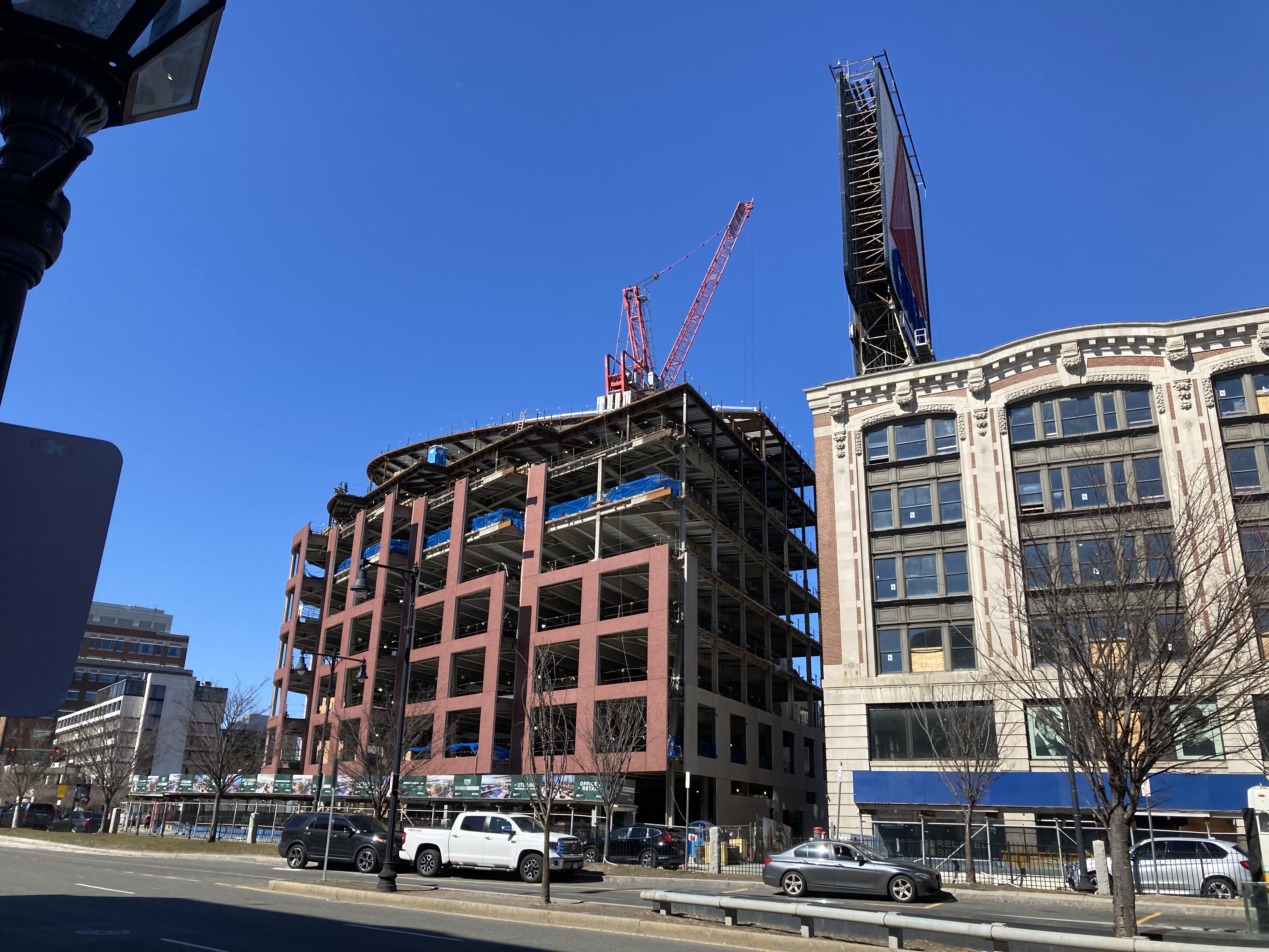
Kenmore Square North (WHOOP) | 533-541 Commonwealth Ave | Fenway

I wonder the reaction when Zucker gets his way and tears down the Shreve building and a couple of more next to it on Arlington/Boylston to replace it with an equally bland superblock of modernism? That's one corner even more significant than Kenmore as it sit's adjacent to Arlington St. Church, the Public Garden, and the rest of a block struggling to maintain scale and some architectural historicity.
 
2/26
Kenmore_Square_2021_02_26.jpg

Kenmore_Square3_2021_02_26.jpg

Kenmore_square4_2021_02_26.jpg

Kenmore_Square5_2021_02_26.jpg
 
Let's complain to the BPDA...maybe they will treat it like the commonwealth hotel and demand better quality. Aisling Kerr is the project manager: email her and demand the BPDA adhere to the quality agreed upon. This is value engineering. aisling.kerr@boston.gov
 
It's not even remotely attempting to look like brick.
Just gonna echo my statements from 7 months ago...


On the bright side, at least the building's life cycle will be short enough that it'll come down sooner


...not great from a sustainability standpoint...
 
Let's complain to the BPDA...maybe they will treat it like the commonwealth hotel and demand better quality. Aisling Kerr is the project manager: email her and demand the BPDA adhere to the quality agreed upon. This is value engineering. aisling.kerr@boston.gov

The difference is that what the Hotel Commonwealth (not "Commonwealth Hotel," btw) did was to build something that was NOT depicted in the approved renders and presentations. Kenmore Square North, while shaping up to be quite bland/ugly/"office park-ish" (as many have said) is exactly as bland/ugly/office park-ish as the renders suggested. There's no bait-and-switch at play here; they didn't promise the moon and give us camden, n.j. Instead, this is exactly as awful as was promised and approved.

The time to lobby the BPDA for common sense has long passed.
 
Last edited:
I doubt the BPDA would have intentionally approved brick of the quality shown in those photos. Design review has leverage.
 
Personally I just really hate stacked brick pattern (as opposed to a running pattern or a more intricate pattern) It just always feels like the bricks aren't actually "working" if that makes any senses. When they are in a running pattern you can see the bricks interlocking and they feel like they are holding something up or keeping weight back, but when in a stacked patterns it just looks so flimsy like if I push on one column of bricks they could just fall over because they aren't interlocked with the others. I know this isn't physically true but its how it feels visually.
 
Last edited:
Feels like ensuring 100+ year old structures aren't destroyed is an easier putt from a regulatory perspective than micromanaging the specific brick (or other materials) a developer purchases.
 
If I can, I'll take some up-close pictures, because bad as it looks from further away, as cjbski notes, it's REALLY bad up close. Some of the panels are chipped, and the panel fit/alignment is awful. I can't believe we lost that nice period corner anchor building for this dreck.
 
Personally I just really hate stacked brick pattern (as opposed to a running pattern or a more intricate pattern) It just always feels like the bricks aren't actually "working" if that makes any senses. When they are in a running pattern you can see the bricks interlocking and they feel like they are holding something up or keeping weight back, but when in a stacked patterns it just looks so flimsy like if I push on one column of bricks they could just fall over because they aren't interlocked with the others. I know this isn't physically true but its how it feels visually.
I still remember the great frustration of learning that lesson with Lego structures as a young builder. So many buildings exploding under the pressure of me applying a new brick directly above the line of already installed bricks. Finally, my parents showed me about the strength of overlapping bricks! To this day, it's the first thing I look for in masonry.
 
If I can, I'll take some up-close pictures, because bad as it looks from further away, as cjbski notes, it's REALLY bad up close. Some of the panels are chipped, and the panel fit/alignment is awful. I can't believe we lost that nice period corner anchor building for this dreck.
I'm as disappointed as anyone that we lost the original structure, but you really can't judge panel fit / alignment at this point. Panels are always put up rough at first, then adjusted and fine-tuned later. The original fit and alignment of the panels when they are first hung is not the final placement fit and alignment.
 
I'm as disappointed as anyone that we lost the original structure, but you really can't judge panel fit / alignment at this point. Panels are always put up rough at first, then adjusted and fine-tuned later. The original fit and alignment of the panels when they are first hung is not the final placement fit and alignment.

Looking at the second photo, there's some serious quality issues with the panels themselves, not their alignment. I haven't been there myself, so I can't say for sure, but the pictures are telling of what cjbski and StillInTheHood are describing, especially if you zoom in on the third picture...
 
Now would be an ideal time to Sikorsky the Citgo sign across the street to the roof of the Hotel Commonwealth #tgo
 
Last edited:
A number of the brick corners/edges along the bottom row are damaged too. Pretty shoddy looking from below.
I wonder if they'll get fixed at some point... don't really know the process for repairing within a larger panel.
 

Back
Top