Kenmore Square North (WHOOP) | 533-541 Commonwealth Ave | Fenway

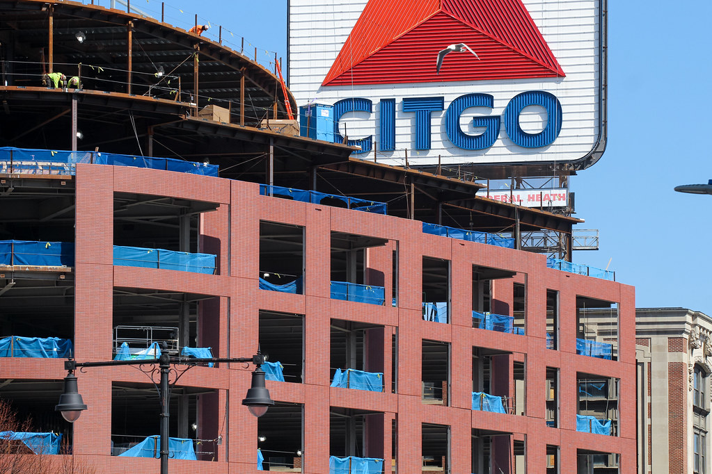
The good news: few in autos will notice this bland excuse for architecture...they'll be fighting the classic Kenmore Sq. traffic in both directions. The bad news: every pedestrian who looks up from the ground will wonder, "What happened? and Why?" The sad news: too many won't care since the Citco Sign remains (I agree, it should have been replaced by the Sox sign, financed by the team of course).
 
Its an excel-sheet driven "design," for sure. Related has some of the nicest properties in Boston, at least from this most recent boom. They even have an in-house architecture/design team, so they understand the value in good design. This is a stain on their portfolio, and I don't understand how they didn't think something better could have gone up here, especially considering what this unfortunately replaced.


Also, I haven't been down here for a while, but I hear the second part of this project has begun and the demolition is underway/possibly complete?
 
Last edited:
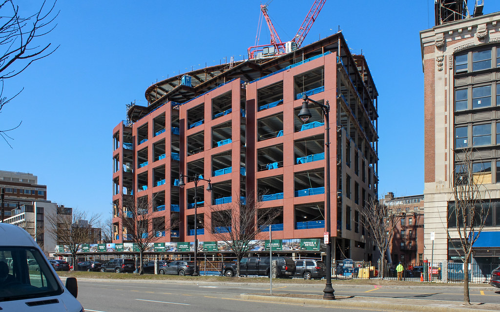
I drove past this on Friday and it is, almost unbelievably, worse looking in person. The paneling comes off somewhere between cardboard and the plastic of a Playmobil set.
 
The good news: few in autos will notice this bland excuse for architecture...they'll be fighting the classic Kenmore Sq. traffic in both directions. The bad news: every pedestrian who looks up from the ground will wonder, "What happened? and Why?" The sad news: too many won't care since the Citco Sign remains (I agree, it should have been replaced by the Sox sign, financed by the team of course).

Great. So the people Boston SHOULDN'T be catering to are not as harmed by this as the people Boston SHOULD be catering to.
 
Here's hoping the glass is really truly spectacular.......?
 
Took a good hard look at it today... yes overall it's crap but the massing is fine and I don't really find these precast brick panels to be horribly worse than 90% of the other precast brick panels as people here seem to think? They just look like typical IDGAF precast to me.

51047061668_b2c87bd971_b.jpg


51047877937_103c64311e_b.jpg


51047877857_80529feeb3_b.jpg


51047791266_7cb634bd2a_b.jpg


51047791141_ac78fd4dbb_b.jpg


51047877512_7c56db3760_b.jpg


51047877372_15bd084d89_b.jpg


Also, check out this bitchin' precast

51047790726_8a8d648ffd_b.jpg
 
Overall I like the design. But those precast panels really are the cheapest shit they could find. This had the potential to define Kenmore Sq. Looks like it went the Hotel Commonwealth route.
 
The pink color contributes to the cheap look. A darker color would have been less painful. Maybe over time as this pink crap weathers it will improve a little.
 
I'm pushing 40 years old. Will this building be demolished and replaced before I'm dead? We can only hope.
 
this building got a lot of attention on Twitter today:


From the misleading angle that suggests one of Bostons most prized possessions (a lit up Venezuelan gas company logo) is entirely covered by this and the subsequent anger they can no longer see it, to the comments calling this a) a parking garage and b) a skyscraper, I had a good laugh.


Good to see some minorly-informed thoughts mixed in though, and some people having taste in calling this a monstrosity.
 

Back
Top