Bananarama
Active Member
- Joined
- Mar 18, 2020
- Messages
- 605
- Reaction score
- 1,249
I counted 0 people with masks on in their profile picture in that thread.I am more offended at how many people wear masks in their profile pictures.
I counted 0 people with masks on in their profile picture in that thread.I am more offended at how many people wear masks in their profile pictures.
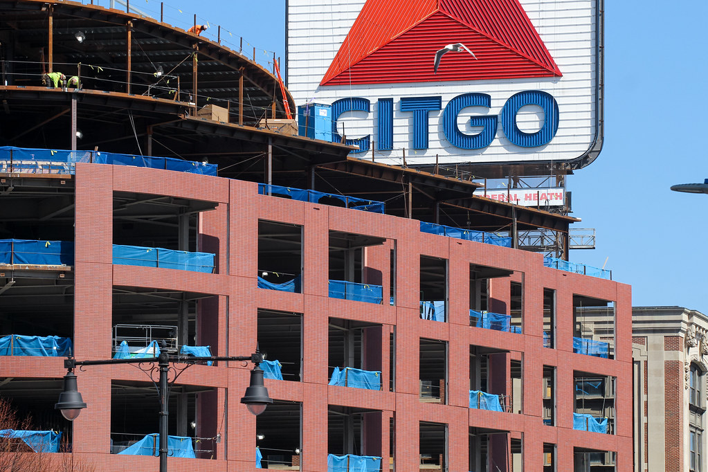
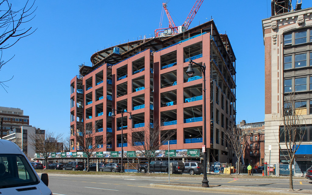
From the misleading angle that suggests one of Bostons most prized possessions (a lit up Venezuelan gas company logo) is entirely covered by this and the subsequent anger they can no longer see it, to the comments calling this a) a parking garage and b) a skyscraper, I had a good laugh.
I can still see that freakin sign.Took a good hard look at it today... yes overall it's crap but the massing is fine and I don't really find these precast brick panels to be horribly worse than 90% of the other precast brick panels as people here seem to think? They just look like typical IDGAF precast to me.


Also, check out this bitchin' precast

The photo I use was taken before Covid hit, It was when I was visiting Victoria BC.I am more offended at how many people wear masks in their profile pictures.
The photo I use was taken before Covid hit, It was when I was visiting Victoria BC.
I don't know what the designer was trying to say with this.

They picked the best design, but why not in the red/orange?
http://www.bostonplans.org/getattachment/c6fc0a2a-ec3b-43fa-a9ae-4481630c4f64
It doesn't even make a decent foreground for the Citgo sign.I didn't even notice until I was home reviewing this photo but I guess the glass is going in?

Here's hoping the glass is really truly spectacular.......?
I didn't even notice until I was home reviewing this photo but I guess the glass is going in?

Requesting a permanent ban for this individual
