BostonUrbEx
Senior Member
- Joined
- Mar 13, 2010
- Messages
- 4,340
- Reaction score
- 130
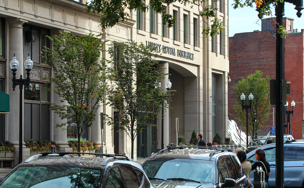
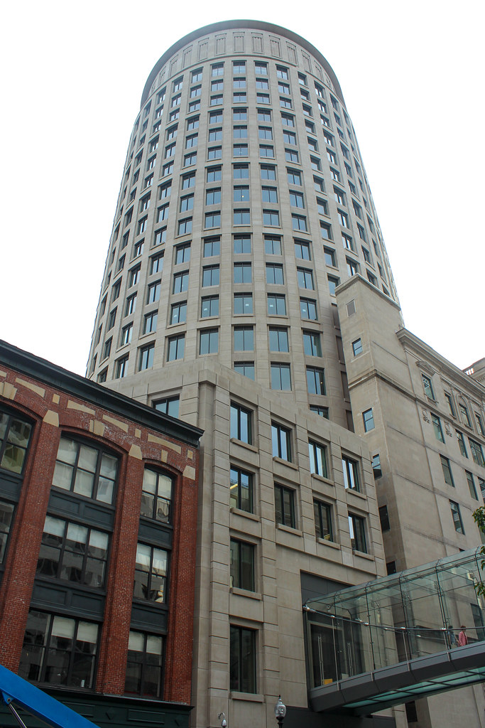
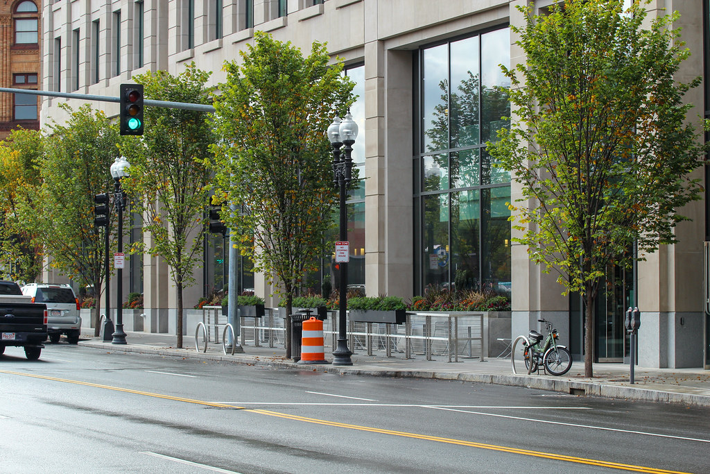
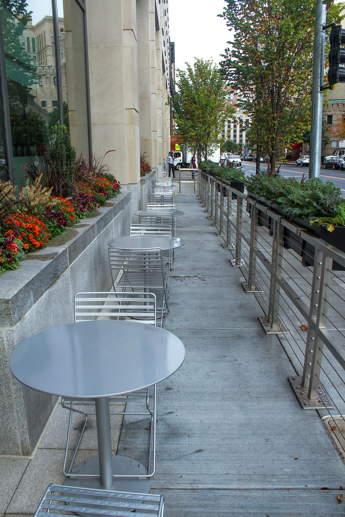
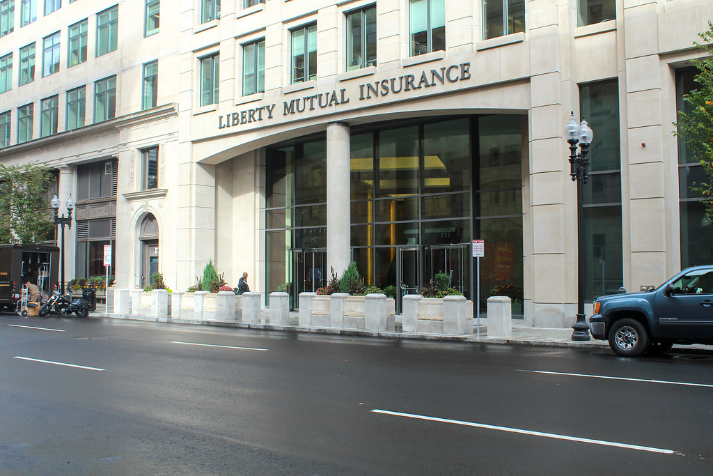
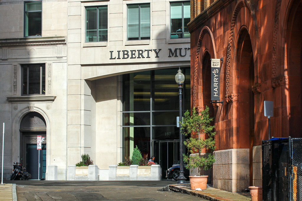
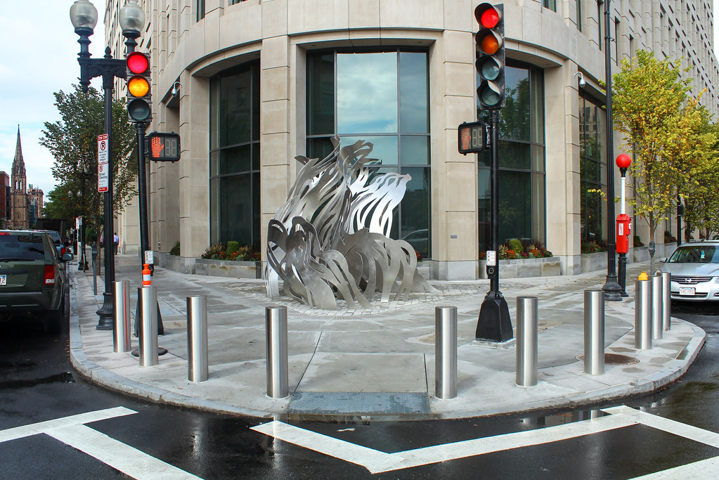
Re: Liberty Mutual Expansion
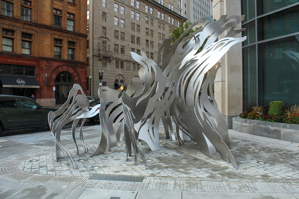
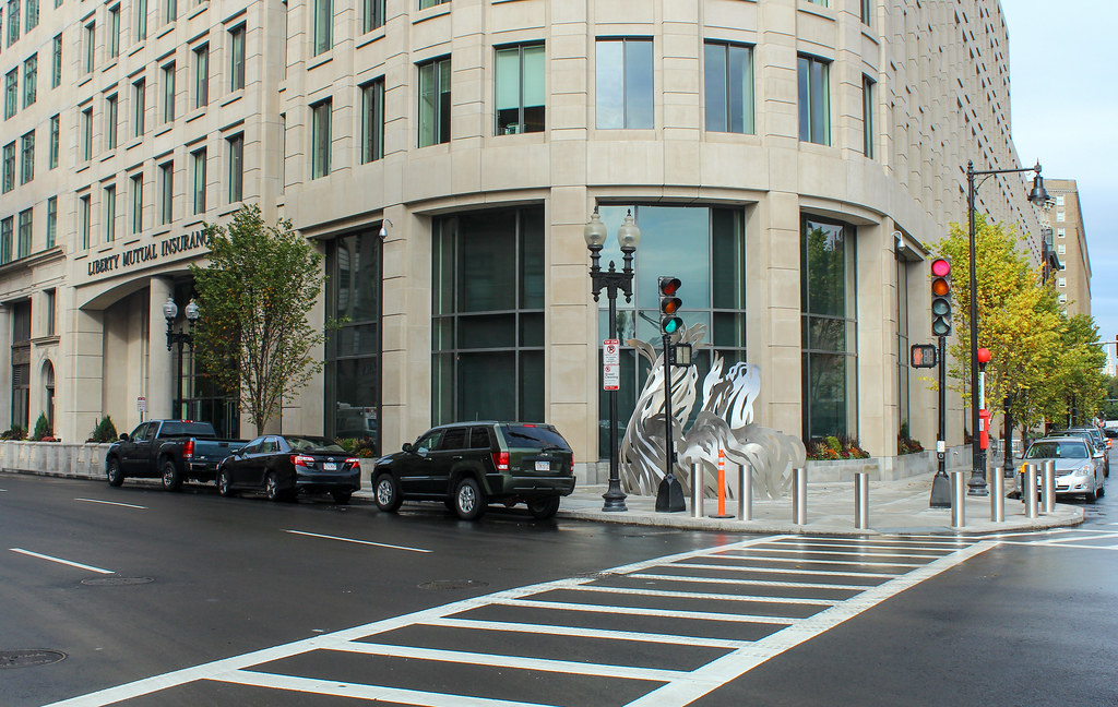
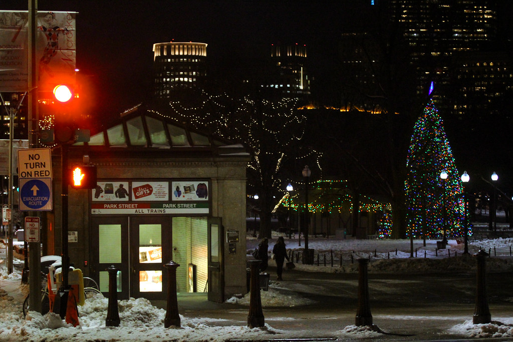
Ughhh! YES! This is AWESOME!
More buildings with classy/dramatic lighting, please.
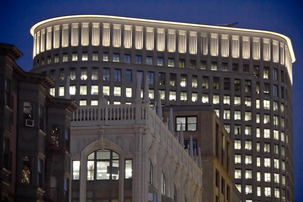
Ughhh! YES! This is AWESOME!
More buildings with classy/dramatic lighting, please.