You are using an out of date browser. It may not display this or other websites correctly.
You should upgrade or use an alternative browser.
You should upgrade or use an alternative browser.
Liberty Mutual Tower | 157 Berkeley Street | Back Bay
- Thread starter PlanBoston
- Start date
pixelsand8
Active Member
- Joined
- Mar 16, 2013
- Messages
- 467
- Reaction score
- 2
Re: Liberty Mutual Expansion
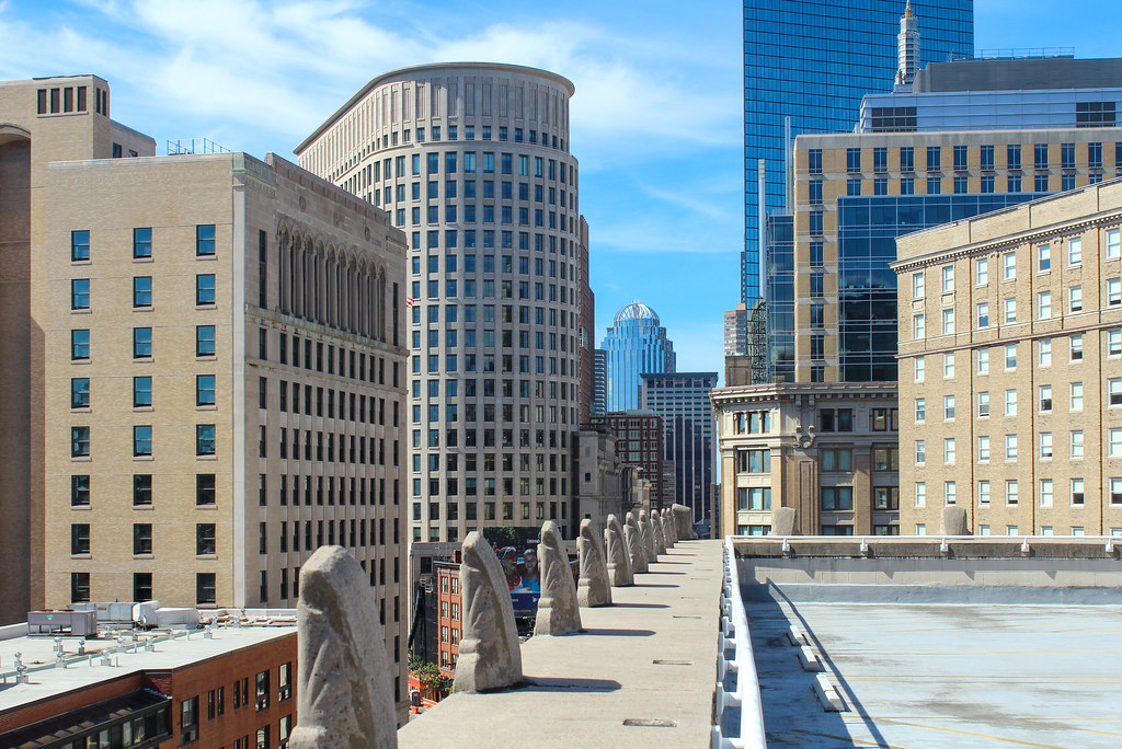
From in front of the Chinatown Y;

From in front of the Chinatown Y;

pixelsand8
Active Member
- Joined
- Mar 16, 2013
- Messages
- 467
- Reaction score
- 2
Re: Liberty Mutual Expansion
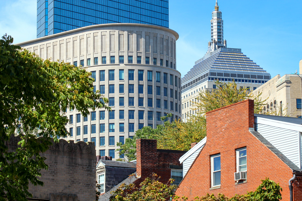
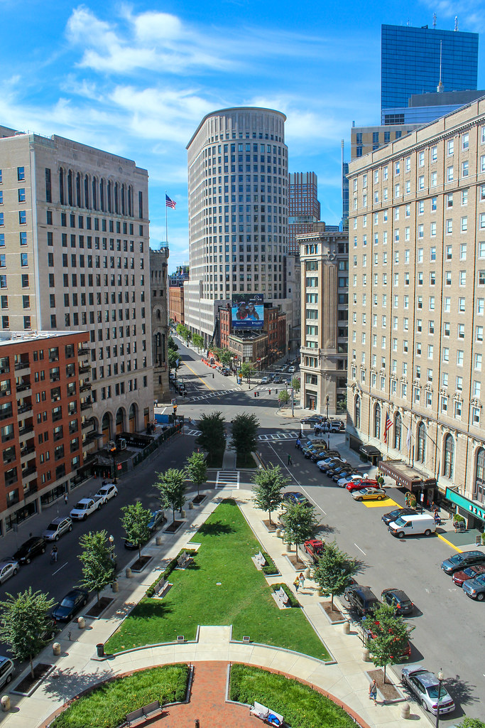
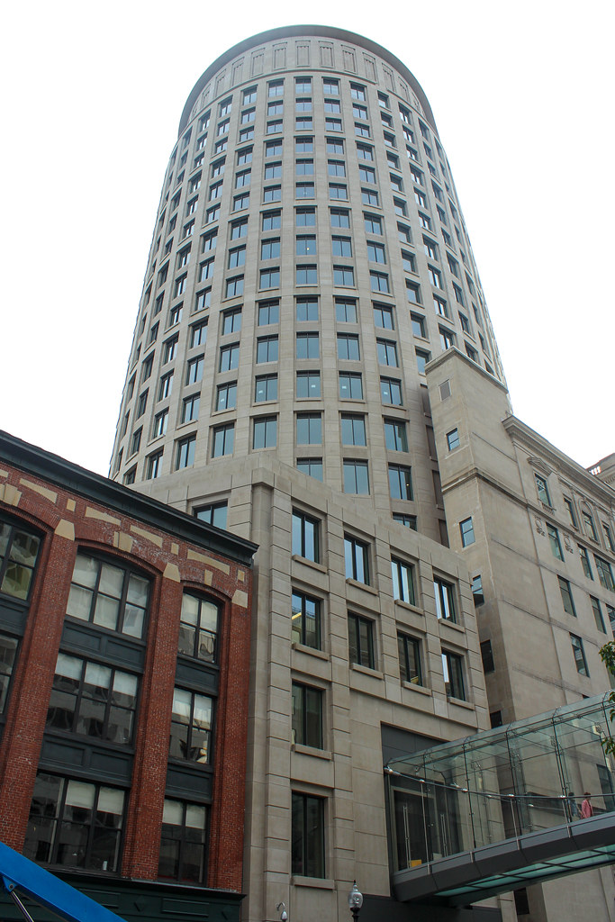
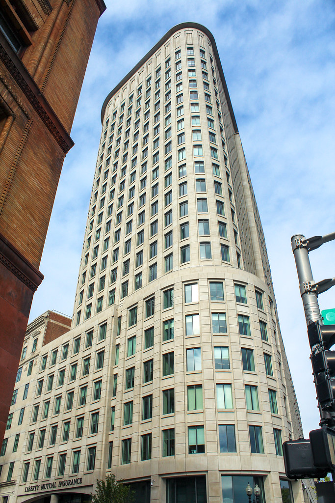
thanks. I was pretty surprised when I got out of my car and saw it there being so prominent. I guess it's not that far away but I just didn't think I was "near" that building. The much maligned "squatness" gives it a real presence from certain unexpected angles.
^ That's a GREAT shot.
thanks. I was pretty surprised when I got out of my car and saw it there being so prominent. I guess it's not that far away but I just didn't think I was "near" that building. The much maligned "squatness" gives it a real presence from certain unexpected angles.
Re: Liberty Mutual Expansion
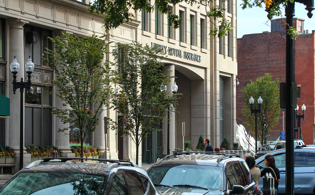
I walked by the columbus ave side the other week. Fits in nice... I walked 90% of the street wall before i even noticed it. The first floor has a lot of cafeteria space. kinda lame but i guess LM doesn't want employees straying very far.
I walked by the columbus ave side the other week. Fits in nice... I walked 90% of the street wall before i even noticed it. The first floor has a lot of cafeteria space. kinda lame but i guess LM doesn't want employees straying very far.
Re: Liberty Mutual Expansion
Stunning photos kz1000ps, this one beat my expectations.
Why can't more buildings be of this high quality? I would be 100% in favor of tax credits going towards developers choosing to create aesthetically appealing facades, after all, architecture can act as either a positive (Custom House Tower) or negative (One Beacon) externality. I almost wrote my undergraduate thesis on how to value architectural externalities, but doing so would have been way out of my league, if even possible.
Imagine a developer wants to build a 30-story 1920s-esque building, with a facade of stone, masonry, and ornament including a cornice with dentils and ionic columns. That developer would be an idiot, because for 1/8 (I made this up - I don't know what the difference would be) of the price they could alternate between cheap precast and glass. While there probably aren't many benefits that the higher-quality would bring to the developer's bottom line, having a higher-quality building benefits society (Boston) in ways by helping to create a quality public realm - I'm not able to articulate well what the benefits are right now, but if you're reading this post on this forum you know what I mean. Instead of insuring facade quality through some sort of fuzzy review process by the BRA or community groups that if it existed would raise development costs, why not institute some sort of market-based solution where developers who create high-quality facades are rewarded via tax credits towards building? It could either be a straight Better Building Get More Tax Credits system, or it could work so that ugly buildings get higher taxes, attractive ones get lower taxes, with some sort of neutral equilibrium in the middle.
Yes, I understand that architecture is subjective. BUT 1) I think we can all agree that some buildings by popular consensus are nicer than others and 2) most buildings are really not that original - instead of having a shitty-looking original building, wouldn't you rather have an unoriginal attractive building? I imagine creating this kind of a system would lead to a set of "template" buildings that developers could turn to in order to avoid going through a review process, but I think as long as we choose a good set of templates this may not be a bad thing? There could even be exception to this tax-credit/penalty for colleges, hospitals, and companies designing buildings that they will own/occupy long-term, because in my mind it seems like these stakeholders are the only ones these days building quality stuff in Boston.
On another note - I agree with others about making sure it is well-lit. Boston's skyscrapers in general ought to be better lit - I'd love to see some LED lighting placed onto some of the skyscrapers around DTX/Chinatown.
Last edited:
JohnAKeith
Senior Member
- Joined
- Dec 24, 2008
- Messages
- 4,337
- Reaction score
- 82
AmericanFolkLegend
Senior Member
- Joined
- Jun 29, 2009
- Messages
- 2,214
- Reaction score
- 248
Re: Liberty Mutual Expansion
Ummmm.... you might want to send that to the Globe (or more likely, Herald).
Ummmm.... you might want to send that to the Globe (or more likely, Herald).
- Joined
- Sep 15, 2010
- Messages
- 8,894
- Reaction score
- 271
Re: Liberty Mutual Expansion
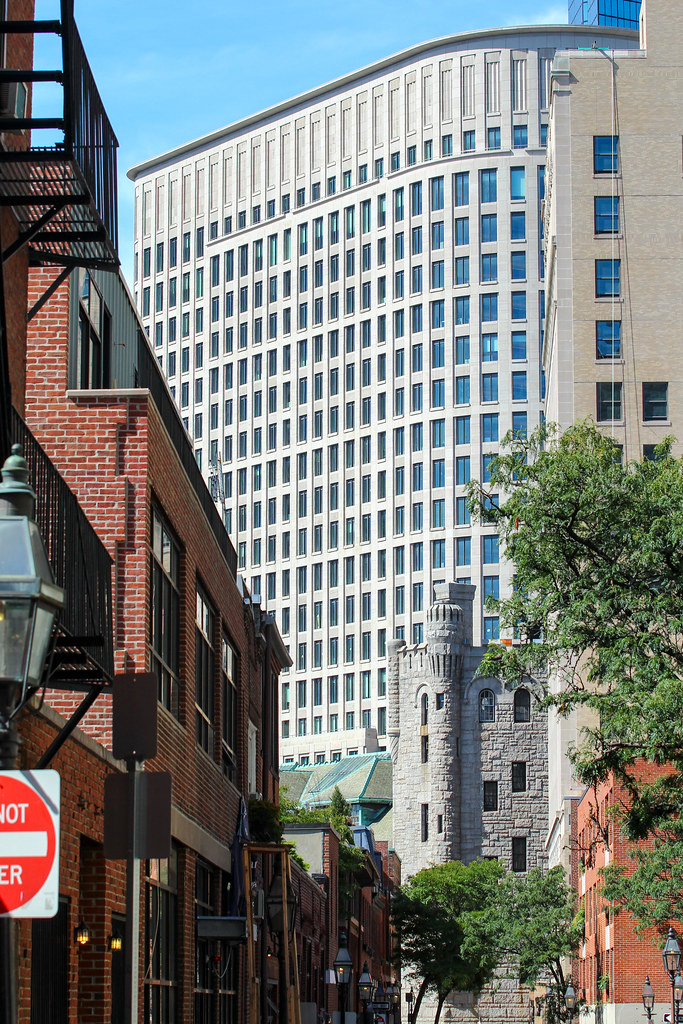
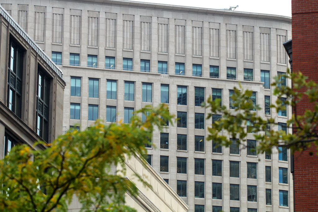
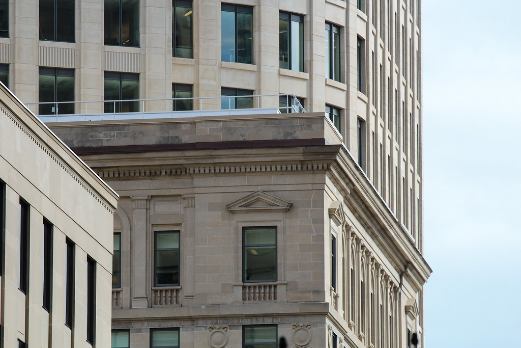
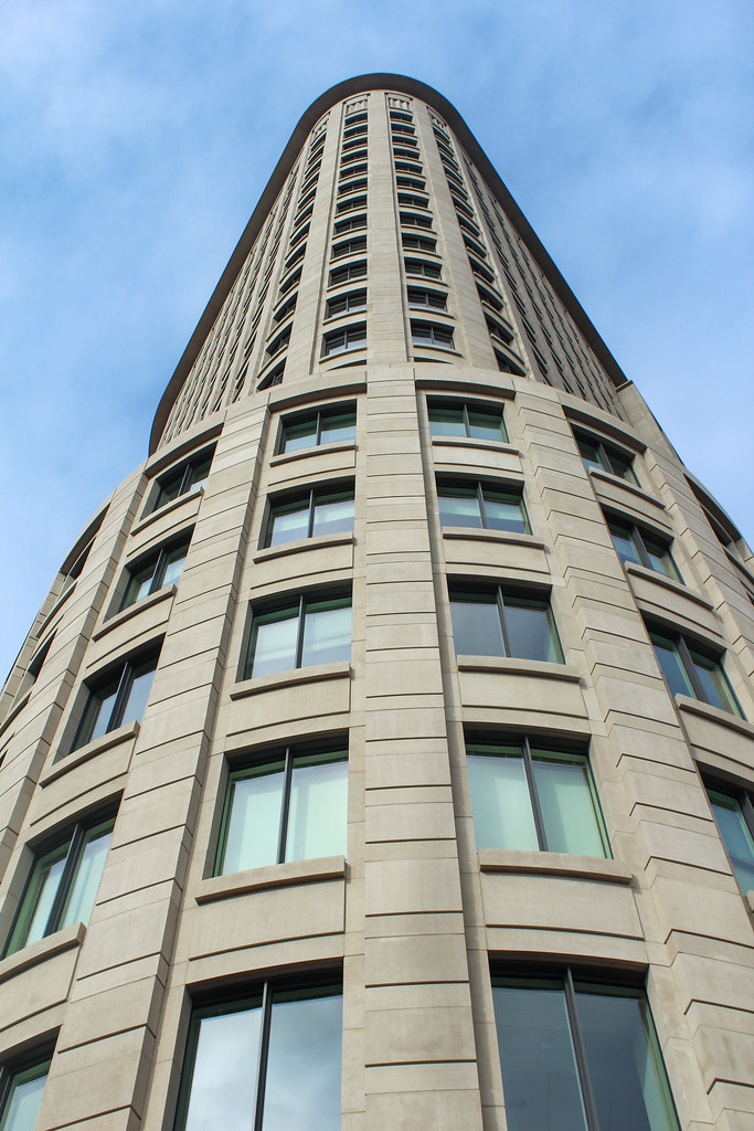
Absolutely in love with this building. Such quality and care for depth and materiality.
Absolutely in love with this building. Such quality and care for depth and materiality.
kz1000ps
Senior Member
- Joined
- May 28, 2006
- Messages
- 8,983
- Reaction score
- 11,839
Re: Liberty Mutual Expansion
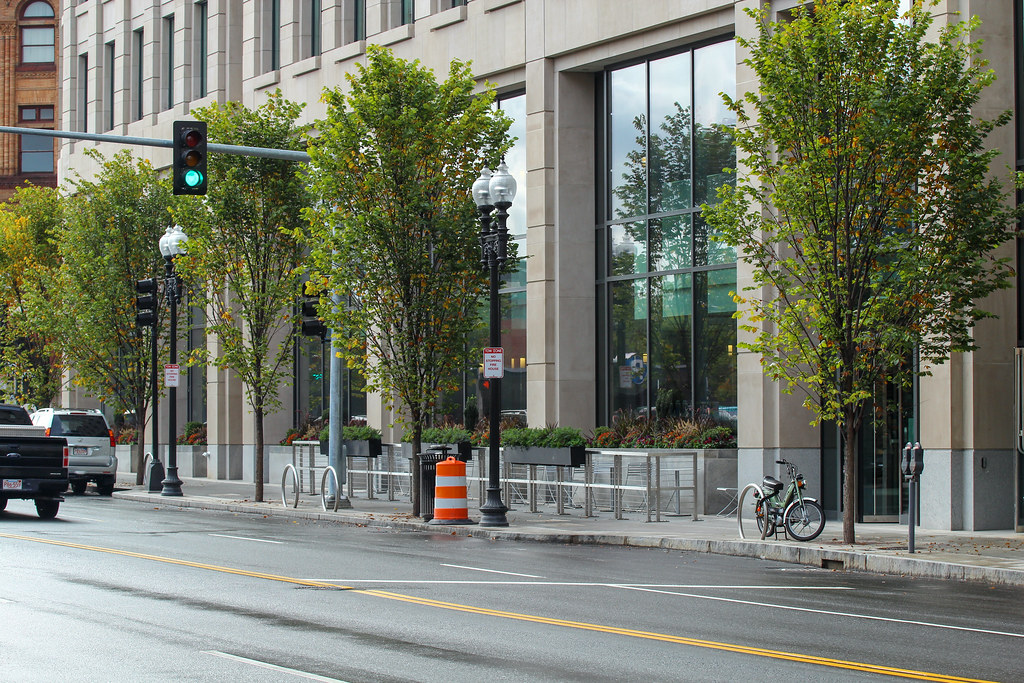
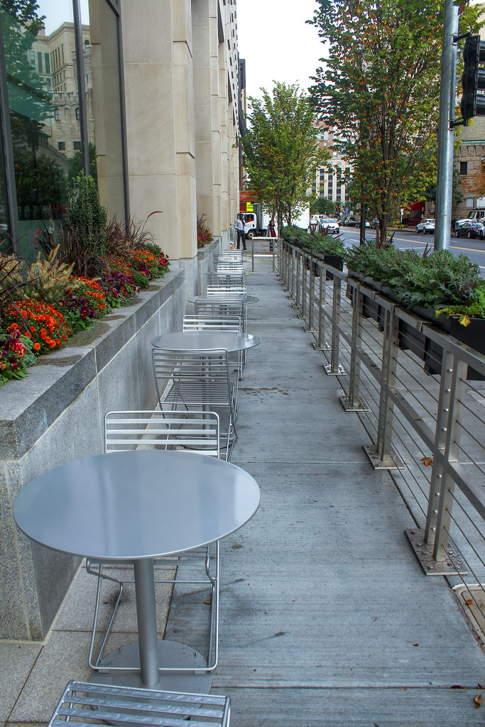
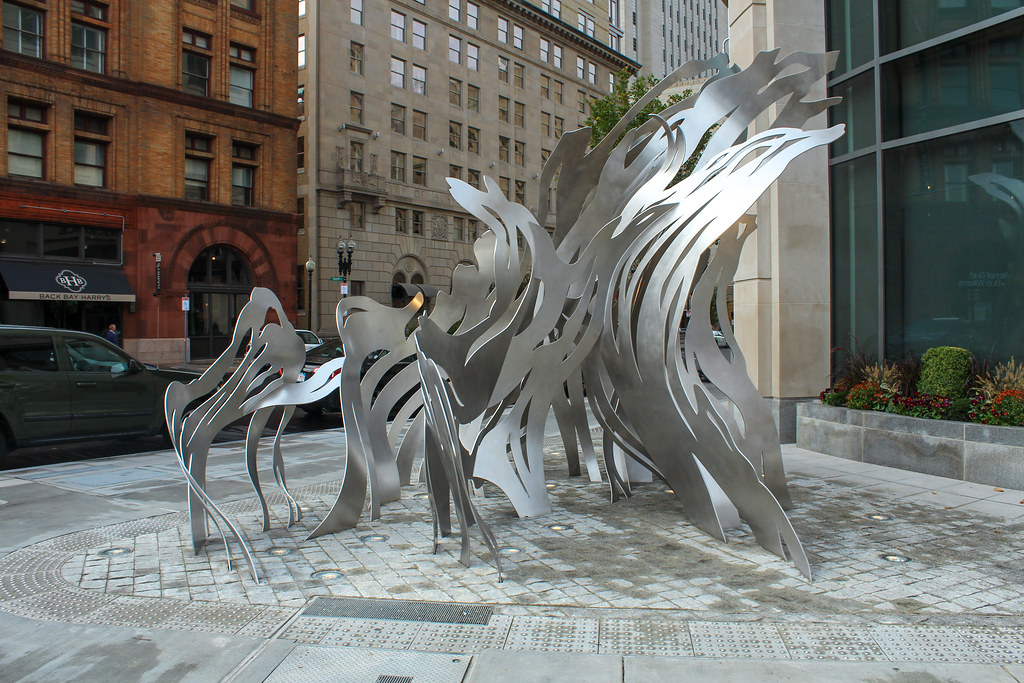
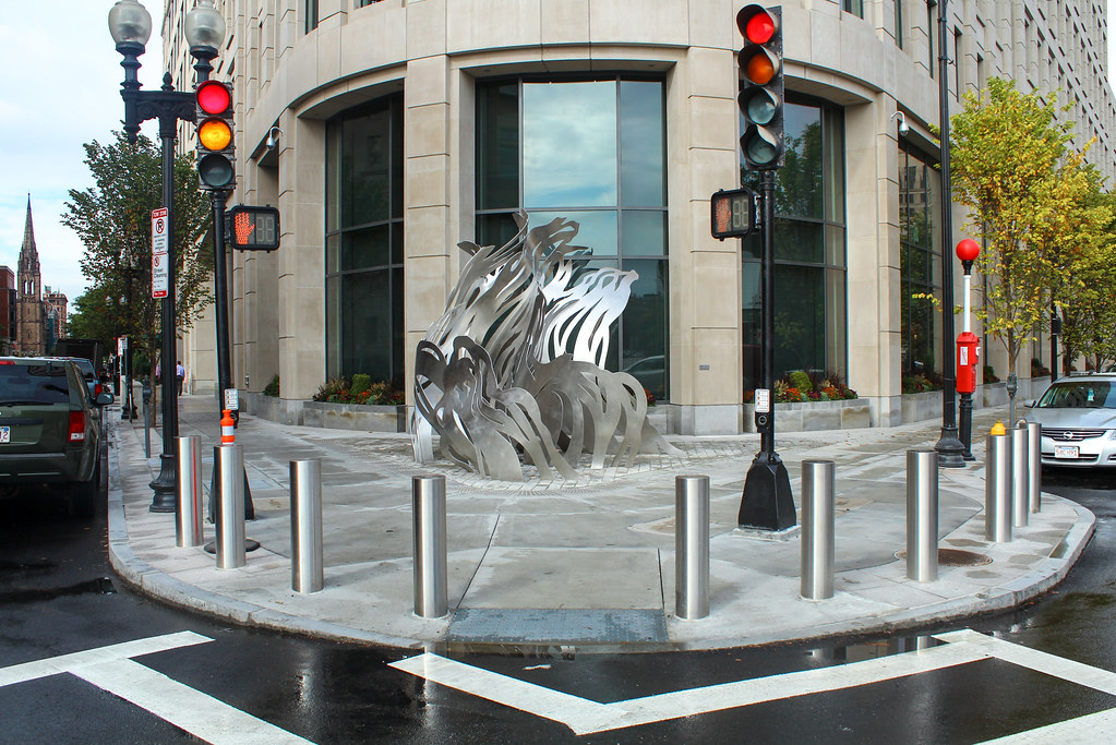
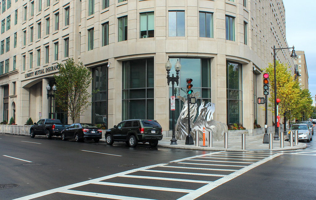
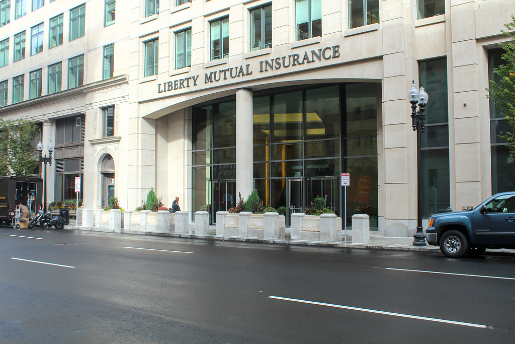
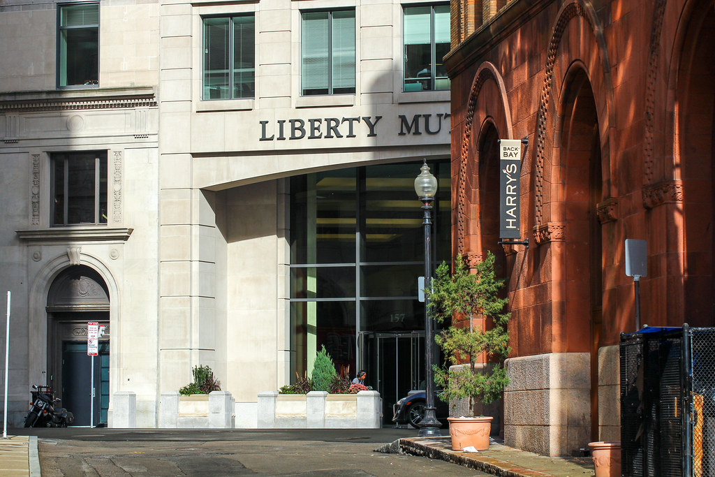
I do love the subtle changes of window depth on the south facade. And that art piece on the corner is way cool and surprising given how buttoned-up the rest of the LM complex is. But the south ground level is pretty bleak the way everything is cocooned off, right on down to the too-narrow outdoor eating area. Still, nice work CBT.
I do love the subtle changes of window depth on the south facade. And that art piece on the corner is way cool and surprising given how buttoned-up the rest of the LM complex is. But the south ground level is pretty bleak the way everything is cocooned off, right on down to the too-narrow outdoor eating area. Still, nice work CBT.
brucepf
Active Member
- Joined
- Oct 22, 2010
- Messages
- 130
- Reaction score
- 42
Re: Liberty Mutual Expansion
A little info on artwork.Sorry if previously posted. Great pics kz!
A little info on artwork.Sorry if previously posted. Great pics kz!
http://www.bizjournals.com/boston/real_estate/2013/08/what-is-it-liberty-mutuals-public-art.html?page=allAs Liberty Mutual approached completion of its $300 million worldwide headquarters in the Back Bay, the insurance giant considered how they would fill the outdoor space at Berkeley Street and Columbus Avenue.
“To be honest, we were looking for things to enhance the public realm for the whole project,” said Sean Murphy, design and construction director for Liberty Mutual. “We looked holistically at what can we do to improve the overall streetscape, we looked at several different artists and we felt that her medium would work well in that corner.”
“Art is in the eye of the beholder and we think people will see different things in it,” he said. “People might see fire, air or wind. It could be anything.”
When asked what he sees in “Uplift” as it is called, Murphy said “I see a lot of hard work on my part.”
Pearlman could not be reached for comment. On her website she wrote “I’m thrilled to announce that I have been commissioned to create a permanent site specific sculpture for Liberty Mutual’s new headquarters in Boston’s Back Bay. Titled Uplift, this new work is an indoor-outdoor sculpture made of waterjet cut stainless steel and aluminum. Uplift will act as a metaphorical bridge between the new Liberty Mutual headquarters and the surrounding streetscape, visually linking the Liberty Mutual and local communities together.”
In June, she told Sculpture magazine Uplift will be on a triangular plaza in front of the building. “The other half will hang inside a two-story atrium swirling around like autumn leaves, birds, or air currents...The cut metal will create dramatic shadows, a little sparkle, and act as a visual bridge between the community and the company.”
But not everyone is pleased that Liberty Mutual chose an out of state artist given the local talent. Laura Montgomery, director of the Bunker Hill Community College Art Gallery in Boston, said the insurer should have used a Boston artist for this commission.
“Liberty Mutual missed an opportunity to express its commitment to Boston and its art world with its selection of a New York artist,” Montgomery wrote in an email. “Liberty Mutual missed potential positive recognition by not selecting a Boston-based artist, an area which is rich with well known sculptors.”
atlantaden
Senior Member
- Joined
- May 31, 2006
- Messages
- 2,606
- Reaction score
- 2,753
Re: Liberty Mutual Expansion
kz, please, you or anyone else should never apologize for posting "all the photos" since so many of us appreciate "all the photos". Thanks, kz, for posting all those great photos!
Sorry for all the photos but per usual I got a little trigger happy!
]
kz, please, you or anyone else should never apologize for posting "all the photos" since so many of us appreciate "all the photos". Thanks, kz, for posting all those great photos!
J
JoeBoston1
Guest
Re: Liberty Mutual Expansion
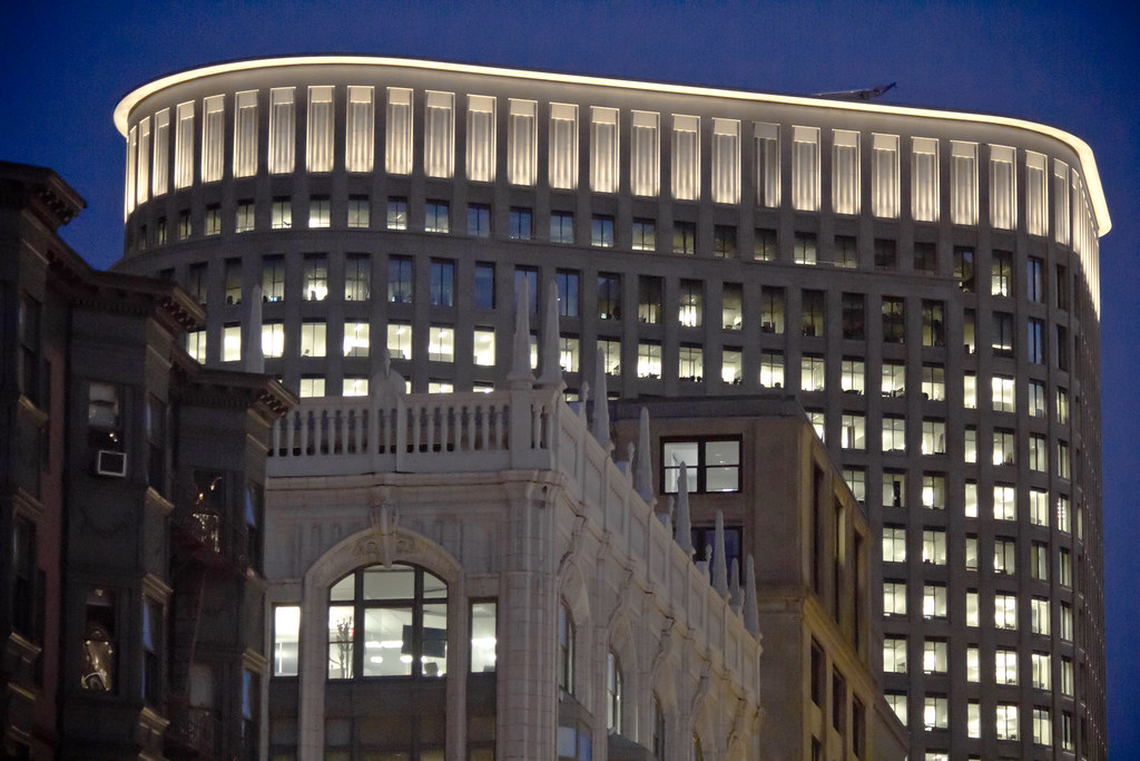
I like this building, especially at night.
But the ground level is a real lost opportunity for more public interaction. The attempts with the water-fountain and eating slot are nice, but there should have been more. For such a big monolithic building, I would have liked to see something like the walk-through corridors of the Park Square Building or the sky-lit corridor that runs behind 75 Arlington St.
But not a big deal because that area has enough open public indoor spaces.
This sort of giant, closed-off corporate HQ building would be completely unacceptable for a neighborhood that has few indoor public spaces like the Financial District.
pixelsand8
Active Member
- Joined
- Mar 16, 2013
- Messages
- 467
- Reaction score
- 2
Re: Liberty Mutual Expansion
Finally got out to take a walk and get some pics.

Finally got out to take a walk and get some pics.

pixelsand8
Active Member
- Joined
- Mar 16, 2013
- Messages
- 467
- Reaction score
- 2
Re: Liberty Mutual Expansion
