File under "reasonable wayfinding projects"
Solution: either tilt the "Departures" arrow a little bit, or re-center it under the "p" in Departures.
This sign at Logan drives me NUTS because it essentially clarifies NOTHING about what lane you're supposed to be in. It literally is best read as "crash into the impact absorption barrier" to get to Departures:
View attachment 17793
Also, the right shoulder is so poorly marked it appears to be the exit lane for Harborside Drive, reinforcing the impression that Departures is immediately to its left. Other solution: hash marks on the shoulder to make it clear where the right lane is.
And so you see people at the last minute changing lanes, even in Streetview:
(click the link below and "on the street in front of you" to follow the blue Subaru as it makes the all-too-common path.
Where it looks for a long way like it is perfectly lined up for "Departures" only to find out that the Departures sign is wrongly mostly above and indicating the Harborside Drive lane.)
Find local businesses, view maps and get driving directions in Google Maps.

goo.gl
 IMG_2965
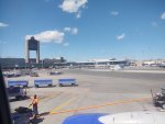
 IMG_5480
 IMG_5478
 IMG_7075
 IMG_7076