You are using an out of date browser. It may not display this or other websites correctly.
You should upgrade or use an alternative browser.
You should upgrade or use an alternative browser.
Longwood Place (Simmons Residential Campus) | 305 Brookline Avenue | Longwood
- Thread starter Equilibria
- Start date
Equilibria
Senior Member
- Joined
- May 6, 2007
- Messages
- 7,083
- Reaction score
- 8,310
Specifically, let's make it Boynton Yards!
Equilibria
Senior Member
- Joined
- May 6, 2007
- Messages
- 7,083
- Reaction score
- 8,310
BCDC: https://bpda.app.box.com/s/j54h2obfqjdf5d6l4jr3t7l2450cs5s9
To their credit, they have tried again.


To their credit, they have tried again.
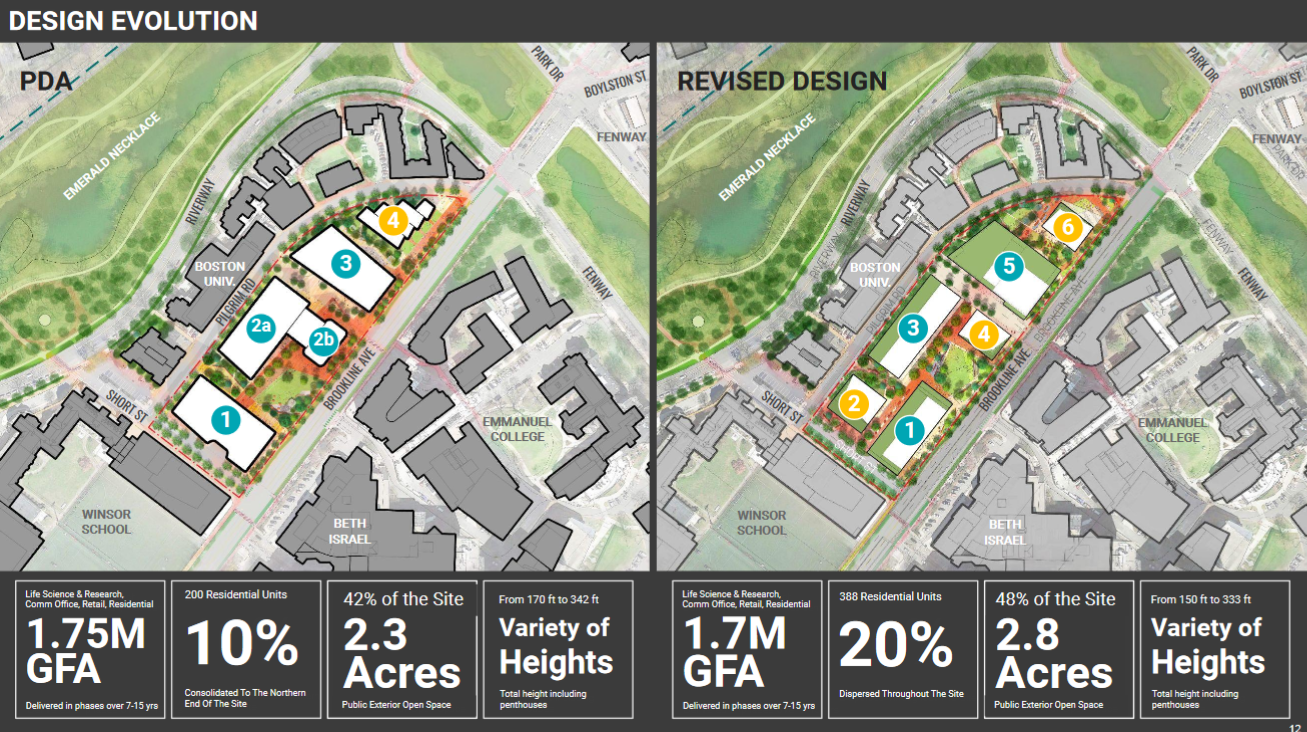
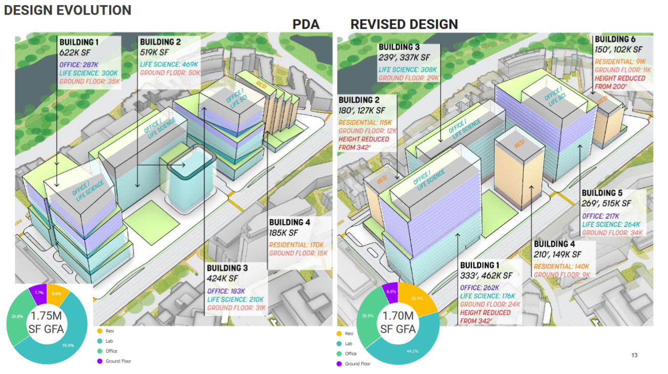
I feel like they made the designs a lot less interesting overall. They also cut the tallest building as expected, but it was only by 9' (from 342' to 333') so they're still trying to get some height here! But overall, other than adding more housing, I don't really see why this would be preferred over the 1st iteration.
Equilibria
Senior Member
- Joined
- May 6, 2007
- Messages
- 7,083
- Reaction score
- 8,310
I feel like they made the designs a lot less interesting overall. They also cut the tallest building as expected, but it was only by 9' (from 342' to 333') so they're still trying to get some height here! But overall, other than adding more housing, I don't really see why this would be preferred over the 1st iteration.
I think this is a work in progress. They didn't have nearly as many renderings as they did for the first version.
It's an improvement because there are more buildings arranged in a more urban pattern. I agree that open space should be going down not up, though.
urbanmansprawler
New member
- Joined
- Oct 8, 2021
- Messages
- 63
- Reaction score
- 97
It struck me right away that the revised designs don't feature any real custom steel, the kind that's experiencing significant and costly delays. Boxes get built faster and cheaper I'd guess.
Plen-T-Pak
Active Member
- Joined
- Jul 23, 2007
- Messages
- 251
- Reaction score
- 480
They need to properly fill out that corner at Pilgrim and Brookline. Forget the little office building style lawns and do a double row of trees down along Brookline with a continuous streetwall. Tall glass boxes and a wide street is a tough one.
ccole
Active Member
- Joined
- Apr 4, 2016
- Messages
- 172
- Reaction score
- 1,357
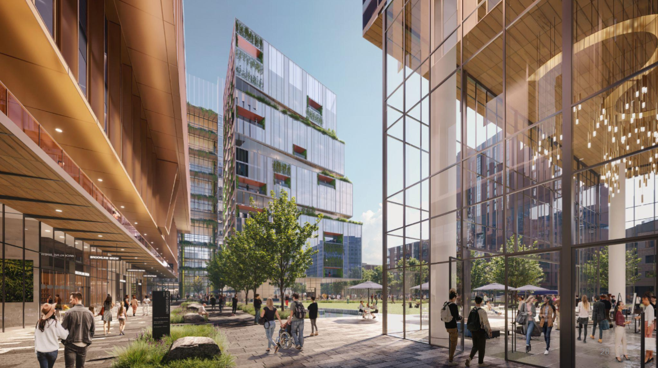
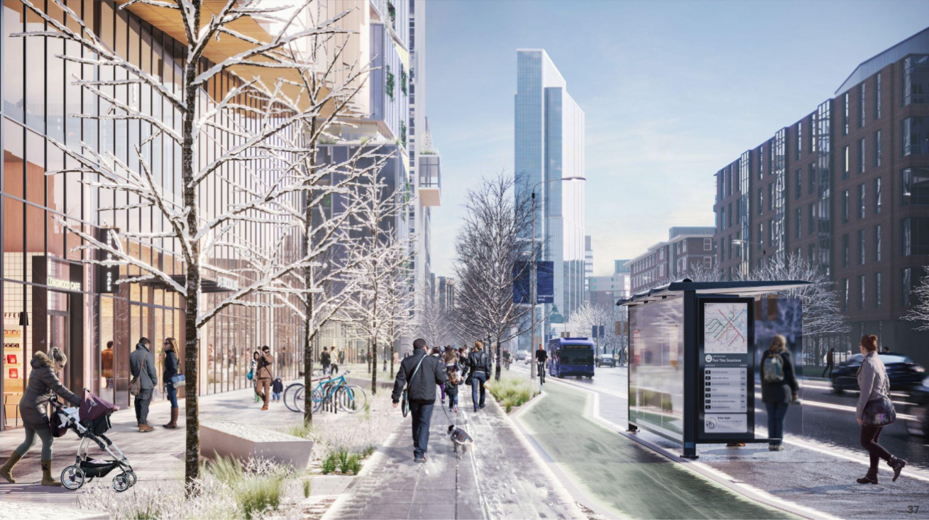
New presentation with more renders of the updated buildings: https://bpda.app.box.com/s/4sdfoyugcsh2w7ad13fpr93930j3u6k8.
I like the boxier massing and division into two rows of buildings with the implication of a street in between. I am concerned there's a lack of human scale on Brookline Ave - they should do a small podium with a setback at the third story at the very least. If it was me I would put the larger buildings in back. Also, I would do the park at one of the corners, facing the riverway or Longwood Ave. This way it will get a little sunlight and feel more public. The park as placed seems like it will be dark and windy 90% of the time and not feel public.
Last edited:
Equilibria
Senior Member
- Joined
- May 6, 2007
- Messages
- 7,083
- Reaction score
- 8,310
HenryAlan
Senior Member
- Joined
- Dec 15, 2009
- Messages
- 4,184
- Reaction score
- 4,450
I think this is a work in progress. They didn't have nearly as many renderings as they did for the first version.
It's an improvement because there are more buildings arranged in a more urban pattern. I agree that open space should be going down not up, though.
Overall, the massing and positioning of the buildings is much better. Even though they slightly increased open space, it's better hidden from the Brookline Ave. street wall. This is vastly more pro-urban and pro-pedestrian.
Equilibria
Senior Member
- Joined
- May 6, 2007
- Messages
- 7,083
- Reaction score
- 8,310
Glad they're holding their ground on that tallest building for now, at 333'. It really takes 300'+ to truly stand out in these secondary skylines and this is a critical litmus test for the next few years of proposals under the Wu administration.
TomOfBoston
Senior Member
- Joined
- Mar 29, 2007
- Messages
- 1,241
- Reaction score
- 465
What is the status of Simmons constructing its new residential tower on its main campus?
Equilibria
Senior Member
- Joined
- May 6, 2007
- Messages
- 7,083
- Reaction score
- 8,310
It would help their case if they showed the Center for Life Science at the correct height which is almost 350', and slightly taller than the tallest proposed here.
What case?
Fair question as my comment refers to unposted diagrams, which I added below. I'm assuming any NIMBY attacks are focusing on the height first and foremost. It looks like this proposal is taller than anything in Longwood, but in reality Longwood's tallest is listed more than 50' too low. That's the Center for Life Science building, also known as Blackfan. Like many built in the early 2000's it was listed without the mech and we only found out the real height years later. Thus the wrong heights continue to float around and sometimes rear their ugly head.
Ultimately this will only be the 4th tallest in the area with the Fenway Center air rights portion getting built first. However these make it look like it will be the clear-cut second tallest behind the Pierce, which is extra (unnecessary) ammunition for the NIMBY battle.
