Longwood Place (Simmons Residential Campus) | 305 Brookline Avenue | Longwood

It would help their case if they showed the Center for Life Science at the correct height which is almost 350', and slightly taller than the tallest proposed here.

What case?

Fair question as my comment refers to unposted diagrams, which I added below. I'm assuming any NIMBY attacks are focusing on the height first and foremost. It looks like this proposal is taller than anything in Longwood, but in reality Longwood's tallest is listed more than 50' too low. That's the Center for Life Science building, also known as Blackfan. Like many built in the early 2000's it was listed without the mech and we only found out the real height years later. Thus the wrong heights continue to float around and sometimes rear their ugly head.

Ultimately this will only be the 4th tallest in the area with the Fenway Center air rights portion getting built first. However these make it look like it will be the clear-cut second tallest behind the Pierce, which is extra (unnecessary) ammunition for the NIMBY battle.

1656182370633.png


1656182488853.png
 
I got issues, but my real beef is the 'main heart'. This parklet is on the edge of the development and crisscrossed by ped paths, so it's neither central (like a heart) nor conducive to actual 'arterial' function for the neighborhood.

As for the new design, it's a crowded pastiche of 'mod' 70s/80s styles that, unless built with the detailing of a bespoke suit, will likely appear cheap and dated right out of the gate.

I'm not in the camp that every successful city needs to go the way of Toronto (max out the lot and build high af), but this is a colossal waste of a lot of space.
 
What we heard: Make it worse.
What we did: Make it worse.

Wash, rinse, and repeat, every damn time!!!

Is this true? Comparing the current renders to the ones on page 1, I think I actually like the current ones more.

Having the main park space connect to Short Street is smart cuz it will make the space more seamless with and tied to the Riverway.
 
Last edited:
The schedule notes phase 1 entitlements and design while Simmons builds it's new dorm building for the next 2-3 years. That suggests to me there's a lot more design work for the buildings themselves.

The length at which this is going to be completed is slightly concerning to me. The first building/phase won't be done for 6 years, followed by 2 additional (more aggressive) phases after that with no anticipated timeline. Coming off this building boom, which to me is appearing to slow down (nationally and regionally), with a massive amount of proposed SF to come online in a decade is quite a risky development to take on. Good for Simmons for cashing out on their real estate when they did, and good luck Skanska for navigating a new RE market - perhaps the flame for new space in Longwood will never die out.

All that said, the urban design here is leaving much to be desired for a project that's going to be developed through the 2030's...
 
Is this true? Comparing the current renders to the ones on page 1, I think I actually like the current ones more.

Having the main park space connect to Short Street is smart cuz it will make the space more seamless with and tied to the Riverway.

The buildings are worse. They continue to get wider and shorter with each iteration. The tallest one here, now down to 320', looks wider than it is tall.
 
Also in the next decade the NE Baptist is rumored to be looking to build a new hospital in Longwood
 
I actually think the architecture is doing all that it can with the massing. The counter-angle thing is pretty cool-looking, IMO. And they only lowered the height by 12 feet. Let's be honest: if it's not over 400' to begin with then it's not worth discussing the height at all.
 
....Let's be honest: if it's not over 400' to begin with then it's not worth discussing the height at all.

300' for the neighborhoods outside downtown and Back Bay is when they start to stand out.

I actually think the architecture is doing all that it can with the massing. The counter-angle thing is pretty cool-looking, IMO. And they only lowered the height by 12 feet.....

They lowered the height and made it wider. It's now wider than it is tall. Any "highrise" that's wider than it is tall becomes an automatic loser in my book.
 

View attachment 33296
Somehow this doesnt look like Boston at all. Honestly looks like something from the Galleria in Houston. But I like how in the one you posted here, Brookline Ave doesnt look like a highway (compare the one in the tweet, where it looks even more highwayish than it is).
 
Somehow this doesnt look like Boston at all. Honestly looks like something from the Galleria in Houston. But I like how in the one you posted here, Brookline Ave doesnt look like a highway (compare the one in the tweet, where it looks even more highwayish than it is).

And the buildings look completely different in those two renders. Different angle? Different street/vantage point? Different renders?
 
Last edited:
And the buildings look completely different in those two renders. Different angle? Different street/vantage point? Different renders?
Not sure. Definitely are different designs..
 
The BPDA image is the March 2022 version. The Boston Globe image is the December 13 2022 version.
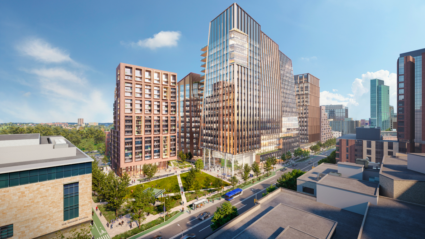
 
The BPDA image is the March 2022 version. The Boston Globe image is the December 13 2022 version.

That's what I thought, and it makes sense.

More than a tiny bit disturbing, though, that the City of Boston's Supreme Court of Judgement for all development projects used an outdated/replaced project render to publicly announce its official approval of said project.

That's a really pathetic look from a competency point of view.
 
Last edited:

Back
Top