I am fine with curving Boylston St. But pedestrian experience can be improved by eliminating "islands", expanding sidewalks, improving lighting and activating park edges a bit. All pretty doable with some impact to car throughput.
You are using an out of date browser. It may not display this or other websites correctly.
You should upgrade or use an alternative browser.
You should upgrade or use an alternative browser.
Lyrik Back Bay | 1001 Boylston Street (Parcel 12) | Back Bay
- Thread starter Equilibria
- Start date
urbanmansprawler
New member
- Joined
- Oct 8, 2021
- Messages
- 63
- Reaction score
- 97
Respectfully, I'm glad none of you in favor of messing with this stretch of Boylston could bring your ideas to bear. This bridge over a river/floodplain doesn't need a starchitect redesign or a bunch of gimmicky kiosks, it's great as it is.
Blackbird
Senior Member
- Joined
- Feb 2, 2014
- Messages
- 1,207
- Reaction score
- 1,721
Uh, no. Cutting a road through one of the best parks in Boston (and the one that probably most closely adhere's to Olmsted's original vision) is not a great idea.
It's especially too bad that some of the nicer parts of the park (the Victory Gardens) are right in that line where Boylston bends.
This bridge over a river/floodplain doesn't need a starchitect redesign or a bunch of gimmicky kiosks, it's great as it is.
You're out of your mind if you think this is "great".
HelloBostonHi
Senior Member
- Joined
- Apr 17, 2018
- Messages
- 1,480
- Reaction score
- 4,113
Let's keep this thread for Parcel 12 and keep the well debated overpass discussions somewhere else, https://archboston.com/community/threads/bowker-overpass-replacement.1708/
urbanmansprawler
New member
- Joined
- Oct 8, 2021
- Messages
- 63
- Reaction score
- 97
I recognize pedestrian islands are a necessity on a road heavily used by cars and walkers, and I don't think they need to be anything other than useful. I've stood there 1000s of times, no worse off for it.It's especially too bad that some of the nicer parts of the park (the Victory Gardens) are right in that line where Boylston bends.
You're out of your mind if you think this is "great".
Blackbird
Senior Member
- Joined
- Feb 2, 2014
- Messages
- 1,207
- Reaction score
- 1,721
I recognize pedestrian islands are a necessity on a road heavily used by cars and walkers, and I don't think they need to be anything other than useful. I've stood there 1000s of times, no worse off for it.
Is it used heavily by walkers? I find the stretch usually pretty devoid of life especially considering the hustle and bustle along Boylston in either direction.
I've also stood there "1000s" of times. I don't think I'm scarred for life from the experience, but I agree with xec that it's a gross, auto-centric mess of an intersection along Boston's flagship street in the middle of one of its nicest, historically significant parks.
You're out of your mind if you think this is "great".
The lack of proper, bright street lighting in this area should be addressed, regardless of any future projects. It's somewhat startling the lack of clear and bright lighting in areas of Boston.
NorthshoreCity
Active Member
- Joined
- Sep 9, 2020
- Messages
- 122
- Reaction score
- 664
Core still has a lil ways to go but it's already providing an excellent preview of the impact this building will have on the skyline:
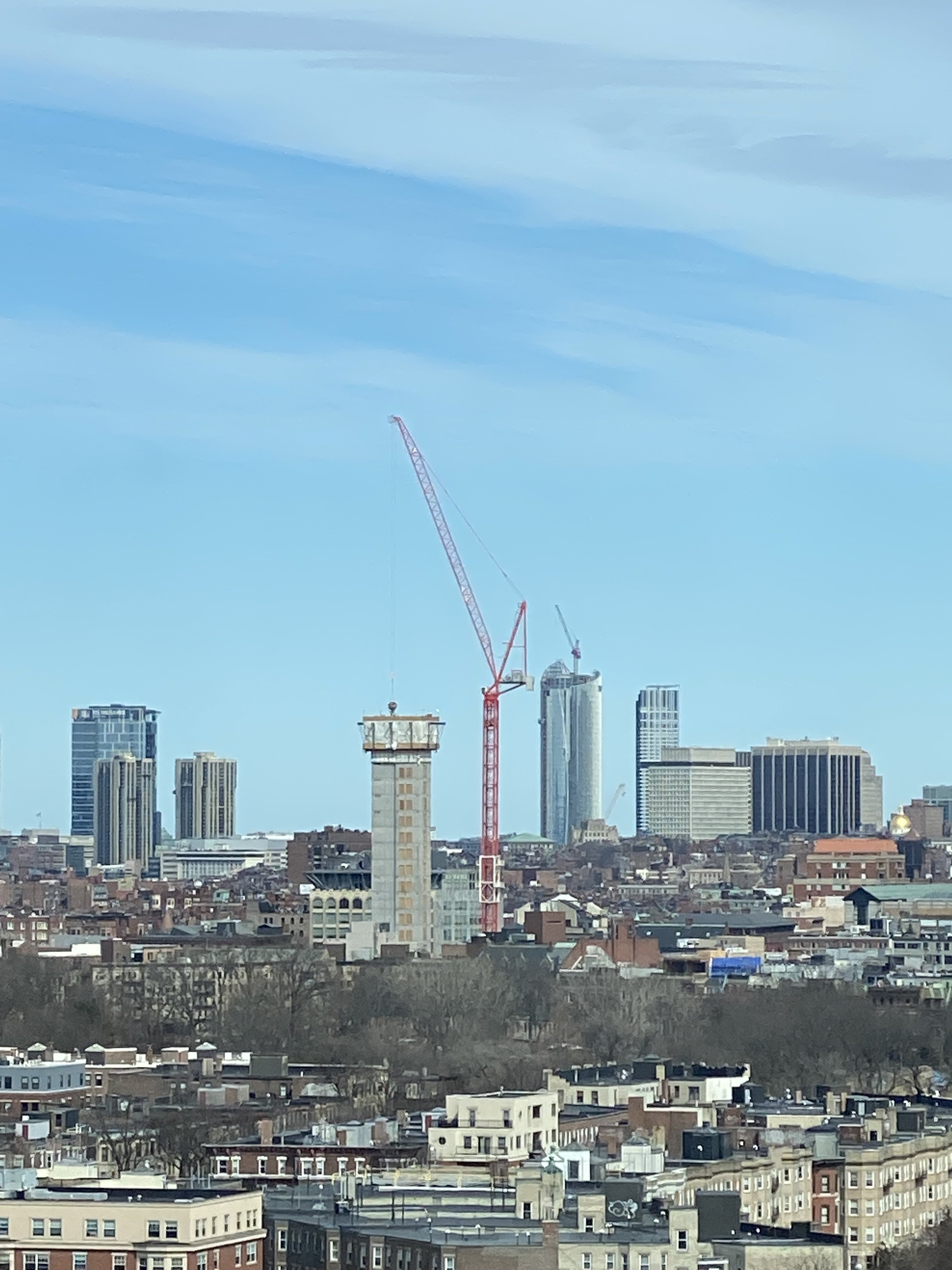
What an interesting angle this is taken from! It took me awhile to figure out the perspective because I was initially sure that this was the Union Sq tower core.Core still has a lil ways to go but it's already providing an excellent preview of the impact this building will have on the skyline:
View attachment 22623
- Joined
- May 25, 2006
- Messages
- 7,033
- Reaction score
- 1,865
Crane porn.
- Joined
- Jan 7, 2012
- Messages
- 14,062
- Reaction score
- 22,731
 IMG_5014 by Bos Beeline, on Flickr
 IMG_5015 by Bos Beeline, on Flickr
 IMG_5020 by Bos Beeline, on Flickr
 IMG_5029 by Bos Beeline, on Flickr
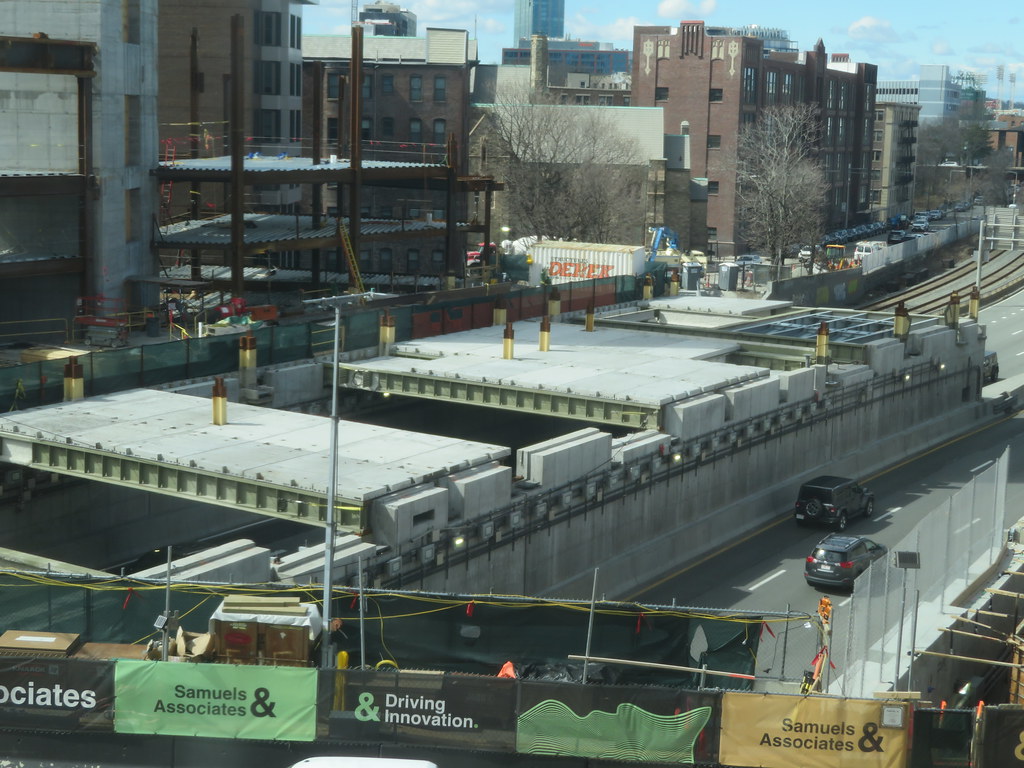 IMG_5027 by Bos Beeline, on Flickr
 IMG_5031 by Bos Beeline, on Flickr
 IMG_5028 by Bos Beeline, on Flickr
 IMG_5026 by Bos Beeline, on Flickr
 IMG_5030 by Bos Beeline, on Flickr
stick n move
Superstar
- Joined
- Oct 14, 2009
- Messages
- 12,096
- Reaction score
- 18,877
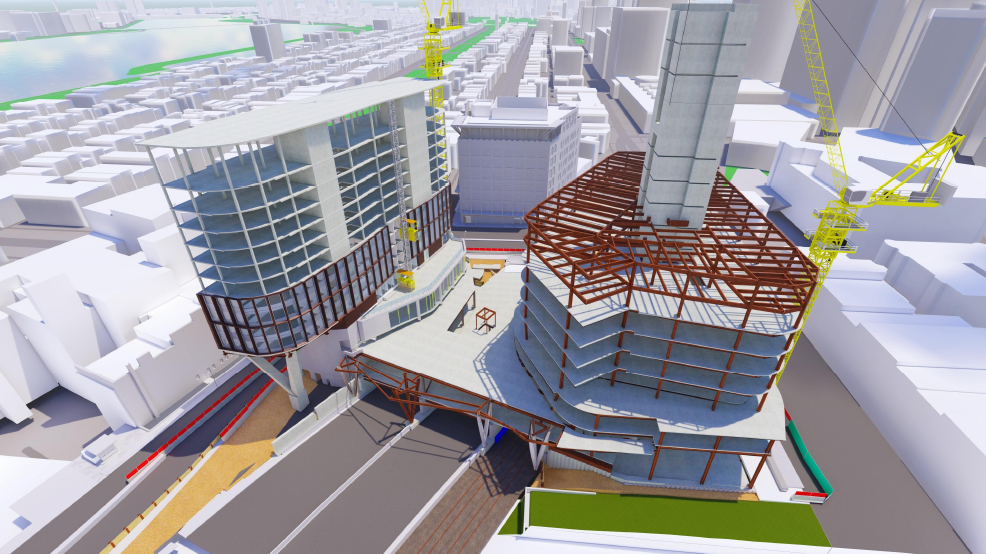
Pretty interesting to have steel beams rising up out of the center of the slabs. Kind of hard to tell where they line up in the podium.
Last edited:
stick n move
Superstar
- Joined
- Oct 14, 2009
- Messages
- 12,096
- Reaction score
- 18,877
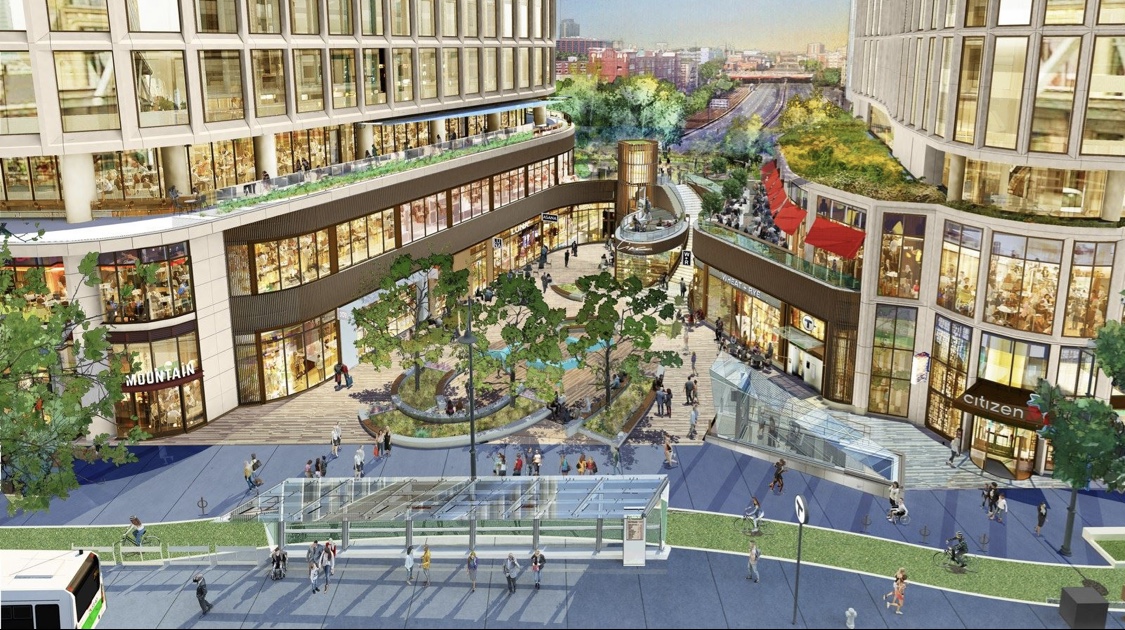
A few apparent changes.
As predicted by many people the excess unrealistic cascading greenery is gone. A few changes to the shorter tower and retail podium as well.

Previous design
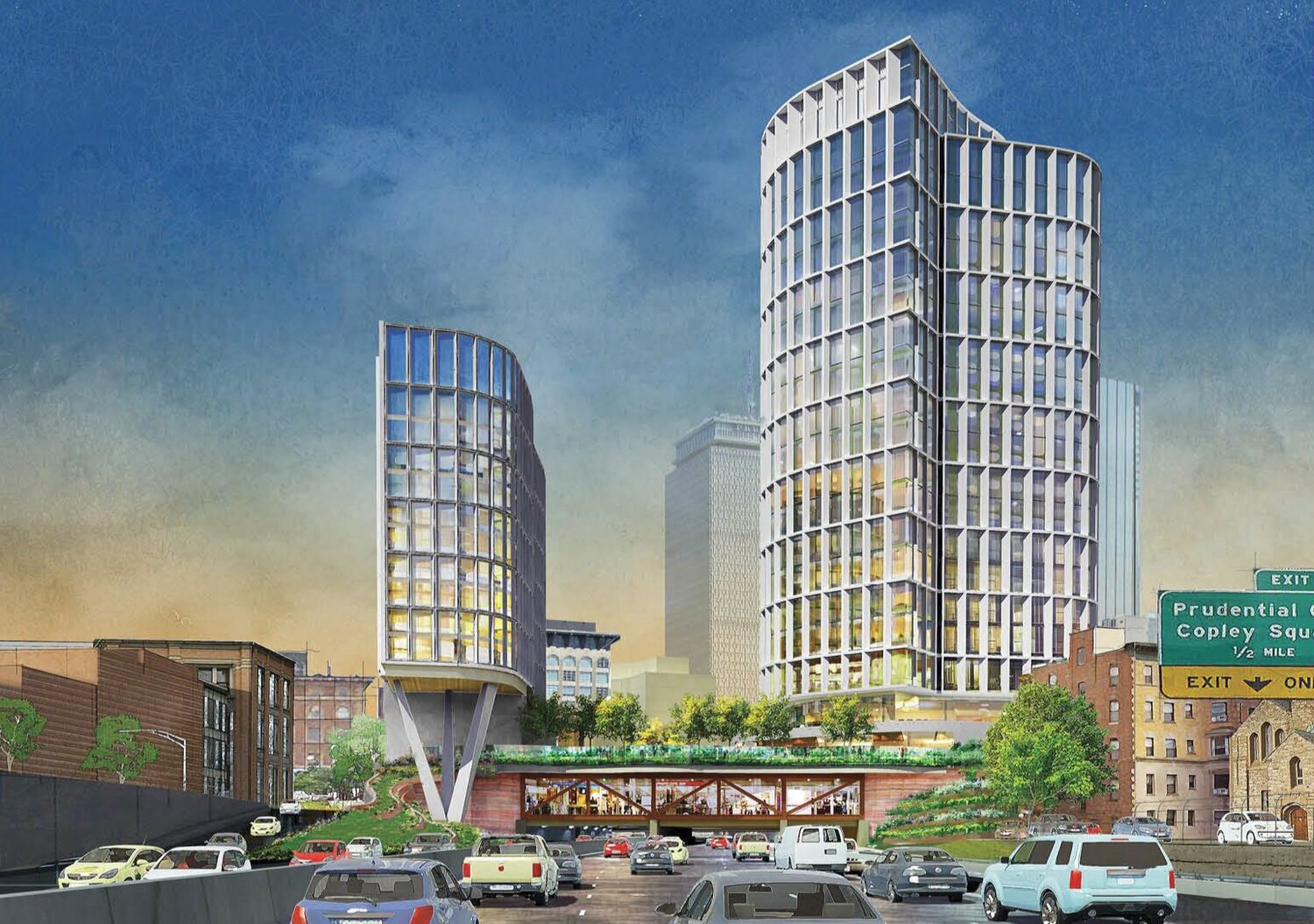
Changes to retail plaza/building
Previous design

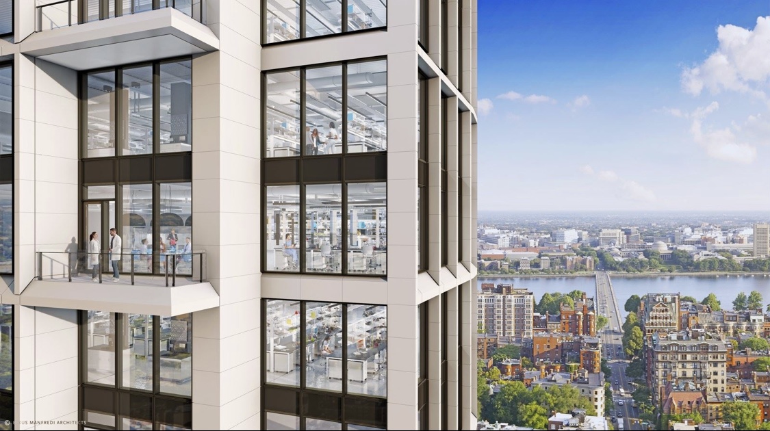
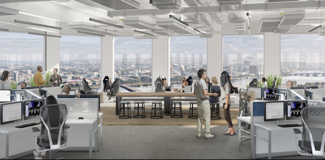
Some other misc shots

https://www.cbre.com/properties/pro...sciences/details/US-SMPL-69322?view=isLetting
As predicted by many people the excess unrealistic cascading greenery is gone. A few changes to the shorter tower and retail podium as well.

Previous design

Changes to retail plaza/building

Previous design

Some other misc shots


https://www.cbre.com/properties/pro...sciences/details/US-SMPL-69322?view=isLetting
Last edited:
I actually like the changes to the plaza better now. It looks a bit more open and inviting. Plus the spiral staircase around what I'm assuming is an elevator and a little cafe is a nice touch. I definitely miss the reddish coloring of the portion above the highway as now the browns look like a generic shopping center from the '80s or '90s. Also, what is with that blocked-out portion on the top left of the shorter tower? It looks so strange! Why can't it be windows as it was before?
stick n move
Superstar
- Joined
- Oct 14, 2009
- Messages
- 12,096
- Reaction score
- 18,877
Gauging by renders like this the top 2 floors are rentable space with an outdoor terrace, so most of the crown is windows with that corner being used for the mech screen. Compared to the left tower where the crown is all mech screen. It had to go somewhere so it went there.


There has to be a better way they can incorporate the mechanical screen up there. One corner of off-colored screen and the rest windows? And it's on the most visible side as you come into the city on the Pike! It's extremely poor design and definitely can be disguised better. Just open it above it and continue the glass in front of it. Even if it looks darker than the other windows up there sometimes, it's still far better than a beige blanked-out corner!Gauging by renders like this the top 2 floors are rentable space with an outdoor terrace, so most of the crown is windows with that corner being used for the mech screen. Compared to the left tower where the crown is all mech screen. It had to go somewhere so it went there.

The latest version looks like an unfortunate instance (aren't they all) of Value Engineering.
Feels like a cheapening of both:
1) the Mass Pike-facing podium/undercarriage elements (moving from terraced greenery, with a wood (?) or copper (?) podium and nice cross-bracing over the Pike ... to something vaguely Brutalist, akin to the most deadening aspects of the Boston Federal Reserve)
2) the Plaza, where the most interesting element (the second-story promenade / outdoor area) has been eliminated, the 'Spanish Steps' removed, the third-floor terrace on the right-hand side removed - in summary, it went from "inviting and open piazza for people watching" to "walled-off shopping mall." As if they were trying to recreate the wonderful outdoor spaces of the Prudential Center shopping mall.

 IMG_9251
 IMG_9269
 IMG_9271
 IMG_9280