You are using an out of date browser. It may not display this or other websites correctly.
You should upgrade or use an alternative browser.
You should upgrade or use an alternative browser.
Mandarin Oriental | 776 Boylston St | Back Bay
- Thread starter LeTaureau
- Start date
- Joined
- May 25, 2006
- Messages
- 7,033
- Reaction score
- 1,865
Re: Mandarin Oriental
Oh shi..... Hotel Commonwealth 2.0
Oh shi..... Hotel Commonwealth 2.0
Padre Mike
Active Member
- Joined
- Jan 27, 2007
- Messages
- 681
- Reaction score
- 1
Re: Mandarin Oriental
I must say it is a whole lot better looking than the Four Seasons up the street, and occupying a far more prominent spot near the Public Garden and a much wider Charles St.. The Mandarian, at least will be viewed mostly on a sharp longitudinal edge as one is proceeding up or down Boylston St. The view of the facade, head-on, will be limited by its prodigious length and the narrowness of Boylston, so that it can't really be seen in one visual "gulp". (...and at least it's not as "kitchy" as Hotel Commonwealth, which, due to the width of Kenmore Square, can be taken in as a whole visually from certain vantage points.)
I must say it is a whole lot better looking than the Four Seasons up the street, and occupying a far more prominent spot near the Public Garden and a much wider Charles St.. The Mandarian, at least will be viewed mostly on a sharp longitudinal edge as one is proceeding up or down Boylston St. The view of the facade, head-on, will be limited by its prodigious length and the narrowness of Boylston, so that it can't really be seen in one visual "gulp". (...and at least it's not as "kitchy" as Hotel Commonwealth, which, due to the width of Kenmore Square, can be taken in as a whole visually from certain vantage points.)
JeffDowntown
Senior Member
- Joined
- May 28, 2007
- Messages
- 4,795
- Reaction score
- 3,660
Re: Mandarin Oriental
Unfortunately, you are presented with most of the ungainly facade when you approach Boylston Street on Fairfield (on foot -- Fairfield is one way so you can't drive in that direction). The Mandarin creates a messy, claustrophobic cap to Fairfield's street scape.
Unfortunately, you are presented with most of the ungainly facade when you approach Boylston Street on Fairfield (on foot -- Fairfield is one way so you can't drive in that direction). The Mandarin creates a messy, claustrophobic cap to Fairfield's street scape.
Re: Mandarin Oriental
Taking the contrarian viewpoint I have to say it's turning out better than I was expecting after the smaller building was revealed. Not as grand as the original design due to simplifications and substitution of materials but still a positive contribution to the streetscape. It's going to create a great street wall along Boylston. As to the view from Fairfield, my reaction is that the high facade gives Fairfield the feel of an outdoor room. Even along Boylston the high streetwall creates a sense of enclosed space which gives the street the feel of an outdoor room rather than a traffic corridor. And it's an exaggeration to put this building in the same class as the Commonwealth Hotel. It's not going to have those split-level shop entrances that are the Commonwealth's major offense at street level or those fiberglass dormers it originally sported, the ne plus ultra of cheap kitsch. This bulding doesn't sink anywhere near that level. It does have its kistchy touches but they're minimal. The only real problem with the facade is that it's too flat in the sections on each side of the pavilion and that it could use more detailing, maybe a frieze somewhere along the top. And of course it would have looked better all limestone. But overall, the building is a definite plus.
Taking the contrarian viewpoint I have to say it's turning out better than I was expecting after the smaller building was revealed. Not as grand as the original design due to simplifications and substitution of materials but still a positive contribution to the streetscape. It's going to create a great street wall along Boylston. As to the view from Fairfield, my reaction is that the high facade gives Fairfield the feel of an outdoor room. Even along Boylston the high streetwall creates a sense of enclosed space which gives the street the feel of an outdoor room rather than a traffic corridor. And it's an exaggeration to put this building in the same class as the Commonwealth Hotel. It's not going to have those split-level shop entrances that are the Commonwealth's major offense at street level or those fiberglass dormers it originally sported, the ne plus ultra of cheap kitsch. This bulding doesn't sink anywhere near that level. It does have its kistchy touches but they're minimal. The only real problem with the facade is that it's too flat in the sections on each side of the pavilion and that it could use more detailing, maybe a frieze somewhere along the top. And of course it would have looked better all limestone. But overall, the building is a definite plus.
Batterymarch
New member
- Joined
- Oct 28, 2007
- Messages
- 65
- Reaction score
- 0
Re: Mandarin Oriental
DOES NOT RESEMBLE THE MODEL
DOES NOT RESEMBLE THE MODEL
Ron Newman
Senior Member
- Joined
- May 30, 2006
- Messages
- 8,395
- Reaction score
- 13
Re: Mandarin Oriental
So what exactly is supposed to be 'Oriental' or 'Mandarin' about this fa?ade?
So what exactly is supposed to be 'Oriental' or 'Mandarin' about this fa?ade?
Re: Mandarin Oriental
Once again, no real relation between arch renderings and reality. Perhaps it's not as grave a failure as Hotel Comm, but the sights were set so much higher. A disappointment however you look at it. Would be curious to know how the tentative condo buyers are feeling. They put cash on the barrell head based on renderings for an exceptional property. From the evidence thus far, this ain't it.
Once again, no real relation between arch renderings and reality. Perhaps it's not as grave a failure as Hotel Comm, but the sights were set so much higher. A disappointment however you look at it. Would be curious to know how the tentative condo buyers are feeling. They put cash on the barrell head based on renderings for an exceptional property. From the evidence thus far, this ain't it.
briv
Senior Member
- Joined
- May 25, 2006
- Messages
- 2,083
- Reaction score
- 3
Re: Mandarin Oriental
These renderings are from the Mandarin Oriental site. They were up a couple of weeks ago, but now they're not:
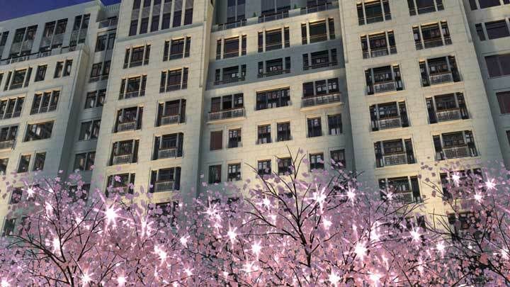
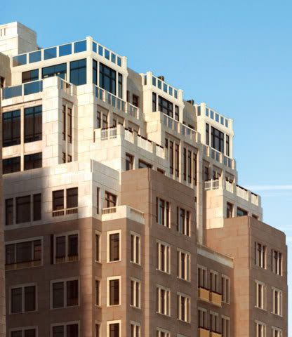
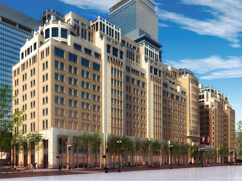
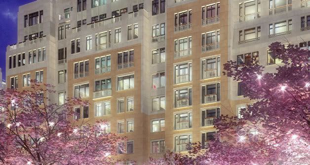
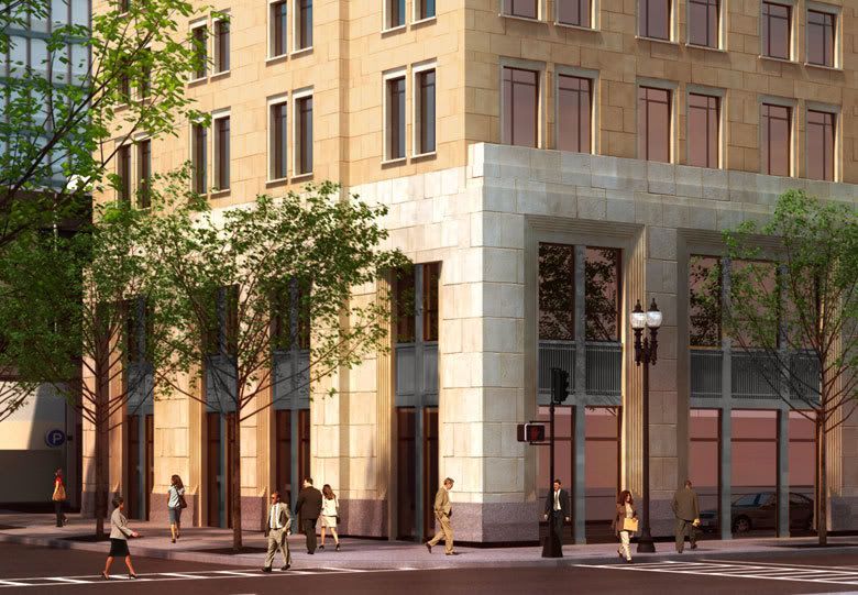
They clearly show a stone facade.
I was initially taken aback by the brick, but I've since accepted it.
It is very...blah.
These renderings are from the Mandarin Oriental site. They were up a couple of weeks ago, but now they're not:


They clearly show a stone facade.
I was initially taken aback by the brick, but I've since accepted it.
It is very...blah.
stellarfun
Senior Member
- Joined
- Dec 28, 2006
- Messages
- 5,711
- Reaction score
- 1,544
Re: Mandarin Oriental
If you go back several years to announcements about the project, limestone is always paired with brick in the description. Mention of granite too. I don't think anyone who bought a condo was under the illusion that the upper facade was going to be pre-cast stone rather than brick. Condo owners -- see Harbor Towers -- ought to have a great interest in future maintenance and upkeep costs.
If you go back several years to announcements about the project, limestone is always paired with brick in the description. Mention of granite too. I don't think anyone who bought a condo was under the illusion that the upper facade was going to be pre-cast stone rather than brick. Condo owners -- see Harbor Towers -- ought to have a great interest in future maintenance and upkeep costs.
Re: Mandarin Oriental
I dont think this is blah at all--in fact it provides an interesting alternate to the standard brick or precast stone that seems to plague Boston. This is a big improvement over the smaller of the two buildings first revealed.
I dont think this is blah at all--in fact it provides an interesting alternate to the standard brick or precast stone that seems to plague Boston. This is a big improvement over the smaller of the two buildings first revealed.
Re: Mandarin Oriental
I think that Justin's pictures reveal just how bland this project is. I like the massing, I think the height is good, and the terraces at the top create interest, but the colors and materials are a wash. From some shots its hard to tell if it is pre-cast beige concrete or limestone or brick.
I think that Justin's pictures reveal just how bland this project is. I like the massing, I think the height is good, and the terraces at the top create interest, but the colors and materials are a wash. From some shots its hard to tell if it is pre-cast beige concrete or limestone or brick.
- Joined
- May 25, 2006
- Messages
- 7,033
- Reaction score
- 1,865
Re: Mandarin Oriental
I think this would work better in Kenmore Sq (i.e. better than Hotel Comm.) but it seems to be a lost opportunity here, not bold enough thanks to short sighted NIMBYs.
I think this would work better in Kenmore Sq (i.e. better than Hotel Comm.) but it seems to be a lost opportunity here, not bold enough thanks to short sighted NIMBYs.
JimboJones
Active Member
- Joined
- Apr 4, 2007
- Messages
- 935
- Reaction score
- 1
Re: Mandarin Oriental
It looks somewhat better, unwrapped, yes. It does blend.
It looks somewhat better, unwrapped, yes. It does blend.
TheBostonBoy
Active Member
- Joined
- May 8, 2007
- Messages
- 442
- Reaction score
- 0
Re: Mandarin Oriental
Ya, I agree. I like it, it actually did come out similar to the renderings. The biege doesn't look that bad, it is good for buildings of that height.
Ya, I agree. I like it, it actually did come out similar to the renderings. The biege doesn't look that bad, it is good for buildings of that height.
Last edited:


