You are using an out of date browser. It may not display this or other websites correctly.
You should upgrade or use an alternative browser.
You should upgrade or use an alternative browser.
Marine Wharf (Hampton Inn and Homewood Suites) | 660 Summer St | Seaport
- Thread starter odurandina
- Start date
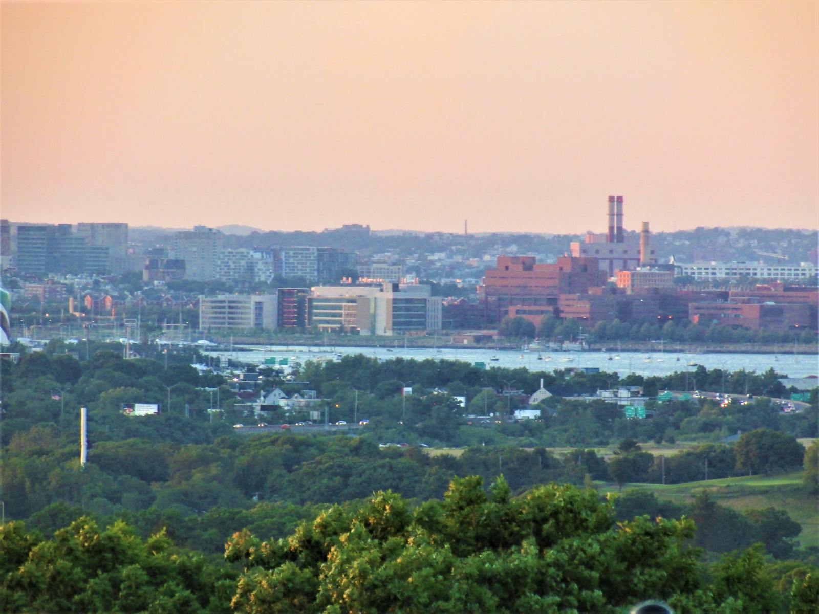 IMG_1497
- Joined
- Jan 7, 2012
- Messages
- 14,173
- Reaction score
- 23,688
 IMG_7384 by Bos Beeline, on Flickr
 IMG_7387 by Bos Beeline, on Flickr
 IMG_7391 by Bos Beeline, on Flickr
 IMG_7393 by Bos Beeline, on Flickr
 IMG_7395 by Bos Beeline, on Flickr
 IMG_7396 by Bos Beeline, on Flickr
- Joined
- Jan 7, 2012
- Messages
- 14,173
- Reaction score
- 23,688
 IMG_7821
 IMG_7820
- Joined
- Jan 7, 2012
- Messages
- 14,173
- Reaction score
- 23,688
 IMG_9906 by Bos Beeline, on Flickr
 IMG_9904 by Bos Beeline, on Flickr
 IMG_9910 by Bos Beeline, on Flickr
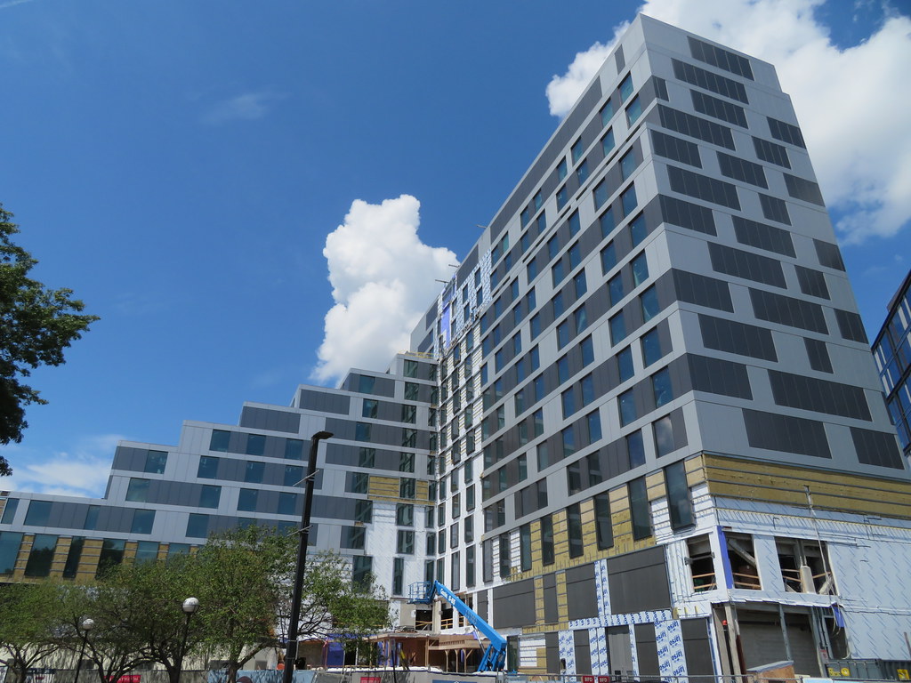 IMG_9911 by Bos Beeline, on Flickr
 IMG_9916 by Bos Beeline, on Flickr
 IMG_9917 by Bos Beeline, on Flickr
 IMG_9920 by Bos Beeline, on Flickr
 IMG_9923 by Bos Beeline, on Flickr
 IMG_9924 by Bos Beeline, on Flickr
 IMG_9926 by Bos Beeline, on Flickr
 IMG_9761 by Bos Beeline, on Flickr
- Joined
- Jan 22, 2012
- Messages
- 5,078
- Reaction score
- 1,662
For real my mind kept debating whether these were renders or photographs. Especially the first three.
Wow! I recently commented on another thread that the original Commonwealth Hotel looked like a gigantic plastic toy building. This is just about as bad, and not likely to get a makeover soon.
Java King
Active Member
- Joined
- Apr 6, 2007
- Messages
- 986
- Reaction score
- 2,053
This had SO MUCH potential. but that cladding and design scheme for the panels is really hideous. I was driving around here a few weeks ago. This very industrial area needed some good design. The office/lab building behind the hotel is quite nice.
Wait!!!! What happened to this???????????
Reality.
Wow! I recently commented on another thread that the original Commonwealth Hotel looked like a gigantic plastic toy building. This is just about as bad, and not likely to get a makeover soon.
I was just thinking that this is what you get if you gave a very uncreative kid some plain gray basic lego bricks.
I was just thinking that this is what you get if you gave a very uncreative kid some plain gray basic lego bricks.
Frankly, I'm disgusted with this building. It's an insult. The developer basically chose to dump this one out.
dshoost88
Senior Member
- Joined
- Apr 14, 2008
- Messages
- 2,188
- Reaction score
- 2,724
Calm down, guys. It's a Hampton Inn/Homewood Suites, not the Ritz Carlton or Four Seasons. I think given the occupant and compared to what was there before, this is great. For cruise passengers spending a night or two next to Black Falcon Terminal hoping to walk to the ships, this is a superior addition than what you'd see in most domestic ports (I'm looking at you, FL) and even Caribbean ports. The color scheme and facade pattern--though a bait-and-switch--are no different than literally dozens of institutional and hotel projects built throughout Boston.
Visit the Google Images for "Hampton Inn" and "Homewood Suites." Boston made out okay.
Visit the Google Images for "Hampton Inn" and "Homewood Suites." Boston made out okay.
- Joined
- Jan 7, 2012
- Messages
- 14,173
- Reaction score
- 23,688
[QUOTE="BeeLine, post: 380490, member:
IMG_9910 by Bos Beeline, on Flickr
[/QUOTE]
Would have been nice if they had something a little bolder on this East facing blank wall.
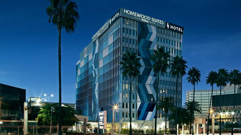
Maybe something like they did at the Austin Homewood Suites.
 Homewood-Suites-Austin-1_FPC by Bos Beeline, on Flickr
IMG_9910 by Bos Beeline, on Flickr[/QUOTE]
Would have been nice if they had something a little bolder on this East facing blank wall.
Maybe something like they did at the Austin Homewood Suites.
Homewood-Suites-Austin-1_FPC by Bos Beeline, on FlickrJumboBuc
Senior Member
- Joined
- Jun 26, 2013
- Messages
- 2,808
- Reaction score
- 1,995
I go back and forth on this project.
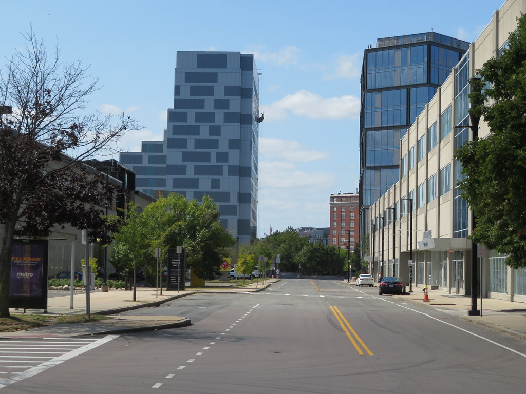
Part of me hates it for all the reasons discussed above, but part of me almost appreciates the design leaning in to the flat / "render" look and embracing it. Like, if you're going to go flat, go flat. I'll take that over, for example, the first phase of Waterside Place, which was just as flat but tried to pretend it wasn't. Once this is all patched up and finished I can imagine it having something of a "glitch in the matrix" appearance, especially on the window-less frontage. You can see this in BeeLine's first shot below:
I also appreciate that this project came to fruition. Putting aesthetics aside, this building's function is perfect for it's location; it was sorely needed.
I don't think it's fair to compare this urban Homewood Suites to the architecture of their suburban properties. I've stayed at the Homewood Suites in DC's Navy Yard (basically their Seaport) a few times and it's typical 2010s corporate "fast-casual" architecture: bland and uninspired but not objectionable.
The one at LAX has a similar treatment:
Part of me hates it for all the reasons discussed above, but part of me almost appreciates the design leaning in to the flat / "render" look and embracing it. Like, if you're going to go flat, go flat. I'll take that over, for example, the first phase of Waterside Place, which was just as flat but tried to pretend it wasn't. Once this is all patched up and finished I can imagine it having something of a "glitch in the matrix" appearance, especially on the window-less frontage. You can see this in BeeLine's first shot below:
Standing by itself that wouldn't work, but mixed in with some (better) neighbors it could provide some cool juxtaposition.
I also appreciate that this project came to fruition. Putting aesthetics aside, this building's function is perfect for it's location; it was sorely needed.
Calm down, guys. It's a Hampton Inn/Homewood Suites, not the Ritz Carlton or Four Seasons. I think given the occupant and compared to what was there before, this is great. For cruise passengers spending a night or two next to Black Falcon Terminal hoping to walk to the ships, this is a superior addition than what you'd see in most domestic ports (I'm looking at you, FL) and even Caribbean ports. The color scheme and facade pattern--though a bait-and-switch--are no different than literally dozens of institutional and hotel projects built throughout Boston.
Visit the Google Images for "Hampton Inn" and "Homewood Suites." Boston made out okay.
I don't think it's fair to compare this urban Homewood Suites to the architecture of their suburban properties. I've stayed at the Homewood Suites in DC's Navy Yard (basically their Seaport) a few times and it's typical 2010s corporate "fast-casual" architecture: bland and uninspired but not objectionable.
ould have been nice if they had something a little bolder on this East facing blank wall.
Maybe something like they did at the Austin Homewood Suites.
The one at LAX has a similar treatment:
Calm down, guys. It's a Hampton Inn/Homewood Suites, not the Ritz Carlton or Four Seasons. I think given the occupant and compared to what was there before, this is great. For cruise passengers spending a night or two next to Black Falcon Terminal hoping to walk to the ships, this is a superior addition than what you'd see in most domestic ports (I'm looking at you, FL) and even Caribbean ports. The color scheme and facade pattern--though a bait-and-switch--are no different than literally dozens of institutional and hotel projects built throughout Boston.
Visit the Google Images for "Hampton Inn" and "Homewood Suites." Boston made out okay.
And some people enjoy eating head cheese..........
j/k dshoost. I'm just going to have to agree to disagree with you here. The Boston's Seaport isn't Port Canaveral. This is supposed to be a world-class city. We shouldn't settle for dogshit.
- Joined
- Jan 7, 2012
- Messages
- 14,173
- Reaction score
- 23,688
 IMG_2396 by Bos Beeline, on Flickr
 IMG_2397 by Bos Beeline, on Flickr
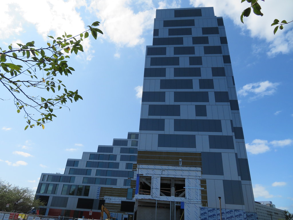 IMG_2399 by Bos Beeline, on Flickr
 IMG_2400 by Bos Beeline, on Flickr
 IMG_2403 by Bos Beeline, on Flickr
 IMG_2406 by Bos Beeline, on Flickr
 IMG_2407 by Bos Beeline, on Flickr
 IMG_2410 by Bos Beeline, on Flickr
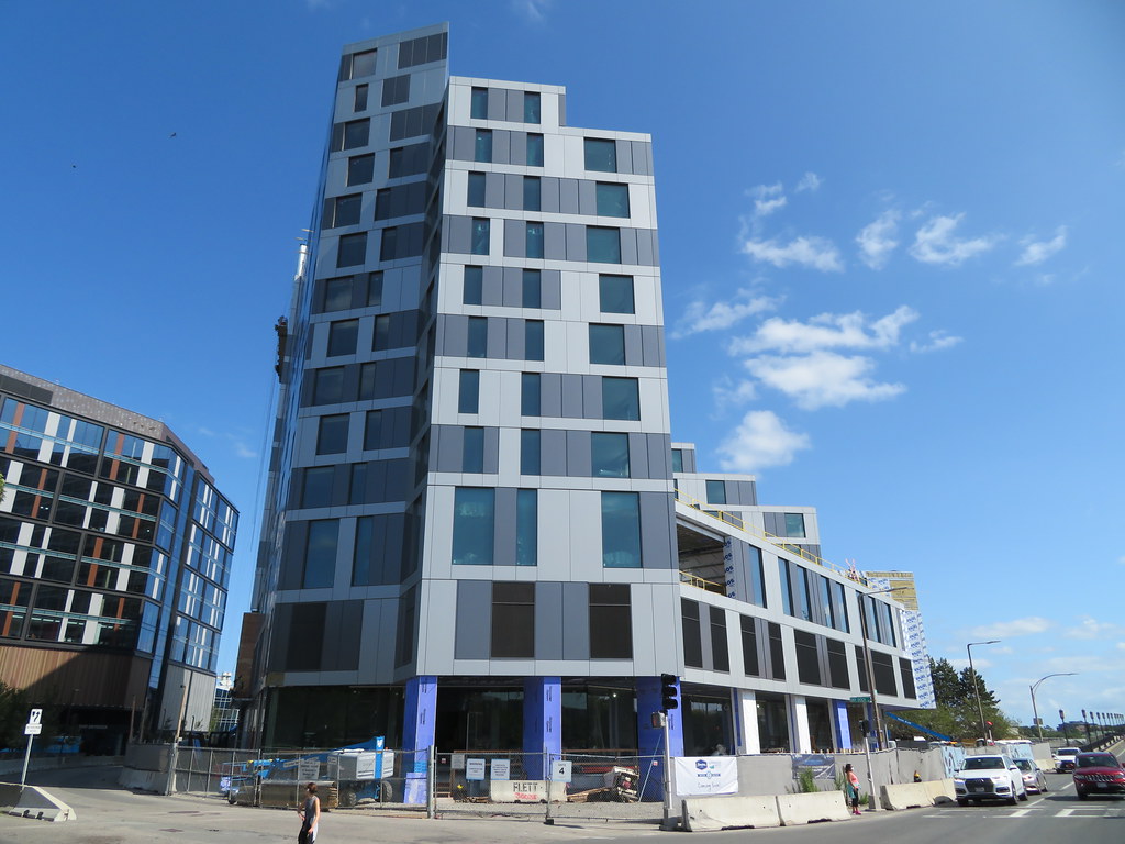 IMG_2412 by Bos Beeline, on Flickr
 IMG_2419 by Bos Beeline, on Flickr