Market Central (née Mass + Main) | 415 Mass Av | Cambridge

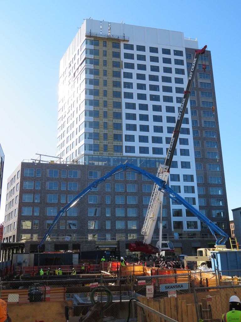
That black outline around the windows is actually a pretty nice touch to make this side pop a little more than just white otherwise would have. Nice
Yes it is. Sometimes a small gesture like that can really upgrade a design. This project is a big win for Central Sq.
 
I don't know that I've ever seen a white mechanical screen help a building's aesthetics this much. Creates verticality all down the facade and makes the tower look much thinner.
 
I don't know that I've ever seen a white mechanical screen help a building's aesthetics this much. Creates verticality all down the facade and makes the tower look much thinner.

Agree, and I'm also sure it's an homage to context. If you swing around you'll see at least 3 other instances of light-colored corrugated metal (e.g., MIT library annex building, Uhaul building, MIT Museum). But, on this new building, the vertical extension of the asymmetric window lines makes clear that this was something that was designed...not just plopped on.

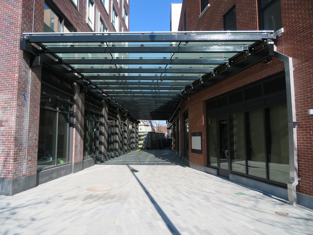
All due respect to BeeLine's amazing photography, but this thing is turning out better up-close than the at-a-distance shot suggests...the ground level, and the stepped integration with the rebuilt/restored 3-story building are pretty good. Also, there's a lot more brick on this thing than that photo's particular vantage point shows. Make no mistake, it's a cheap-o residential tower, but designers did OK with what they had to work with.
 
^following-up on above:
Was walking by today & grabbed this shot: "an ode to white corrugated metal neighbor"...FWIW

image_10.png
 
The tower, street wall, and integration of the smaller buildings into the area all came out flawless imo. Lately our developments have gotten very good at incorporating a very nice street wall regardless of whats above, where in the past the taller something was the more likely it stood on its own with just a lobby and no integration with its surroundings.
 
1580906738367.png

The rendering did a good job simulating how cheap the white portion of the tower would look, but I had held out more hope for the faux brick portions.

One month of free rent + $1000 if you rent within 24 hrs of a walk-through, but if you live there you could work from home and theoretically rarely have to see the buildings, silver lining...
 
The rendering did a good job simulating how cheap the white portion of the tower would look, but I had held out more hope for the faux brick portions.

I'm pretty sure that's real brick (the smaller building is a perfect replica facade for a structurally-deficient historic structure). What don't you like about it? It looks like... brick.

This building needed to have a good street level, and it does. It will never be noticed in any skyline.

Also, it's funny how obviously that blank wall assumes the corner building will go taller sometime soon.
 

Back
Top