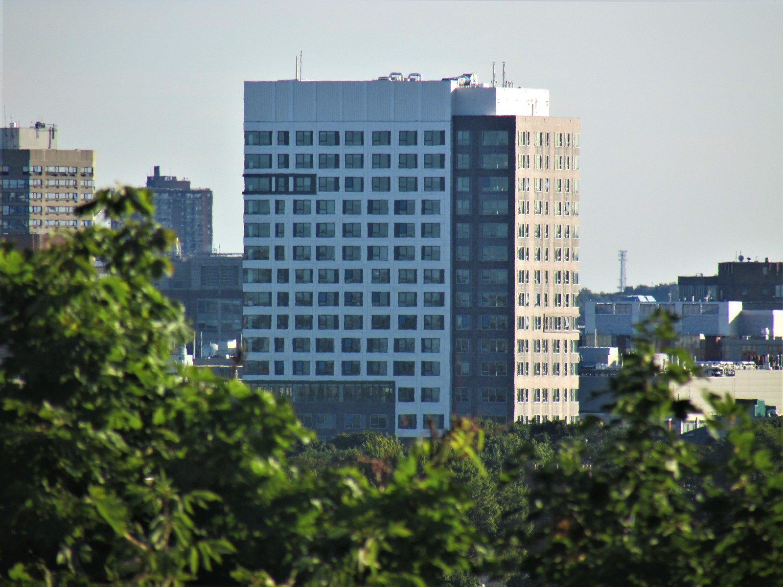
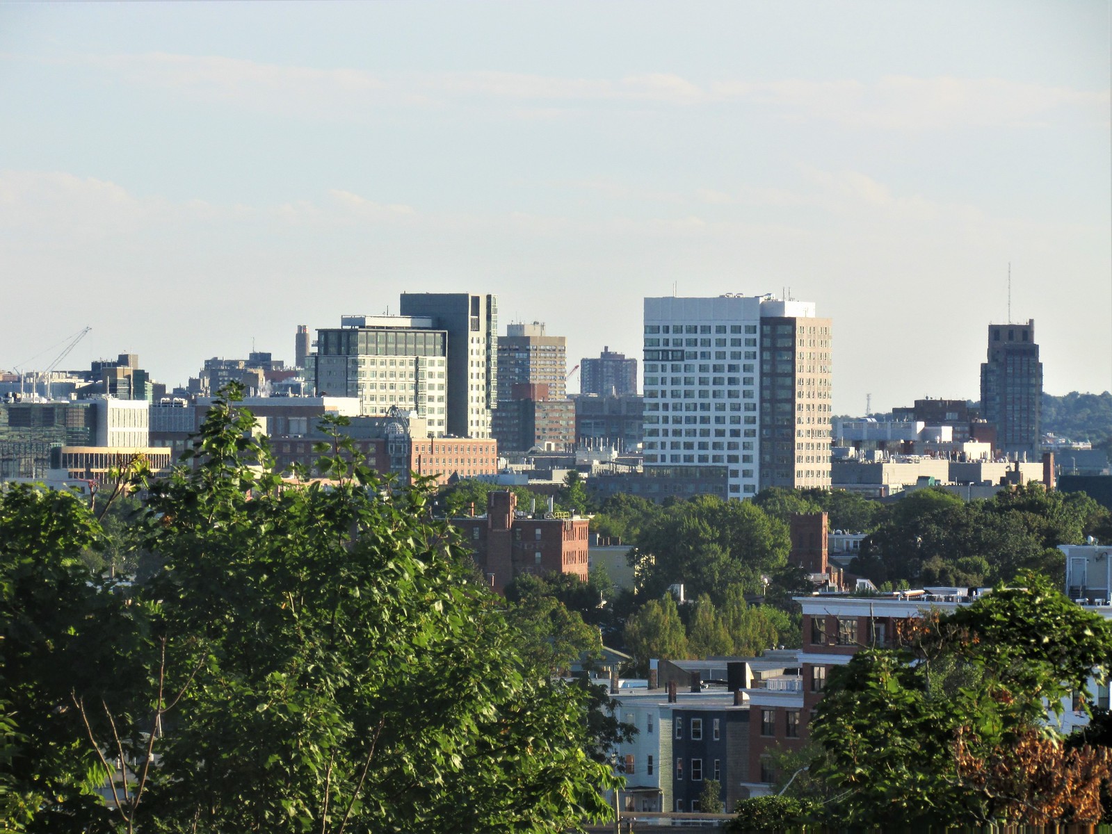
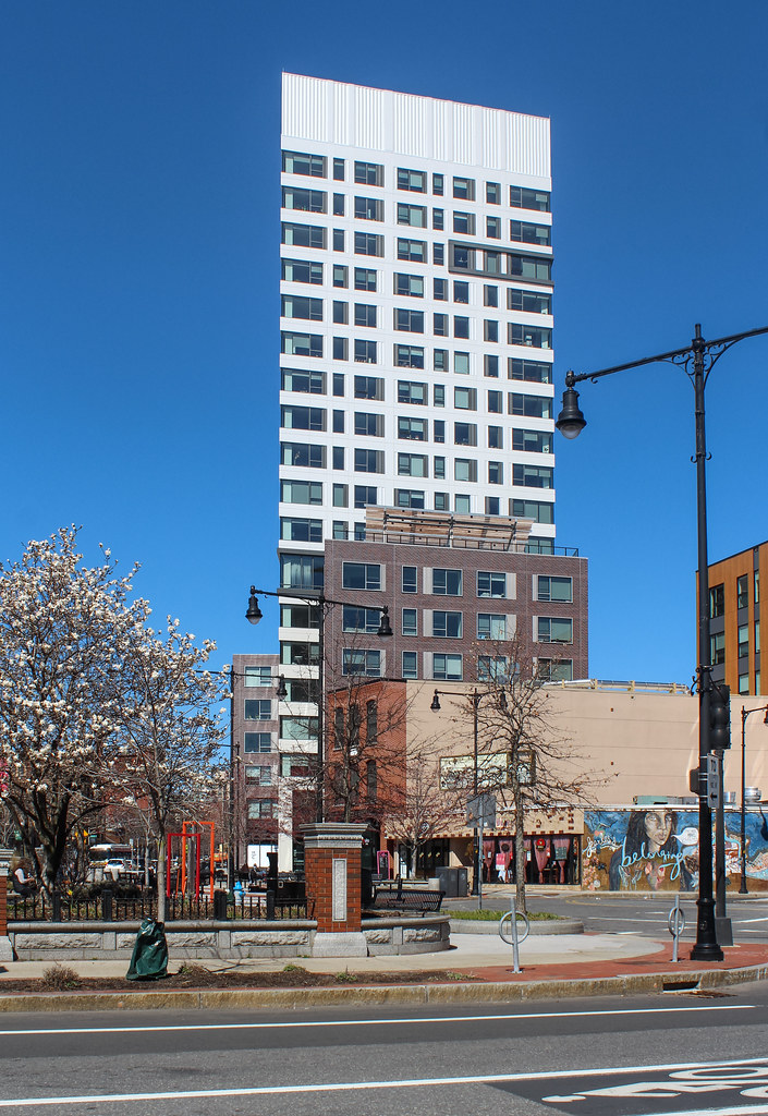
I'm referencing the brick that wraps the back of the tower and the two low-rise wings. The new-build brick looks cheap, both up close and from a distance, and the way the color distribution is laid out makes it look like a 'brick heather' t-shirt that quickly goes on clearance.
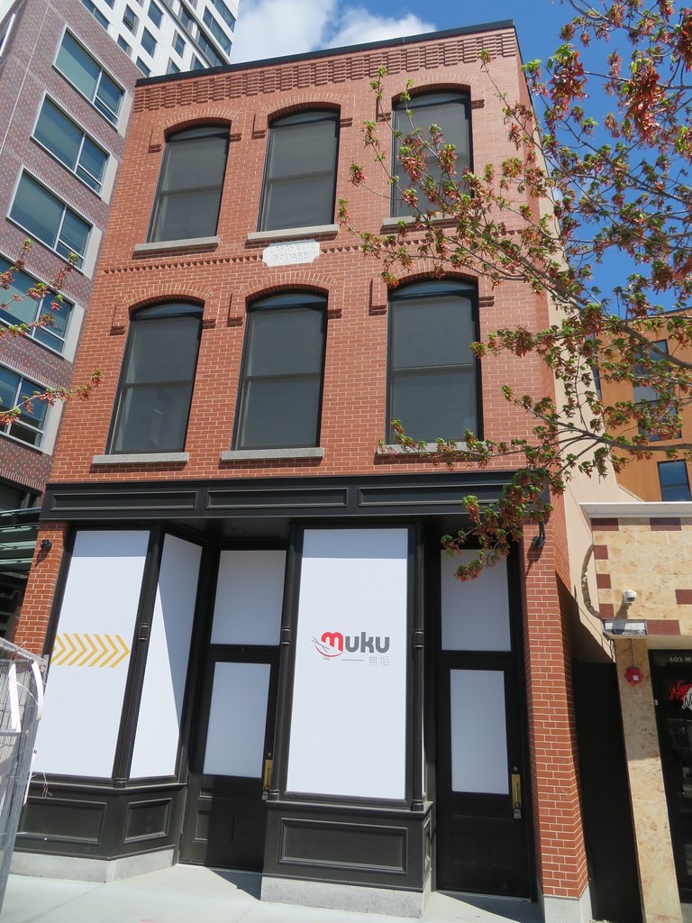
The brick on the remodeled storefront was cleaned up and looks fine. I too find the blank wall strange, as the large window placements in the structure behind it don't indicate an adjacent future build-out.
The brick on the remodeled storefront was cleaned up and looks fine. I too find the blank wall strange, as the large window placements in the structure behind it don't indicate an adjacent future build-out.

 IMG_0211
 IMG_3809
 IMG_3832
 IMG_3838
 IMG_3841
 IMG_3842
 IMG_3847
 IMG_3849
 IMG_3850
 IMG_3848
 IMG_3859
 IMG_3867
 IMG_3865
 IMG_3869
 IMG_3872
 IMG_3873
 IMG_3875

 IMG_2572
 IMG_2573
 IMG_2574
 IMG_2575


 IMG_7333
 IMG_7332
 IMG_7334
 IMG_7324
 IMG_7325
 IMG_7329
 IMG_7337