Marriott Moxy Hotel | 240 Tremont Street (Parcel P-7A) | Theater District

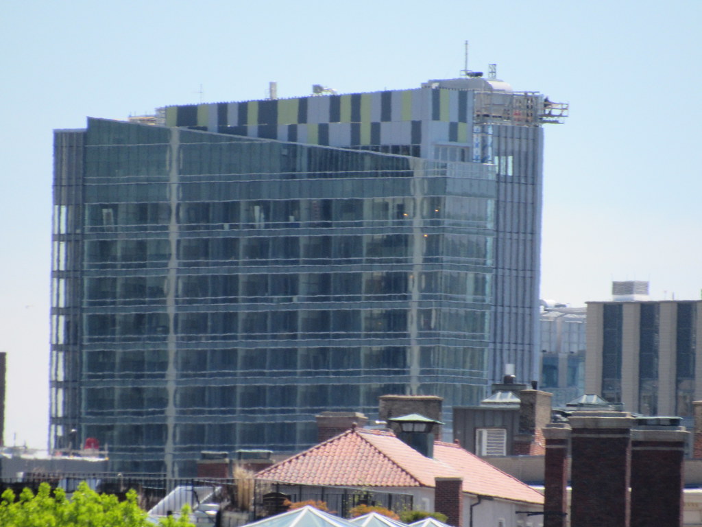
Hmmmm. I dont know, I dont know. I hate blank walls, and these colors are pretty wild and dont go with anything in the area, but they may have just pulled it off. I dont love it and I dont hate it. I guess Im just gonna hold off and see how it ages, and see how I feel about it each time I see it to gauge what I feel. This could be one of those towers that people absolutely love and some absolutely hate. Not sure if this is gonna be a filler.. dont notice it anymore, tower. It could, but again I think this is gonna take some time to become what it becomes.
 
Last edited:
I don't love the blank wall, but....

It is colorful and not overly bold (such as hot pink or something)
The building isn't 60 stories where something like that would be a distraction

The overall execution of building this hotel in a very small plot, that is both attractive and adds value to the area is really good.

I think this solid performance makes us focus on the bad stuff. This could have easily been clad front to back in cheap panels with offset windows and look more like a college dorm.
 
47637975632_a9b34121e3_b.jpg


Anyone who thinks the south facade design is a dumpster fire, proof enough.
 
^ Eh, its better than a blank wall a la 45 province. I dont love it but I dont hate it
 
Jeez a literal dumpster fire happened... Half of the panels are covered in soot now, I wonder if theyre salvageable or if this is ruined before its even finished now?
 
Jeez a literal dumpster fire happened... Half of the panels are covered in soot now, I wonder if theyre salvageable or if this is ruined before its even finished now?

A dumpster fire of a wall indeed. But how did the panels get covered in soot? :)
 
^^^ On the 4 of April they had a fire.
google moxy hotel fire for more info.
 
I love how they brought the backside pattern to the front's mechanical screen / crown. Perfectly playful without crossing the line into campy. This would fit perfectly in with what's going up in Rotterdam or Sydney - that's meant as a strong compliment.
 
Yeah - it reads as a skinny rectangular building composed of two extra-skinny rectangular volumes, which is cool.
 
I wish they would have chosen a different color, instead of the pea soup green.
 
Everybody loves this one so let me knock it down a peg. I mean, it's FINE, but at the end of the day it's absolutely an inferior version of the W Hotel next door. The clear glass side is better on the W, and as for the back the W's cladding is highly underrated while the messy pattern of the MM is more of a passable oddity than anything to be particularly proud of. The messiness at the top of the crown also detracts from the tower overall.

I mean, overall the buildings works, and it's fine, but it's no more than a B-/C+ piece of filler.
 

Back
Top