Something I've been thinking about since the T released the new subway map, going into effect with BNRD Phase 1: the T, at long last, is finally recognizing that the Silver Line is sui generis.
"Sui generis" is a fancy term that basically means "in a class by itself". Wikipedia provides a
range of examples, in biology, art, law, philosophy, and politics, all of them sharing the common element of being impossible to squarely fit into any established category, and unlikely themselves to create a new category with additional exemplars to follow.
The MBTA's visual language around the Silver Line in their new map points to this recognition. Notice that the Silver Line no longer sits in the Rapid Transit section of the key; it no longer gets its own version of the "shields" marking the end of the Red Line, Blue Line, etc. It is thinner than the rapid transit lines... but not as thin as the Frequent Bus Routes, from which it is also distinguished. Its stop labels are smaller than the Rapid Transit labels, but larger than the Frequent Bus Labels.
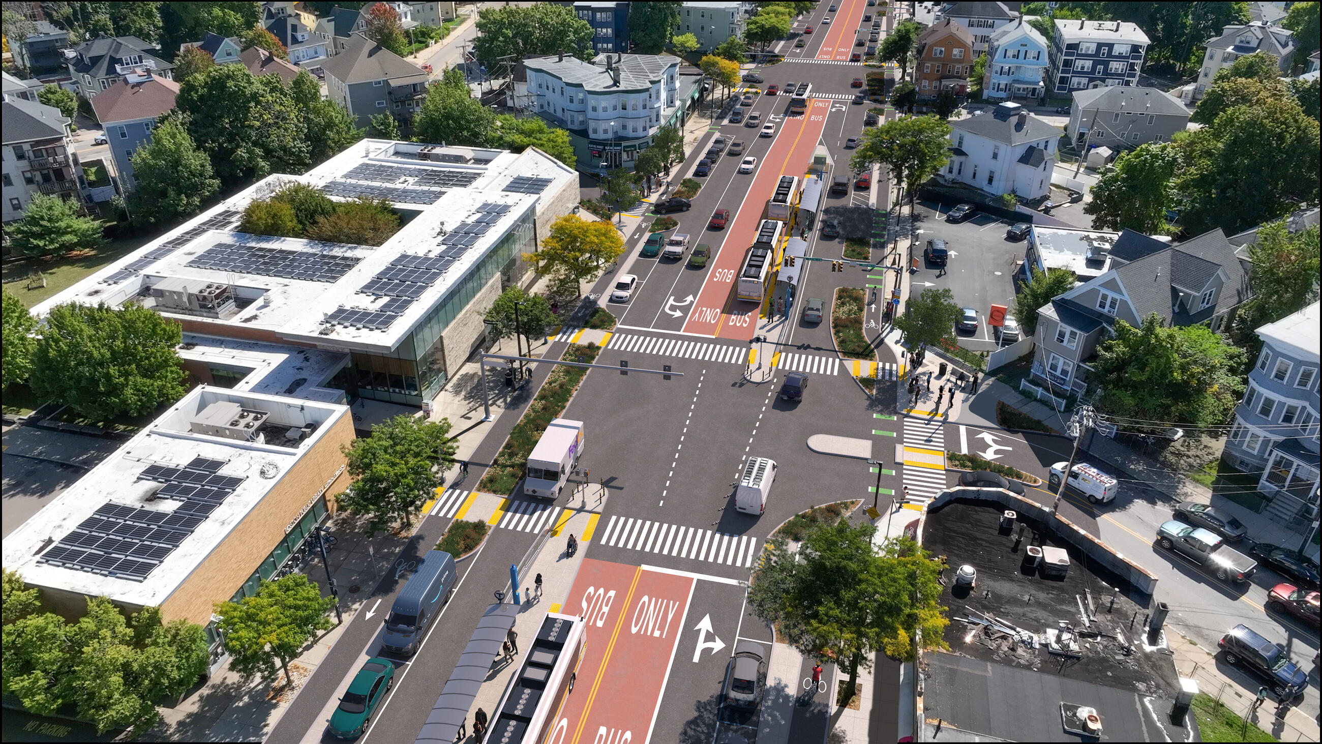
I hesitate to overinterpret this shift, but it does prompt some mild optimism in me that perhaps the T will be more honest with itself that the Silver Line, by and large, does not meet the standards of BRT. And honest about the fact that the Silver Line is now a melange of thirty years' worth of proposals and semi-finished projects, resulting in a complex system unto itself that cannot be fully described with standard terms, but which must be understood in its specific details and context. I do believe that the Silver Line can make useful contributions, if used appropriately; hopefully, this marks a turning point in the T's understanding of this bizarre little system it has spawned, setting aside unrealistic expectations about what they want the Silver Line to be, and instead accept and embrace whatever it is that we find the Silver Line to
actually be.
View attachment 57843
(It's like what every parent should remember: don't focus on the way you
wish your children were; instead, accept and embrace your children for who they
are.)
 www.mbta.com