Do we have any numbers for S Attleboro yet? I only remember someone's anecdotal report up thread. (Actually, I suppose I could swing by there on errands today, though probably numbers will be depressed due to the Fourth.)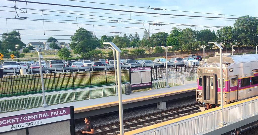
No drop-off in ridership at Pawtucket-CF station after S. Attleboro reopens
PAWTUCKET – Transit observers were watching curiously to see the impact of a reopening train station in a neighboring community on ridership at the Pawtucket-Central Falls Commuter Rail Station.www.valleybreeze.com
You are using an out of date browser. It may not display this or other websites correctly.
You should upgrade or use an alternative browser.
You should upgrade or use an alternative browser.
MBTA Commuter Rail (Operations, Keolis, & Short Term)
- Thread starter Balerion
- Start date
New England Born & Raised
Active Member
- Joined
- Jun 19, 2021
- Messages
- 603
- Reaction score
- 1,417
Do we have any numbers for S Attleboro yet? I only remember someone's anecdotal report up thread. (Actually, I suppose I could swing by there on errands today, though probably numbers will be depressed due to the Fourth.)
It was my earlier post about counting just three cars in the S Attleboro lot on Friday, June 14th at 9am. It would appear that few are using it. Its reduced schedule and fees to park probably are a factor in this. To my knowledge, the Pawtucket station is still yet to charge for parking which it had indicated would eventually happen. As long as Pawtucket has a more frequent schedule and free parking, S Attleboro is not likely to see a lot of passengers.
Came across a fascinating photo on Facebook earlier this week. (Shared in a private group, so won’t repost it here, though I’m sure any number of our intrepid photographers here might be able to snap their own.) Apparently at Readville there’s a new, rather elaborate piece of signage that lines out the services available on each platform (2 for Providence/Stoughton, 3 for via Back Bay, 4 for Fairmount, and 5 for Franklin/Foxboro, both directions). It actually uses some of the design language from the individual subway line maps with faded sections indicating stations unreachable from that platform (eg outer stations on an inbound platform).
And I actually just noticed: it uses the “white box black circle” symbol for transfer stations — which was used for the Cambridge Seven spider diagram and the early 2000’s diagram, but which hasn’t been used for a while.
The sign itself is cool, IMO, and it also makes me wonder what might be going on behind the scenes/in store.
The EGE
Senior Member
- Joined
- Jun 29, 2013
- Messages
- 1,905
- Reaction score
- 5,270
Does anyone know why the Riverside Avenue entrance to Campello station has been closed since last September? There doesn't appear to be any construction going on that would cause it, and the concrete blocks that block off the entrance are pretty substantial. Given the amount of tire marks in the parking lot, I have to wonder if the intention is to discourage that.
It was my earlier post about counting just three cars in the S Attleboro lot on Friday, June 14th at 9am. It would appear that few are using it. Its reduced schedule and fees to park probably are a factor in this. To my knowledge, the Pawtucket station is still yet to charge for parking which it had indicated would eventually happen. As long as Pawtucket has a more frequent schedule and free parking, S Attleboro is not likely to see a lot of passengers.
I'm on the 7:10 out of PVD usually once or twice per week (midweek, Tues/Weds/or Thurs). The most people I've ever seen waiting on the platform at SA is 6, with a handful of cars in the lot (10, maybe?). It's become a game to count the SA riders. Obviously this is anecdotal, but that's a clear, stark contrast to every other station along the route. I almost always take a NE Regional home, so I don't really have an idea what it looks like in the afternoon but I can't imagine it's all that busy. I didn't expect it to be super busy, but (often low) single digit boardings on peak trains in the middle of the weak is pretty dismal.
So, per a comment added 5 days ago to a 2 year old reddit thread, as well as some RR.net rumors, we should apparently expect to get a heritage liveried commuter rail locomotive in the very near future.

Personally, I suspect this is Eng being a railroad person, who is willing to step outside the boardroom and find a few low/no cost opportunities, like the googly eyes, to generate goodwill for the T. After all, a rebuilt CR locomotive was always going to need new paint.
Personally, I suspect this is Eng being a railroad person, who is willing to step outside the boardroom and find a few low/no cost opportunities, like the googly eyes, to generate goodwill for the T. After all, a rebuilt CR locomotive was always going to need new paint.
HenryAlan
Senior Member
- Joined
- Dec 15, 2009
- Messages
- 4,496
- Reaction score
- 5,322
MBTA Board votes to officially transition Fairmont to BEMU based, 20 minute frequency service, effective 2028.

 www.universalhub.com
In my opinion, there are several other lines that should be looked at for this, as early as 2030.
MBTA board commits to making the Fairmount Line battery operated by early 2028
The MBTA board today approved a $54-million plan to replace the diesel-powered trains on the Fairmount Line with more climate-friendly battery-operated cars within four years, which could mean almost subway-like train frequency - and some relief for Readville residents who live near the yard...
In my opinion, there are several other lines that should be looked at for this, as early as 2030.
Teban54
Senior Member
- Joined
- Nov 13, 2021
- Messages
- 1,142
- Reaction score
- 2,856
So I guess that's official endorsement of battery trains... Even in the Eng era.MBTA Board votes to officially transition Fairmont to BEMU based, 20 minute frequency service, effective 2028.
MBTA board commits to making the Fairmount Line battery operated by early 2028
The MBTA board today approved a $54-million plan to replace the diesel-powered trains on the Fairmount Line with more climate-friendly battery-operated cars within four years, which could mean almost subway-like train frequency - and some relief for Readville residents who live near the yard...
In my opinion, there are several other lines that should be looked at for this, as early as 2030.
Longfellow
Active Member
- Joined
- Dec 12, 2023
- Messages
- 440
- Reaction score
- 1,069
New and exciting ways to light money on fire.
soundguise
New member
- Joined
- Jun 11, 2021
- Messages
- 25
- Reaction score
- 78
This has been hard for me to follow. It is clear that the T didn't want (or at least didn't see political and financial support) to go it alone on electrification so accepted this proposal. The idea seems to be that by choosing this hybrid BEMU that also in motion charges/uses OCS to power when under wire lets them electrify without wiring the entire line? Specifically no need to modify bridges and stations. I am annoyed that we aren't getting a cost breakdown on the differential on partial electrification infrastructure vs full and then a look at standard EMUs vs BEMUs to do a real cost comparison. This probably because the T isn't proposing the full project or doing a study. I also wonder if going this route avoids all of the state and federal studies and applications for funding that this sort of capital project usually requires.So I guess that's official endorsement of battery trains... Even in the Eng era.
I personally still hold to the idea that the best approach is to build an in-house electrification department with the mandate to wire the whole system and just-keep-going until it is all done and than do the procurement and roll out of vehicles etc. and add to each line as it makes sense. This would require much more foresight and long term funding so I see why it isn't happening under the financial and governance model we have for the T.
Trying to not let the perfect be the enemy of the good. Or at least not a pure ideal system prevent the start of electrification. I think there is room for advocacy and pressure to make sure the T has a plan to move to full electrification infrastructure eventually.
Here's the important detail though - they're only leasing them, and only 3-5 sets. Given the T's financial situation it makes sense, and means that we get to give them back if the first gen batteries in these things suck, and that the T is wanting to put in some - they didn't say how much - catenary over the Fairmount. Also, once they get them, they're planning on testing them on the other lines, like Providence and The EJ corridor, so they will either prove fine or terrible and the T didn't spend too much on its lesson.
Other details include that the existing diesel fleet would get redeployed elsewhere for increased service, Based on how the directors were talking, we're looking at Stadler Flirts like Metras too, though we'd be behind them in line to get them.
Other details include that the existing diesel fleet would get redeployed elsewhere for increased service, Based on how the directors were talking, we're looking at Stadler Flirts like Metras too, though we'd be behind them in line to get them.
Last edited:
soundguise
New member
- Joined
- Jun 11, 2021
- Messages
- 25
- Reaction score
- 78
Good info. I didn't think through it like that in terms of being potentially lower risk for the T.Here's the important detail though - they're only leasing them, and only 3-5 sets. Given the T's financial situation it makes sense, and means that we get to give them back if the first gen batteries in these things suck, and that the T is wanting to put in some - they didn't say how much - catenary over the Fairmount. Also, once they get them, they're planning on testing them on the other lines, like Providence and The EJ corridor, so they will either prove fine or terrible and the T didn't spend too much on its lesson.
Other details include that the existing diesel fleet would get redeployed elsewhere for increased service, Based on how the directors were talking, we're looking at Stadler Flirts like Metras too, though we'd be behind them in line to get them.
F-Line to Dudley
Superstar
- Joined
- Nov 2, 2010
- Messages
- 10,012
- Reaction score
- 12,499
It's not going to be FLIRT's. They aren't available for 48-inch full-high platforms, only 8-inch lows (like Metra's) and Euro-style 29-inch middle-highs (like CA Arrow's). Doing a U.S. high-boarding variant would be a fresh customization Stadler's never bid anywhere before, and I'm not even sure the floor height on that make is adaptable enough to add another 1-1/2 feet.Here's the important detail though - they're only leasing them, and only 3-5 sets. Given the T's financial situation it makes sense, and means that we get to give them back if the first gen batteries in these things suck, and that the T is wanting to put in some - they didn't say how much - catenary over the Fairmount. Also, once they get them, they're planning on testing them on the other lines, like Providence and The EJ corridor, so they will either prove fine or terrible and the T didn't spend too much on its lesson.
Other details include that the existing diesel fleet would get redeployed elsewhere for increased service, Based on how the directors were talking, we're looking at Stadler Flirts like Metras too, though we'd be behind them in line to get them.
There's nobody's option orders or platform-compatible active/soon-to-be-active assembly lines to tag along to, so I don't know where they're going to find 3-5 lease sets of any BEMU make.
Last edited:
It's not going to be FLIRT's. They aren't available for 48-inch full-high platforms, only 8-inch lows (like Metra's) and Euro-style 29-inch middle-highs (like CA Arrow's). Doing a U.S. high-boarding variant would be a fresh customization Stadler's never bid anywhere before, and I'm not even sure the floor height on that make is adaptable enough to add another 1-1/2 feet.
There's nobody's option orders or platform-compatible active/soon-to-be-active assembly lines to tag along to, so I don't know where they're going to find 3-5 lease sets of any BEMU make.
 I'm just reporting on the verbal Q&A content of the meeting. I'll grant they've been very careful not to say anything definitive regarding the vehicle maker but it very much feels as if the the working assumption is that we're in trail behind CA and Metra with Stadler.
Director Smart: "I understand that we're third in line for these vehicles? And that California and Chicago are before us, and I'm ... A little nervous about us being in the same position as we are in Springfield in terms of delivery? How do you plan to address that...?"
Mike Mueller, exec director of CR: "Part of Keolis's role as the project delivery partner is to actually go out and procure the vehicle, so we actually have not gone through the process of procuring a specific manufacturer for the vehicles, so we won't know until that occurs where we are in queue behind our peers in California and Chicago."
F-Line to Dudley
Superstar
- Joined
- Nov 2, 2010
- Messages
- 10,012
- Reaction score
- 12,499
It could be the Stadler KISS bi-level BEMU's that Caltrain is ordering for the un-electrified Gilroy tail of their system. Those would fit our system, as the heavily Caltrain-modified version was bid for both our EMU and BEMU RFP's. But right now their order is only for 1 pilot set for a cool $80M; none of the permanent options have been exercised yet. So there's questions about exactly what kind of production line they're sustaining, and lots of questions about the price tag.
Director Smart: "I understand that we're third in line for these vehicles? And that California and Chicago are before us, and I'm ... A little nervous about us being in the same position as we are in Springfield in terms of delivery? How do you plan to address that...?"
Mike Mueller, exec director of CR: "Part of Keolis's role as the project delivery partner is to actually go out and procure the vehicle, so we actually have not gone through the process of procuring a specific manufacturer for the vehicles, so we won't know until that occurs where we are in queue behind our peers in California and Chicago."
There's just no way it could be the single-level FLIRT given the platform incompatibility of all the active installations of them worldwide.
Last edited:
")
Apologies for the double post, but I went through an embarrassingly large number of Flirt datasheets. Apparently, Stadler built aIt's not going to be FLIRT's. They aren't available for 48-inch full-high platforms, only 8-inch lows (like Metra's) and Euro-style 29-inch middle-highs (like CA Arrow's). Doing a U.S. high-boarding variant would be a fresh customization Stadler's never bid anywhere before, and I'm not even sure the floor height on that make is adaptable enough to add another 1-1/2 feet.
There's nobody's option orders or platform-compatible active/soon-to-be-active assembly lines to tag along to, so I don't know where they're going to find 3-5 lease sets of any BEMU make.
Edit, I misinterpreted. Those are mixed floor designs with high floor operator cabins and set ends. I don't know how the Polish Intercity cars structurally differ besides propulsion systems from the commuter version, but at least 1180 is something that Stadler has attached the Flirt name to.
Attachments
Last edited:
F-Line to Dudley
Superstar
- Joined
- Nov 2, 2010
- Messages
- 10,012
- Reaction score
- 12,499
The bottom one is a Stadler KISS, same one Caltrain ordered. Note the high-and-low boarding doors, which was the Caltrain customization. Although I'm not sure what's up with the front car in that render, which looks like an HSR power car and not a passenger carriage. The Caltrain KISSes board passengers in all cars of the consist.The MBTA is thinking about THESE again for their commuter rail lines. Electric locos.
View attachment 53063
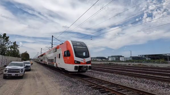
Their BEMU pilot is a 4-car set. But egad...the price. $80M for 4 cars. It's estimated that they need eventually need 6 sets of them to cover the entirety of Gilroy service, which would cost them nearly a half-billion dollars at the going rate for the BEMU variant.
F-Line to Dudley
Superstar
- Joined
- Nov 2, 2010
- Messages
- 10,012
- Reaction score
- 12,499
Caltrain spent $25M less per KISS EMU set than it's spending on the KISS BEMU set, and those were 6-car sets not 4-car. The BEMU markup is extreme. Some of Caltrain's advocates are even advocating for bustitution of the Gilroy branch until CAHSR gets its house in order and electrifies that portion, they're so nonplussed with the costs of the BEMU dalliance.Are regular EMUs cheaper than BEMUs, OCS investment aside? I'd think so, what with batteries being so expensive and EMUs being a very mature technology.
EDIT: The Caltrain costs are a little funky, because they have powered trailers, unpowered sandwich trailers, and unpowered cab cars in the lineup for these semi-permanent sets. And Stadler charged them different rates on the configurations, which were for 6-car EMU sets (base), 7-car EMU sets (option), and expansion power cars and trailers trailers to lengthen the 6-car sets into 7 (another option).
Power car: $4.9M average
Unpowered trailer: $3.3M average
Cab cars: $5M average
$20M per car on the BEMU. Which consists of 2 power cars and 2 stock cab cars. So the BEMU power cars are likely $35M each, or 7x more than their EMU power car equivalents.
I don't know if Stadler would charge the T less. Caltrain was definitely paying a heinous premium because their pilot is the debut BEMU KISS worldwide. It's never been done before on that make, so Stadler extracted its pound-and-a-half of flesh from Caltrain for being the guinea pig. Most of Stadler's BEMU sales to-date have been FLIRT Akku's (the one Metra is buying), which were a lightweight cleansheet design meant to be plug-and-play with batteries. So it's quite likely that follow-on KISS BEMU orders will be significantly cheaper than what Caltrain is shelling out for its one demonstrator unit. But how much cheaper? It's certainly going to be cheaper to electify Fairmount than spend 4-7x the going EMU power car rate on a BEMU.
Last edited: